image: .www.artrenewalcenter.org
Above is a drawing by William Bouguereau, 19th century French academic painter, this guy could REALLY draw! An amazing artist and until recently little seen in museums, now seeing a restoration to the position in art history he truly deserves. I will do a post on him soon.
I promised I would return to the subject of copying drawings and I will do that now. You must obtain a clear reproduction in something like the actual size of the original drawing. I would suggest starting with an Ingres or Michelangelo, however there are many great draftsmen whose work will do. You must first find a suitable drawing. either in a book or printed out from online, perhaps from the Art Renewal Centers' web sites' wonderful collection. Tape it to a drawing board next to a sheet of good quality drawing paper. I like Aquabee Deluxe and Canson Ingres but there are many good papers out there. Do not use a cheaper poorly made paper! You don't want it's surface failing when you are hours into a project.
First mark off on your drawing paper an outline the size of the drawing to be copied. Find a point with a ruler at the top of the drawing and place a tic mark there, find two or three landmarks in the figure directly below your first mark. Then find and mark another couple of dimensions with your ruler corresponding to other important points on the drawing and you now have a sort of map with which to begin.
Starting very , very lightly with a pencil, begin to imitate the drawing on your paper. You must do this very softly, as you will erase it a few times before you are happy with it.All of that erasing is why a good quality paper is important, it has to be able to take the beating. Work the entire drawing out like a ghost before you darken any line. You can find more landmarks in the drawing with your ruler as you go, that way you can see if things you are drawing are falling into their right places in relation to one another. The point of this exercise is accuracy,so try to make as perfect a copy as you can. Obtaining the last 20% of the accuracy in your copy will teach you more than the first 80%. Leave nothing knowingly wrong on this drawing, or any other for that matter. Every thing in art should be as right as you can make it.
Art must be "A" work or its not art. Art wont shine your shoes, fuel your car, or feed your cat. therefore:
ART HAS NO REASON TO EXIST, OTHER THAN THAT IT BE WELL MADE.
Saturday, February 28, 2009
Friday, February 27, 2009
Drawing, the rhythmic line
Here is another Ingre portrait.This guy is so well characterized that I feel like he might be someone I might know. Maybe he is a wry and clever guest on some late night talk show. Could he be a senator?
Here again, the modeling in the lights has been kept to an absolute minimum. But I want to speak about another quality that a drawing can have. The lines in this picture have something going on besides describing the things they are delineating .They have rhythm. That is the flow or direction of one line is picked up and carried on in another . The lines doing this in this drawing are arched or C shaped, those on the front of the figure curving inwards , enclosing the front of the volumes portrayed. Those on the back of the figure face the other way enclosing the forms within them in the opposite direction. Refer back to blog entry dissecting a Metcalf 3 and you will notice Willard using the same arching and enclosing form implying lines, These lines have a lyrical and active motion swirling in a sort of loose S curve up to the head.The darks are placed as accents in and around this gentlemans' face, which also leads our eye.
All of that complex costume is subordinated to the head, and considering all the collars, capes, kerchiefs and cuffs on this cat that is a remarkable piece of understatement. In the work of a lesser artist the costume would be wearing the man. Here is a great example of subordinating an area which could easily be too assertive to the larger unit of the drawing.
Thursday, February 26, 2009
Art and price
On Tue, Feb 24, 2009 at 8:57 AM, Linda Larynxslicer
Stape;
How 'bout you-guys whipping up some quickies that can go for cheap as compared to your masterpieces? I read that Mary Kaye and other cheap make-up companies are thriving right now, stock going up, because (apparently) women get a boost out of using it, for but little invest. Not clear, however, that this theory might transfer to the art world.
xo xo xo Linda
The art market is different, Linda. Thanks for asking for the quickie though. People often imagine that art is expensive because of the enormous hubris of the artists or our lack of understanding of how the business model actually works, They are vile crustaceans. Here's why.
Lets say I make a painting to sell for $500.00 The dealer earns his half, ( and deserves it too, retail is a lot of work and overhead ) that leaves me with $250.00 A frame will cost me 50.00 I really can't get a frame for that, but lets just suppose....Now I am down to $200.00. If I then back out of that, a very reasonable charge for canvas, paint, stretchers, driving to location ( often distant) and some marketing, accounting, shipping and incidental expenses, let's call all of that
$ 25.00 , (again in the real world it costs more)......Now I have $175. Now lets assume that Mr Obama and that cheery band of tax cheating thugs in congress , were to take, say $25.00 for some stimulants, I am left with $150.00. That's assuming I am in the 10% bracket. Which I am not, because my goddamn social security tax alone is 15%, by it Ponzi scheming self.
How many 150 dollar paydays must I then receive to earn 100 thousand dollars a year? With my mortgage, health insurance, kids in college, debt, medical bills and secret heroin habit, that's what it takes for me to live in the sparkling wonderland of the greater Boston area.
Assuming that every single painting I do works out and then sells without exception, the number of paintings I must sell at $500 a piece is 666 per year, that is, no kidding the actual number ( and oddly enough the number of satanic completion as well ) . That works out to about two a day if I take Sunday mornings off to get down on my knees and thank God for those hundreds of sweating, Mary Kay opaque gypsum foundation plastered housewives buying $500.00 paintings like there's no tomorrow, in the heart of a recession, rather than a Tom Kinkaid bathtub strainer at K-mart. Fat chance!
PS. Thanx for asking though , this will make a swell post for my new blog on art, I will expunge any reference to you of course and place the question into the mouth of a happy little cartoon lobster with a droll Jamaican accent dancing to a churning yet harmless and lighthearted calypso beat.........................Stape
Wednesday, February 25, 2009
An entry about values, conventions and their uses
inage; wwwartrenewal.org
Above is the head of Daphne from a larger statue by Gian Lorenzo Bernini 1598-1680.
Heres an example of light falling across a figure and it presents something like the usual drawing problems. The halftone of the left cheek shows nicely the separate world of halftone approaching the shadow. However the halftone and the shadow in the eye sockets are very close together, the knowledge of anatomy is helpful in knowing what is halftone and what is reflected light.
A little trick that often works in the studio when painting a head or a still life, is to take a brush handle or your charcoal and cast a shadow on the subject. You will find that you cannot cast a shadow onto a shadow. If you can cast a shadow onto it, its a halftone.
In practice it is often very hard to determine where the halftone leaves off and whether the reflected light is as bright as the darkest part of the lights, particularly on a dark or extremely reflective surface. So, out in the world our nice system of light and dark is not so easy to see and often you will find situations where because of multiple light sources or materials of varying reflectivity the object doesn't seem to display the perfect division of the two. You may see situations where a very dark object in the light, or a very dark object in the shadow seems to escape our rule also. It happens. Although in the physics lab it is probably an immutable law out in the real world things can get awfully fuzzy. So I guess the systematic representation of light is part science and part artistic convention.
For expressing form this practice works and ignoring it does not. But it is a system like perspective, a general principle that helps the artist in his task. It is a model for the real world and not the real world itself. You can find scenes that seem to defy perspective but you may not make a convincing representation if you draw them that way.
OBSERVATION SHOULD NOT RULE , BUT SUGGEST EXECUTION
Drawings are routinely ruined for lack of understanding of of values and seldom harmed by it. There are plenty of examples of figures with lots of dark halftones and strong reflected lights. Michelangelo did many, but he was an artist who understood this principle well enough to cheat it.
The nice thing about knowledge is that if you acquire it you can choose to operate without it. The problem of not having knowledge is you can't choose to operate with it. There is an intellectual laziness I have on occasion encountered in the art world, that derides the study of academic technique. Often these folks fear their natural abilities will be diminished by such studies. They imagine that ability is bestowed rather than achieved. ( I am not speaking about you, anyone you know, or have ever met ). Go for the full tool box it is not any heavier than the half empty one.
Good painting is the result of both observation and knowledge. It is an old artistic saying that:
first you paint what you know,
then you paint what you see,
and finally, you see what you know.
What that means, is that beginning painters don't really look at what they are painting, instead they make a pictograph or a symbol containing the things they know about their subject. Think of those drawings grade school kids make when asked to draw their own house, that contain a door ( gotta have one of those ) a window and a chimney but are a representation of every house, the idea of a house, rather than their own particular house.
As artists progress they learn to see things in the abstract, that is they can see the shape of an object laid out in space, what the thing looks like, which is often very different that what the thing looks like in the head on or side view we store in our memory. This leads to more accurate representation including proportion and values..
In the final stage the artists' eye is informed by ideas like conservation of values, anatomy, color theory, perspective etc., and when he peers put at the world he actually sees those principles operating out there.
A woman in a class once told J.M. Whistler ,"but I like to paint what I see" to which he replied "wait till you see what you paint".
I guess if I am going to quote Whistler I should show you one. I will review his book "The Gentle Art of Making Enemies" in a later post.
Tuesday, February 24, 2009
Drawing, suppresion of values in the light
Thank God for www.artrenewal.org
Above I have presented a detail of a William Bouguereau. I know we are talking about drawing but as I said in a preceding post. a painting is really a drawing in color. Particularly an academic paintiing like this which is made from a careful drawing transferred to the canvas. Bouguereau, ( pronounced Bouguereau ) was an absolutely splendid draftsman. Lets examine this head. He has defined the shadow edge, our "bed bug line", and softly turned the form in the shadow with restrained reflected light . Over on the light side of the head the half tones are so suppressed that they are barely perceptible. Although the half tones are suppressed, the planes of the head go around just fine.This gives an elegance and a "clean" look that takes this thing up from worksmanlike representation to fine art. It looks good. That's the idea.
Here's the same thing going on in this head by Henry Raeburn, the eighteenth century Scottish portrait painter. Notice how broadly seen and simple the shadow side of the face is. The "bed bug" line is right there, softened in some places and sharp where the bone of the skull is close to the surface. Notice also the simplicity of the kerchief at his throat. The values in that are suppressed as well, keeping it in its proper place in the picture rather than calling attention away from the head. Every thing in a painting must be subordinated to the larger image.
I have stressed before that it is difficult to place too much emphasis on what the painting actually looks like. The art is in the appearance of the painting. That may seem really obvious to you, but we live in an era where we often hear art lauded for what it says about society, or how it pushes the envelope or defies our preconceived bourgeois notions, etc. I think it good to remind you that," what it looks like" is where the art lives.
Over expression of the halftones in the light creates a problem called over modeling and causes a dirty look in a painting. It is the result of trying so hard to get the form that the "BIG LOOK" is lost. Lets talk about the "big look" idea for a little bit here. Imagine I have a model set up before me in the studio, while were at it in fact, lets imagine her about nineteen, breathtakingly beautiful and unbelievably naive. We'll call her Muffy for the sake of this exercise.
Now when we look at Muffy in her entirety she looks one way, but when we look at some individual part of Muffy she looks a different way. In order to paint Muffy well, we must paint each part of her as it looks when we are looking at all of her. We want to paint her hand the way it looks when we are looking at her head. I know that sounds like zen but here's why its important. Looking just at the shadow for instance and not seeing it in comparison to the light causes us to overstate the reflected lights, and of course staring at the lights causes us to overstate the halftones .This also causes us to over "detail" each individual part of Muffy, giving not one large vision of compliant loveliness but a patchwork of separate and unrelated examinations. Our representation of the fetching and cooperative Muffy becomes PIECEMEAL. Rather than one big image on the canvas we have half a dozen, each calling out for our attention. We have made a group of disparate an unrelated parts hooked together, rather than nice Muffy. What we have lost is the most important quality a painting can have;
UNITY OF EFFECT
Unity of effect is that quality, which all great art possesses, be it a painting, a Hiroshige woodblock print, a Richardsonian Romanesque public library, a piece of Attic red figured ware or a Goddard-Townsend kneehole desk. The thing holds together. It is one cohesive statement and not a handful of conflicting and individual parts . If I can teach you only one thing. Learn this.
Sunday, February 22, 2009
Drawing,light and shadow.
Here is a drawing by Pierre-Paul Prodhon, a French artist who lived from 1758 until 1823. The image is courtesy of www.artrenewal.org . whose online museum is something you should be aware of, as it is a great resource. I am routinely indebted to them for images without which much of this tutorial would not be possible.
This beautiful figure is a good example in which to clearly observe an artist finding the shadow edge or our "bed bug line". His shadow edge is easy to see and the two worlds, the light and the shadow are carefully divided. I am now going to write something you will have to read a few times to understand. The first time I heard it, I thought it was gibberish;
THE DARKEST DARK IN THE LIGHTS IS ALWAYS LIGHTER THAN THE LIGHTEST LIGHT IN THE DARKS.
conversely
THE LIGHTEST LIGHT IN THE DARKS IS ALWAYS DARKER THAN THE DARKEST DARK IN THE LIGHTS.
There are two separate worlds with no note occurring in both. When we draw, we are "sorting " the values into the two great camps, light and shadow. Everything belongs to one or the other. Either the light strikes it or it doesn't.
No matter how dark some gradation in the halftone may appear, it is never as low in value as anything on the shadow side of our drawing. When you get this overly dark halftone it is because you are comparing one part of the halftone against another, rather than looking at the object in its entirety. This is what causes a problem called over modeling. More on that in the future.
Routinely when I teach I will explain this to students who "get" the concept. Then when I join them at their easel, I will place the heel of my brush at some random point on their canvas and ask them "is this in the light, or is this in the shadow?" They are sort of dumbfounded and will look down at their feet and say they don't know, or that its sort of in both, or neither. Every time your brush or pencil touches that canvas you need to know whether that mark you are making is in the light or if it is in the shadow. Every time. If you place one note from the light into the shadow the illusion of form vanishes.
PS. the reason I am finishing the aforementioned charcoal drawing from left to right is, because that way ( since I am right handed) the heel of my hand is to the right of, and not sitting on and smearing the delicate area of drawing I have just completed.
The bedbug line
Above you see a sphere showing the PARTS OF THE LIGHT. They are;
1) The half tone, that's the value (degree of light to dark) of the object as it appears in the light.
2) The point on the sphere that faces most towards the light source and reflects that light to us is the highlight.
3) The shadow edge, which is where the light no longer hits the surface of the object, this is the bedbug line, I will explain that in a moment.
4) The shadow has a minor, lighter area within it called the reflected light.
5) The sphere throws a shadow onto the surface behind it called the cast shadow.
It is through this organized presentation of the light hitting an object, that the form of that object is represented. We have no other way of representing an object other than by a description of the light hitting it. Most of drawing is either measuring the proportions of one part of an object as related to another, or presenting the form through a representation of its values.
I intend to spend some time describing the different parts of the light I have labeled above. Today I shall deal with the most important. That is the BED BUG LINE. Your drawing book doesn't call it that, usually it is referred to as the shadow edge. My teacher R.H.Ives Gammell (more about him later) used that whimsical title to teach me a valuable lesson that I have never forgotten. Here it is:
A bed bug walking across the surface of the sphere steps boldly from the light into the shadow. That's it!
That means our tiny bug is EITHER IN THE LIGHT, OR HE IS IN THE SHADOW. Why that is very important is because it means that the two worlds are totally separate . No value occurs in both. My entry of Saturday January 31st shows a value scale and you might want to take a look at that. The instant you take a note from the light part of the sphere and introduce it into the shadow side of the sphere the illusion of form vanishes. This is the most important thing you can know about representing light. It sounds obvious and easy, however in practice it is one of the places where most students run into problems with their drawing. I will join them at their easel and touch the heel of a brush to some random point on their drawing and ask them, is this in the light or is this in the shadow? They often don't know and they try to explain how it's dark but it's in the light or it's somehow not in either. Every time your brush (or pencil , charcoal , whatever) hits the canvas you MUST know whether it is in the light or the shadow. Its one or the other every time.
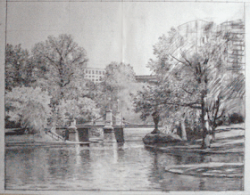
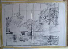
Here's another photo of the Boston Public garden drawing progressing. I am pretty much working from left to right on it. Tell you why tomorrow, along with more on the parts of the light.
Saturday, February 21, 2009
Drawing 2, about charcoal
I will return to copying drawings of the masters in a subsequent post. Raise your hand if you had any intention of doing it. All of you? Oh I'm so pleased. I know its going to help you so much with your painting! I was so sure you were just going to ignore that suggestion.
Since I have begun a large drawing in preparation for a painting I think I will show you that. When I draw these days I generally work in charcoal as I am doing studies for paintings. If I go to a life class I draw in pencil.
Because I am making a drawing 24x30, the size I want my painting to be, I have taped two sheets of Canson Ingres charcoal paper next to one another on a half sheet of plywood. I have several of these big drawing boards that I can trade in and out of my easel for different projects. When I am taping things down as references I use ordinary masking tape.
Charcoal that has wax in it or the compressed sorts are impossible to erase and I want to be able to push this drawing around until it is looks the way I want the finished picture to look. It seems sometimes as if I erase as much as I draw.
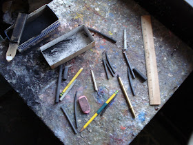
Vine charcoal is just what it sounds like, it is made by heating vines in an airless environment. I always buy the sticks they grade as hard. I am using Winsor & Newtons charcoal. I sharpen it to a needle point with my sandpaper block. My teacher the late R.H.Ives Gammell would call these our "dental instruments" I have a little brass sleeve that will hold a piece that has become too short to work with. Here you see a piece of vine charcoal and my brass charcoal holder.
It is important to use top quality charcoal paper. I like the Canson Ingres but Strathmore makes a suitable paper as well. These papers take the charcoal well and will withstand a great deal of erasure. I will probably throw these drawings in a portfolio or even discard them when I have finished this project. If I was concerned with keeping them I would have drawn it one one big sheet. But I had the Canson on hand.
I have a kneaded eraser, a pink pearl and a couple of ordinary pencils for their erasers. I also keep an ebony pencil handy for drawing fine lines.
The next image shows the study I painted outside on location in the Boston Public Garden, last spring. It is also a 24x30, so I have squared it and transferred its outlines onto my canvas. I guess I should explain squaring a canvas for transfer. . I have numbered the squares down the left side of the canvas and lettered the squares across the top of my canvas. I then drew squares that corresponded to them on the drawing paper. Often squaring is done to enlarge a drawing, that is I might put 1 inch squares on the sketch and 2 inch squares on the drawing to be.
At the time I made the painted sketch I also took photos from my viewpoint with my digital camera. I then photshopped those a little and printed them ou tas 8x10s. I have this big sheet of plywood so there is room around my drawing for me to tape photos and often reproductions of paintings that I am mining for infleunce.
For a pure landscape I probably wouldn't have bothered to make a finished charcoal drawing, but that bridge is extremely complex. If it were not in the painting I would probably just wing it in paint. But that bridge needs to be drawn very carefully.
Some artists have a problem with using photography.I think the trick is to keep it from using you. I would never start a painting from a photograph. In order to do good landscapes I feel I need to go out and stand there and make a painting, even if I intend to make a studio painting. Down below in the last image you can see my drawing progressing. When I took this shot the light had failed so I shot it under my studio lights. That made the darks look way to dark but you can see what I am doing anyway.
This drawing is like the blueprint for a house. The amount of drawing in this scene and the need to have it all right is of utmost importance to me so I can work out all the bugs ahead of time. I will probably recoup the time I spent on the drawing when it comes to making the painting. I think it was Norman Rockwell who said "genius is the ability to take infinite pains" I now have about a day and a half in the project. I will return and show you this again when it
is more complete.
Friday, February 20, 2009
Some thoughts on drawing
image :www.artrenewal.org
I believe I will take up the subject of drawing for a while. At left you see a drawing by the great French draftsman Jean Auguste Dominique Ingres 1780-1867. Ingres has been held up by traditional painters for a long time as being just about as good a draftsman as a man can be. He did a lot of these portrait drawings . I knew I needed to begin writing about the subject of drawing by presenting one.
When I speak of drawing, often people will think of drawing and painting as being different things. I think of a painting as a colored drawing, a mass drawing more than a line drawing but a drawing just the same. If you can draw well you can learn to paint in a season. If you want to paint better, grow your drawing.
Over the years I have heard many students say, "Oh. I can draw, I just need to learn how to paint". I look at their drawings and they are distorted, badly proportioned, hesitant and flat.. For a long time I was puzzled, Why did they imagine they could draw so well, when their drawings were so amateurish?
What I figured out was this. Each of us has a list of qualities we think a drawing should possess.. For someone like Ingres that checklist was extremely long. For these students I referred to, the list was quite short. They compared their drawing to their list of desirable qualities and it had all the features they required. It looked just fine to them.They knew of no qualities their drawings lacked. This also explains why my mom liked my drawings so well when I was a kid.
From this we can gain a lesson.
THE ABILITY TO JUDGE A DRAWING PROCEEDS THE ABILITY TO MAKE ONE.
I mean by this, that you are unlikely to make a better drawing than you know how . I suppose that sounds cryptic, but if you ponder that for a moment, I think you will see what I mean.
You need to expand that checklist of excellencies against which you are comparing your drawings. The best way to do that is by studying the drawings of the masters, artists like Raphael, Michelangelo, Rubens, Ingres, Holbein, and Watteau. These are all artists who were masters of drawing and whose works may be readily found in widely available books. You need to know very well what a great drawing looks like, in order to make a better one yourself.
The best way to study these drawings is to copy them. I know this doesn't sound real creative, but I suggest it as a training act and not as an art making exercise. I copied many drawings as a student and it helped a lot. Most of you will roll your eyes and go on without giving this a second thought. Still, I have made myself responsible for telling you by what means excellence may be obtained, and this is how it has been done successfully in the past. If you are an art student, I strongly advise you to consider doing some copying of great figure drawings. People get really good at doing things by going to lengths to learn, that others will not. You might consider taking some time to build your skills rather than concentrating solely on the production of art. Skills building is much neglected in today's art instruction in favor of self expressive creativity, OK it aint art, but if it helps you make better paintings it's good to do, right? I aim this advice particularly at you who are students within an atelier or art school. You have the time and the leisure to do this and you will learn more from doing some of this than anything else. It is actually kind of fun, and you will end up with a really nice looking reproduction of a great drawing to put on your refrigerator. In tomorrows post I will begin to tell you how to go about doing it. I believe I will close with another Ingres drawing I have studied them many times and they are like beautiful and familiar old
friends to me now...... image: www.artrenewal.org
Thursday, February 19, 2009
Metcalf 4
all images this page courtesy; www.artrenewal.org
I suspect you may have had enough of Willard Metcalf. Okay, this is the last one I promise. This post is going to be different than the last few anyway It is going to be more philosophical.
What I believe makes Willards' paintings special is this. Despite his rough edged personality and a libertine way of life, his art is the opposite of what you might expect from such a man. Rather than being explosive or gestural, Willards' art is quietly reverent. He treats nature with a gentle and and dignified respect.There are no flourishes here that call attention to the man who made them.There are no affectations in these paintings, no idiosyncratic weirdnesses thrown in to make them deliberately stylistic or self consciously unique, they are completely devoid of the pretentious showmanship and hype of contemporary painting. These paintings whisper. Willard was raised in a time when the idea of nature being the face of God was a common. Many of the Luminist painters of the generation before saw landscape painting in a religious context.
I think Metcalf painted a landscape he saw as holy. His paintings quiver with an awed hush before the eternal. They have a careful and symmetrical balance of execution in the following ways.
1 ) they are neither academically tight nor splashy and loose, they are carefully and gently in between the two, both finely drawn and resolved, yet with a visible brushstroke and broad simplification of what in most hands would be complicated passages. Willard is able to maintain the drawing in these pictures unlike the French and some American painters of the era who dissolved form into light. They have impressionist light yet still have form at the same time.There is none of the hardness of photography with its relentless presentation of both the essential and inessential, but a reduction of the scene down to visual purity.
2) At a glance his paintings seem impromptu almost like snapshots, but
on more careful examination they have deliberate arrangement that has been imposed on nature. They are carefully designed, but in a cunning and unobtrusive manner. They are neither random views cropped from nature nor are they synthetic and composed like a Hudson River school painting. They are not artificially formal and gardened like a Claude Lorain. These compositions are balanced and are arranged so as to lead the viewer into and through them. The painting with the river in autumn is a good example of this. His designs are so unobtrusive that we are hardly aware these things have been arranged, we think that nature before him must have just been arrayed perfectly. After thirty years of landscape painting outside I know that this kind of design is virtually never just "found" out there.
3) They are neither extremely colored like a Monet nor are they somber. Again they are carefully in the middle. They seem naturalistic but further study reveals a sort of heightened gem like clarity of color that is more than natural.
4) These paintings are neither particularly high key, nor do the appear dark, they contain a full range of both ends of the value scale. Their values are spread across the full range
and you are not aware of their key. They just look right.
These paintings are without artificiality or theatrics they have no extreme mannerisms, no affectations , and the art in them is concealed and only reveals itself gradually. We are almost unaware of the presence of the artist. Yet no other artists paintings ever looked like them either.They are individual without a deliberate stylishness. It is that subtle and shimmering vision of Metcalfs that gives them a quiet timeless perfection. They seem so real but somehow eternal as well.
It is because of that mysterious clarity, and quality in these paintings of being both totally believable, yet perfected that makes Willard Metcalf in my opinion the finest American Impressionist painter.
Wednesday, February 18, 2009
Dissecting a Metcalf 3
Well, here's our image again. Lets notice something else about those lines I have drawn across the painting.
They are all springy, arched lines. All of them are convex, there are very few concave lines in nature. These swelling lines represent the bulging forms of the hills they describe. The expression of the roundness of nature is called FORM. You are aware that figure painters use form, as they express the volumes of the human body, did you know landscape painters use the same methods to express the solidity of the earth and of the things upon it?
These lines also display rhythm in their relationship to one another. Although they are all different, they repeat the movements of one another, in a lively and joyous manner.
There's another thing going on with these lines. They overlap one another starting from the front, showing that each form is successively behind the last. These forms recede in size. That is, the largest hills are the closest, and they grow smaller as they recede further from the viewer.
The dark pine trees are arrayed like accents along these lines, decorating them. Every one of our lines is pierced, obstructed or interrupted by one of these upright trees, even the upper most hills' bounding line is crossed by a tree.The largest, darkest trees are well inside the painting. Notice there are no heavy darks against the edge of the picture. No two of the trees are the same size or shape, and no two of the hills bounded by the lines are of the same volume. Each of the arcs described by the lines is different. No two parallel each other or the frame. This is called variety of shape. Metcalf has been careful not to repeat the same shape or angle of line. This gives the painting greater visual interest, There is more to discover here. If it takes longer for the viewer to perceive each of the different shapes in the painting, it will hold their attention longer. Great variety of shape is one of the marks of fine painting and one of the tell tale signs of a weaker effort is the same shapes, or interval between those shapes unconsciously repeated over and over again . Repeating shapes also give an unnatural, man made look to things.
Painters speak about an artistic inequality of proportion. What that means is that different values or shapes are not evenly divided in the painting. The area given to the hills in the painting is not the same as the area of the sky. If they were both the same size, the painting would be static and seem dead, because of its too equal division.
I have now identified these characteristics of the lines in Metcalfs painting.
1) the arched lines express the form of the landscape and give that D which is three.
2) the arched lines have a lyrical relation to each other called rhythm.
3) the lines overlap one another and the size of the forms described decreases to give an ordered recession into the painting.
4) these lines bear accents and ordered decorations, the trees, that gracefully allow and then impede our eyes movements along those lines.
5) the areas bounded by the lines and the shapes of the trees, are carefully crafted to be unique and different from one another, so that no shape or area is the repeat of another. This is done to obtain maximum visual interest.
None of these things JUST happened . Each is the result of a conscious decision made by the artist.These things did not happen by luck, accident, observation, sincerity, talent or just plain coolness, they arrived in this work of art by deliberate design.
Tuesday, February 17, 2009
Dissecting a Metcalf 2
image: www.artrenewal .org
I know you are asking ,Who the heck is Willard Metcalf? Well here he is, born in Lowell Massachusetts in 1858. His family moved to and his early years were spent in Searsmont, Maine. From a family deeply involved in the then very popular spiritualist movement, that is communicating with the dead through seances etc. Willard was, like many of the landscape painters before the 20th century influenced by Emersonian transcendentalism. We will certainly return to the religious influences on American landscape painting, but that is for another post. He was also very fond of strong drink and women many years his junior. In 1911 he married his second wife Henriette, who was then 23 years old, he was 53.
Trained in Paris, he didn't really develop his mature style as an artist. until in his fifties. He spent much of his earlier career doing illustration for magazines. It is in the last twenty years of his life that he becomes the preeminent and enormously successful impressionist painter of the New England landscape. Much of his painting was done around Cornish, New Hampshire although he painted in Old Lyme Connecticut with Childe Hassam earlier, and also in and around Chester, Vermont and Stockbridge, Massachusetts..
Below I have again reproduced our Metcalf painting, ( last reproduced on Saturday February 14) on which I have drawn some lines.
The design is a diagonal rising from left to right. This diagonal orientation is very typical of his arrangements and he returns to it again and again. It is an excellent skeleton upon which to built a painting. This is of course "installed" rather than perceived in the landscape. Certainly the elements out there before him, facilitated and suggested the diagonal construction of the painting, but it is a deliberate act. This is an EXTREMELY important idea for you to grasp. The great landscape painters are not mindlessly recording that which is offered them in the landscape. They are using nature as a set of elements from which to assemble a painting on an armature of their own, called design. We will spend a great deal of time on this idea in future posts. But note it well. This is crucial to understanding the making of fine painting.
I will again, as I do so often, make a rock and roll metaphor. We instinctively seem to understand music better than painting. We know without being told, that a musicians' composition is not mimicking for us some series of sounds he heard out in the world somewhere. We understand that the sounds he makes are a new arrangement that he has crafted himself, not found and reproduced. They are invented not discovered.
" A painting is an arrangement of lines and colors that set one another off" said Degas. That it is a picture of the world is secondary to that.
LANDSCAPE PAINTING IS POETRY, NOT JOURNALISM!
Making a laundry list of the objects before you will not make a fine painting. Painting well, requires the ability to select, design, eliminate the nonessential, characterise that which is essential and subordinate all of the disparate parts to the larger image. The landscape painter must lead the viewers eye deliberately through the painting, and hold the viewer long enough to make them think about what they are seeing. A fine painting must have UNITY OF EFFECT, that is, it must be one image on the canvas, perceived as a whole, rather than half a dozen lesser ones each clamoring for our attention. I would add that ideally, although not essentially, a painting should have dignity, reserve, power, poetry and should look as if it could have been made only by that particular painter and no other.
I have just thrown down an enormous amount of information and ideas of tremendous scale and importance to landscape painting. I would ask you to review the preceding paragraph several times. Every phrase above could be a chapter in a book on painting. This blog will return to these ideas repeatedly and if you can keep them in mind they will guide you to better paintings of your own.
Chew on that till tomorrow, when I will return to dissecting the Metcalf.
Monday, February 16, 2009
Dissecting a Metcalf , brushstroke
image; www.artrenewal.org
Above you see a close up of the middle of our Metcalf painting. We are seeing it smaller than actual size.So lets pull this thing apart,we can start with brushwork. There are no brushstrokes in nature, so this is a purely artistic choice the artist makes here. They are the handwriting of the artist who makes an artistic decision about them. Does the artist intend for his hand to be visible or invisible in the piece? That is, will the individual strokes show? Will the brushstroke describe the form or obliterate it? Will they be large or small? and so on. Lets observe Metcalfs' brushstroke. Willard is not painting leaves or even individual trees. He is painting the large color shapes in a simplified manner. His strokes are elongated and thin like quills. I think of them as colored rice. Some painters' brushstroke describe each separate object, but these are like pixels on a screen. Perceived together they add up to the image.
Below is a another passage from a different Metcalf, again showing that rice like brushstroke that assembles at a certain distance to form the image. This is done with the edge of a small flat. It is also only one brush stroke deep. In some of his paintings the white canvas actually shows between his brushstrokes. What that means is the painting went down in one shot, on the white canvas, no washed in tonal plan preceded it and it was done with absolute assurance, once, with no revisions.
image: www.artrenewal.org
Remember me saying a post or two back that you could slide a ring from your finger around on a canvas and always find multiple notes of color within it? Look at the detail above, there it is. Another thing is going on here as well,These little brushstrokes are sewing the edges of the different objects to each other. All of the forms have indeterminate edges. The edges are lost and found in a different way than most painters, they are not softened, or pulled together with a sable, the brushstrokes are crisp, so the shapes are woven together almost like a tapestry or perhaps an oriental rug. I am thinking of a kilim or flat weave rug here for those of you you who are hip to rugs. Each brushstroke sits separate and unsoftened from its neighbor. Even the flowers are painted as masses with that same stroke. He uses no individual dots for flowers. The trees the grass the flowers all are presented in this same quivering brushstroke. This gives the painting enormous unity It helps it be one big thing on the canvas rather than a lot of little things.
He doesn't paint the objects out in the landscape , he is painting the light reflecting from them. He is painting the general not the specific.
image; www. artrenewal.org
By way of contrast here is an example of a very different approach, this is a detail of a painting by Albert Bierstadt, a generation before Metcalf. Bierstadt is painting leaves and blades of grass. This is an academic approach as compared to an impressionist means of representation. Each brush stroke is the size and shape of some little thing out there that it represents. The Bierstadt was done in the studio from drawings made on location. The Metcalf of course was done on location.
Saturday, February 14, 2009
About quality
I have often heard people ask whether there is such a thing as quality in art. Is some art better than other art or is it just your opinion versus mine? Isn't it totally subjective? What I tell them is this.
My daughter came home from school one day and told me this question had come up in class and she found herself the only one in her class defending the idea of quality in art. She was also the only one who was raised in an art gallery, and certainly the only junior in her high school who had personally closed the deal on a $7000.00 painting in her dads gallery and walked away with a 10% commission. What I formulated for her as a high school level argument was this....
I suggested she tell them she played guitar as well as Hendrix. No kid in her class is going to buy that for an instant. No way! Jimi was a better guitarist they all will insist. . ..Hendrix was the better guitarist, he just was! they exclaim in frustration at such an absurd claim. They have no problem with the idea of quality in music.
In part because I never hear this argument from folks who have spent a lot of time painting. I would suggest that the more you know about painting the less subjective it becomes. I have spent my life trying to paint well. I do it perceptibly better than some one who has not. I have to some extent sought and found quality. I think most of us who have worked hard at painting realize in a short time that there are artists we admire, that they have certain things in common that are good, and that those things being somewhat rare, make those artists special. More so than another artist without those qualities. There are qualities great paintings have and weak paintings lack.
The reason I am talking about quality in this post is that I held this painting by Willard Metcalf up in my last post as an example of great painting. Tomorrow we will begin looking more closely at it and I will give you an idea why I think that it so, and how we might apply some of those ideas to our own paintings.
image; www. artrenewal.or
Fields of similar value and disimilar color
image courtesy: www. Art Renewal.org
I would like to begin this post by thanking Fred Ross the chairman of the Art Renewal Center for allowing me the use of the images collected and posted on the largest online art museum in the world. I have posted a link to the Center over on the right. They are a great resource and you should go wander through their tremendous archive. The ability to use these images greatly expands my stock of examples to use in this blog. I am grateful to them. There are a lot of people out there trying in their own way to foster great painting and the Art Renewal Center has made a terrific contribution.
Above you see a Monet, I would like to draw your attention in particular to the lower left hand corner, Here's an example of different colors of the same value grouped together. Those flowers and leaves all read as one unit, yet their colors show them to be different elements.
image: www.artrenewal.org
Above is a simply wonderful Willard Metcalf. Stop and look at this thing for a while, this is artistic genius, it looks simple but that simplicity is achieved by an absolute mastery of painting. It is quiet and clear, it stays behind the frame and has enormous reserve. Much great painting is subtle and elegant. In today's world of instant gratification and disposable art that is accessible as hell but only a micron deep, people don't often stop and give the contemplative time to appreciate a work of art that doesn't scream.
A PAINTING SHOULD NOT BE DANCING ABOUT WITH ITS PANTS DOWN AROUND ITS ANKLES!
Willard is my favorite impressionist painter. I will be returning to Willard again for examples. He is one of my three great heroes (the others are Hibbard and Hendrix) This lovely spring image is most likely from Cornish, New Hampshire where he often painted. I go there sometimes and hunt down his painting sites. More on that later. The painting is a 26x29, that's his usual size. Its just a little off square. Below I present a closeup of the lower right hand quadrant of the painting:
I know, it doesn't look the same up close, does it. But when you back away, your eye fills in the details and makes you think you are seeing the grasses and patches of earth. It is more artful, more effective and more efficient to let the viewer participate in the perception of the painting. There are a lot of close keyed notes here. Yes, some of the notes in this passage are accents a step above or below, but the basic operating method here is our field of similar colors of the same value. Look at how he scatters those violet notes into his greens, notice also the variation in the greens. At the top of the frame you see alternating bands of warm and the cool greens thrown on top of one another.
What I would like to suggest you do in your own painting is ask yourself,"can I describe this thing by varying my color while staying within the same value? We are sneaking up on a concept called
CONSERVATION OF VALUES
We will talk more about that in the future.
Friday, February 13, 2009
Yet more about color vibration
We are again looking at another piece of the Woodstock Maine painting that I posted on Thursday. Here's another example of throwing different colors the same value (degree of light to dark) into a passage. The color notes in the barn are not just different colors they are different temperatures as well. Note the cool greenish grays around the doorway and interspersed with the reds up in the eaves below the rake boards.These variations give a lively look to the passage that a single tone would not. Up on top of the barn, on that rusting steel roof I have laid that green note next to a red note of about the same value. The different notes against each other give a sort of flickering appearance that makes the eye believe it is seeing more variations than it really is, which gives a more convincing illusion of nature.
Here's the same thing going on in the distant hill and in the mountain behind it.The other advantage to this tactic is that I can add descriptive information to a passage like that distant mountain without using more values. That would cut the thing up and I would lose the big shape for a number of less effective small ones. Also I can give the illusion of detail with this sort of color variation. The viewers eye will "invent"the detail.
On the right in my last example, look at the variations in the red of that old mill building. I have about three different shades of red and a gray notes thrown in there as well. That gray makes the aged mill look weathered. Without it the reds would seem too "new" and freshly painted. Some color vibration is going on over in that pine tree over on the right as well .When I paint a passage I almost automatically mix the same color or close to it, from different parts of my palette to get similar but varying versions of the same note. Next post I will show you some examples from the great French Impressionists doing the same thing. Color Vibration is one of the things on the list of essential skills you need to have to make your paintings look like they are done by a professional painter. Without it you will always have a sort of flat, primitive look. Now you don't want to look flat and primitive do you? I didn't think so.
Thursday, February 12, 2009
More about color vibration
Woodstock,Maine
Here's another painting from that Maine trip. It contains some passages that I think I can use to explain color vibration. I guess I need to stop and say that a passage is an area of a painting that is of a piece, that is, the side of the house is one passage and the snow on the roof, another. Perhaps that's obvious, but I don't want to leave anyone behind by using jargon without an explanation. If you are a reader of this blog PLEASE let me know if I have lost you on something and I will return to it and try a better explanation. stapletonkearns@gmail.com or in the comments.
Okay, here we go:
Here is the right foreground of the picture. I had to photoshop the picture some so you could see the different notes and it has made the snow a little too blue in the lights, but for our purposes I think it will do. There are some auxillary skills I am picking up to do this blog and heres a place I will need to do some more study. As I go on I will develop better methods of effectively presenting closeups of passages. Bear with me, I can do it in paint, I have a harder time doing it in electrons.
I absolutely love to paint snow, it is so much fun. I think it is my favorite subject. The lights, that is the areas exposed to the sun are painted as I described in the last blog. Painted first in this case with the white and ultramarine, Quinacridone red mixture, this is in the light so there is lots of white in the mix compared to the other two colors. Into that I have thrown a cadmium yellow and cadmium red light mixed with white, again very high key. These two notes are a step apart in value so I can describe the surface of the snow with them. Its a delicate operation getting it light enough to appear to be in the light, yet dark enough that the next note I intend to lay can be light enough to tell against it. I have used two values in the lights to model the snow and I will add a third soon. The next note in the light is the brightest and most highly colored note where the sides of the ruts in the road turn directly towards the raking light. These I painted with a very bright white and a little yellow ocher. Remember the value scale I posted on January 31st? Here's why its important to have 10 values in your scale, I just used three, painting the lights in the snow alone. Every time I teach a workshop, most of the students aren't using enough different values. Much more on that later.
Now look over at the shadows, the same thing is going on. I roughed in the passage with Ultramarine, Quinacridone (or alizirin if that's your cool red) but with less white than I did before in the lights. Into that I threw a flurry of strokes of Prussian blue and white the same value.I also threw some white plus viridian strokes in there too. Remember I don't want an area of flat , dead color like a house painters work, The interplay between the two notes, one warm and one cool gives vibration. On the upright walls of the ruts I placed a hot reflected light containing white and cadmium red light, stepped on with my ultramarine mixture again. I also put in dark accents of the road showing through the snow. That's now six different values, in the snow alone.
There's another thing going on here as well. Its what I will call a color drone. I suppose some of you are familiar with an Appalachian instrument called a dulcimer. It has several strings that you fret to get different notes and one that is tuned to a drone, or a note that always plays though the other notes are varied. That one note always runs in the background, like a field against which the other notes stand. The same is going on in the snow as well, every passage contains that ultramarine and quinacridone, white mixture. Its lighter in the lights and darker in the shadows but it plays in the background of both.
Tomorrow I will pull another passage from this painting and give you another example.
Wednesday, February 11, 2009
Color vibration
A river in winter, Maine
Hers a painting I made this winter up in Maine. Snow is not white! Its is often prismatic. I usually paint snow by putting down a mixture of warm color and white and then break a cool color in white over that. I am referring to the sunlit portions of course. Sometimes the light color is a mixture of cadmium yellow and cadmium red light and a whole lot of white. Sometimes I use cobalt violet and that white. The cool note into that is usually a mixture of ultramarine, Quinacridone and white. The two different notes must not be too mixed together or it won't work. The eyes sees the separate color notes and their complexity gives believability. A flat tone like a house painters' would instantly make that area go flat.
IN AN IMPRESSIONIST PAINTING THE COLOR IS MADE TO "VIBRATE" BY THE JUXTAPOSITION OF DIFFERING NOTES USUALLY OF THE SAME VALUE.
If you were to take a ring off your finger and slide it around the surface of this painting there would always be multiple notes of color within it. I will show some closeups and discuss this further in my next post.
Tuesday, February 10, 2009
A book about drawing
The Practice and Science of Drawing
Here you see some drawings by the author, Harold Speed who was born in 1872, was an English Royal Academician, and lived until 1957. That's my high school girlfriend on the right.
If you go to a bookstore there are shelves full of books on drawing, but this small volume is, in my opinion the best book on the subject. You can get the entire book as a PDF file from the Gutenberg Foundation for free!
The problem with most art books is that the author is himself not an expert. You leaf through most books on drawing and say to yourself, "I can draw that well". You won't feel that way looking at Harold Speeds drawings, he was a consummate draftsman and could explain what he did, how and why.
I have a theory,
NO ONE CAN TEACH YOU TO DO ANYTHING IN ART, THAT THEY CAN'T DO THEMSELVES!
I know that sounds a little over the top, but I do like to be provocative you know. That kind of thinking ended my art school experience.
I know of no one alive today I would consider a better draftsman than Harold Speed. The drawing skill that was common among the academy trained artists of the 19th century is very rare today.
Speed uses reproductions of his own drawings and those of the masters to present an orderly and worksmanlike method of drawing both accurately and expressively. One of the all time great texts and yours free for the taking.
Copy and paste the URL below into your browser and there you are :
http://cg2020.com/docs/TheProjectGutenbergeBookofThePracticeAndScienceOfDrawing.pdf
Monday, February 9, 2009
Inorganic canvas
Here's a group of my friends painting up in Vermont
Although I am a traditional painter I don't limit my choices to only historic materials, as you saw in my post on pigments for instance, when I replaced the old Alizirin with Quinacridone red. When modern methods work, I use them. I have been experimenting with a new canvas from Fredrix called Red Lion. It is a relatively new product made from a material called polyflax. This is a completely synthetic canvas. It doesn't come and go at all. Since it is synthetic it is not hydrophilic, that is, it doesn't absorb water from the air and "grow". I expect it is probably as archival as you can get, as it won't rot. This canvas is absolutely consistent in texture which is nice, no slubs, no knots, no larger or smaller lines in the weave, perfect. Incidentally a slub is an annoying little lump in the weave often where the line or thread has run out and a new one is knotted in. That's why fancy linens say they are picked and pumiced. Essentially they are gone over by hand and have these lumps sanded out.
Although it is acrylic primed I have been enjoying painting on it. It is a little too absorbent and toothy and I may try putting a primer coat of white oil paint of my own on it before use. Once I have the painting laid in of course that problem goes away. I have only been using Red Lion for a couple of months but I haven' had any problems with it yet. It certainly stretches up well. It is very inexpensive and has a medium texture. I like the slightly pronounced weave and flawless look under my paint. The stuff seems to be tough as iron and I have been impressed with its resistance to damage when I scrape a passage out with a palette knife. The last painting that I posted that I titled the Mountains of Maine was painted on this canvas. Red Lion canvas is available from most of the online art supply outfits at a very reasonable price.
Sunday, February 8, 2009
Prestretched canvas
Above you see a commercial grade prestretched canvas. Apart from the crude construction of the thing there is another problem with this unit. The canvas is held in place with a plastic welting forced down into a little channel on the back of the stretcher. This practice only began in the last few years. I am sure it confers some advantage to the manufacturer, but its a problem for you and me. Here's why, they have also put glue around the edges of those stretchers. If the painting doesn't work out, when you pull the canvas off the stretchers you expose that glue. I can find no way to remove it. I have tried water, turpentine and a carborundum grinding wheel, okay, I'm kidding about the grinder, but nothing seems to take that glue off. When you stretch a new canvas on those stretchers inevitably all sorts of debris is embedded in that glue and ends up between your new canvas and the stretchers. It makes an appalling mess. I won't let the damn things in my studio any more.
I know some of you readers out there have never stretched a canvas and only buy the prestretched canvasses. Often the quality of the canvas they use to make those is very low unless you are buying the most expensive sort, which are quite nice. Another problem with only buying readymades is you end up with a house full of old stored paintings that are not the equal of the wonderful things you are making now. There is no reason to let all those stretcher bars go to waste. If you put new canvas on them you save a whole lot over throwing them away and buying new ones, and stretching canvas is not very hard to do.
I will do a post on stretching canvas soon. I can tell some of you are squirming, look, I have met plenty of art school graduates who have never stretched a canvas in their lives, its OK. I don't know who you are. But you need to learn this. Its easier than rolling your own cigarettes. I may do a post on that down the road as well. One of the goals of this blog is to teach you to paint affordably and here's where that starts. If you want to turn any kind of a profit down the road you will have to know how to control costs. When you are rich and famous you can buy prestretched oil primed linen on old growth redwood stretchers with startled looking spotted owls still clinging to them. For now you need to learn to stretch your own .
Saturday, February 7, 2009
More about canvas
Above you see the basic sorts of canvas. The lower one is linen. This particular linen is Claessens type 12. Its a very fine oil primed canvas made in Belgium. Linen is made from flax and is usually brown in color. The oil primed has a distinctive sort of silky feel under the brush. Linen is better in every way I can think of than cotton, except it is much more expensive and comes and goes a lot as I have described in a earlier post . Good linen is oil primed, as long as you are going to pay for linen get oil primed not acrylic. I should pause and mention that I assume you are painting in oil, you can not paint on an oil primed canvas if you are using acrylics, but you can paint on an acrylic ground in oil. Fredrix makes several nice oil primed linens, I have used the Carleton and the Kent. Kent doubleprimed is a great canvas. A 54' by 6 yard roll will cost nearly 400 dollars. When it arrives you pry the metal cap off the tube and it smells so good, its a mixture of linseed oil and the flax, not as good as an old fashioned restorers shop doing wax relining and varnishing but close. There are advantages to both linen and cotton and I am myself conflicted on this so you should try both and make up your own mind.
The upper canvas is a primed cotton. Both of these canvasses have been sitting in a corner of my studio for a year or more. The linen is loose on its stretchers and if there was a painting on it, in a gallery that would be a problem. The cotton is of course as taut as the day I stretched it.
If you wanted to beat this problem one way to do it of course would be to mount your linen on a panel with glue. There are companies out there that sell mounted canvas on hardboard but I find them expensive and am capable of mounting my own in any event. I would spend a lot of money on panels if I didn't make my own. Incidentally I should mention that all of this is leading up to a tutorial on making top quality panels at home. I probably paint 70 or 80 pictures a year, but I only show about half of them. Many of those that are not shown are rough sketches or are not my best work and end up destroyed. Mounting canvas works best for smaller pieces. Over about 18x24, weight gets to be a problem. I usually paint on a primed panel below that size anyway. I like painting on panel a lot and I have a way of oil priming them quickly and easily.
If you look at the stretched canvasses above, you will notice I have left a fair amount of extra canvas turned over on the back of the stretchers, I do this for several reasons. If I need to tighten the canvas up later there is something for me to grab with my canvas pliers, and if I really have to, I can add an inch to one side of my canvas to save a painting with a design fault. This takes a bit of finessing, I guess I will have to address that trick later but there's a lot of other things to explain first. One of the things that make most hobby shop prestretched canvasses so despicable is that they leave you no selvage turned over on the back and if you want to tighten up the canvas they expect you to key it out. Keys are a bad idea I will explain later. Also it is common practice to wet the back of a canvas to make it taut again. Don't ever do it again. At least not often. I will tell you why later.