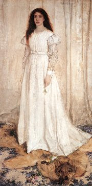
Whistler, "Little white girl" image: artrenewal.org
Usually I choose a subject and beat on it for a week or so. However yesterday I was checking out the prices of paint at the big mail order art suppliers and I noticed the prices on some of the common whites had gone up. So I think I will give you some advice on white. What follows is only an opinion, but some surprising things stood out at me so much that I decided to write this post.
I will restrict this discussion to titanium whites. I am fond of Flake (lead ) white but it is growing harder to find and I am reticent to advise you to use lead, as it is poisonous. A lot of your colors are poisonous but lead has been the focus of so much attention I will leave it out of our discussion for now. I personally think the very best white is about 2 parts flake with about 1 part titanium.
I buy my paint from RGH. A link to their site is in my sidebar. They are a very small paint maker in Albany, New York. I like their paint and it is affordable. I buy it in big cans and tube my own. If you want to know more about that, in the first month of this blog I did a a post on tubing paint. The first thirty or so posts were on materials. I am attempting to download what I know about painting onto this blog and it seemed sensible to begin with materials.
Since most of you buy your paint in tubes.That is what I am going to examine now. I recommend Jerrys artarama , but there are other fine mail order houses selling paint also. I do not recommend your buying paint from the mall outlets and craft supply stores. They are often 40 to 50% more expensive than mail order even after you figure in your shipping. The prices I am using in this post are from Jerrys. I don't think you will find other suppliers significantly cheaper on many things. If you do, let me know, please.
There are a bunch of different paints available and I think all of the professional lines are acceptable. None of the student grades are. Within the field of professional quality paints there is a range from good to super premium. There are also different tastes in paint. I will tell you what I like in titanium's and the one brand that stands out to me as a great bargain.
Old Holland, 125 mls costs $26.73 or about 21 cents a ml. That's a very high quality and expensive super premium paint. I won't spend that. If you can, this is a great white. I personally find Old Holland paint to actually have more pigment in it than I want. I like a looser paint. That is definitely a matter of opinion and many would disagree with me on that.
Rembrandt titanium costs $16.58 for a 150 ml. tube or 11 cents a ml. I personally don't like this white, it seems too fluffy to me. Like its whipped or something. I like their other colors but not their white.
Winsor and Newton costs $21.60 for 200 mls. or 10 cents a ml. that's a good price for an excellent white. I would say thats a great choice at its current price.
Gamblin cost $20.21 cents for 150 ml. tube That's 13 cents per ml. I can't see why you would choose this over the Winsor Newton . I think of Gamblin as being a professional quality paint but not so fine that I would pay a premium to have it, rather than Winsor Newton. Perhaps you know something I don't, am I missing something? Let me know in the comments if you think I am.
Blockx titanium costs $52.65 for a 200 ml. tube or 26 cents a mil. What are they kidding? If you are married to a thoracic surgeon this might be a good paint for you. But I wont spend over $ 50.00 a tube for white. I use a lot of white.
Grumbachers, soft titanium white is $13.26 for a 150 ml. tube or 8 cents a ml. That's a great buy on a classic paint that once owned the American market. Good buy. But not tonight's big winner.
Weber Permalba white is $8.49 for a 150 ml. tube or 5 cents a ml. That's a pretty good deal too, but not everybody is going to like Permalba. I think of it as a novelty act. It has a peculiar stringy (long) handling that I sometimes like and sometimes hate. You may want to try a tube and see if you like it. It has been around a long time and some fine painters have loved it. Odd stuff, weird plastic tube that I KNOW I don't like. It can be bought in quantity for an even better price. If price is your top consideration Permalba is for you. It works and it is a quality paint for a very low price.
Sennelier Extra Fine sells for $29.29 for a 200 ml. tube That works out to 14 and1/2 cents a ml. This is a nice white and I am as I said, fond of French paint however, it costs three times as much as the next paint on my list, which is tonight's winner of the Stapleton Kearns blogs' authors' choice award.
Lefranc & Bourgeois titanium white costs $13.70 for a 250 ml. tube
That works out to about 5 and1/2 cents a ml. I think this is a great buy. I like it better than any other white on this list at any price. This stuff has the greatest handling of any white, in my opinion. Now keep in mind I like a French style white, that is a somewhat oily, slippery white. I like the look of the brushwork I get from this paint. I think this is the white to use and it is sold at a great price besides. I recommend you use Lefranc and Bourgeois titanium white.
I am going to do another critique of a readers image, so please send me an image of something you have made, I will probably choose a landscape, but not necessarily, lets see what you've got. You can send it to me at stapletonkearns@gmail.com. I will photoshop your signature off of the piece and I will tell no one whose work I am critiquing.
See you all tomorrow.
Thursday, April 30, 2009
Wednesday, April 29, 2009
In which young Stape applies to the art school and is found wanting
Here I am, drawing outside, sometime in the mid 1970's.
I do intend to return to Edward Seago. I run subjects through this blog in rotation. Because of several large web sites putting links to this blog, I suddenly have a lot of new readers. Welcome, I am glad you are here. I do a number of things on this blog. Mostly it is a painting tutorial. But I do some art history and some art philosophy.
I am also telling my own experiences , I am doing this for a number of reasons, first of all I have spent almost forty years in the traditional painting world, and I have seen a lot, and it should be recorded and shared. Two, since I am giving you my opinions on art , you can't help but wonder, ( I would think ) who is this guy? But lastly and probably most importantly, it makes a pretty good story . You might want to go to autobiography in the side bar and go back to Monday March 23rd, This post will carry the narrative forward from that point.
I left high school early in order to more fully participate in the 1960's. A year later I applied to The Minneapolis College of Art and Design. In Minnesota if you wanted to be an artist, that's what you did.
I submitted my portfolio to the art school. I was doing whimsical ink drawings in a style that was a cross between Heinrich Klee and Alphonse Mucha. I think the year was 1970. I though my portfolio was pretty good, I had had some nibbles from a commercial art agency. The art school turned me down. I was flabbergasted, it didn't seem to make any sense. I knew what the kids made that did get in, and I couldn't figure it out. The school admissions office told me, if you go to to our summer school we will accept a small number of students from that program into the next years class. So I signed up for summer school.
Since I had been on my own for a while, unlike the other students I was living in an apartment and had to be out by the last day of the month. The summer school didn't start until about the 5th. So I went to the school and asked if I could move into the dormitory a few days early. They had just acquired this big old house and they assigned me a room in it, and I moved in. The next day as I am sitting out on the roof, smoking a joint and playing my guitar, a van pulls up in front of the house next door. A long haired guy gets out and begins to carry boxes and musical equipment into the house. I see he has big amplifiers to haul in alone and so I trotted down the stairs and introduced myself.
As we carried his amps up the porch stairs and into the house he explains to me he has just joined the faculty of the art school. He was a neon sculptor named Cork Marcheschi and he must have been in his late twenties and was moving in from Haight Asbury in San Fransisco. He was about the coolest guy I had ever met. He had led a band called the 40 foot hose that played the Filmore and had opened for all the San Fransisco bands I listened to. I had been in various dreadful garage bands and knew my way around the music of the era. So, we quickly became fast friends. I was considerably hipper than the rest of the summer school students, who were now beginning to arrive as virgins in their chinos and desert boots.
Well, I did the summer school and I quickly realized that the teachers there had no interest at all in the representational art I wanted to do. It was in fact "bad" to do that. I figured out, that's why they hadn't taken me in the first place. They only wanted people who were into avant garde art.
It was so strange, all these dowdy chicks with their phony berets and mirror studded India purses and their earnest boyfriends driving Wimbledon white Ford Falcons were going to push the envelope. They had been painting maybe six weeks, and they were already the tip of the arrow of art history. I was appalled. This made me all the more interested in traditional art and I began to study the works of the masters. The school sat next to the museum so I could go frequently and see the kind of paintings that I wanted to make.
On the last day of the summer school I was waiting to see if I had been accepted into the winter school, the "real"art school , my friend Corky showed up. He had been in the faculty meeting, my name hadn't even cone up. He had "sponsored" me and I was able to go to art school solely because of one hippie neon sculptor from the Haight.
Now after being a professional artist all of my life I wonder if any of those other students spent their lives making art. Somehow I doubt many of them did. What I figured out from the experience was that they were all conformed to the system. They were required to be avant garde. In fact nothing else was tolerated. They were all in a hand-me-down revolution against an art they had never seen. I still remember how shocked I was over that week as I put it all together. The whole thing was a sort of fraud. These kids were going to be trained to be teachers, who would teach other kids just like them to be teachers of other teachers on ad infinitum. It had already been going on just that way for decades. I lasted only one year at the art school.
The next year I tried the University of Minnesota. I took a test, got a GED and talked my way past the admissions chick in the beret by admiring her mirrored purse. It was the height of the Vietnam war and the U had 50,000 students. It was an exciting environment with a lot going on. But pretty much the same uninspired curriculum was taught in the art department. This was the low point for traditional painting, the absolute low ebb, with so many ateliers and schools available today in which to learn representational painting, it is hard to imagine that in the 1970's it had dwindled to a very small handful.
I discovered that if I hung out in the etching labs I could do the kind of art I wanted. In that department there was a sort of acceptance of traditional work, particularly if you were interested in the teachers collection of historic etchings, which of course I was.
Late one evening I was in the etching labs trying to get a small edition printed on the huge, iron spider wheel presses. The guy at the press next to me runs his plate through the press and pulls back the blanket and the sizing catcher and pulls the paper off the plate. I glance up and I am dumbfounded. It was a nude, and it was better than anything I had ever seen done in any of the classes or schools I had been in. In fact I had no idea anybody alive was doing that kind of work. My teachers certainly couldn't. I drew better than they did. I hadn't seen anything in the art magazines around the schools like that.
I went over to get a better look and struck up a conversation with the artist. There were a lot of art students in a school the size of the U so it wasn't unusual that I hadn't seen him around. He explained to me that he wasn't actually a student there. He had signed up for an adult ed. night class just to get at the presses. I doubt he ever even bothered to attend the class itself. This young man was going off, I think to Italy in a few days. I invited him to the little room I lived in and he wrote me a bibliography of books I should read and told me about the man who had taught him how to do, what I wanted to learn myself. I only knew him for a day. But this chance meeting was to be the hinge on which the rest of my life would turn.
His teacher was an elderly artist in Boston named R. H. Ives Gammell. I read Ives Gammells book "The Twilight of Painting" and it all finally made sense, and there were at least a few people out there who were interested in traditional painting. That chance meeting set me on a course for Boston and led me to Gammell and the opportunity to study with someone who could pass down to me the science of painting he had received from an unbroken line of masters and pupils going back into the French academy.
Tuesday, April 28, 2009
Juxtaposing different values and counterchange
© The Estate of Edward Seago, courtesy of Portland Gallery www.portlandgallery.com
Here's the first Seago I showed you again. I want to point out to you a design tool that Seago is using in this painting, juxtaposing different values. It is the practice of deliberately relieving objects on top of dark ones and and dark shapes on top of bright ones. This gives a "snap" and visual excitement to the piece. Look at this detail;
Sometimes an artist wil modify the value os an object so that it is light as it passes infront of a dark object and light as it passes in front of a dark object. This is called counterchange. It is a means of juxtaposing your values. See how Seago has arranged this passage so that the trunk of the important tree sits in front of the dark grouping of trees behind it. That makes it jump. A little further up the trunk is dark and the landscape is now light behind it. Then several of the branches above that are counterchanged against where the trunk itself becomes dark.
Here is that little grouping of houses out to the right of the trees, look how they are juxtaposed against the dark copse of trees behind them.Then there is a dark in front of them. Below is another Seago that is full of the same techniques.
© The Estate of Edward Seago, courtesy of Portland Gallery www.portlandgallery.com
Every shape in this painting is silhouetted against its opposite value. But notice another thing, if you squint at this painting, there is really just one big light, which cover 3/4 of the painting. The darks are arranged in a decorative pattern over that large light. It is almost like one of those cut out black paper silhouette portraits, of which our colonial ancestors were so fond. Here is a detail from the center of this painting.
The trunk is counterchanged it is light against the darks behind it, but as it rises into the sky it becomes light against the sky.Seago is using stacked lights and darks or value juxtaposition in the picture in many places. For instance the branches on the left side of the tree are dark against the bright sky, while those on the right side of the trunk are light against the darks behind them. The front wall of the house is bright, behind it the roof is dark and the sky behind that is light again.
Now I know you are still spinning from the confrontation with these new ideas, counterchange and stacking or juxtaposing values.. These are important because they have an enormous implication about the artistic thought process.
HE MADE THINGS DARK OR BRIGHT IN VALUE, BASED ON WHAT FURTHERED HIS DESIGN, RATHER THAN HOW THEY ACTUALLY APPEARED IN FRONT OF HIM!
That is an absolutely huge idea. Now think about that, even his values are subject to the machinery of design. All of the effort you put in as a student to learn to record values accurately, while essential and useful, is only the default way of doing things. Values are, like any other element in painting, just another tool for the designer.
Now that is one of the things that thrills me most about landscape painting. I don't mean to say that portrait painters or figure painters don't have these opportunities, but landscape painters do have the leeway to do more of these things because of the nature of the genre.
Pity the tyro landscape painter, fresh from still life class or naively clutching a promising photograph who tries to compete with a designer who will ruthlessly use his values just as he pleases, rather than respecting the capricious arrangements of styleless nature.
If you don't learn how to arrange the landscapes values yourself, that man will eat your lunch, every, single, goddamn, day.
Seago images: Edward Seago the landscape art by James W. Reid published by Sothebys 1991
I am going to do another critique of a readers image, so please send me an image of something you have made, I will probably choose a landscape, but not necessarily, lets see what you've got. You can send it to me at stapletonkearns@gmail.com. I will photoshop your signature off of the piece and I will tell no one whose work I am critiquing.
Monday, April 27, 2009
Dissecting a Seago
August afternoon, Champs Elysees, 20x26 © The Estate of Edward Seago, courtesy of Portland Gallery www.portlandgallery.com
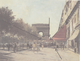
Here is our Parisian Seago again. I would like you to notice a few different things about it. First is the extreme velocity of the painting. It is LOOSE, this is not a small painting and it looks loose shrunk down to the size of a playing card.This painting is also colored almost entirely with shades of ochre and earth reds. Even the sky was pre painted in the warm ochery color and then the blue was thrown down into that. Then the decorative accents are applied on top of that foundation. One of these accents is of course that marvelous red awning. That was painted with vermilion, which is a lovely mercury based red. It is also extremely poisonous. When I learned to paint in the Gammell studios in the early 1970s it was still in common use, at least, by traditional painters. It w s often used by portrait painters as a color for the lips and cheeks of the maidens with which that age seemed so well supplied. I don't believe they make maidens any more. Today we would probably use cadmium red light instead. That's a hotter color than you'd use on a maiden, I think.
The painting is full of lines that direct the viewer in and to the "punchline" area of the painting. The red awning attracts our attention, but notice also the negative shape formed by the light to its left. It is, like the awning, a big arrow shape directing you deep into the picture. Seago reaches out and grabs you by the hair and drags you into this painting.
Here's another device Seago is using. Its called the string of pearls. Look at this, and compare it with the unaltered image at the top of the page.
Seago has arranged all of this interesting stuff, those little people and umbrellas and white dots along a horizontal line across the middle of his canvas. This makes a sort of decorated band. Which is like.....a string of pearls. Watch for this , you will see this device used routinely not just in the work of Edward Seapo but in lots of other landscape painters work as well. I believe I will throw an old Dutch painting at you with a string of pearls . Here's our old friend Jan Van Goyen, stringing some pearls 300 years earlier.
Seago lived in a lowland marshy area of England that was a lot like the lowlands countries. It was logical for Seago to model some of what he did on the little Dutch masters. He was routinely confronted with the same sort of painting problems.
Above is a simplified view of the darks in the painting. For the most part they are all linked as I have discussed in a previous post. This linking of the darks transforms many small "busy" shapes into a few large decorative ones. There is a strange sort of repeat relationship between the white awning on the far right hand side of the picture and the negative shape of the sky to the left of the red awning.I believe this is a rhythmic device, as it seems too planned looking to have just happened. Very little in the art of someone at Seagos level happens by accident. In fact I think I will now repeat one of the mantras of this blog which is:
NOTHING GOOD GETS INTO A PICTURE BY ACCIDENT.
There are now two available books on Seago,
Both are full of exclellent color reproductions, and are available from Amazon.
1.
Tomorrow I will lecture on counterchange. That is a great way to make a picture dynamic, rather than a static.
I am going to do another critique of a readers image, so please send me an image of something you have made, I will probably choose a landscape, but not necessarily, lets see what you've got. You can send it to me at stapletonkearns@gmail.com. I will photoshop your signature off of the piece and I will tell no one whose work I am critiquing.
Here is our Parisian Seago again. I would like you to notice a few different things about it. First is the extreme velocity of the painting. It is LOOSE, this is not a small painting and it looks loose shrunk down to the size of a playing card.This painting is also colored almost entirely with shades of ochre and earth reds. Even the sky was pre painted in the warm ochery color and then the blue was thrown down into that. Then the decorative accents are applied on top of that foundation. One of these accents is of course that marvelous red awning. That was painted with vermilion, which is a lovely mercury based red. It is also extremely poisonous. When I learned to paint in the Gammell studios in the early 1970s it was still in common use, at least, by traditional painters. It w s often used by portrait painters as a color for the lips and cheeks of the maidens with which that age seemed so well supplied. I don't believe they make maidens any more. Today we would probably use cadmium red light instead. That's a hotter color than you'd use on a maiden, I think.
The painting is full of lines that direct the viewer in and to the "punchline" area of the painting. The red awning attracts our attention, but notice also the negative shape formed by the light to its left. It is, like the awning, a big arrow shape directing you deep into the picture. Seago reaches out and grabs you by the hair and drags you into this painting.
Here's another device Seago is using. Its called the string of pearls. Look at this, and compare it with the unaltered image at the top of the page.
Seago has arranged all of this interesting stuff, those little people and umbrellas and white dots along a horizontal line across the middle of his canvas. This makes a sort of decorated band. Which is like.....a string of pearls. Watch for this , you will see this device used routinely not just in the work of Edward Seapo but in lots of other landscape painters work as well. I believe I will throw an old Dutch painting at you with a string of pearls . Here's our old friend Jan Van Goyen, stringing some pearls 300 years earlier.
Seago lived in a lowland marshy area of England that was a lot like the lowlands countries. It was logical for Seago to model some of what he did on the little Dutch masters. He was routinely confronted with the same sort of painting problems.
Above is a simplified view of the darks in the painting. For the most part they are all linked as I have discussed in a previous post. This linking of the darks transforms many small "busy" shapes into a few large decorative ones. There is a strange sort of repeat relationship between the white awning on the far right hand side of the picture and the negative shape of the sky to the left of the red awning.I believe this is a rhythmic device, as it seems too planned looking to have just happened. Very little in the art of someone at Seagos level happens by accident. In fact I think I will now repeat one of the mantras of this blog which is:
NOTHING GOOD GETS INTO A PICTURE BY ACCIDENT.
There are now two available books on Seago,
Both are full of exclellent color reproductions, and are available from Amazon.
1.
Buy new: $29.74
17 Used & new from $20.00
Usually ships in 2 to 3 weeks
Eligible for FREE Super Saver Shipping.
(3)
Other Editions: Hardcover
2.
15 Used & new from $24.70
Other Editions: Hardcover
Tomorrow I will lecture on counterchange. That is a great way to make a picture dynamic, rather than a static.
I am going to do another critique of a readers image, so please send me an image of something you have made, I will probably choose a landscape, but not necessarily, lets see what you've got. You can send it to me at stapletonkearns@gmail.com. I will photoshop your signature off of the piece and I will tell no one whose work I am critiquing.
Sunday, April 26, 2009
Hunting Seago in Paris
August afternoon, Champs Elysees, 20x26 © The Estate of Edward Seago, courtesy of Portland Gallery www.portlandgallery.com,
About eight years ago I took a painting trip to Paris to put together a show for Galerie Kornye in Dallas. I did a number of shows with them and we sold most of them out. George Kornye became both a friend and and my dealer We had many long telephone talks where he would tell me about dealing paintings for so many years, and I would tell him the things I am now telling you, in this blog. He died a year or two ago and I miss him. He had a lot of style.
I walked into his gallery in Dallas about ten years ago and we hit it off. He had been a dealer of 19th century European art for about 40 years and felt like his clientele would enjoy what I did. For a number of years most of my work went through Galerie Kornye. It was, and is a lovely space with oriental rugs, marble floors, sparkling chandeliers and ormolu ( look it up ) mounted furniture. He gave me a showroom to myself he called the A salon.
I would do several major painting trips a year to supply Kornye. I made several trips to Europe to paint for George, and many to the deserts of West Texas.
I took my Seago books in my luggage to Paris with me and while painting there every day, I also went on a Seago hunt. Seago had a little sailboat called the Capricorn that he would take across the English channel in the 50's and 60's. He would take it up the Seine and park it at a yacht club near the Place de Concorde. I found the mooring and was able to work outwards from there and find his painting locations around Paris. I painted some of them. This is a means I have used to study the work of several artists. If I set up and painted in the same place an artist worked in the past I could get a feeling for the decisions they made there. By subtracting what they painted, from what is actually there, I am left with the decisions they made.
I guess you might look at my work and say "Stape, I don't see much Seago in there". But I have learned a lot from him. I am not, nor do I want to be a super loose painter like he was, but I learned a lot of design ideas from him and he continues to influence my color. When you see me using a reduced palette featuring earth colors, that is Seago influence.
I found this location and it was still there, pretty much as you see it in his painting. There was a sidewalk cafe right where he must have set up. He either pitched his French easel ( for that is what he used ) in the roped off area of the cafe, or perhaps it wasn't there at the time. Directly in front of this position is a heavily traveled sidewalk leading to the entrance to a large building and I doubt he would have obstructed that. I'd like to think he set his easel up in the cafe and painted there, flirting with the waiters bringing him cafe creme, while he smoked Galoise caporals and astonished the Parisians with his rapid and facile painting.
Despite the appearance of a lot going on, this painting is masterfully simplified, both in color and in drawing. In a way that is the same sort of reductionism that typified this whole era which gave us the stripped down glass architecture of the international school, the chrome and leather furniture and the A line dress. However Seago is able to use the minimalist aesthetic and still operate as a traditional painter.
Edward Seagos' art is a direct continuation of the English landscape tradition and he deliberately appended himself to the open end of it.
Notice the big simplified shapes he makes, for instance the Arc de Triomphe is one large shape. The variations within it, that describe its form are subordinated to the larger tone, rather than chopping it up into an assemblage of small pieces, it is one thing. The trees on the left are reduced to nearly one big shape and the architectural details of the upper right corner are all joined up into only a few shapes.
Seago made it look this way. He didn't see it any differently than you or I, but he knew how to make it look cool. He did this by making decisions based on logical ideas and principles. At high velocity. This painting was probably made in about 2 or 3 hours.
The color is minimal also. The whole painting is really a drawing done in yellow ocher, indigo, and an earth red. He put a minimal amount of blue up in the sky. It didn't take much in a painting as warm as this. Then he put in that red awning and there it was. The trees, the sidewalk and the buildings are all pretty much the same color. In the foreground the woman has a coat that is accented with a little yellow that is not an earth color like its surroundings. The spots of color he does use are so effective because they stand unique in a field of very restrained earth colors.
Tomorrow I will return, strap this squirming picture onto my gurney and begin its dissection, with the twin knives of opinion and experience.
I would like to do another critique feature in the next week or so. Send me some images and I will choose a few and critique them. I will of course photoshop your name off of the images and I will tell no one whose work I am critiquing. I will probably choose a landscape to crit, but send me what you like. I will survey what I get and see what seem like the best pieces from which to teach to the larger audience reading this blog.
Seago image from: Edward Seago, the landscape art, by James W. Reid
Published by Sothebys 1991
Saturday, April 25, 2009
Edges, deweighting for eye control
© The Estate of Edward Seago, courtesy of Portland Gallery www.portlandgallery.com
Here's our Seago again. Did you get the book?
I am going to break out some passages and speak about what is going on in them. Particularly as concerns expression of edges. For that is what the control of edges is, expression, not transcription.
I have had a side conversation with a painter who was concerned about the turning of form with color and was having a hard time getting both his values and his color . There has been some instruction on this blog where I have mentioned turning form using color (but not much) I clarified something for him, and I thought I might repeat it here.
Values are part of drawing.
Color is a decoration you hang on your drawing. Therefore go after the values first. You can inject the color later, if you have the values "right". Drawing is always the first consideration, not color. Anything well enough drawn will be well enough colored. I remember Ives Gammell saying that and I am sure it is a quote. But I am afraid I don't know whose.
Turning form with color is a means of simplifying the halftones, out in the lights. It will not build the "bedbug" line. That calls for a value shift.Rermember thepost on the parts of the light? You may want to review that if you aren't sure about the bedbug line, and its significance as arbiter between Gods pure light and the stygian darkness of shadow. Now I am going to get all the Hensche students after my hide. Henry Hensche put a great deal of emphasis on turning form with color. None of his students are young anymore, I will" puff up" and intimidate em.
I am going to throw a new idea at you , ready?
Here is a detail of the left hand side of the painting. Compare it with the full image above and notice something. The sky is light on the right side of the tree and dark on the left. Seago is doing something I call "deweighting". Don't go looking for that phrase in art instruction books because I made it up. But not recently. What I mean by deweighting is the downplaying of an edge in order to lessen visual interest.
Seago has darkened the edge of the sky as it meets the branches of the tree in order to direct the viewer elsewhere. He has arranged his values in such a way that the eye doesn't stop there but continues on to where he really wants you looking. He has put a bright sky contrasting strongly against the branches on the other side of the tree in order to direct your attention to that area.
You may remember in an earlier post my saying to imagine visual interest as having weight, and a painting needs to create an artistic balance of those different weights. Seago lessens the visual interest that would have been drawn to this area had he allowed the contrast of a bright sky with the gnarled and complex branches . He has removed visual weight from the area . Hence deweighting.
Here is the opposite. Seago has weighted this passage. He has done it with edges and values. Look at the razor sharp edges on the top of those houses out there, they haul our eye to the area with their contrast with the darks behind them. He has also loaded his lights. He has used a great deal of paint to get a textural attention grabber there. That house stands out better than if he had painted it the same value, but thinly. Seago of course wants us to look here.
I have shown you Seago drawing attention to this passage and called it weighting, after all I am using the word deweighting, surely there must be weighting? Well the important idea is really deweighting, I think we all know about drawing attention to an important area within a painting. Subordinating other passages to it by reducing visual interest at our edges, is a more subtle matter.
ALL OF THIS IS ABOUT EYE CONTROL
I am going to be talking a lot more about eye control.
Seago image from: Edward Seago, the vintage years by Ron Ranson, available through Amazon
Friday, April 24, 2009
Endless information on edges, pt. 3, continued
© The Estate of Edward Seago, courtesy of Portland Gallery www.portlandgallery.com
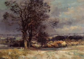
Above is an example of a painting by another great landscape painter, Edward Seago. 1910-1974 I apologize for having cropped the right hand side of the picture slightly, although for our purposes here it shouldn't matter too much.As I am sure you have noticed I champion a lot of lesser known 20th century artists. I have every book on him I can find. They are all British and till now, out of print.
Seago used to be absolutely unknown in America but that is evidently changing. He was very well known in England, and was collected by the royal family. Seago sold out shows routinely. Although he was very successful financially, Seago was ignored or dismissed by the art press of his day. Perhaps a little like Norman Rockwell, he was thought of as lowbrow, I guess. Time has raised our brows some. He lived and worked at the low ebb of traditional painting. I will tell you the story of his somewhat tragic life tomorrow.
There are now two available books on Seago,
Both are full of excellent color reproductions.
They may be had through Amazon .I wouldn't be surprised if studying these books radically changed how you approach landscape painting. Ron Ransom is himself a painter and has spent many years studying Seago, so his notes on the paintings are useful in contrast to so many art books with good plates and dim commentary.
Seago was a master of handling and edges, and design, he could do it all. However I will begin by talking about his edges, because that is the subject at hand, isn't it? Lets look at this detail of the piece.
Seago has done something I briefly mentioned a post or so back. You see it done with the branches of trees, by a lot of landscape painters but Seago uses it all over his paintings. That is the dragged paint application you see in the branches on the right hand side of this detail. Now this painting is 22 by 36 so what you are seeing is pretty big, so Seago is a loose painter. Real brushy too.
Look closely at the branches there and notice something else. They are dragged over a texture already existing on the canvas. That texture is not part of the brushwork or impasto of the day that Seago painted that branch over it. He has pre-textured the canvas. In a future post I will describe several ways of doing that. What this does for Seago is it gives him a way to soften or obliterate his edges and he uses it everywhere. It is one of the "secrets" of his technique.
If you click on the top image you will get a larger view of the painting and can see this crumbled brush stroke is all over the painting. So long as he kept out of his medium, this edge was automatically "softened". He had to thin his paint to get a hard edge such as that on the houses in the middle of the painting. Notice how the bright one with its gable end facing us, is layed in with a knife. Crisp.
The whole foreground is just big overlapping brushstrokes of different colors but the same value. That also gives edge control. He throws in a couple of accents and the viewer does the rest. You can almost watch this picture painting itself.
Tomorrow I will dissect this painting some more, particularly how the various means of controlling edges have aided Seago in controlling the viewers eye.
Above is an example of a painting by another great landscape painter, Edward Seago. 1910-1974 I apologize for having cropped the right hand side of the picture slightly, although for our purposes here it shouldn't matter too much.As I am sure you have noticed I champion a lot of lesser known 20th century artists. I have every book on him I can find. They are all British and till now, out of print.
Seago used to be absolutely unknown in America but that is evidently changing. He was very well known in England, and was collected by the royal family. Seago sold out shows routinely. Although he was very successful financially, Seago was ignored or dismissed by the art press of his day. Perhaps a little like Norman Rockwell, he was thought of as lowbrow, I guess. Time has raised our brows some. He lived and worked at the low ebb of traditional painting. I will tell you the story of his somewhat tragic life tomorrow.
There are now two available books on Seago,
Both are full of excellent color reproductions.
1.
Buy new: $29.74
17 Used & new from $20.00
Usually ships in 2 to 3 weeks
Eligible for FREE Super Saver Shipping.
(3)
Other Editions: Hardcover
2.
15 Used & new from $24.70
Other Editions: Hardcover
They may be had through Amazon .I wouldn't be surprised if studying these books radically changed how you approach landscape painting. Ron Ransom is himself a painter and has spent many years studying Seago, so his notes on the paintings are useful in contrast to so many art books with good plates and dim commentary.
Seago was a master of handling and edges, and design, he could do it all. However I will begin by talking about his edges, because that is the subject at hand, isn't it? Lets look at this detail of the piece.
Seago has done something I briefly mentioned a post or so back. You see it done with the branches of trees, by a lot of landscape painters but Seago uses it all over his paintings. That is the dragged paint application you see in the branches on the right hand side of this detail. Now this painting is 22 by 36 so what you are seeing is pretty big, so Seago is a loose painter. Real brushy too.
Look closely at the branches there and notice something else. They are dragged over a texture already existing on the canvas. That texture is not part of the brushwork or impasto of the day that Seago painted that branch over it. He has pre-textured the canvas. In a future post I will describe several ways of doing that. What this does for Seago is it gives him a way to soften or obliterate his edges and he uses it everywhere. It is one of the "secrets" of his technique.
If you click on the top image you will get a larger view of the painting and can see this crumbled brush stroke is all over the painting. So long as he kept out of his medium, this edge was automatically "softened". He had to thin his paint to get a hard edge such as that on the houses in the middle of the painting. Notice how the bright one with its gable end facing us, is layed in with a knife. Crisp.
The whole foreground is just big overlapping brushstrokes of different colors but the same value. That also gives edge control. He throws in a couple of accents and the viewer does the rest. You can almost watch this picture painting itself.
Tomorrow I will dissect this painting some more, particularly how the various means of controlling edges have aided Seago in controlling the viewers eye.
Thursday, April 23, 2009
Different ways of making an edge
There are several ways of softening an edge. When I present them in this post,you will probably say to yourself. "Whats the difference whether I use one or the other, it looks like the end result is the same?"
Here in the lab there isn't a lot of difference, but I will be going somewhere with this later. I am laying ground work for some further conclusions.
Okay, here is our first example. The edge between the two notes has been made by pulling a flat bristle brush along the edge. That melds the two together. If I was doing real slick work, I might want to use a sable for this. But In my brushy paintings a bristle is just fine.
Also, as an aside here, notice my handling in the blue portion . That sort of fat look to the paint is something I have learned to do. Often painters try to push the paint around with lots of medium and not enough paint. I make em out of paint . I am a brushwork guy and often I want that luscious look of the full bodied paint. You may want that, or not want it, but you should be able to do it. It is another arrow to have in your quiver when the need arises.
To do this, you load the brush (bristle ) and put the paint down straight no medium, and then most importantly you leave it alone. Try working with your paint as it comes out of the tube with no added turpentine or medium at all. I 'll bet you get the best handling you have ever had in your life. If you need to speed your drying add a little alkyd to your white before you begin, but don't put it on your palette. This is not always how I do things but it is something I use to get a certain look out of the paint. Incidentally if you are putting pea sized blobs of paint on your palette, you will never have good handling.You may get an enameled surface, but you won't have expressive brushwork.
You are working on what Emile Gruppe called a starved palette. He said to paint like a millionaire. Squirt more than you would put on your toothbrush, onto your palette. Get cheap somewhere else, buy the generic soda. Teach your pets to forage for themselves. But lay out enough paint to allow you to use it freely. I am always amazed by how stingy students palettes are at workshops. When I lay out their palette with enough paint they act like I am crazy. Then they drive home in a Mercerdes.
Here is the other way of dealing with an edge. I am referring to this as softening it, but actually this is something different. Rather than blurring the two together I am darkening the light note as it approaches the dark note, and I am lightening the dark note as it nears the light note.
I am really downplaying the value shift between the two. The viewers eye will pass on without "over registering:" on the edge.
This means of dealing with an edge allows all sorts of trickery and diversions in the designing of paintings. More about that in a following post.
The second way of making edges often gives a firmer look to your work. Too many softened edges that are pulled together can give an overly slick look to a painting. Making your edges by adjusting your values is often the better choice in practice.
I suggest you practice until you have both in you repertoire. You need to be able to blur or pull delicate colors together without dirtying the notes , only melding them. To do the values control method you will have to think about altering the temperature of the two notes as they come together. Sometimes that is not necessary, but sometimes it is. You should be able to do both neatly and cleanly. I have seen many still lives and many horizons in landscapes ruined by crudely handled edges.
Wednesday, April 22, 2009
Yet more about edges
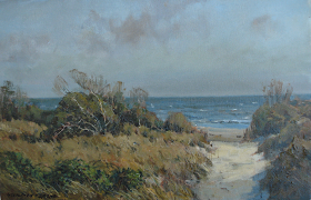
Here's a recent painting of mine. I did this next to the historic' Fort Moultrie near Charleston South Carolina. Fort Moultrie was bombarded in both the revolutionary and the civil wars. I will use this painting to show you some softened edges. Below is a detail of the sky.
There are several different types of edges in this passage. The first and most obvious is the clouds at the top of the detail. I pulled them together as I painted them, with the same large bristle brush . I put them into the wet sky so the whole thing went down in one go. If it had not all been done at once I would have been unable to soften the clouds into the sky. Sometimes people call this wet into wet. I don't, because when I hear that I think of "method" painters . The ones with their books at the local craft supply barn.
The second set of soft edges are created by dragging the tops of the stunted trees up over the sky. Rather than blending the two together with a brush, I let the color break over the sky note below it, to represent the fine haze of branches there. I also threw some sky color into the mixture I used to do this. Thay way the two notes were not so different. They shared a common element and were close together in value.
I have blurred the ocean and the sky together at the horizon to get that to recede.
There are other edge games going on in here also. In the grass I am throwing different colors of the same value over one another giving in effect soft edges. I am also throwing in real hard edges there. I have for instance put a dark shadow under that bush and then pulled the grass up over it and left it as a crisp accent stroke.
Lastly if you look at the upper right hand corner of that bush you will see I have "loaded" the paint there with my palette knife. That gives me a super hard edge to serve as a contrast to my soft edges. I want a bone or two in there. If I used only soft edges I would get a weak kind of painting. Although soft paintings can look very real they can also look vapid, insipid, noncommittal, fluffy poodle like and indecisive. You don't want that. Dynamic paintings contain a variety of edges.
With every note I lay on the canvas I ask myself a list of questions. I will give you that in a later post. But one of the questions on it is." What about the edge?" If the edge is not right the brushstroke is not right. I consider my edges with every stroke I lay on a painting, just like I do color and value. If you handle your edges on the" fly" it becomes automatic and you get the edge right while the passage is still wet. An overly hard edge in a passage can command so much attention that you see it, instead of another fault lurking nearby. When you soften that edge you become aware of the concealed problem, and can fix that.
I guess I will say it one more time just to make sure you have the concept because it is crucial.
YOU CANNOT OBSERVE EXPRESSIVE EDGES INTO A PAINTING. THEY MUST BE INSTALLED.
IN ORDER TO DO THAT YOU MUST OBSERVE, THINK AND THEN DECIDE.
See you all tomorrow.,
Tuesday, April 21, 2009
More about edges 2
Chardin, Return from the Market
image:artrenewal.org
Learning to use soft edges was very important when I was studying with Ives Gammell back in the 70's. Why do I say soft edges and not hard edges? Well, because hard edges are the norm. You will get hard edges without trying or thinking about it. Almost all amateur painters have them. Softened edges are a nicety of drawing that seem never to occur to the uninitiated. I remember when I was instructed about edges, thinking "how come nobody told me that in art school?"
The painters of the Boston school of which Ives Gammell was a fossil, were often recognizable for their control of edges. They nearly made a fetish of it. I think to some extent it came from idolizing John Sargent. But many of those artists were trained in Paris in the late 19th century by men who also stressed the importance of edges.
In the evening as my dinner cooked on the DC current hotplate with the cloth covered cord from
about WWI, I would sit with my painting in my lap, and using a small sable flat, soften the edges. I did this not looking at the subject I was painting . I just softened every edge. This did a number of things for my painting.
Most importantly it assured that I had softened my edges. It was really hard for me to get the idea and this enforced it. I remember thinking I had done it, and having Ives come in and berate me for my hard edges. He would soften a few of them and I would see he was right. I thought I had but....
I could the next day, harden up a few select edges as needed. It is a safe assumption that you are painting with edges that are too hard. If you just soften them all, you will be surprised by how often a painting will come together. There is a phenomenon that goes on here. When you soften a few of your edges you realize that all of your edges look too hard in comparison. Because you had them all as hard as razors they didn't individually look too hard. Soften a few and that fault jumps out at you.
There is another thing to be gained from keeping those edges soft at least until you are well into a painting. If you put something down with a hard edge, the temptation is to believe it is more accurate than it actually is. It sure as hell looks authoritative. A line stated more softly "admits" to being a little approximate, and you won't treat it as sacred. As other parts of your painting become more "right" you will be willing to go back and correct this fuzzy line.
Another thing softening my edges did for a painting was to give it more unity. The eye "slid" more easily about the image without the hard edges seizing our attention to each separate area rather than allowing us to apprehend the entire image.. Remember me telling you in an earlier post that the most important quality a painting can have is unity of effect. That is, the painting is one single image on the canvas, rather than a dozen separate images each clamoring for our attention.
This softening edges discussion leads me to another quick point I want to make. The beginner complains that oil paints dry so slowly. The pro knows that the advantage of oil paints is that they dry slowly. The long "open"time gives you the ability to manipulate your paint while it is on the canvas. but before it has dried. This is one of the reasons I don't like acrylic paint. The rapid drying time means that you can't return later to a passage and soften it up, so that it takes its proper place in the larger tableau. So if you are at a point where, although you have been working in acrylic, but you have been considering switching to oils this is a good reason to do it. And quit wearing polyester while you're at it.
Tomorrow I will discuss some different ways of getting softened edges, or actually, a variety of edges in your paintings.
Sunday, April 19, 2009
More about edges.
image:artrenewal.org
This is a Vermeer called The Girl in the Red Hat. This is of course a really great little head.
Vermeer was a master of edges and we can learn a lot from him. I chose Vermeer because he
often uses a great number of very soft edges.
I am sorry this post published late today. Other people were bad. Actually sometimes blogger screws up the html and the type comes out in sizes I don't want after I use large type to highlight a thought. I am not good enough at working in html to fix it, although I do waste valuable daylight to trying. So today if the type sizees are screwed up I apologize. When my wife gets the time, I will turn her loose on the html and she will buff it up . Pretend its the large print edition.
I can think of four different purposes served by controlling your edges. They are;
You can not "observe" fine handling of edges into your painting. You must, observe, think and then decide, how you will handle each edge.
This whole head is a dance of hard and soft and lost and found edges. Let me point a few of those out to you. I know I did this yesterday but I would like to run another example by you. I think after this you will look for handling of edges in paintings when you see them . Here we go:
At point A we have the collar, a hard edge. It draws the eye there. It is the point from which the head launches and is our starting point for reading it. The hard edge here also gives a counterbalance to the face over on the right. Above it at B, the hair disappears into the background. The hair and the back of the head is secondary to the face so it is soft pedaled, it also needs to give the idea of its going around, out of our vision.
Point C above that, has, I think, the same purpose as the edge at A that is, it is a sort of accent. That of course is only part of its purpose. The edges if all soft would give a flaccid look to the painting so you have to get some hard ones in somewhere. A painting should be an artistic arrangement of hard and soft edges. An arrangement deliberately made by controlling and not merely observing the edges in nature.
Below D where it is soft, Vermeer hardens the edge up as it nears the ear and throws a hard edge where the jaw sits proud in front of the neck. The hard edge pulls it forward and separates it from the neck behind. As the line slides down to E he softens the jawline where it and the neck merge together softly.
Lastly at F, notice this whole passage is soft except for the hard edge on the right side of the pupil. That's where he wants you to look. It is the lead player on the stage which is the eye. Not everybody on the stage can be the star, some must be relegated to a supporting role. If everything in a passage, or an entire picture is handled with equal attention you get a busy and hard to perceive painting, lacking unity, as each diverse part calls for our attention over its neighbor.
More tomorrow on edges.
This is a Vermeer called The Girl in the Red Hat. This is of course a really great little head.
Vermeer was a master of edges and we can learn a lot from him. I chose Vermeer because he
often uses a great number of very soft edges.
I am sorry this post published late today. Other people were bad. Actually sometimes blogger screws up the html and the type comes out in sizes I don't want after I use large type to highlight a thought. I am not good enough at working in html to fix it, although I do waste valuable daylight to trying. So today if the type sizees are screwed up I apologize. When my wife gets the time, I will turn her loose on the html and she will buff it up . Pretend its the large print edition.
I can think of four different purposes served by controlling your edges. They are;
- Expression of the turning edge away from the viewer.This also includes declaring variations in the drawing that occur on that turning edge, such as we saw with that malar bone in yesterdays post.
- Pushing forms back or pulling them forward to establish their position relative to the other forms surrounding them.
- Directing the viewers attention through our painting. That is, subordinating a less important passage by using a soft series of edges, to an area you wish to be dominant, where you will use a harder edge.
- Obtaining rhythm and variety throughout a painting by making your edges part of your design machinery.
You can not "observe" fine handling of edges into your painting. You must, observe, think and then decide, how you will handle each edge.
This whole head is a dance of hard and soft and lost and found edges. Let me point a few of those out to you. I know I did this yesterday but I would like to run another example by you. I think after this you will look for handling of edges in paintings when you see them . Here we go:
At point A we have the collar, a hard edge. It draws the eye there. It is the point from which the head launches and is our starting point for reading it. The hard edge here also gives a counterbalance to the face over on the right. Above it at B, the hair disappears into the background. The hair and the back of the head is secondary to the face so it is soft pedaled, it also needs to give the idea of its going around, out of our vision.
Point C above that, has, I think, the same purpose as the edge at A that is, it is a sort of accent. That of course is only part of its purpose. The edges if all soft would give a flaccid look to the painting so you have to get some hard ones in somewhere. A painting should be an artistic arrangement of hard and soft edges. An arrangement deliberately made by controlling and not merely observing the edges in nature.
Below D where it is soft, Vermeer hardens the edge up as it nears the ear and throws a hard edge where the jaw sits proud in front of the neck. The hard edge pulls it forward and separates it from the neck behind. As the line slides down to E he softens the jawline where it and the neck merge together softly.
Lastly at F, notice this whole passage is soft except for the hard edge on the right side of the pupil. That's where he wants you to look. It is the lead player on the stage which is the eye. Not everybody on the stage can be the star, some must be relegated to a supporting role. If everything in a passage, or an entire picture is handled with equal attention you get a busy and hard to perceive painting, lacking unity, as each diverse part calls for our attention over its neighbor.
More tomorrow on edges.
About edges
Okay; Thats it with the Bouguereau, now we are moving on to the study of edges.
image: artrenewal.org
Painters worry a lot about edges. An edge is, of course, where one area of color or form meets another. The Sargent above is a great example of masterful handling of edges. Lets take a closer look.
The jawline of this head goes from hard to soft, and back again repeatedly. Look at point A. that hard edge shows where the the malar bone sits close to the surface and creates the bony cage protecting the eye. I know, you thought because I was a landscape painter, I knew nothing of the figure didn't you? I can paint a better landscape because I spent a great deal of time in front of the figure. If you want to paint anything well, you should too.
The line of the cheek runs downward and softens till at B it disappears and is lost against the background.The line again hardens up, bringing the chin out in front of the line of the cheek, and in front of the neck below it. After the edge passes C it softens into the shadow and is lost at D. The head comes forward from the soft distance and hardens up as it comes closer to you. That is an over simplification, but that is the rough idea.
Each of these changes in softness of edge describe something that is going on in the form. Often where the form turns gradually an artist will use a soft edge. Often in portraits or a figure, a hard edge is used where a bone sits close to the surface. Point E is a hard line and the two points F and G are soft. F to keep the hairline subordinated to the face and unobtrusive and G to drop the back of the head back and into the "distance".
Notice how Sargent has taken that hoop earring in and out of view. Those are called lost and found edges. Sargent is particularly known for this sort of handling. He has also used a selectively hard edge to show the forms about the eye emerging into the light from the shadow filled socket. Look at how squared off and planar the upper lids are. That is a demonstration of structure and how to get it. He has expressed the planes as simply as they can be shown.
Here we return to a variation of an ongoing theme in this blog. Which is this:
These edges were designed and installed into this painting.
They are based somewhat on what the artist saw in front of him. However they also are used to describe the anatomy and the way some forms sit in front of other forms, or disappear into the shadow and drop away from the viewer. There are visible hard and soft edges in nature. But you can copy that model in front of you as carefully as you want and you will never get edge quality like this. The edges are expressive because they have been expressed, not discovered.
Whenever you have an artist using bravura (flashy ) brushwork, look for an interplay of hard and soft edges. Artists who are into brushwork pay very close attention to their edges.
What happens when you paint all of your edges hard? This is what you get. Nasty, and brutal.
We will continue with the study of edges tomorrow.
Saturday, April 18, 2009
Bouguereau's preparatory drawings for Nymphs and Satyrs
Lets look at some preparatory drawings that Bouguereau did for the Nymphs and Satyrs. The first are thumbnails, the little scribble like drawings that artists use to brainstorm their ideas for paintings.
There were certainly more than these, but you can see the evolution of the idea from the top to the lower sketch. Next Bouguereau works up studies of the individual figures . Here are a few of those.
Here is the Satyr drawing. According to mythology, satyrs were afraid of water. It may have taken them a long time to dry.
Here are two of the nymphs, and then my favorite.
I am particularly fond of the drawing of the woman on the left. She has a broad based appeal.
Here is the girl who is shoving down cruelly on our hapless satyr from behind. If you look at the sketches above it looks like Bouguereau has discarded the pose for this figure, from the second of the three thumbnails above. I believe he did this in order to give a rhythmic echo to the angle of the figure on the lower right which the pose he finally used does.
Here is a painted color study. The reproduction I found is in black and white though.
I want to show a closeup of one of the nymphs.
Notice the modelling here. All of the lights are one big shape. This gives a delicacy and an elegance that removes this painting from the commonplace. Rather than chopping up the big shape of the light .
The modulations within that shape expressing the forms are very subtle. This is no little thing. If you have drawn figures, you have seen how easy it is to get caught up in the over expression of the roundness's of the forms and lose the big look. This is called overmodelling. It makes a drawing look muddy.
It is because of this kind of idealization, ( for that is what such a statement of the lights is ). that the picture is one of frolicking nymphs rather than naked hippies.
This gives a delicacy and an elegance that removes this painting from the commonplace.
Those who dismiss technique and its importance miss the idea that part of the art is contained in the technique itself. Non painters tend to think that a painting can be thought, rather than crafted into existence.
IT IS DIFFICULT TO PUT TOO MUCH EMPHASIS ON WHAT THE PAINTING ACTUALLY LOOKS LIKE.
How the thing is made is part of how it looks, the two are indivisible.The delicacy and restraint with which Bouguereau operates here is in itself artful. This handling is, like the subtle playing of a musical instrument, artistic.
More tomorrow................Stape
images from:
William Bouguereau published by the Wadsworth Atheneum, Hartford CT.
Friday, April 17, 2009
Bouguereau, and historical precedent
image;artrenewal.org
Here's the donkey! This painting which has been called Return from the Harvest, was actually named the Donkey Ride by the artist. This particularly fine painting lives at the Cummer museum in Jacksonville Florida. I have never seen the original, but I would like to. I'll bet its a knockout. It is 42" by 95 inches . That's seven feet, nine inches high!
Let me show you some paintings from an earlier French artist, of the same sort of subjects Bouguereau painted. My aim here is to show that Bouguereau was an extension of the French tradition and not some oddity of the 19th century. He extends a tradition of idyllic "Arcadian" pictures from several generations of French painters before him . His late 19th century "slick" handling makes it seem a new and decadent sort of art, that he invented himself, but it is not. First another Bouguereau;
image:artrenewal'org
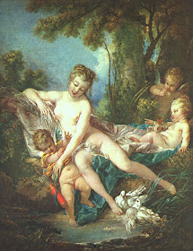
Now, as a comparison, this painting below is by Francois Boucher 1703-1770.
image: artrewal.org.
The calligraphic, more drawn look is different from the Bouguereau's, but the naked nymphs, and goddesses are from the same casting agency. How could anything be more lovely, there is nice glowing color, and real clean drawing, notice how "open" the lights are. Here's another Boucher.
image:artrenewal.org
And another;
image:artrenewal.org
I can hardly believe this is legal. Send the children out of the room. We are only doing this because we have to, I'd much rather be looking at sharks preserved in formaldehyde.
image: artrenewal.org.
And now I will end with another Bouguereau:
So you see, There is an on going tradition within French painting of these rather sexualized and superbly beautiful Arcadian pictures . Tomorrow....More Bouguereau! and another historic comparison followed by a discussion of modeling.