Thanks again to artrenewal.org for images
In the late 19th century the painting world was suddenly confronted with impressionism. Much is made today of the chilly reception that the Impressionists received at the hand of the Academy. That did happen. But not for very long, and I think rather too much is made of it. Many of the Impressionists became very successful, Monet had five full time gardeners and a studio you could have played basketball in.
In the flurry of "isms" that followed, the narrative of the oppressed school of daring new artists became a powerful sales tool for scores of multiplying and ever more 'revolutionary" movements in the art world. Recently some scholars and many painters have seen more in common than dissimilar betwixt the impressionists and the academics of the era. Certainly compared to the art of today, like that nice Damien Hirst fellow, they have a lot in common.
Just as there is diversity of opinion on most any subject in the world today, there was then also.
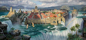
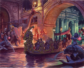
The painting at the top of the page is by Leon Gerome, an arch conservative academician who certainly fit the stereotype. He was a magnificent painter but reviled impressionism, as did many others. However within a single generation most academic painters had taken from the impressionists the tools they found useful and by the 1890's very few painters works were not informed by impressionism. Below is an example of an enormous painting by Bastien LePage, Joan of Arc, from the Met.
It is without a doubt an academic "machine" but it has moves learned from the impressionists.
By the 1890's most of the instruction given in painting was a mixture of the two, and grew ever more weighted towards impressionism. Lepage was held up as an example as a modern painter who had successfully amalgamated the two schools of thought.
I am going to return to Sargent again, but also to Zorn and Sorolla. These three have a lot in common and have become very popular as heroes among traditional painters today. I remember when Zorn and Sorolla were pretty much unknown in this country and Sargent was just beginning to be returned to the stature of an historically important artist. That would have been in the early 70's. The influence these three have had on contemporary realist (or traditional as I prefer to call it) painting has been enormous.
These three synthesized some of the lessons of the impressionists while still retaining their academic chops and outlook. They were all, neither fish nor fowl. You wouldn't call Sargent an impressionist, but he did paint alongside Monet who he admired, and he was influenced by the great "eye"of Giverny.
Above, John Sargent
Tuesday, November 30, 2010
Monday, November 29, 2010
James Gurney's "Color and Light"
I received my copy of Color and Light today from Jim Gurney. I have to tell you you MUST get this book. This book is like nothing written on color before. Most books I have read on color are hard to understand and harder still to apply to your art. James has really sorted it out from a painters perspective AND explained the science of color too.
James Gurney is an illustrator and does mostly science fiction or fantasy work. He has worked for National Geographic, done book covers and published the wildly successful series of Dinotopia books that have been translated into about 2,900 different languages except that weird one with the clicks in it.
I have little interest in fantasy literature, but Gurneys drawing skills and his amazing abilities put him in a class all by himself. I don't think I know of anybody today who draws better. He is an amazing artist. Check THIS out. That image should be clickable, click it and stare. That friends, is an amazing tour de force.
He also has an insatiable curiosity that leads him into all sorts of research on the "why" of the things that we painters wrestle with.
Here is an example of one of his paintings that he uses to explain multiple light sources for instance. This book is filled with plates of his own works, the masters, great illustrators and the academics of the 19th century.
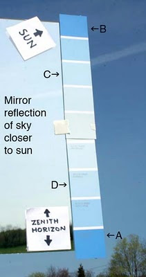
He also shows photographs of light effects the painter will encounter when painting skies, reflections, sunsets, and well........dinosaurs.Below is an explanatory photo about the color in skies for instance.
Below is a you-tube flip through of the book.
I think this is one of those books an aspiring painter needs. It is easy and fun to read and will equip you to deal with the problems of color in your painting and cheerfully explain the reasons why things look the way they do, all without being hard to read or tedious.
You can get a copy, signed if you like from Jim himself Here.
Or you can get it from Amazon or your local bookseller. Jame's last book was a New York Times best seller in the art instruction category and this one will probably be too.
Sunday, November 28, 2010
Raymond Loewy 4
By the the 1940's Loewy headed a design studio, what they designed, borer his name, but individual projects were executed by others under the supervision of Loewy. The firm worked for Studebaker. Above is the 1950 bullet nose. Below is the Commander Starlight Coupe, one of the most beautiful cars of the 1950's.
Below is a 1956 Studebaker Silver Hawk.
In 1961 Lowey designed the Studebaker Avanti, a legendary car. I remember seeing one at the county fair when I was a kid. This thing looked like it came from outer space. The Jetsons could have driven this thing. The front end, with no grill, looked radical then and still does today.
Here is a panel truck designed for International Harvester.
Loewy designed the classic Greyhound Bus.
And Ta-Da! Air Force One, or at least the paint scheme.
Raymond Loewy, though he became an American citizen, retired to his native France in 1980 and died in 1988. His firm is still existent today and run by his surviving family. Loewe designed the look of America from the era of steam engines to the era of jets, he designed toasters, tract houses,cars and radios and even a 140 foot long locomotive. No designer had a bigger effect on the 20th century than Raymond Loewy, not only for the breadth of his influence but also for the length of time he was active.
Friday, November 26, 2010
Raymond Loewy 3
By the late 40's Loewy employed over 140 people and ran a giant design firm executing designs for major clients across the country. In 1949 Loewy appeared on the cover of Time magazine, he was a culture hero. Above is his redesign ( and streamlining ) of the Coca-Cola bottle, and below the machine from which it was sold. Those rounded shoulders showed up on refrigerators and lots of other things in that era. Loewy's designs were often a "treatment" they all have a lot in common, the rounded off corners and the bulked up all steel look. This stuff was built to last and it was of high quality, little built today is made as well.
Here is a happy housewife in an all steel kitchen, I had these cabinets in apartments. Never had her in my apartment though. Think she was a friend of my mom's. I wish she'd put her arms down.
Below is one of the many radios that Loewy designed, this one is an Emerson. You could listen to Monitor radio, or maybe Clyde Clifford doing Beaker street out of Little Rock.
Here is a toaster, wish I had that. That black plastic handle and its base were made of Bakelite
( polyoxybenzylmethylenglycolanhydride) an early thermosetting plastic that is little used today. I think someday soon I may do a post called, "Great Plastics of the Past".
I did have this refrigerator. In the 70's this stuff moved into the apartments I rented. These refrigerators ran for ever, this one is still running , maybe in a landfill somewhere .
Tomorrow night, the final post on Ray, cars! Here comes the Avanti!
Thursday, November 25, 2010
Raymond Loewy 2
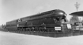
In 1932 Loewy began designing for the Pennsylvania Railroad. He is shown here standing on the S1 engine. Of course Loewy designed the cowling or "shroud" of the locomotive and not its innards. He has been critiqued as being a stylist rather than a designer, and perhaps there is something to that. However he made stuff look cool. The S1 is probably the largest locomotive ever built. It was slightly over 140 feet long! It was so long that it could only be used on a few parts of the line, because it couldn't negotiate tight corners. Here is a side view of this massive beast.
The large engine, built with a radical new duplex design in it's drive wheels had a problem with what was called wheelslip and was only operated for a few years. It was the end of the steam era and the steam powered engines were replaced with diesels. Loewy designed those too. Here is a streamlined design below, the T1 called the sharknose.
Loewy even reworked the designs and paint job of an electric engine called the GG1 for General Electric.
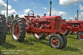
Loewy also designed, or "styled" the Farmall tractor for International Harvester. Below is one of those.
All of these objects bear a common aesthetic. They are powerful and blunt looking but elongated and swept back in appearance. They look tough and capable, and are simplified and slab sided.
Design is important because it is the intersection of aesthetics and our daily world. We have to look at the products of the industrial designer everyday. They can make our environment fascinating and beautiful, or oppressive and inhuman. The ideas that these designers use are the same in many instances as those that artists use. I think there is a little made argument for better art education in pour schools, based on this. If the general public is uninformed or disinterested in design, they will choose to fill the world about us with ugly products. A population with a little trained appreciation for design will want to acquire and surround themselves with beautifully designed things. When we teach our children art in school, the quality of that education may ultimately determine the appearance of the things we will have to see about us. Nowhere is this more true than in architecture and consumer and household products.,
Tomorrow, refrigerators, cars and radios.
Wednesday, November 24, 2010
The man who designed the 20th century
Industrial design might seem pretty far off the usual track of this blog, but I think that an artist should know about aesthetics in general. A few weeks ago I was boring you with Greek vases, tonight I am going to begin a two part series on the greatest designer of the 20th century, Raymond Loewy. You have been seeing his work your whole life, probably without being aware of who he was, or that one man designed so many familiar things.
Born in France in 1893, Raymond Loewy served and was wounded in World War I. After the war he emigrated to the United States still wearing his officers jacket with 50 dollars in his pocket. His first jobs were doing window dressing for New York city department stores. He then began to do fashion design with some success. However his life's work began when in 1929 he was commissioned to redesign the Gestetner duplicating machine. It looked something like this, a late 19th style of design, utilitarian but homely.
Raymond Loewy produced this.
This is a cowling that fit over the sort of unit above. it looked clean and modern. Loewys design looks normal enough today, but in its time it was very hip. Loewys influence has been so great that it is easy to overlook his enormous influence on industrial design. We see his designs, or their influence, about us every day. This design led to more commissions and over his life, he produced hundreds of designs that we take for granted as part of the "modern" era. Many of his designs were "streamlined. That was a rounded off, slicked back and aerodynamic look which characterized much of the 20th century. Here is a design you may have see for the logo of a fine tobacco product. This is one of the landmarks of modern package design.
Loewy also designed this well known logo.
This logo was so effective and well known that Shell discovered they could omit the actual company name in their advertising and merely show this symbol designed by Loewy. Here is another of his logos.
Lowey began to design all sorts of things besides logos here is an example. Here is a design for a refrigerator.
More tomorrow. Have a happy Thanksgiving!
I have a few spaces left in the three day workshop to be held in Charleston, South Carolina. It will be fun to meet those of you who read this blog from the low country. As usual the workshop is open to all levels of experience and will run from Saturday, December 11 until Monday the 13th. I will teach outside and will demonstrate in the morning and then run from easel to easel teaching for the afternoon. I can save you years of screwing around learning to paint outside.
Here is the link to sign up. Class size is limited to 10 and given the short notice on this one might be very small indeed. People are starting to sign up, so reserve your space.
More about Sargent's Luxembourg Garden picture
I was writing about this picture the other night and talking about it's tonalist leanings. But I noticed another thing about it that I want to mention. You who have read this blog for a while know that I often advocate linking shadows together. Look at the image of the painting below. I have fooled with the contrast in Photoshop to make the linkage here more obvious.
This painting has pretty much one big shadow shape. Even the little guy with the lady on his arm and a tasty tobacco product in his mouth, is linked to the background trees by a couple of strategically placed bushes.
If you were to place your finger on a dark in this painting you could travel all about the darks without having to lift it. This is useful for two reasons. First it guides the eye around the painting via a simple, plainly visible pathway. Secondly, every time you link one shadow to another, you reduce the number of shapes in your painting. If you can make of all your shadows a single linked shape, gerrymandered as it may be, it is a single shape. Usually a very interesting shape at that.
I was asked in the comments
"Think Sargent would have set his subject up with those props and colors in mind before hand?, or would he have translated the color scheme and the subject into what he painted?"
I think that Sargent imposed his color schemes on the paintings, but he based that on the props he found useful. He would have altered the color of things to get his dominant note spread around the way he wanted. For instance in this piece below;
The chair and the carpet may have had that rose color but I expect that Sargent "forced" it into the dress. I think all of those rose colored shadows in the shawl like thing that hangs from her shoulder must have been installed too carry his color scheme around the painting. Those hot shadows around the back of her lower leg look to have been pushed into that heated note. It would have been easy for him to force that note up into the upper left hand corner too. I am assuming that he liked the color of the chair and the rug and sewed the whole painting up in it.
Tomorrow night, a tangent.
Tuesday, November 23, 2010
Sargent's tonal "themes"
images from artrenewal.org
I have written about tonalism before. There is a search box up at the upper left if you want to find thgose. Sargent uses some tonalist ideas in a number of his paintings. Here are a few examples.
Above in the Jardin Du Luxemburg painting, Sargent has suffused the whole scene in a cool blue pearlescence. He is putting the picture into a unifying color theme. All of the colors except for a few red accents are variations on a color theme. This soft shade permeates the entire picture and is mixed into almost every note.
Lady Agnew above also has a tonal "drone" going on. That cool blue and soft blush pink is everywhere on the canvas. The trick to getting a tonalist effect is often as simple as suppressing its complement. That is if you want to paint a tonalist color based on yellow, you suppress it's opposite, violet. The color unity of the painting benefits enormously. This is the opposite idea of impressionist color in a way. The color is "corralled" into a narrow range, rather than observed in its actuality. Sometimes a plein air painting in accurate color can look like a mosaic of unrelated colors.
Here is another example, that glowing rose madder color is sneaking into just about everywhere in this painting. Sargent is "smuggling" red.
I have written about tonalism before. There is a search box up at the upper left if you want to find thgose. Sargent uses some tonalist ideas in a number of his paintings. Here are a few examples.
Above in the Jardin Du Luxemburg painting, Sargent has suffused the whole scene in a cool blue pearlescence. He is putting the picture into a unifying color theme. All of the colors except for a few red accents are variations on a color theme. This soft shade permeates the entire picture and is mixed into almost every note.
Lady Agnew above also has a tonal "drone" going on. That cool blue and soft blush pink is everywhere on the canvas. The trick to getting a tonalist effect is often as simple as suppressing its complement. That is if you want to paint a tonalist color based on yellow, you suppress it's opposite, violet. The color unity of the painting benefits enormously. This is the opposite idea of impressionist color in a way. The color is "corralled" into a narrow range, rather than observed in its actuality. Sometimes a plein air painting in accurate color can look like a mosaic of unrelated colors.
Here is another example, that glowing rose madder color is sneaking into just about everywhere in this painting. Sargent is "smuggling" red.
Monday, November 22, 2010
Delicacy in halftones
I was asked in the comments last night to comment on the handling of the halftones in this head by Anders Zorn.
I will do that briefly. I am a landscape painter, and although I was trained traditionally I am off of my ground here. I will do what I can.
The important thing to note is that the halftones are all subordinated to the larger field of the lights. amateur drawing exaggerates the halftones giving a dirty look to the lights. all of the halftones must be higher in key that anything in the shadows. ( I know I keep harping on this, but it is crucial).
The plane changes, i.e. the swellings and recessions of the forms ARE represented, but they are soft pedaled. Compared to the contrast between the light and the shadow they are minimal. The best word to describe halftones done well is delicacy. It s easy to overdo these transitions.
If you look at the forms about the eye and nose, the structures are clearly expressed, but they are done so in a quiet and non assertive way. They are part of the lights and they are subtle. The tendency of the tyro draftsman is to look at the halftones only in relation ton each other and to over represent them. The halftones should be compared to the entirety of the head rather than to one another.This subordination to the larger form is key to understanding the proper role of the halftones.
Even though sometimes the halftones conceal the delineation between the light and the shadow, in the head above, Zorn always shows that he knows where that transition takes place. The essential idea is that these transitions should always be "clean" Although in nature the transition may be mushy, in your drawing it is important that they always appear well understood. More tomorrow after some much needed sleep. I am traveling again. You who read this blog would be shocked if you knew the condition I am in when I write it sometimes . I post every day, no matter what that day has been like. Today is an example of functioning beyond the point of exhaustion.
I have a few spaces left in the three day workshop to be held in Charleston, South Carolina. It will be fun to meet those of you who read this blog from the low country. As usual the workshop is open to all levels of experience and will run from Saturday, December 11 until Monday the 13th. I will teach outside and will demonstrate in the morning and then run from easel to easel teaching for the afternoon. I can save you years of screwing around learning to paint outside.
Here is the link to sign up. Class size is limited to 10 and given the short notice on this one might be very small indeed. People are starting to sign up, so reserve your spot.
Sunday, November 21, 2010
Zorn sidetrack
Here is a picture of Emma Zorn, wife of tjhe Swedish painter Anders Zorn (1860-1920). Zorn, Sorolla and Sargent are the triumvirate of alla prima figure painters from the late 19th century. They have a lot in common. I want to show a Zorn head and note the similarities in the handling of light and shadow that he shares with John Sargent. Zorn was also an admirer of Velazquez.What I want to point out is the "clean" delineation of the shadows in this portrait of his wife.
Zorn has "mined" the shadow areas in this head. There is a complete demarcation everywhere in this head between the halftones and the shadows. Sargent and Zorn both did this, and it gives a concise look of understood form to their art. I have been pointing this out repeatedly bin Sargent's paintings but here is Zorn doing the same thing.
THIS PRECISE DELINEATION IS THE RESULT OF CLARIFIED OBSERVATION, BASED ON A CONCISE UNDERSTANDING OF THE FORM.
I hope I am not beating you over the head with this too much, but this is REALLY important.Great figure and head painters know exactly where the shadow is, and where the halftones (part of the lights) are. They never mush the two together, even in the subtlest passages the delineation is there. This is installed from an understanding of the form and may or may not be actually visible. But here is a little trick you can use to find this demarcation yourself.
YOU CANNOT CAST A SHADOW INTO A SHADOW!
That means,that if you are confronted with a passage where it is unclear where the halftone ends and the shadow begins, you can hold a pencil or stick of charcoal or a brush between the light source and your subject, be it a head or still life, the shadow of that stick will appear in the halftones and not in the shadows. Try this, it is an amazing phenomenon. The shadows will be unaffected by a shadow thrown across the highlights .
Every time your brush touches that canvas you must know for sure whether what you are painting is in the shadow or in the lights. Every time. There is no other place. If you have a doubt, cast a shadow across the model and see what happens. If I have not explained this clearly, let me know in the comments and I will take another run at it.
Friday, November 19, 2010
Post no. 700 sailor suits and breeching young boys
Well, I am certainly off on a tangent tonight. But since I posted the picture of a little boy in a curls and bows there has been some ongoing discussion on this blog of young boys costume in the 19th century. I can't imagine the use of this information other than a clearer picture of costuming in historical portraits of young boys. Above is a 17th century painting showing a typical enough costume for a young man of the aristocratic classes. He is wearing a dress. That was the common outfit at the time, particularly for young boys still undergoing the rigors of toilet training. When that ended, the child began to be dressed in pants. That was called" breeching" and it was a rite of passage, it represented the point at which the father would take a more active role in the raising of a male child.
Here is a little boy from the 19th century done up in curls and a sailor suit. Boys of the era were given no choice in their wardrobe and their mothers dressed them up as little fops. How they must have doted on these little guys! Below is a portrait by the great 19th century portrait painter to royalty, Winterhalter. In 1846 Prince Albert of Wales was dressed in a miniature version of the suit worn by the sailors on the royal yacht. This created a sensation and the sailor suit for young boys became the fashion. Below is Winterhalters portrait of young Albert in the sailor suit. Engravings in the popular press popularized the idea in the 1870's.
An alert reader pointed out to me that Renoir had painted a picture of "Madame Charpentier and Her Children. One of those two children is a boy, I don't know which, but they are both done up in little dresses and curls.
Sargent painted several more little boys in girlish costumes below is Mrs. Edward L. Davis and her son Livingston.
And below is Caspar Goodrich also by John Sargent..
I have a few spaces left in the three day workshop to be held in Charleston, South Carolina. It will be fun to meet those of you who read this blog from the low country. As usual the workshop is open to all levels of experience and will run from Saturday, December 11 until Monday the 13th. I will teach outside and will demonstrate in the morning and then run from easel to easel teaching for the afternoon. I can save you years of screwing around learning to paint outside.
Here is the link to sign up. Class size is limited to 10 and given the short notice on this one might be very small indeed. People are starting to sign up, so reserve your spot.
Male or female?
Jacques Barenton from artrenewal.org
I have traveled across the country today and am so tired I can hardly function. But I will manage a short post. There has been some ongoing discussion about this head I posted recently. It is evidently a young boy. In the 19th century young boys were sometime dressed in skirts and costumed similarly to their sisters. Evidently until puberty they weren't thought of as particularly male. I poked around the net and found many references to this painting as Jacques. So, it must be that this little dandy is a boy. I'll bet he got pushed around a lot at the skate board park.
On the other hand, this is Violet Paget, or Vernon Lee, her pen name.
Violet or Vernon is rather ambiguous about her gender too. There is something androgynous about this head . She was a friend of Sargent and also Henry James. A writer and aesthetic theoretician, Violet-Vernon was a lesbian and often dressed as a man. I love this head, it is one of my favorites of Sargent's less formal studies.
There has always been question about Sargent's sexuality. He painted the erotic male nude above, and the fetching Egyptian girl below with equal attention if not lascivious interest. He was linked to at least one woman and it is suggested that he perhaps had male lovers as well. The truth is either concealed or unknown. Perhaps he himself was open to morphological variation. I have no idea where the truth may lie, but it is certain that he never married and was at best ambiguous about his preferences. There was a fashion in those days for men to suppress their sexuality with the intent of funneling that energy into their art. He may only have been intensely private about his affairs.
I don't feel I need to know, in order to enjoy his art, but there does seem to be a pattern of androgynous sitters and male nudes that border on the homoerotic.