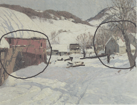
 Here I am again defacing that poor Hibbard painting.
If you look at this picture again you will notice that there are two main areas of interest, left and right with a "bridge" of little darks, houses and accents across the middle tying them together.Why its almost like...................... a BALANCE BEAM.

Paintings are often said to balance, and this one does. On one end of the beam we have the red barn and on the other we have the tree, figure and house grouping. This composition is often called a "steelyard" design.
The red barn is a larger shape and more assertive than the tree grouping but that little figure creates a lot of interest. Hibbard is balancing the lighter right hand side by adding interest rather than weight . This creates a pleasing design that balances but is not too symmetrical. It is a balance of artistically arranged unequal parts.
If you imagine a nail in the center of the image on which the painting is hung, then imagine visual interest having weight , you have the mechanism with which a painting balances visually.
Artists have many available geometrical arrangements into which they "drop" paintings. Hanging your painting on this invisible geometry gives the viewer a sense of order that makes him feel comfortable and rewarded when he looks at the painting. This hidden order gives a painting an enormous visual power and internal logic thatis much more human and pleasing than the random arrangement of things where ever nature and circumstance happened to drop them.
Not all paintings need to be perfectly balanced, this is a design tactic, not rule, but a badly out of balance painting can make the viewer feel as if they need to turn their head to one side to look at it. The picture will just "feel"wrong to the viewer, but they won't know why. Painters scatter little accents by instinct, about their pictures, what they are often doing is throwing out little weights to balance their designs.
Another design "stem" as these useful artists compositional devices are known, is the circle. Here I have dropped a circle onto the painting.
 Besides a symmetrical balance the eye can also travel in a circular track around the painting with major objects and accents laid out to encourage you. Notice how the center of the painting is relatively spare and the heavy, interesting things are placed about three quarters of the way out to the edge of the image all the way around. This is another form of balance.
I know many of you are rolling your eyes and thinking, Stape this is so basic. Well here's something a little less basic. A painting can balance internally. Look below ;
 The foreground and the distance can balance against one another. If you imagine a fulcrum out there in the middle of the painting, on one end of the beam is the foreground, at the other end of the balance beam running deep into the picture is the distance. Because the distance section is smaller and made of less interesting units it needs to be farther away from the fulcrum that sits between the two, so as to achieve internal balance. That is again an artistic arrangement of unequal parts.
Lay down on the floor with your arms at your sides until tomorrow, when I will return...Stape
These post on Hibbard have been excellent Stap. I didn't know about internal balance. It seems to me that the most important part of a painting is it's design , along with variety you had talked about and interest. You can have a painting well painted but if the design is not there it is not a good painting?
ReplyDeleteJames:
ReplyDeleteA lot of this blog has been and will continue to be about design.
Design is the "pearl of great price"
The longer I paint the more it gets to be about design.I am glad to have hung out with some fine designers over the years.
The old Cape Ann guys
( Gruppe, Hibbard, Mulhaupt, Thieme and Cirino, etc.) paid a lot of attention to design and were rewarded for their efforts......Stape