Friday, July 31, 2009

Everything set to medium


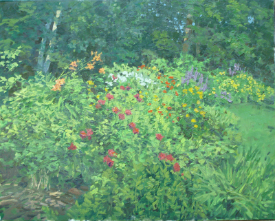
Here is a painting that has been sent to me for a crit.

There are a handful of problems with this picture. I will focus on the "overallness" of the painting.
  • I don't know where I should look, the white spots on the ground might be the subject matter, but it might be the trees in the background, and the way my eye tracks through the painting leads me to the clump of trees on the right. That makes me think that they are the subject. One thing in a painting must predominate and the other elements in the painting need to be subordinated to that.
  • The same thing is going on with the values. There is no part of this painting where the values dominate. Some parts of the painting are a little lighter and some a little darker, but there is nothing that by virtue of its value says,"here I am, I am the subject!". There is an overall closeness of values that gives the painting a mushy feel. Areas in the foreground don't really explain themselves.They might be patches of wildflowers, I can't tell. Whenever a viewer stops to think "what is that?", you have lost.You gotta make em believe.
  • The painting needs to have more drawing, at least in few areas. I guess it would be like an important scene in a movie, where a leading characters important lines are garbled . The viewers lose that capacity to suspend disbelief which carries us along in a movie. Its OK for a minor element in a picture to be mysterious or only cursorily indicated, but an important passage should always explain effortlessly.
  • The area of the sky and the land are roughly the same. Again it is a matter of equal emphasis. One should be dominant and the other subordinated. I have known some painters who when they layed out the shapes in a painting would think to themselves, papa bear, mama bear, baby bear, to make sure they had areas of different size and importance. look at the above painting and see if you can tell where each of these "bears" is.
  • The same is true of the color, color wise each area of this painting is about of equal importance. It is good in a painting for one area to be dominant in color, and then another area would be of a supporting, contrasting or complementing color. In this picture each area is of about the same in terms of color importance. There is no place in this painting that is either saying "I am important" or "I am an accent".
  • All of these faults have in common a sort of "medium" setting. Musicians speak of dynamics, that is the volume gets louder and softer and there are quiet passages that are gentle, contrasted with passages that are fast, loud and thrilling. There are unexpected surprises. There used to be music in elevators and supermarkets called Muzak, I don't think I have heard it in a while, but you will probably remember it. Muzak had no dynamics. It was deliberately made to sort of tootle along in an an unassertive and deliberately uninteresting way, because it didn't have wildly contrasting parts or surprises. It was all set on medium.

DON'T SET YOUR WHOLE PAINTING ON MEDIUM!

  • A painting needs to have dynamics, in its values, the area of its shapes and in its colors. That is, if their are a number of shapes, make one the papa bear, and another the mama bear and another the baby bear in area and assertiveness. The same with the color of those shapes, make one a papa bear etc. Always think "is this the dominant shape? Or is that over there the dominant shape? Is this shape dominant to that one in color, or subordinate?"
  • A painting should have counterchange and shapes of contrasting values placed on top of or behind one another. Here is a link to a post about that. Again that is a way to get dynamics into a painting.

Just as when doing public speaking, you must vary the tone of your voice, accent certain thoughts by speaking more forcefully or pausing dramatically, it is necessary to vary the emphasis on the elements of a painting to hold the viewers attention. In a gallery or a show full of paintings a painting all set on"medium" gets lost in the crowd, eclipsed by its more dynamic competitors.

Ten books

Rembrandt, Self portrait with Saskia image from artrenewal.org

A reader e-mailed and asked if I would write a list of ten good books, or favorite books. I thought about it for a while and I will restrict it to books that are available, or if out of print, affordable. That leaves out some cool stuff, but whats the point if my recommending a book that you can't find? I have posted ten authors really, several entries list two books, because one is out of print and expensive,but worthwhile if you can afford it.

Carlsons guide to Landscape painting. I have written a lot about this book. Here is a link to some of that.


The Composition of Outdoor Painting by Edgar Payne, another classic text,written by an important California impressionist explaining methods of designing paintings. Only available used, but is routinely reprinted. Worth spending some money to get though.


The Human Figure by Vanderpoel I felt I should include one artists anatomy book, I like this one. It is clear, well illustrated and approachable.


Sargent, by Carter Ratcliff, I have a whole shelf of Sargent books, but this one is a good overview of his whole career and different sorts of paintings.


Gruppe on Painting Great outdoor painting book. Another classic by a fine American painter.Explains his one shot, full sized canvas, rapid painting techniques with bold color and brushwork. Power painting!


Edward Seago There are several books of his paintings in print here is one.


The second is an out of print book, it is available but expensive. If you can afford that, it is the best book and I treasure my copy. I have duct taped the spine back together.

The Boston Painters by R. H. Ives Gammell (my teacher) Out of print but not expensive. Also Twilight of Painting , by Gammell. Out of print AND more expensive. Good book though. A bit of a tirade. Still informative. This book changed my life.


Keys to Successful color by Foster Caddell. Simple presentation on color in the impressionist landscape. Caddell uses a clever means of presenting tje material. He shows you an amateur version of a painting and then his and explains what he did differently. So wonderfully simple it could be used as a middle school text. I learned a lot from this book long ago.


The Painted Word, by Tom Wolfe. Great contemporary writer and author of The Right Stuff and Bonfire of the Vanities takes on the philosophical underpinnings of modern art.


Everything I Know about Oil Painting by Richad Schmid A living master writes down his approach. Worth the price. Schmid has mentored a great number of young painters and this book does cover a lot of information. A few of the ideas in here I have found no where else as clearly. Well illustrated and based on a lifetime of experience by Americas most admired traditional, impressionist painter.


This list is books that have I have returned to and studied many times. I could have written a far longer list. I included only one artist monograph, that of Sargent. I could have listed a hundred of those. But if I could have only one, this would probably be it.

Lastly, I include a book I treasure as an addendum. This book is out of print and I treasure my copy. It is quite expensive, that's why it is number eleven on a list of ten.

Thursday, July 30, 2009

Hows and wise

Well. Here I am on a new,new computer. The last new computer developed a keyboard problem. I took it back to best buy and they no longer had that unit, so I now have a different brand. I guess its OK, either way it will take all night to download all of my files onto it from Carbonite.com. That will make it the second time Carbonite has saved the day. I got my 50 dollars worth there!
I however do not have photoshop reloaded so I wont play those games tonight. That's alright because although I will soon return to the crits, I got several questions in the comments that I will answer. I was asked
I like the start to this painting. Could you talk a little about your approach to this type of subject matter? Lots of foliage is a difficult thing to simplify sensibly. Are you doing a dark mass and then painting leafs, stems and flowers into that?

I should be so orderly! But yes that's almost what I do. I paint the shadow note that is colored and then throw my leaves onto that, then I paint the dark accents and violets into my shadows. I don't use many highlights outside but if I did I would then paint them in onto the lights. That's four values. The shadow note I mixed up in a pile and I made a pile of leaf color. The leaf color pile I subdivided and made about four separate piles , a warmer less green one, a yellower one , etc.
I threw the leaves and foliage onto the shadow note and then mixed other green notes using different pigments and used those for particular clumps of foliage. None of this went into the trees in the background. They are a wholly different set of colors and they are in the shadow and an upright plane so they are;

WRITTEN IN A DIFFERENT PIGMENT LANGUAGE

That is, no color from the flowers in the light was allowed up there. I mixed new colors for up there, also in premixed piles. All these piles of color are mixed with a leaf shaped knife. I try to use a different set of pigments in the shadows than the lights, WHEN I CAN in practice it is only possible to do it somewhat, but just leaning that way makes a difference. That is one of the reasons why I don't use a three color palette.

I premixed huge piles of color, often an amount equivalent to most of a small tube of paint. I use a lot of paint and on this painting I wanted to get a nice surface with big fat juicy brushstrokes, big piles of paint and little medium help me get that. They also enable me to work really fast. I don't always premix color, but in this instance it made sense.

I worked out all of the foliage without putting in a single flower! Well actually I put in a few of the larger clumps of flowers transparently as placeholders and to help me stake out the different parts of the picture. But I waited until I had the whole plant structure of the garden in and then I dropped in the flowers. I arranged them some, but not so much as to waste that structure below I had worked to achieve, I think in garden painting that structure needs to make sense under the flowers. I mixed piles of the flower colors too. I have quinacridone, ( spell check suggests gangrene here.) cobalt violet and cobalt blue and cadmium red and used them all to make the flowers. Here is a link so you can read about my usual palette.

I was also asked;

.. would you be able to expand a bit more on how you used photoshop to make these changes? Questions (1)how did you turn up the light to glare level.. I usually use levels.... is there something better to use? (2) Strong pattern on the ground and the furniture.... is this a custom brush that you used?? (3) Scattering little pixels and accents... custom brushes again???

I did all of the alterations on that piece with one stupid little brush in Photshop express that's the smaller cheaper version. My wife does graphic design and has the pro version. But for the simple things I do, Photoshop express is enough. I am using my experience as a landscape painter and not any Photoshop skill at all. Industrial light and magic won't be ringing my doorbell any time soon.

I turned the light up to glare level by consolidating the shadows and darkening them. I then used a much higher value and painted in the lights. There are no custom brushes, just the one simple little brush over in the toolbox, I did however vary the size of the mark and its opacity. Neanderthal! I get a bunch of CG guys who are into sophisticated computer painting who must be laughing at me, but it is enough to make my points, and the fact that it looks like I am correcting in gummy worms makes it easy to see what I have done as opposed to what the original painting looks like.

The last thing I am going to do here is post a few more of the facebook throwaway lines. I put up a notice on Facebook and twitter after I publish this post , and I add to it a line that claims some absurd content is in the post. here are a few more

A million monkeys randomly typing for eternity, have produced my blog tonight on Provincetown and a Hensche demo.

Post analyzing a painting I made in Maine. I have seen the first archeopteryx of the new millennium!

I have a new post entitled asjjfrkmokfjgpydipudatrefajarq! (spellcheck flagged that too, but had no suggestions) check it out.

See my latest post, like yesterdays, it's about getting light in your paintings. I have new shoes!

Post on experiences with a limited palette, Zorn, light, and wooden hats for painting in lightning storms.

Beginning posts on light in a sunny day painting. also the proper way to hold your mouth while painting.

More great Carlson paintings, and an improved method of turning a cockatoo inside out with a crochet hook.

10 greatest American painters. and a plan to connect all Chinese restaurants with underground tunnels to a single underground kitchen

Here is the link again for the workshop in Jaffery, New Hampshire in September.

Wednesday, July 29, 2009

This post must be a short one as this is a travel day for me. I will return to the critical dissections soon, but they are really time intensive so I will not do one today. Above is the garden painting I started yesterday. It is so far a one shot 24 x 3o, after I write this I will take it out again. I read an article today on Fine Art Views written by Lori Woodward Simons. She wrote about artistic jealousy, you can read that excellent article here. If you go to that page and quickly read that short article , what I am about to say will make more sense.

I guess I do get jealous of another artist on occasion. Although actually I don't think it happens very often, But when I do it is usually when sales are slow and I am jealous because they are selling their art when I am not. But when I do feel a twinge of jealousy these are the things I do or think to keep it from being a problem.

  • I remind myself that whenever I see a a really great painting in a magazine I think, I wanna make that! Then I turn the page and see another in a totally different style and I think, I wanna paint that! It is just the form my excitement over another's art takes. I don't really want to paint like them. I have spent too many years becoming me. Sometimes I ask myself, would you really want to trade skill sets with this person?
  • I remind myself that no one I am jealous of is even close to being in the league of a Rembrandt, Inness or Sargent.
  • But this is most my important point, I like to tell myself and others this,
I DON'T COMPETE, I CONTRIBUTE.
  1. What I mean is that I know that I bring something of value to the marketplace or forum. Others may bring something larger, cooler or whatever. But I am bringing SOMETHING of value. I am useful! Don't underestimate the power of that idea, people who are useful are almost always included. Even if you are not a star, you are well....useful.
  • I pick up the phone, or I e mail them and I TELL them what a great piece of art they have made. That really helps, it is constructive and then we can share their achievement. That makes it pretty much impossible for me to be jealous of them. I do this to ABSOLUTE STRANGERS! The next time we meet they are no longer strangers, incidentally. If you have never done this, I strongly recommend it. It is the best way I know of to deal with art jealousy.
The New Hampshire workshop is scheduled and there is a place to sign up here. If this blog has been instructive for you, imagine what I can do for your painting in a personal one on one session
at a workshop. I think that painting in the fall in New Hampshire is about as good as it gets, and people are beginning to sign up now.

See you tomorrow

Tuesday, July 28, 2009

Another dissection

Ribera, Apollo flaying Marsyas image from artrenewalorg the worlds largest online museum, check em out at http://www.artrenewal.org/asp/database/contents.asp

As long as I am showing that baroque painting, I suppose I will dissect it a little just to make sure MY knife is sharp.

Look at that, hidden geometry.Theres a hamster trail, habitat design going on in there! Ribera has linked the two figures together into a large rhythmic vortex. That big black tree brings your eye down to Marsyas who is expressing some discomfort. Marsyas lost a contest with Apollo over who could best play the aeolian pipes. It is best not to wager with Gods.

I have received e mails from some of you who want to sign up for the New Hampshire workshop which will be held September 19th through the 21st.The hills of New England at that time of the year are beautiful and I have scoped out the area around Jaffrey and it should be a great place to do a workshop. There are lakes and rushing rivers, old mills, and small villages full of historic clapboard houses. It is excellent landscape terrain. It is mostly hardwood and there are still open fields and of course Mt. Monadnock. This will be an intensive three day workshop and I will attempt to cram in as much instruction as I possibly can in this time. We will paint together during the day and then join up for dinner in the evening, so we can talk shop and enjoy the company of other artists.I have some information on affordable lodging that I will post soon. Here is the link to sign up. I hope I will see you there.

http://stapletonkearnsgallery.com/news.html

Lets see, our first contestant has been strapped to the gurney and despite some struggling, misgivings, and annoying shrieking, is finally resigned to some surgery.


Here's a lovely little patio scene. I think it has a lot of charm. Certainly the sort of thing that people like to hang in their homes as it reminds them of leisure and a break from the worries of everyday life. I felt it could use a little more light and some more impressionist handling to give it a happier more summery look. Here's what I did to it in photoshop.

Here are some of the things I did to this image and why.
  • It looks like the sort of image that would look good with a broken color French impressionist look, so I took it that direction. The artist who did this may have had entirely different intentions for it, but I have no way of knowing that, and as usual I have never seen this place and have no references other than the painting submitted for the critique.
  • I turned up the light to glare level.I made a strong pattern on the ground and the furniture. Notice for instance how I separated the light and shadow on that cushion on the ottoman in the foreground. I felt the image before was a little mushy, dividing out the lights gave it a crisper look.
  • I scattered little pixels and accents across the piece and used them to break up the linearity of the drawing and to get sparkle.
  • I tied some of the darks together to get the parts of the painting to relate more to each other. I also did this to get a more circular design, a little like our miserable Marsyas above.
Well, that's it for tonight, I will return tomorrow.

Monday, July 27, 2009

Its dissection time again!

Well its time once again for the scalpel and retractors. Hand me that Skilsaw and lets get to work. We have a fine supply of quivering patients to strap to the gurney and examine.

Here is the first one now

This is an ambitious and complex painting. It reminds me of Hudson River school painting. Nice job! I never reveal who the artist is in these crits, but you know who you are.Here are some things that could be done to help this painting along a little.

The first problem I see with this piece is that the lights and the shadows are inconsistent. Look at the value of the rock in the foreground at A and notice how close it is in value to the shadow u at B. Around B it is in fact very hard to tell what is in the light and what is in the shadow. When you hit a note onto the canvas you must always know, whether what you are painting is in the light or whether it is in the shadow. Below point B in the foliage there are notes which I think are meant to be in the light, which are as dark as that shadow also. Now things of different hues may be lighter or darker but in order to get the effect of light, All of your lights must be noticeably lighter than all of your darks. The shadow of the man shows that this is supposed to be a bright sunny day. But the inconsistency of the light in the rest of the painting doesn't carry out this idea.

I think that strong straight line a C is problematic too here's why


There is an unintended relationship between that line and the line of the lower mid ground. That is making a sort of unwanted geometric shape in that area. At point E there is a missed opportunity to show the light moving through the painting. The strong shadow of the man says bright light but this group of bushes does not.


Here I have doctored up the painting in photoshop. Keep in mind I have no reference for this, so I have no idea what this place really looks like.I have done the following things.
  • I got rid of that offending line in the distance and established larger, stronger shadow shadows in those mountains and cliff on the right.
  • In simplified the middle ground and got rid of that bush which was in front of the figure, That bush seemed to bump up against the figure. Be careful when you put something moving into a painting like a little figure or a sailboat that there isnt something right in front of it, for it to crash into. Losing some of those bushes puts the figure up against a big dark which makes it show up better.
  • I also threw the ground in that area into shadow. That makes the foreground light up better as it provides a foil or comparison for it. Your shadows will determine the brightness of the light just as much as the lights do. Its all about comparison. A painting with no strong darks usually wont light up.
  • I rearranged the clouds a little bit to place a dark behind the illuminated cliff on the right and a light behind the darker mountain above it. It makes these show up better and the contrasts give more snap to the image. I have also made the sky shapes more varied and interesting.
  • I simplified and pulled together into larger shapes of the ledges in the foreground. For those of you elsewhere, ledge is a New England term for exposed rock on the ground, which is something we have a lot of.
  • The trees across the middle ground now establish a thrust in their form which counters the thrust of the mountains behind them. That makes the two balance.
  • The painting now has fewer, larger shapes and I have sorted the lights and the darks more carefully.

Sunday, July 26, 2009

Some things Waugh said


Fredrick Waugh

I am illustrating tonights post with paintings by Fredrick Waugh. 1861 194o. Known almost entirely as a seascape painter and probably the best, Waugh was the son of a Philadelphia portrait painter. His later years were spent in Provincetown, Massachusetts. He was a prolific artist and quite successful. His paintings were made in the studio using sketches done outside and drawing on his long experience observing the sea.


In 191o Waughs thoughts on painting were published in a magazine called Palette and Bench. Here are a few of the things he said.
  • simplify, simplify, simplify as much as possible without losing the essential of what is sought
  • look for the big things, art doesn't begin and end in detail. It rather begins in breadth and ends in more breadth, in what you can do without.
  • I have always held that with a few exceptions, no two spaces in a picture should be of the same area or shape.
  • I find that my most striking pictures of the sea are those strong in contrasts, the shadows as dark as I can get them and everything in between of the proper value all the way up to the highest light I select to use. Walking back to judge the work at a distance preserves its carrying quality and force.I walk back all day long. The carrying quality is given by the accents one puts on the shadows, halftones and highlights. This means full rich painting in proper values.
  • A sense of mystery is often conveyed by certain passages which lack obviousness because left unfinished.

Such things call attention to other passages which are of more import. Make these last your climaxes.

There is a fine Waugh called the Roaring Forties that is 48 x 6o and was in the study rooms of the American wing of the Metropolitan Museum of Art. They have been remodeling that for years now. I believe they are beginning to reopen it. I hope they will soon return this Waugh to view as it is spectacular.


I want to touch on a quick handful of other items tonight. First, several readers were concerned that my statement that I saw no design in nature meant that I was disavowing the idea of God as creator. I had not meant to give that impression. It is often hard to write exactly what you mean, no more, and no less and I inadvertently gave an impression that I meant something I did not. What I meant was, that from our perspective as artists, nature is random, and we cannot observe design into a painting, but must install it ourselves. As I wrote that I thought about saying something about intelligent design because I was expecting a question in the comments on that, but I decided I would not take the blog into the province of religion.You can all put down your nautilus shells and relax. I am my self Christian and in no way meant to wade into a discussion on intelligent design. The purpose of this blog is to discuss painting. I have avoided religion and politics, and intend to continue with that. There are many fine blogs on both, written by people who are expert on those subjects. I am only expert on one subject, and that is landscape painting. Forgive me if I gave the wrong impression, which it seems obvious in retrospect I have. Mea culpa.


The sun finally came out today. I set up my big Gloucester easel in the middle of my mother in laws sprawling garden. So I had to stretch a 24 x 3o, one of my favorite sizes. I have become disenchanted with linen. Repeatedly I have returned to a gallery to pick up unsold paintings, and found a painting buckled and hanging loosely on its stretchers. No wonder it didnt sell! Incidentsally no dealer will restretch a painting for you, they will just show it loose or worse put it in a closet, I have closets at home!

I have never had that problem with cotton. I have tried a number of canvasses in the last few years. You will generally hear that pros should always work on linen as it is more archival, and that may be so. But I don't think all of that coming and going of the canvas can be good for a the paint either. Sources I researched seemed to indicate that a top quality cotton canvas was acceptable and I have myself handled many Rocport school paintings now nearly a hundred years old which are on cotton that seemed to be fine. Restores reline, that is, they put new canvas on the back of old paintings routinely. If a hundred years from now my paintings are worth relining, they can do it.
I have never found any cotton canvas that has the silky feel under the brush of Claussens type 12 but I have again returned to using what I think is a very good cotton canvas. It is made by Fredricks and is called Scarlett OHara. It is an OIL PRIMED COTTON, so far as I know it is the only one made. I like an oil priming much better than an acrylic. So after a lot of experimentation I believe that will be my standard canvas for now. the big mail order firms like Jerrys sell it.

I will soon start the next reader critique so if you have a painting for that please email it to me at stapletonkearns@gmail.com

Saturday, July 25, 2009

A delicate balance

Manet, Olympia, courtesy artrenewal.org
An example of how a great painter can design a figure painting so it is not some chick with no pants on. The difference between noble beauty, and vulgarity is DESIGN.

A fine painter sent me this question via email yesterday, I will answer it in tonights post.

I agree with some of the things you say but only to a point. Here is my problem, I see too often the description you use to justify a painters lack of sensitivity and ability.
“Why does that tree look like a frog?”
“Oh, I designed it to go with the bushes that look like sheep.”

Why did you paint those mountains pure dioxinine purple?
Oh well I could paint the subtle gray violet they really were so I designed them to be more colorful to express their mood better.

At what point do you just stay inside and make everything up to be exactly what you want it to be like a Wolf Kahn with purple grass and yellow trees?

Any concept in painting can be pushed until it becomes ridiculous. I think the artificiality of some of the depression era painters like Thomas Hart Benton and John Stuart Curry, are examples of design in the landscape pushed until all naturalism is lost. But these were skillful painters who pursued an artistic extreme that became a dead end. There were others who had similar stylization's who I think kept them in check and produced better art. Reginald Marsh, OK I know I am out on a limb here and Paul Manship for example.

This may sound a little like zen, but there is a balance needed with most artistic ideas. In fact a lot about artistic decision making is about balance. For instance observation makes a painting have truth, but a slavish copying of nature is dull and artless. There is a balance that needs to be hit between natures color and the artistic tweaking that a painter might do to make a more evocative image.

However the examples you cite, and anyone who has taught a workshop will remember teahing some of these artists. These students lack the skill to do an adequate painting, the integrity to admit it, and the wisdom to learn from a teacher who offers useful advice. For the most part we as teachers are too polite to call them on their deception, so we smile and shine them on. In a serius atelier they would be confronted by their fellow students and eer ressure would either correct their attitude or drive them out.The massive workloads in an atelier would generally not be accetable to a student like this anyway.

This attitude is a defense against instruction. What are you as a teacher to say to that? It is usually a sort of self satisfied lethargy, if they really believe that. I smile and offer some useful comment for them to ignore and then go on to another student who IS open to instruction.

The majority of amateurlandscape painters work in the studio and not outside. I think that is the most common reason students fail to progress I always tell them

LEARNING TO PAINT LANDSCAPES FROM A PHOTOGRAPH IS LIKE LEARNING TO SWIM AT HOME ON THE SOFA.

Most of those who choose to paint like Wolf Kahn do so because they are terrified at the prospect of having to learn drawing. They see Wolf and think, I can do that, and then I wont have to learn how to draw. The great majority of people are not going to be willing to do what it takes to became a knowledgeable painter. They shear off into a schtick that will allow them to be an artist without having to learn the hard stuff. Dont let this happen to you. Learn the hard stuff and then forget it if you find it useless, which you wont. The great majority of would be artists, get a simple schtick and stay with it, so they can claim to be an artist without doing the really hard stuff.

More tomorrow.

Friday, July 24, 2009

A definition of design


Fredrick Leighton, Flaming June
image from artrenewal.org.

When I set out to write this blog, my intent was to write down everything I knew about painting. As it progressed I found I was writing a lot about design.

What design means is human intent. Without deliberate intent there is no design. While nature may be arranged in a matter you find attractive,that is not design. Design is an action taken by a human. If you are yourself manipulating the appearance of that before you, you are designing, if you are not, you are transcribing.

I am not arguing that nature isn't beautiful or inspiring. There is a word that is often thought to be synonymous with design and that is composition. But it is not the same thing. It is important not to conflate the two. You may find your composition in nature. You must create a design yourself. That difference is why you have never heard me use the word composition. I always refer to design. Composition refers to the arrangement of something, which it may come by naturally, design refers to a selection and arrangement process by an artist making choices.

I think it is important here to define our terms. Words have meanings. Someone recently argued against using the dictionary definition of design in favor of their own. Were we all to do that we would no longer have a common language with which to communicate. Moreover it would be impossible for me to speak on those occasions when I couldn't reach that person to define my words for me. As the dictionary is constantly accessible and its use is widely accepted in literate circles I hereby establish it as the final arbiter of the exact meaning of words on this blog. When I use the word design, I mean the following:

here follows the definition of design from dictionary.com If you will read through that, I will meet you at the bottom.
–verb (used with object) 1. to prepare the preliminary sketch or the plans for (a work to be executed), esp. to plan the form and structure of: to design a new bridge. 2. to plan and fashion artistically or skillfully. 3. to intend for a definite purpose: a scholarship designed for foreign students. 4. to form or conceive in the mind; contrive; plan: The prisoner designed an intricate escape. 5. to assign in thought or intention; purpose: He designed to be a doctor. 6. Obsolete. to mark out, as by a sign; indicate. –verb (used without object) 7. to make drawings, preliminary sketches, or plans. 8. to plan and fashion the form and structure of an object, work of art, decorative scheme, etc. –noun 9. an outline, sketch, or plan, as of the form and structure of a work of art, an edifice, or a machine to be executed or constructed. 10. organization or structure of formal elements in a work of art; composition. 11. the combination of details or features of a picture, building, etc.; the pattern or motif of artistic work: the design on a bracelet. 12. the art of designing: a school of design. 13. a plan or project: a design for a new process. 14. a plot or intrigue, esp. an underhand, deceitful, or treacherous one: His political rivals formulated a design to unseat him. 15. designs, a hostile or aggressive project or scheme having evil or selfish motives: He had designs on his partner's stock. 16. intention; purpose; end. 17. adaptation of means to a preconceived end. Origin: 1350–1400; ME designen <> 1. To conceive or fashion in the mind; invent: design a good excuse for not attending the conference. 2. To formulate a plan for; devise: designed a marketing strategy for the new product. 2. To plan out in systematic, usually graphic form: design a building; design a computer program. 3. To create or contrive for a particular purpose or effect: a game designed to appeal to all ages. 4. To have as a goal or purpose; intend. 5. To create or execute in an artistic or highly skilled manner. 1. To make or execute plans. 2. To have a goal or purpose in mind. 3. To create designs. 1. A drawing or sketch. 2. A graphic representation, especially a detailed plan for construction or manufacture. 3. A reasoned purpose; an intent: It was her design to set up practice on her own as soon as she was qualified. 4. Deliberate intention: He became a photographer more by accident than by design. 2. The purposeful or inventive arrangement of parts or details: the aerodynamic design of an automobile; furniture of simple but elegant design. 3. The art or practice of designing or making designs. 4. Something designed, especially a decorative or an artistic work. 5. An ornamental pattern. See Synonyms at figure. 6. A basic scheme or pattern that affects and controls function or development: the overall design of an epic poem. 7. A plan; a project. 1. A reasoned purpose; an intent: It was her design to set up practice on her own as soon as she was qualified. 2. Deliberate intention: He became a photographer more by accident than by design. 9. A secretive plot or scheme. Often used in tHe has designs on my job.
----------------------------------------------------------------------------------------------------------------------
Here I am again:
I am guessing you didn't read all of that, but the first few entries make the point. I ran it all not to be a wise guy, but because if I were to truncate it, someone could say that I presented only the definitions that served my purpose, so you got it in it entirety.
What all of these have in common is they are deliberate acts taken by a thinking mind. There is nothing in these definitions that gives any idea that design may preexist your selective action.Therefore design is a human act and not a quality of nature, I am going to stand by that statement.

It is entirely possible to make a picture with very little design, It might even be possible to make a picture with no design. To make a picture with very little design you may project a photograph onto your canvas and copy it as exactly as is possible. Since you cropped the photograph and framed the picture in your lens there is some design, but not much.

You can also make a camera of yourself, A MEAT CAMERA. You can stand in front of nature and paint it as exactly as you can, you will of course crop the scene, but that may be all the designing you do. Design implies choice and selection. If you do no selection and make no choices you are not designing

Oddly enough. there was a school of thought in the 1960's and early 70's that sought to do exactly that. They tried to remove their conscious choices from the artmaking process by making all of their decisions via randomizing methods. They would throw dice or draw slips of paper from a hat to decide each step in the making of their art, Complicated systems were invented to do this, Many fine teaching jobs were acquired in the process.

Marian said;
Try looking at it this way: Nature (the toy chest) has every shape and size of "building" blocks. The blocks we choose, the blocks we don't choose are all in response to what is observable and what we want people to see.Those building blocks become our structure all from nature. After structure there is design (refinement of structure) and decoration. It is good that we as artists have limits. That is what makes a painting our personal vision that we choose share with the viewer.

I like that, and have thought similar things myself. The materials from which to build our painting are laid out before us in nature, but we must pick them up and build with them.The choices we make about how to do that, are design. Just as nature provides us the materials to build a house, we must select through them, choosing that which is useful to us, modifying them to suit our purposes and then decide how to assemble them into a house. Incidentally, Emerson defined nature as "not me".

Gregory said:
I know when I experience something that I would like to share with someone else, it's usually a deeper emotion. If I am trying to incorporate too much in terms of design than the initial reason for painting, I fear, will cause that emotion to slip away from me and that's the part I wanted to share in the first place. My emotions choose my subject. There is already a design in my emotions that points toward beauty. If I try to overwrite that I lose interest. So, how do you design while keeping the original emotional intent? I honestly don't know. I do, however, sense a danger that I am unable to articulate.

Gregory. Design is a tool to make it easier to get that emotion from you to the viewer. What you are feeling matters not at all in art, only what you express. By making decisions about how your painting will look you are exercising more expression that if you allow it to be dictated to you by slavishly copying nature or a photograph without adding your own "spin". Incidentally I have been to your web site and seen your art. It is clearly designed and expressive, I can't imagine you not making your own arrangements. Your work seems to me, to be about their arrangement. Apologies if I am wrong, I am aware I am out on a limb when I try to speak for another artists intentions rather than their results.

Jeremy asked;
How do you see design effecting figure drawing? A big part of design is simplification, but you also mention actually moving things about into a more pleasing arrangement. You can't do this with a nose or eye. How do they same principles apply

Good question, good figurative work is characterized by good design. I have illustrated this entire post with figurative paintings chosen to show strongly evident design, either in the handling of the stylization of the figures or in the case of this Leighton, the manner in which the figures are arranged across the picture plane. Assembling a work of this sort calls for an enormous amount of design skill. Making a painting like this is probably beyond the abilities of anyone alive today.



Fredrick Leighton, Captive Andromache

Malcolm Liepke is having a show at Arcadia gallery this month, his paintings are a good example of how a fine designer handles the figure. Generally you may refrain from moving the nose around or adding extra eyes, but there are lots of decisions to be made about arrangement. We have all seen the result of undesigned figure work, the tired, matter of fact rendition of some bored model from a figure class, rendered accurately but not endearingly. In fact unless you design some rhythm and flow into a figure drawing it will be stiff and inhuman. Mindlessly copying the figure without concern for its form or anatomy gives a stiff and uninteresting, unconvincing figure. I call that look;

NATURE THROUGH A SHOWER DOOR

Seeing as I have been a little confrontive this evening, and have even told some of you that I feel you are wrong, I will end things on a lighter note. Every day after I write the blog I go to Facebook and enter a sort of notice that I have written another post. I do this in order to build a little more traffic. I began claiming to include outrageous or ridiculous content in order to capture peoples attention. Here are a few examples of those that I have posted recently.

Some things you won't see in nature, and ancient yogurt amphorae salvaged for the contemporary treacle industry

Post on steelyard compositions. Also a rare map of reflexology temples in 12th century Missouri.

New post on diagonal compositions. Also dental office rodent color preferences.

New post on underpainting. Also cosmetics for farm animals and fish.

New post about design, and an amazing story of a Guinea pig that can do long division on an abacus.

New post, its a demo , Also I learned the unsettling truth about geoducks.

Artists and attitude. Also crafty bivalves dug from solid rock.

New post on being the artist at the opening. Also discreet personal advice for the easily led.

Promoting a show Also hundreds of rabid lemurs frantically paddling leaking gutta percha liferafts through 50 foot waves.

I have a new post on doing shows and paintstripper haircuts you can do at home.
==================================================================

Gee, I was going to be nice today too.... tomorrow I will post a picture of some baby animals, or maybe some wax fruit

Thursday, July 23, 2009

Some things you will not see in nature.


Here is a new painting. I am never terribly happy with my photography so pretend its about 10% better than it looks, OK? I want to take a break from presenting various design stems, but I will return to that.

I varnished myself today. I wanted to finish this picture and it was grey out but not raining, so I st my easel up out doors so I would have good light and some insects. I shot a coat of varnish on the painting to bring back the darks which had sunk in. I worked for a while but the mosquito's starred to bite me so.............. I reached down without looking and instead of my Deepwoods Off, I grabbed the damar varnish and sprayed it onto my arms and the back of my neck, and a little onto my hat just to be sure. You would think would have smelled the difference before I had done all of that, but I didn't. I figured out what I had done and used Goop to get most of it off. I am still a little sticky here and there. And now my hat is glossy.

Let me throw out an idea or two for you today. The first is "reformatting"paintings. Here is the painting above as it came in from outside.

The painting was 16 x 22. I actually paint that size. It is useful when 16 X 20 seems too square. When I pulled this out to finish it in the studio it seemed to sprawl too much and I felt that if I cropped it more tightly it would be more about the lupines. So I took it off its stretchers and put it on to a set of 16 X 20's. I took a little off the left side but mostly I cropped on the right. I think it helped. Then I worked up the lupines and the leaves that surround them. I put a lot of texture through out all of the grass and the other botanicals in the foreground.

I redefined the distant shore and pushed a lot of reds into that. I also punched up that bright reflection in the water. It looks crisper back there now. I think the painting needed a lot more punch. It had an all over kind of lethargy.

I painted the lupine mostly by loading the side of my leaf shaped palette knife with cobalt violet and other similar mixtures of colors then with vertical strokes I formed the lupines. I don't do a lot with a knife, but over the years of painting lupines annually I have decided that is the best way to do them. My experience is that about most paintings I do outside are about 2/3s done and I add the last third in the studio. I don't add information, I already have enough of that, sometimes too much. I try to add art.

I was on face book today and a very fine painter posted something about the importance of representing the underlying geometry in an object. Another artist logged on an suggested that by copying the shapes and colors carefully the painting would "build itself" I have many times in this blog pushed the idea of thinking a painting into existence rather than trying to observe it onto the canvas. Here is a list of what you will not see in nature.

  • design, nature is random, design is imposed on nature and not observed there.
  • brushwork, there is no brushwork in nature, whether you want brushwork like Sargent or like Constable you have to invent it. it will not be visible before you.
  • artistic color, nature has color, but if you want color that is arranged rather than observed, if you want to control your color, you have to make decisions to do something other than what you see.
  • simplicity, nature is usually insanely complicated and detailed. Most of that detail out there is extraneous and gets in the way of presenting the large idea.
  • You, when you paint you want to paint in a way that is yours, but that's not out there either, you must bring the you with you!
  • style, nature is styless, style is a human construct, it won't be found in observation, it is the product of decision making.

Wednesday, July 22, 2009

Balance or steelyard compositions

Above is a painting I just dropped off at Rock Point Gallery in Northeast Harbor. Maine. I painted it last summer out on one of the islands in the Penobscot Bay.

I want to begin with a few news items. The first is that one of my post has been published on Fine Art Views, an online magazine ( I guess that's what it is ) They have about 9000 readers. It seems kind of strange to be read by so many, as I am usually writing for the several hundred readers of this blog. You can go to that link and if you like sign up to receive their frequent articles via e-mail. I may be writing more for them, I guess it will depend on whether their readers enjoy what I do.

The second news item is that I have the dates and more info on the workshop ion Jaffrey New Hampshire. It will run from September 19th a Saturday through September 221 a Monday. The price will be $300 dollars per student. I will post a link soon to a sign up form that will allow you to reserve your spot with a deposit using Pay-Pal. The hills of Southern New Hampshire will be beautiful at that time of year and we should have a great time. The class will be kept small enough that everyone will get individual instruction. I can help you paint better!

I have posted the image again so you won't have to scroll up to see what I am referring to. This painting is built on what is probably the most common design stem. The Balance or Steelyard. The group of trees on the left is counterbalanced by the long line of the distant shore to its right. If you imagine it a see-saw, the fulcrum, would be to the left of the center of the painting, like so...

If you imagine visual interest as having weight, the trees have more "weight" than the shore behind , so it takes a greater length of them as a counterbalance. Its just like a lighter child who must sit further from the fulcrum of a see-saw to balance a heavier child. The fulcrum is seldom in the middle because most of the time artists are deliberately balancing a heavier mass with a lighter one. That is an artistic balance of unequal parts. There are some symmetrical pictures, usually religious scenes that use an equal balancing scheme.

This triptych was painted by Giotto 1267- 1337 image courtesy of artrenewal.org. Even this piece is not totally symmetrical but the side panels both balance with the middle panel. Extremely symmetrical compositions give a feeling of stillness. That can be used to give a feeling of Holiness to a painting. But be very careful with that, unless you are doing altarpieces, that level of symmetry can be very oppressive in a painting that people will have to live with. It can give a real severe and primitive look.

Here is a beautiful Inness. The two sides of this painting balance one another. There is more weight on the right and it is balanced with a more interesting area on the left.

Well that should do for tonight. More tomorrow.

Monday, July 20, 2009

The Z or S compostion

Here's a Fredrick Waugh. Waugh has used a Z or an S design to lead your eye through his painting. The lines of the composition take you through a series of switchbacks to the crashing wave.
The Z is really a classic composition and artists use it routinely in the landscape. Sometimes the Z is in the form of a receding road, that's been used so much it is sort of a cliche. If you do that one, you have to hide it a bit. All of these design stems work best when they aren't too obvious.

Here's a painting of Vermont, by Emile Gruppe. Every time I go to paint in Vermont the weather looks like this. Those mountains around Jefforsonville are gathering places for gray weather. Gruppe "bent" this landscape into its Z configuration


It may have suggested this treatment, but I am sure he made this design happen.

Here is an example by William Wendt, the California impressionist. And below you can see the Z in his design.

The S design is particularly compelling and will lead the eye of the viewer through your painting nicely. It also has a rhythmic quality.

If you are currently painting from photos, and want to go on to the next level, imposing a deliberate design on an image will improve your work. When you look at the photo, ask yourself, how do I want the viewer to move through this painting. Where within this picture do i want to lead their eye? If you could draw that onto your photo you would probably have the root of a good, effective design. The Z design is a good one tom begin with if you are just starting to add some subterranean geometry to your paintings.

I am still collecting images for the next reader critique, please send them to stapletonkearns@gmail.com. I will of course remove your name from the art and not reveal whose art it is that I am critiquing.

The details are being finalized for a workshop to be held the weekend plus one day, either Friday or Monday ( so it will be a three day workshop ) of the 19th of September in Jaffrey, New Hampshire. September will be beautiful in the rolling hills of southern New Hampshire. More on that soon.

A diagonal composition

Aldro Hibbard. Lanesville

I have been thinking about the question asked by deepbluehue and want to speak a little more about that.
I'm interested in learning more about concealed geometric arrangements. How do you decide what kind of geometric arrangement to use? I'm guessing that you design your landscape, still life, etc. to express that arrangement but subtly.


I don't need to know music theory to enjoy Debussy. Most of the viewers don't know about the structure operating within a painting. They don't really need to know about that structure to enjoy the art. But if you want to MAKE a painting you do need to know about the concealed geometry underlying a designed image.

There was a period a few years back when dentists offices often featured wall sized photomurals of forests and other subjects. I think that has passed and now they are back to those lovely charts about gum disease and posters of happy chipmunks wielding over sized toothbrushes, in the pastel shades those sorts of rodents prefer. The over sized photos didn't really work. They lacked that spark, that humanness, that a painting has. They were of course as accurate as they could be, but they weren't arranged. That geometry concealed below the surface of a traditional painting appeals to something in us that craves order. I think that is why photography hasn't really destroyed painting like many thought it would.

Now lets talk about that Hibbard. It is of Lanesville, Massachusetts. That's a place I know pretty well. It is still a good place to paint and hasn't changed all that much. Many artists have painted there. The design is built on a diagonal leading the viewer up through the painting to the right.

All the way around that diagonal there are other lesser lines running in the opposite direction to counterbalance the design.We usually expect a picture to "balance" . A line generally needs to be countered by an opposite line to balance.

The arrangement of the lines in the picture, gives it

AN ORDER CALLED BALANCE.

I think a few of you are surprised that I call balance a design element, but it is. In fact it is the most basic design element, for those of you who imagine you can make good paintings without having to use an underlying geometric structure, remember balance. You can sometimes just crop a picture to balance, but if you are merely copying photographs, you will have problems with your pictures balancing, even if nature should accidentally occur before your lens in a pleasing arrangement, that leads the eye well, and gives a feeling of enough arrangement to satisfy that human need for order.

Above is a Willard Metcalf (from artrenewal.org) That also has a diagonal design, see it running right up the middle of the painting? The rising diagonal has a positive and major key feeling. Like the Hibbard before it has the same counterbalancing lines intersecting and setting off the main diagonal of the composition.

So there is another design stem. A rising diagonal with smaller lines counterbalancing it. This is a very useful composition and is found frequently not only in landforms but in skies too.

As you look at paintings, try to discover the geometric structure upon which the artist has built his design. Often just knowing that there is a hidden geometry there is enough to help you spot it. Tomorrow I will talk about another design stem.

Sunday, July 19, 2009

Why is design important

Joseph Decamps, The blue cup

deepbluehue asked;
I'm interested in learning more about concealed geometric arrangements. How do you decide what kind of geometric arrangement to use? I'm guessing that you design your landscape, still life, etc. to express that arrangement but subtly.

The design IS the painting.
Tonight will be I guess , a restatement of one of the basic ideas of this blog. That is the idea that design is where the art is, in a painting. The art isn't found in the subject matter, and the technique must of course be there, but it is in the artists unique decision making about color, handling and arrangement that the art happens.

Creativity implies choice. If you are merely transcribing what is in front of you, you are making no choices, that is not art. Art arises from the artists decision making. A drum machine may play a rhythm, but it is not making choices about that rhythm, therefore a drum machine is not an artist. Even though, at a glance it seemingly does what a drummer does.

Transposing the landscape onto your canvas is not art until you make decisions about how it will be arranged intelligently, colored poetically and handled expressively.

When a painter sets up on location, they decide on their subject matter in a minute or two. I will paint this, not that. All of the rest of what the artist does to the painting is not about subject matter, even though they might work on it a thousand more hours. All of that time goes into the presentation of what the artist decided was the subject in the first several minutes. Almost all of what the artist does is about that presentation.

The scaffold upon which the artist hangs his image is the design or root. There must be dozens or more basic "stems" but a dozen or so are most common. The circle is one, a balance (steelyard) is another. Often a picture has some combination of several different design stems. The artist, familiar with a great number of these design ideas, sorts through his library of arrangements and finds one that seems to promise an orderly means of presenting the subject at hand. Imagining that scaffold onto the canvas and using it to "order" the picture is how the artist begins to bend the randomness of nature into a conscious arrangement.

I am terribly tired ( posting everyday has a marathonness to it sometimes ) and must close, however I shall begin in the weeks ahead to lay out the basic design stems available to landscape painters and show how some of them might be used.

I am still collecting images for the next reader critique, please send them to stapletonkearns@gmail.com. I will of course remove your name from the art and not reveal whose art it is that I am critiquing.