Tuesday, March 31, 2009

Hibbard paintings and a lament for the missing New England

Every morning I log on to my blog to check what I wrote the night before. There are always a couple of typos or words left out. I don't know why I don't see them the night before. I go over every post several times. There may well be gremlins altering these posts while I sleep. So if you log on early in the day you may enjoy errors that will disappear later. The posts you read last week or last month are quietly healing in the background as I go back and review them. There's a reason real writers have editors.

Here are three more images by Aldro Hibbard. The top painting is of a place I have located. It is a series of rocks and caves called the cauldrons on Schooner Head in Acadia National Park. I have painted in that area many times and I know very well what it looks like there.


I think it is very valuable to seek out the places that the "old guys" made their paintings.

If I look at what the artist made, then subtract from that what is actually there, I arrive at the the artists decisions .

Many of the places I used to do that 20 years ago are now gone. Particularly those on the harbor in Gloucester where generations of artists worked.When I saw the old wharves and boats in the 80's I just assumed that because they had survived so long and that everyone valued the history of those places , that they were safe. I was wrong. Now there's a post I can do this summer. I will take my camera over to Gloucester and show you some of the locations and the paintings that were made there

I have no idea where this bridge was. I am pretty certain it is long gone, but it was in Vermont though. Of all the places in New England the northern parts of rural Vermont have changed the least. Even there the woods have taken back the pastures and many of the barns are fallen in. A barn will stand until the roof goes. Then it deteriorates rapidly. A field goes back to small trees and bushes in only three or four years.


I will remind you that all of these images and many more can be had by contacting the Rockport Art Association.

http://www.rockportartassn.org/gift_shop.htm

and acquiring the Hibbard book before the very limited numbers of available copies are gone.


I was in the last generation to paint the wooden dragger fleet that sailed out of Gloucester. There is not a single one of those boats left on the water. The last, the 120 foot long Vincie N. sat at her mooring at the end of Rocky neck for years. She is gone now. C.W. Mundy and I painted her together, it seems like yesterday, but it must have been nearly ten years ago.

I try not to take anything beautiful that I paint for granted anymore. I know most of the old New England I love to paint is disappearing.The wooden windows of historic structures disappear to be replaced by plastic ones with no divided lights. All the wooden lobster boats that were still common into the 80's are gone from the harbors I paint on the coast of Maine. Lobster traps are made from vinyl coated wire, and the buoys that mark their places in the cold water are now made from styrofoam. Now I understand why a lobsterman would get tired of working on a wooden boat every spring and hauling in the heavy waterlogged wooden traps. So I don't blame them, but I do miss the aesthetic.


Tomorrow I will strap one of these paintings onto my gurney, retrieve my scalpel from the autoclave and begin dissecting it. Wanna pass me that hemostat? See you then.

Monday, March 30, 2009

Star island 9x12


I made a 9x12 seascape this week. it is from a photo, I don't usually do things from photos, however the photo had no surf in it, having been taken on a calm day. I invented the surf and I shoved the rocks around a lot. I always invent surf. I have painted many seascapes and it just doesn't photograph so that it looks right to me . A lot of surf painting presents similar challenges to snow painting. However it flops about as you paint it.

I owed a favor to the folks that run Star Island . I made this painting for them. The island bears a large19th century hotel owned by the Unitarian church ( no I am not ) and located about 10 miles off of Portsmouth, New Hampshire. They invited me to paint out there with a group of other artists and let us stay and work for a couple of days. They fed us too.

I am particularly interested in this place as it is part of the Isles of Shoals archipelago. The next island a half mile over is Appledore where Childe Hassam painted so many of the early paintings that made him famous. He stayed there at an inn run by Celia Thaxter who was a well known poet.
It was she who convinced him to drop his first name, Fredrick for his far more romantic sounding middle name, Childe. For an artist, having a weird name never hurts.
Here is a Childe Hassam painted out on Appledore.

image; artrenewal.org

Besides being the inspiration for this joyous painting, Appledore was also the location of one of the darker episodes in the history of New England painting. It involved the most important of the Boston painters before the Tarbell and Benson era, portrait painter William Morris Hunt. Hunt was the brother of Richard Morris Hunt, famous 19th century architect who designed the facade of the Metropolitan Museum of Art and Biltmore the largest mansion in the nation, for the Vanderbilts.
William Morris Hunt had studied in Europe under Coture and Millet. Hunt was an influence on a whole generation of New England painters, bringing the ideas of the Barbizon painters back from his 12 years of study in France. Here's the cheerful looking visage of Mr. Hunt below.
image; artrenewal.org

In 1879 Hunt visited Appledore to recover from a bout with depression. His drowned body was found in a pond on the island by Celia Thaxter herself. Although his death was probably a suicide, that has been disputed as he walked with a cane and some argued in his day that he simply fell in.

Do you think women liked that look back then? I think that long beard and bald pate make him look like his head is on upside down.

Sunday, March 29, 2009

Dissecting a Hibbard 3

Here I am again defacing that poor Hibbard painting.

If you look at this picture again you will notice that there are two main areas of interest, left and right with a "bridge" of little darks, houses and accents across the middle tying them together.Why its almost like...................... a BALANCE BEAM.


Paintings are often said to balance, and this one does. On one end of the beam we have the red barn and on the other we have the tree, figure and house grouping. This composition is often called a "steelyard" design.

The red barn is a larger shape and more assertive than the tree grouping but that little figure creates a lot of interest. Hibbard is balancing the lighter right hand side by adding interest rather than weight . This creates a pleasing design that balances but is not too symmetrical. It is a balance of artistically arranged unequal parts.

If you imagine a nail in the center of the image on which the painting is hung, then imagine visual interest having weight , you have the mechanism with which a painting balances visually.

Artists have many available geometrical arrangements into which they "drop" paintings. Hanging your painting on this invisible geometry gives the viewer a sense of order that makes him feel comfortable and rewarded when he looks at the painting. This hidden order gives a painting an enormous visual power and internal logic thatis much more human and pleasing than the random arrangement of things where ever nature and circumstance happened to drop them.

Not all paintings need to be perfectly balanced, this is a design tactic, not rule, but a badly out of balance painting can make the viewer feel as if they need to turn their head to one side to look at it. The picture will just "feel"wrong to the viewer, but they won't know why. Painters scatter little accents by instinct, about their pictures, what they are often doing is throwing out little weights to balance their designs.

Another design "stem" as these useful artists compositional devices are known, is the circle. Here I have dropped a circle onto the painting.

Besides a symmetrical balance the eye can also travel in a circular track around the painting with major objects and accents laid out to encourage you. Notice how the center of the painting is relatively spare and the heavy, interesting things are placed about three quarters of the way out to the edge of the image all the way around. This is another form of balance.

I know many of you are rolling your eyes and thinking, Stape this is so basic. Well here's something a little less basic. A painting can balance internally. Look below ;

The foreground and the distance can balance against one another. If you imagine a fulcrum out there in the middle of the painting, on one end of the beam is the foreground, at the other end of the balance beam running deep into the picture is the distance. Because the distance section is smaller and made of less interesting units it needs to be farther away from the fulcrum that sits between the two, so as to achieve internal balance. That is again an artistic arrangement of unequal parts.

Lay down on the floor with your arms at your sides until tomorrow, when I will return...Stape

Saturday, March 28, 2009

Dissecting a Hibbard 2


Above you see an exaggerated version of all the darks in our Hibbard painting. Look at that! They are all connected together. If you put your finger down on any dark in the painting, you could without lifting it, travel around all of the darks. The darks are joined into one super shape.

The popular idea that modern non representational painting has freed artists to become better designers than the representational guys before them is refuted by examples like this. Traditional painting is chiefly concerned with how it is a picture of, and not what it is a picture of.

The essence of good design is simplicity. This painting is an exquisite tracery of one interlocked shape of dark, silhouetted against the light. This shows the fabulous shape designing ability that Hibbard had. It will seem basic to you all who have followed this blog, but I will reiterate for the benefit of the newly arrived, or the victims of a wholly visual draftsman's teaching,

This design was imposed on nature and not discovered there!

The perfect painting would be a dark shape against a larger light shape, or a large dark decorated with a smaller shape of light. In practice this may be an unobtainable ideal or even a ridiculous abstraction so synthetic as to destroy our ability to represent the particular scene before us. It does however, point out one possible path towards simplification.

Every time you connect two nearby darks into one, you cut the number of shapes, as you connect more and more you simplify your image. This applies to the lights also, you can join them up too, but in practice it is the darks in the landscape that lend themselves most to this tactic. A few large and interesting shapes are preferable to a lot of little fussy disconnected ones.

LINK YOUR DARKS TO SIMPLIFY YOUR PAINTINGS.

This is one of the reasons why I find snow painting so fascinating, essentially everything is silhouetted in front of the big light of the snow. So snow painting provides an enormous amount of design opportunities.

One can learn a whole lot about snow painting oddly enough, by studying 19th century etchings. Those men dealt with the
this same problem continually. That big dark design silhouetted against the white of the paper. The international fad for etching in the late 19th and early 2oth centurys produced scores of fabulous designers. Yes, yes, I know that will be another series of posts, design motifs of late 19th century Scottish etchers. Now that sounds obscure doesn't it?

Paging Muirhead Bone! Would Mr. Muirhead Bone please report to the painting area?

Tomorrow, lines drawn on paintings!

Friday, March 27, 2009

Dissecting a Hibbard, a study in variety

Here is a detail from the middle of the Hibbard painting from yesterdays post.. I think this is absolutely fabulous work! Let me tell you why.

First look at the red barn on the left and notice all the yellows and grays thrown into it's sunlit side. I have spoken in recent posts about breaking one color over another. These different colors sit discreetly separate from one another. That is, the red ends and the yellow begins, no blending, here's one, and there's the other.

There are all sorts of little flecks and lines of variant color going on in there as well. This is exciting painting. You have heard me caution against painting like a house painter in flat unbroken areas of paint. Here's what it looks like when a master breaks up his big areas of paint with other colors of the same value (degree of light to dark, and that's the last time I am defining that for you, too ) If you slid your wedding ring across the surface of this painting there would always be several varying notes within it.

Beginners tend to mix their notes together and blend them so they don't sit separately . If you want good brushwork mix the color on your palette, put it in place, and then lift the brush away. Don't keep messing with it. The old guys used to use the word licking, like a cats tongue, lapping at the painting.

Put the note down and leave it alone. If you don't like it, repaint it, or throw more paint down on to it. You can't worry the paint into a picture once its on the canvas.

Sometimes I pretend I am laying tile. I make the tile on the palette and place it on the canvas. Then I go back to my palette and make another.


Look at the roof of the yellow house over on the right. Hibbard has thrown reds and greens on top of each other, they are same value but opposite colors. Your eye sees them as vibration. It looks like there is more going on than the eye can apprehend, which is what goes on outside.

Into both the red sunlit area of the left hand barn and the roof of the yellow house Hibbard has thrown accents.He is throwing both light and dark accents that are both higher and lower in value, into these passages. In the red he has those dark wedges and also some bright little bits of snow . Now Hibbard painted this, or at least a lot of it, standing before this location, but those accents and little snow spots and variations were designed. I am sure there were some there but Hibbard has organized them and made them interesting. They are all of different shapes and sizes and the thrusts of the lines and forms are different from each other. Hibbard has used enormous variation to make this thing look........well, cool.

Notice all the different sort of marks Hibbard is making. There is a whole vocabulary of them. He was a master of brushwork. Look at the bare trees over on the right side of our detail The trunks of the trees are thin, freely drawn lines from a small flat turned edgewise. Up at the top where the branches splay into twigs, Hibbard has dragged the brush across the surface leaving a different kind of a mark. Then he throws the colors of the snow from behind the trees, into those dragged twig marks to cut holes and break the masses up so they don't look like big fan blenders. All around this passage there are little jots, dashes and pointille ( my spellchecker suggests painkiller here ) that our eye reads as detail and moves on, satisfied. Look at the variety of the shapes he has made in all of that stuff , half covered in snow. The farm wagon and the sleigh in the middle of our detail are made of both large and small shapes of different size ,all of which are canted at a different angles . No two shapes are the same. If there is such a thing as total variety of shape, here it is.

It is a jazz age sensibility, a syncopated, active sort of way of presenting things. Could I call it boogie woogie?. These are not observed from nature but suggested by nature, Look at the lines describing the snow below the blue green barn and the yellow house. There's all sort of humps and arcs, overlapping each other, and every single one is different. Look at the base of that blue green barn at those shapes that define the edge of the snow there. Hibbard is mixing curved arched lines in with straight sections to get this active variety of line going on. Its like a figure draftsman mixing straight lines into the boundary of a figure to get some strength there, rather than an overly round , inflated look. If you draw a figure with only curved lines it looks like its made of sausages. Hibbard was trained in classical drawing and remembered his lessons when in front of the landscape

When I see 19th century paintings like the Hudson river school, I get all excited about those. I have done some painting that follows those ideas. However that is a studio thing. At least for me. When I am outside these are the ideas that I bring to my work. Not that I paint like Hibbard, but
I have him as an an influence that keeps my paintings from looking like 19th century stuff.


I know I have referred to Hibbard as a Boston school painter and as he studied with Tarbell I suppose that is so. Still this is a very different approach to painting than the cool and elegant interiors we associate with the Boston painters of the generation before.

I feel like Hibbard is so imortant because he is what modern art could have been. Is it any less modern than the avant garde of his period. You wouldn't say it looked like 19th century painting would you?

Someone recently referred to me as expressing Boston school ideas in this blog, and I guess you could say that. But I don't do the measured nearly academic painting of my teacher Ives Gammell or his teacher William Paxton.I have another influence and that came from the Rockport painters . I lived and worked in Rockport on and off for over ten years. I worked really hard to absorb the ideas that made the Rockport school have its own look. I think I am a sort of a hybrid of both the Boston and Rockport traditions.

The only place you can get one of the very limited supply of Hibbard books is through the Rockport Art Association. Call them, if you want one and they will ship it to you. 978.546.6604
More Hibbard tomorrow.

Thursday, March 26, 2009

Let me introduce, Aldro T. Hibbard


This guy is my hero. I was unaware of him until after his death in 1972. I saw a memorial show of his work at the old Doll and Richards gallery, now long gone, on Newbury street in Boston. I was floored by his paintings and I have stayed that way. I have spent a lot of time studying his art.

Most of his paintings are in private collections but a few are out where the public can see them. The Currier museum in Manchester New Hampshire has one hanging and the Whistler house in Lowell, Massachusetts has several very good ones. The Vose gallery in Boston has handled many of the best over the years.


He is from the second generation of the Boston school. The word school here refers to a group of painters rather than an institution with classrooms in building. Hibbard studied with the great American impressionist Edmund Tarbell at the Museum School in Boston. Frank Benson also taught there during this era. Both Tarbell and Benson are important painters with works that hang in the American Wing of the Metropolitan Museum of Art in New York. When they reopen the American Wing you will again be able to see them there, along with the Sargents and Homers.

Aldro Hibbard moved to Rockport, Massachusetts in 1920 and was a part of it's rise to national fame , during the time when there was a fad for summer art colonies around the nation. He taught a summer workshop there for years and coached the Rockport baseball team. He was, like George Bellows obsessed with baseball and probably could have played in the major leagues had he not chosen to pursue his art instead.

Aldro spent his winters painting in Vermont. he is mostly known as a painter of snow. I think he was the best snow painter who ever lived. He would take his Gloucester easel out no matter how cold it was and paint alone in the hills of Vermont. In those days many more of the fields were still open and there were many fine views that no longer exist today. It surprising when you go to the small towns in which he painted to see how nature has reclaimed all of the fields that were once so laboriously cleared.

I had the good fortune to know his daughter who told me about growing up in the heyday of the Rockport art colony. She also spoke of wintering in the snows of a Vermont that was in those days before good roads and interstate highways, extremely remote. She told me once I reminded her of her father and I will treasure that as long as I live. Maybe she was jiving me, but I hope not. I helped put on a large show of this artists paintings at the Rockport Art Association about ten years ago. I went to see it every single day it ran..

There is a book reprinted by that art association and still available there. I recommend you buy one as it was for many years unavailable and artists paid high prices for dogeared copies.It has been reprinted in a small quantity and when they are gone may be unavailable again. This book is ;

" A.T. Hibbard N.A. Artist inTwo Worlds" by John Cooley

it is the only way currently, to own a collection of plates of his work and the last chapter of his book is filled with advice he gave to and was recorded by his students. The telephone number of the Rockport art association is 978 .546.6604.

I intend to spend a little time showing you the work of Aldro .T. Hibbard and I will dissect a few of his paintings like we did with the Metcalfs some time ago.. See you tomorrow.

Wednesday, March 25, 2009

The artist and charity auctions


This post is going to be rather harsh so I am beginning it with a picture of this nice little lamb.

My fictitious character Linda Larynxslicer is about to appear again, and when Linda shows up things can get rough. She last appeared on Thursday Feb 26 in another discussion on art and business. Linda represents a number of commonly held attitudes about art. Some hard truths are about to surface. I am going to be business like. I can be, you know. I have had to be. Its part of being a pro. You need to be an artist in the studio, but when its time to make a living, you are a small business and if you don't toughen up you will not survive in this business, or any other. I wish I didn't have to tell you this. If you have a problem with that, maybe you should raise tropical fish.

Linda Larynxslicer writes in:
Gee Stape, You cant say that! what do you mean by a "professional artist?" isn't it kind of mean to say someone isn't a professional artist? Isn't everybody a professional artist? What about the art teacher down at the pre-school, I think shes nice. ( I'm not sure I like you very much though).

Linda;
I think of a professional wrestler as someone who wrestles for a living. I think of a professional artist as someone who makes art for a living. I know some artists whose work I don't enjoy at all, like that Damien Hirst fellow. But he is a pro, its not a measure of whether I like his art or not. Its about how he makes his living. Conversely if I say someone is not a pro, I am not dismissing their art, it may be great, they just don't do it for a living. Professional artist is an occupation. Monet was not a waiter.

Every week this time of year I get letters and phone calls from organizations that want me to participate in their annual art auctions . I get lots of these.This thing has gotten out of hand. Isn't this year the thoracic surgeons turn ? Imagine all the local attorneys lined up at that auction to give their work away for short money.

Now I don't mean to be uncharitable, but there has got to be a limit. At least for me as a pro there has to be. I haven't forsworn charity auctions entirely. I did one last year, and it has a proven history of receiving good prices for paintings. I also believe strongly in the organizations mission.

Now if you are a student, paint for a hobby or are just starting out I am not speaking to you. In fact these venues might be a great place to have a fun day painting with some other artists and pay for a little paint with which to make more art. I am addressing this to the pros or those who are near that and trying to complete their journey.

I have sold a lot of paintings, They are expensive. I treasure the people who have bought them. Without them I would have had no career. I can't feed my children snowballs. When I had my own gallery I met many of my collectors personally. Now that I do most of my business in other peoples galleries, I don't know who all the collectors are. But they ARE. I owe them more than just my gratitude, I defend the value of their purchases and reward their faith in me and my painting. They are the last group of people in the world I want to stick it to. When my valuable paintings are sold for a steeply discounted price at a highly advertised and visible event I am devaluing my clients investment in my art.

I am also allowing people who wouldn't dream of paying me the real price I have worked a lifetime to establish , to have my art more cheaply than my valued customers. In fact every time someone admires my painting in their home for the next 40 years, they will say "He gets big money for his paintings but I only paid 325 dollars for this one!"

Now Linda is a fine citizen and she called me to be in the Wiemaraner Hypertension Society's annual auction because she is trying to help out in her community. She called me last year too. Otherwise I never hear from her.

But she is a stranger to art and no part of her purpose is helping me make it in the art biz. She thinks artists are as common as robins, many of her friends are artists, in fact she macrames plant hangers and does a batik of a wizard now and then herself. Her roommate in college became an art therapist. However, she knows no one who makes their living painting pictures.
Linda's friends have basements full of their paintings and they are very infrequently paid for them. If she sells one for $325 that's magic, she doesn't really think of them as having value, if they bring 32.50 that's okay too. Anything they get for a painting they are ahead.They've got lots of paintings and they aren't counting on their art to feed their children.

She doesn't think of my paintings any differently than her uncles who took a watercolor class with Mrs. Pthalosquirter over to the junior college? back when he retired. She thinks my prices are just a matter of my overinflated sense of self worth and wouldn't dream of paying for one herself. She thinks I'm mean anyway. Her friends could just make her one for free! Now she won't tell me that because someone told her I get "big money" for paintings and she plans on selling my art for 1/9th of its market value for her goddamn wiemaraners.

You need to ask yourself if you actually care enough about this charity to give them, say 4000.00, if you get that for a 16x20, because that's what you are doing. Or do your children need that painting so they can eat, and live indoors? You then either say I am sorry I don't do auctions but I will give you a donation of $30.oo, or you say, call a cardiologist, its their turn this year.

Tuesday, March 24, 2009

Critique of a pastel

Here are three more images I have been sent for the critique project. I have had a good response to this, perhaps it should be a regular feature of this blog. Kind of makes it OUR blog. Above is a pastel done on location and below are two woodcuts made from that pastel.

These are very nice indeed and the artist who did them should be proud of them. There are strong things about each of them and I am unable to say whether I prefer the top or the bottom image. I like the horizontal shape with this subject, and the color of the images is pretty as well. The upper piece is of course the most naturalistic in color. The lower piece has a quiet interpretive color laid onto the same composition. I think the middle piece is less unified and doesn't hang together as well as the other two. The addition of the distant mountains to the woodcuts is nice and might have been a good thing in the pastel too.

Here is what I can say about these three images that I hope will be of use. I am tying each of these critiques to a subspecies of design fault, and I will do that to these as well. They have a variety problem I call WICKED STRIPEY. Below I have drawn lines on the image to illustrate that.

All of the elements in this design march across the painting in straight lines paralleling each other and the frame. They are stripes. This is an overly symmetrical and static design. You could probably get away with it in a single image that has as much charm as this. But if you hung a show of paintings and many of them bore this fault it would become a problem.

This is the original image above. I put it here again so you could see it and my suggested corrections next to each other.
In the image above I have pushed some of those stripey lines into a little more diagonal configuration. I tied the foreground bushes on the right into the middle ground row of trees. That should send the viewer into the painting and break up that first major field so it doesn't run all the way straight across the painting. I have also softened up the hard line of the bright field at the base of the distant hills, again trying to downplay the horizontal lines . Both that very distant field and the nearest field were the same value, so the distant field did not recede and they both called equally for our attention. One or the other needs to predominate.

I have tonight discovered another nice thing about critiquing work in photoshop rather than in the original. I can offer a second version. If I had done this to a students painting in a workshop they would have walked out, and it would have been my fault too.

So here is the heavily reworked version below. I have made every line I could into a slanting one and added atmospheric perspective to the distance. I have added more light to the sky, more drawing and color in the foreground bushes and I have made that first field much brighter and much more diagonal.I have cheated another bit of bright field behind the middle ground trees to get a little more recession there and I have pushed one of the trees up and in front of the distant hills breaking up that line. I have also put more variation into the top line of the distant hills .

CHARM IS THE ONE QUALITY THAT WILL REDEEM A PAINTING BEARING ANY OTHER FAULT.

This little painting has so much charm that fixing its design flaws didn't really make that much difference. It was already "going over" despite its stripe problem. I hope whoever our mystery artist is, polishes their design skills without losing that friendly and welcoming feeling their in work.

Monday, March 23, 2009

In which a foolish young man takes a whacking from reality

That's me. In about 1969 or maybe 68. I was about 16 or 17. I left the military academy after several years there and returned to public school . Shortly after this I left high school early, in order to more fully participate in the 1960's.

I am showing you this picture mostly so you can have a laugh at my expense. The artist I critiqued this week on my blog probably needs a laugh at my expense. But here's the other reason why. I happened to speak to several young art students over the last week, they were talented, obviously quick and seemed excited about what they were studying. I have since been thinking that I should do a post about that time in my life. I also want to describe the earliest period in my art career.

When we met someone in those days we would not ask "what do you do" but "what are you into". When asked that, you were supposed to have an answer that told what you did that was creative. Some people might say, "I make macrame plant hangers " or "I play guitar"or "I am studying English lit " my answer was of course, I am going to be an artist. We all defined ourselves not by what we did for a career but what we did to give our lives a purpose.

I was stretching cotton sheeting over an embroidery hoop so I could draw on it in India ink. Then I would batik (a wax and dye process popular then) color into them. I could get all sorts of effects with the batiking process. There were a lot of outdoor art festivals in those days and a lot of hippie types were doing pottery or making jewelry and selling arts and crafts at these festivals. I did my first, the year that picture was taken. I had ten or twelve of my batiked ink drawings mounted on cardboard and covered in saran wrap. I thumb tacked them to the section of red wooden snow fence to which I had been assigned. It was a beautiful early summer day and there were bands playing and pretty young girls in granny glasses and long India print dresses. A young physician and his wife came up to my little display and bought two of my drawings. One was, as I remember, of a wizard under a toadstool.

They gave me 60 dollars apiece for them. In 1968, 60 dollars was serious money. You could rent a small apartment for $60.00 a month. Over the course of that day I sold most of what I had brought with me. I don't remember the total I earned at that festival, but I think it must have been $300 or $400 dollars. I was absolutely blown away. I decided that day, that I would make art for a living. I had always planned to be an artist but somehow had never put that together with the idea of making a living. I was really young and naive. I had no idea then, how terribly difficult the years ahead would be. The 60's was an optimistic time and we thought we could do anything.

I wasn't somebody who wanted to draw and paint and then got a teaching degree so I could continue doing that . It never even crossed my mind to be a teacher, or go into commercial art. I wanted to be a professional artist, fine art. That day set me on a course I have followed all my life. Other than a few part time, student sort of jobs in the 70's like driving cabs in Boston, sweeping floors or working in nursing homes I have never had a job.

What I did have was fifteen years of no car, no phone and no bank account. I would surely have starved to death if it had not been for my various girlfriends in those years. I will always look back fondly on the many kind young women who gave of themselves so selflessly.

Also, although I don't think you could guess it from this picture, several years in a boarding military academy had hardened me up pretty good and I had learned to be enduring and stand my ground when necessary there. It was a tough place.

I did have one sort of help that made it possible though. My father, even though he literally thought I was crazy, did this. He mailed me a check for 300 dollars every month, for year after year. He also was willing to pay for any school I could get into. I saved him a lot of money on college. I don't know if I could have done it without this stipend, perhaps I would have found a way, perhaps not. I was so driven, I think I might have. Inflation was running high then and a few years later 300 dollars would buy me a bag of groceries, 3 cases of beer for ten bucks, a carton of Old Golds and a months rent. But not more. Lots of times I went hungry, I cut my own hair, did my laundry in the sink and fixed my shoes with duct tape. I bought paint instead of food lots of times, routine. But I painted every day. Some months I sold a painting. In those days they were all 300 dollars. I did fifteen years of that. I will have to write about what the art market was like in the 70's. There were almost no galleries that sold traditional painting and "smart" people only liked modern art. Things have changed a lot since then. What I figured out early on, was this, and it got me to my goal of making a living as an artist.

I ALWAYS DECIDED FOR MY ART. MANY TIMES I HAD TO MAKE '"BAD" DECISIONS, WHEN ANY SANE AND PRUDENT PERSON WOULD HAVE DONE SOMETHING ELSE, I CHOSE MY ART, AND I WAS WILLING TO TAKE THE BEATING. I BECAME A PROFESSIONAL ARTIST BY DEFAULT, BY REFUSING TO BE ANYTHING ELSE.

Sunday, March 22, 2009

Charleston picture, painting the house and trees


Here is the lower right hand corner of the Charleston painting. I have been working that up over the last day or so. If you click on the image you will be able to see it enlarged enough to study the brushwork. Pretty much everything here is painted with a visible brushstroke. The name that describes the various ways this might be done is paint handling or just handling, which sounds cooler . In my work I almost always keep a visible brushstroke. It makes a lot of sense for a landscape painter.

There are no brushstrokes in nature. There is a sort of handwriting in visible brushstrokes and that can give a painting style. Thinking the visible forms into brushstrokes involves practiced decision making. When you are making decisions about nature, rather than just taking orders from it, you are painting with a style.. There are many more things which can contribute to style, I don't mean for you to think that brushstroke is the only way. There are many painters who have no visible brushstroke that have lots of style. Style can be defined as decision making leading to a painting that could only be made by the hand of one particular artist. ( I am making this up as I go along,you know, and I may refine this definition further, but that will do for now, it puts out the essential idea anyway).

There is another reason why a visible brushstroke makes sense in landscape painting. It is a method of simplifying the enormously complex. A brush stroke is a pixel. That is, it is a unit, a sort of brick out of which the painting is made. Nothing smaller than that unit is described. So it enforces a broader look onto a painting. Okay, in practice there are little things you might want, and sometimes you put them in. But if you do too much of that you lose the effect.

In this painting I have different sized brushstrokes, some are like grains of colored rice and others are slabs of paint. When I first lay in a painting outside with a big brush, I will joke to my companions that I am throwing hamburger sized chunks. What I mean is I am making real big marks, each the size of a hamburger. I will refine these chunks with a smaller brush later, but if you are working on a 30x40 outside you have to be able to get the thing on the canvas efficiently. I need to get the entire painting roughed in so I know my big design is working.

Saturday, March 21, 2009

Variety of shape


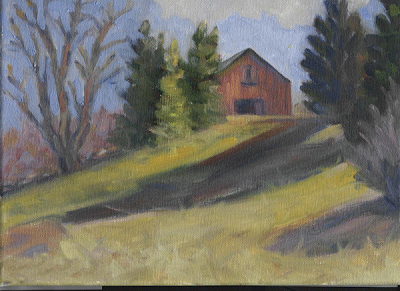
Here's is a painting sent in by a member of our studio audience. I asked for unwitting victims of this blog to send me some images to critique. I got quite a few and will return to these several more times to illustrate design principles. I want to do a post on variety of shape and the two ideas seemed to come together.

Before I tear into anybodies painting I always like to say the same few things. I am critting this painting, not you, You is you and the painting is not. It is very hard to paint a good picture and the painting above is the product of a lot of effort and experience, there is a lot right with it. I have painted pretty much seven days a week for forty years. I was painting full time when Hendrix was still alive. The fact that I can totally rework this painting, in no way diminishes the achievement and effort of the anonymous artist who sent it to me. Nor will it earn them a shred of mercy.

My job here is to find its problems and shake them out onto the floor so we can paw through them, and thereby learn to avoid them in the future. When I teach workshops people are often a little crestfallen when I find fault with a painting. I have to remember that any one painting is a whole lot less important to me. I have made thousands. If one ain't so good, how about one of those thousands over there?

The problem that jumps out at me is a lack of variety of shapes. Now I have never been to this location, so this is not about what the place really looked like. I am describing design flaws.

Design is imposed on nature, not discovered there.

If you are thinking about getting a tattoo, say, on your neck? you might consider that. Neither a viewfinder tool, close observation, or careful copying of a photo will give you good design. To have design you must think and make decisions. Some of those decisions involve variety of shape.

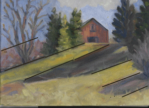
I have drawn some lines on the painting above and they show a repeated series of shadows and lights, all of nearly the same breadth and spaced equally apart.This is a fault called repeated intervals. The same measurement is happening over and over.

Repeated shapes look unnatural but that's not their biggest problem. Perfect symmetry is uninteresting because it makes a painting look static. The most beautiful painting contains an interesting and decorative arrangement of shapes having different areas and values.

SEE TO IT THAT THE SHAPES IN A PAINTING ARE AS DIFFERENT FROM ONE ANOTHER AS POSSIBLE
.

As a guy who makes a living selling paintings, my work is routinely shown on walls alongside other artists works. I want to grab that viewer and hold them as long as I can. Now I can grab their attention with violent color ( and about half of em like vulgar subject matter too). But that won't KEEP them looking at the picture. That takes design. Different angles, thrusts of line and form, interlocking shapes that weave into one another and shapes that form patterns are all interesting. I routinely "police" my paintings to see that I am not repeating shapes or intervals about my canvas.

Below I have photoshopped the painting to give it greater variety of shapes, particularly in the shadows across the middleground. I have never worked on a painting in photoshop before and I felt pretty clumsy. It was like a fancy etchasketch, or painting with a Popsicle stick dipped in electrons. I just used the brush tool in varying sizes and hacked away at it. It came out looking sort of like gouache. I know C.G. artists can do miraculous things, but I am a brush and paint guy. I can see it will be a marvelous teaching tool though. In workshop settings I sometimes will rework a students painting as a demo. The drawback to that is they no longer have their painting, and they can't see a before and after shot displayed next to one another.

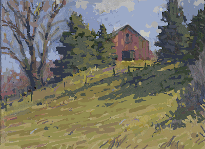
Here is what I did. I hooked all those stripey shadows together to make one big shape of them and threw lots of variety into their edges, little bits of grass sticking up, etc. I added fence posts in silhouette to get some interest into the mid ground and again to vary the edges of that shadow even more. The fence posts also cut up that light band between the tree shadows and the barn getting some of the stripyness out of that area too. The vertical fence posts also look good amidst all of the horizontal and diagonal lines in that passage. The right hand post has a support that runs counter to, and contrasts nicely with the downward thrust of the tree shadows on that hill.

I have tried to get rhythm into the line bounding those cast tree shadows in the midground. I also threw some bright spots where sky holes in the trees have allowed beams of light to pass through and enliven the shadow. This is to get a lively and interesting shape there.
I have made all of the elements in this part of the painting interlocked or overlapping. They are all tied together into a larger decorative unit, instead of each being alone and calling for our attention only to itself.

I made each of those pine trees have a different size and shape , the three of nearly equal shape to the left of the barn, have been made into two. One is large, the other small. The tree to the right of the barn is now taller and thinner, I have a fat tree over on the left so a thin tree here gives more variety of shape. The tree against the edge of the canvas has been beheaded. Again for variety of shape, now one of those trees goes all of the way, boldly out of the picture and one stops well short of the edge. I have also reorganized the overly repetitive sawtooth shapes of the sides of those pine trees making larger and smaller V shaped negative spaces about their profiles.

Then I decorated each of the large open areas of the painting with varying colors to enliven them. I am using texture and variation to enliven but not cut up the large grassy field. I put grass stalks in a vertical pattern in the lower right corner to counter the diagonal lines of the shadows. Plain flat color like a house painter uses, looks plain and flat, so I put in varying notes to entertain my viewer. Again this is another form of variety.

As best I could in my photoshop express program I made different and varying sorts of marks, thin lines and larger slabs of color and the dots that painters call pointille. That's again another form of variety. I broke up and made the clouds more lively.

I made the bare deciduous tree on the left more convincing by using more values there.The lights on the trunk and large branches are broken up so as to give variety and make the limbs look as if they pass in and out of the light as they twist towards the sky. I have also indicated the sort of hazy blur of the finer sticks and branches against the sky at the top of that tree. I also tried to get a little more rhythm into those branches and made them of varying diameters.

Finally I threw some different shades of red into the barn along with some green gray notes to dirty it up. I don't want it to look too perfect and new. That's another form of variety. Of course I installed all these things . I wasn't on this location and had no reference photos, nor did I need them. My point in the studio is to add art, not information.

Friday, March 20, 2009

More lines in the sky


There is something else going on in that sky. Another set of lines run in such a way as to establish perspective or recession. They also point towards my house and tree grouping which helps take the viewer to that area which is my subject. The first line I showed you was done for designs sake, these lines are part of my drawing, ( design is that part of a painting which is neither drawing or color) These lines are a little hard to see in the image here and not much easier to see in the real painting.The image above is the same without my explanatory lines so that you may compare the two. Oh doo da day!

As I said , I have kept the sky pretty soft. These lines are meant to be subtle. If I nailed them they would attract too much attention to themselves. An awful lot of good painting is about subtlety, the ability to subordinate things to the larger whole.

Above is a close up of a section of the sky, and below is the same close up with some explanatory lines drawn on it.You will have to look closely at these two images to see what I mean, but if you compare them you will see a smaller set of implied lines, these are sort of notches cut by negative space ( the sky color ) that do the same thing as the first set I described above.

Big bugs have little bugs ,
upon their backs to bite 'em
little bugs have littler bugs.
and so on, ad infinitum.
- Johnathan Swift

There are smaller lines implied by the negative spaces here too. They are one size smaller and "ride" on the backs of the larger perspecting lines shown above. So I have implied perspective lines on two different scales hidden in this sky. There are actually more of these than I have outlined.

Paintings often contain a lot of hidden geometry, in my case it is poolroom geometry rather than actual mathematical plotting. But there are artists who have worked with carefully plotted systems of geometric structures operating within their images. Arthur Wesley Dow was one and he wrote a book on what he called the Scotch Plaid system. He promulgated a formal way of plotting points on which elements of a composition were to be placed.

I hope I haven't confused you, this is rather ethereal stuff, I will return to it again and perhaps make it more clear. Some of these ideas are larger than a single post and I will have to spell them out in future posts. If I have you scratching your head, hang in there I will return to these ideas again. But not tomorrow. Tomorrow I shall discuss variety of shape.

Thursday, March 19, 2009

On painting the sky

image : artrenewal.org

Above is a John Constable. 1776 -1837, the greatest English Landscape painter and on the short list for the best landscape painter who ever lived. I included this picture because I wished to quote him, John said; "the sky is the chief organ of sentiment in landscape painting".

What he meant was that the first place to operate when getting feeling into a landscape is the sky. I feel a bit presumptuous putting my painting on the same post as a Constable, but it has to be done.
I would begin by pointing out that this sky is entirely made up, there is no photographic reference for it at all. I sometimes use bits and pieces of photos of skies to build my clouds but generally I prefer to make them up. It really is an abstract expressionist sort of exercise. The danger is of course you could push it around for ever, and you need to make yourself stand by your decisions sometimes.


There is an enormous rising diagonal line implied in my sky. There is one in the Constable, and a whole lot of other paintings as well. We read from the left to the right, text and usually pictures too, and a rising line feels good, exalted, positive. A painting made with downward sagging lines is depressing or melancholy. People made with downward sagging lines are depressing as well. These are generalizations that often are true anyway.

I have laid out a pattern of decorative shapes along that rising line, accents that alternately slow or accelerate our passage along it. Think back to the Metcalf posts and remember me speaking of Willard, playing the same game in a landscape, not in the sky though. The most active and complicated shapes are strewn along this line. The shapes of the clouds are larger at the top, where they are nearly overhead and then they are tiny in the distance. I also threw some warm notes in the bottoms of those nearest large clouds to bring them forward. I am keeping the edges soft as I said before.

It is best to paint all of your edges in a sky super soft (blended ) and then to selectively harden some up as accents. I also divided the amount of blue sky and clouds unevenly. I don't want the same amount of each, one should predominate. I almost never want anything divided equally on a canvas. That's way too static. What I want is an artistic and pleasing inequality of division.

Theoretically every note in the sky except perhaps the nearest cloud bottoms should be lighter than anything on the land. The sky is the source of light and the earth is the receiver. Keeping that sky up in value is almost always a good idea, unless you are deliberately catching something light up against it in contrast. That's called counterchange (now I am going to have to do a post on that as well, remind me) Notice up in the Constable that his church spire is both more colored, warmer, lighter in places and darker in others than the sky behind it. Very, very fancy stuff. Smart.

The shapes in the sky are meant to counterbalance in this instance, and always to compliment the landscape below. I have painted it as I said with a 2 inch brush so it is brushy when you see it in real life. The landscape has brushwork in it so I feel that the sky should as well. The two should be parts of the larger cohesive whole painting, in order to get....U__________of E____________. fill in the blanks, If you don't know what goes in the blanks, you either just found this blog or you need to review some. The correct answer can be obtained by rubbing the bottom third of your monitor with an ordinary wax candle dipped in motor oil.

I will leave the sky alone now while I work on the rest of the landscape, although I will post another entry telling you more about the painted sky tomorrow and probably the next day. When I have finished the landscape the sky will be dry. I will again return to it. I will scrape out any ridges of paint or eye catching edges of brushstrokes and soften things up. I may throw some transparent glazes in there to modify areas slightly and I will probably insinuate some colors from the landscape below into the undersides of the clouds. If I do it very subtly it will go unnoticed and seem natural, like a reflection from the ground. This will serve to tie the sky and the ground together as well. I also might mix a tiny bit of the blue and cloud colors from the sky into the highlight portions of the ground, very sneaky like ,almost imperceptibly. This ties the ground in with the sky and makes it look even more like the source of light on the land is the sky.

Tomorrow more lines drawn on the sky.

Oh yeah, anybody else who wants to e-mail me an image. I will critique one or two on this blog soon. I won't let anyone know whose art it is, so you have another couple of days to get your act together. This is an $ 4.50 value and you could win it, absolutely free so send me those images.
stapletonkearns@gmail.com
Thanx........Stape

Wednesday, March 18, 2009

Charleston marshes 2


Above is the Charleston Marshes painting. over the next few days I am going to studioize it. Sometimes a painting only needs a few touches in the studio and at other times it needs a lot of work. Probably no spot of paint on this piece now will still be showing when the thing meets it's frame. Sometimes I wreck' em in the studio and you might get to see that as well.

I want to scrape the surface of the painting with my palette knife to get all of the ridges of paint off of it. I can do this because it is bone dry. I stick an old Masonite panel under where I intend to scrape ( on the back of the canvas) I do this so that I don't hit the stretcher bars with the knife and cut notches into the front of my painting or leave ghost impressions of the bars on my paint. This photo is "keystoned a bit, the actual painting is square of course.

Here is a closeup of what I did next. I threw a warm mix of titanium white, gold ocher and a touch of Quinacridone red ( instead of Quinacridone my spellchecker just suggested gangrene ) onto the sky I put plenty of it down too. It is a mattress onto which I intend to throw my blue. I want this "cooking" behind my sky color. You have heard me say this before but,

THERE WILL ALWAYS BE ENOUGH BLUE IN A SKY IF YOU PUT ANY IN!


It is essential to get the red and yellow in there or your painting will be cold and dead. These colors give light, and life. put em in first, to make sure they are there. When you put the blue in, don't mix it down into the warm colors, scatter it over them allowing them to show. This is really important. Amateur painters screw up right here all the time. The used furniture stores are full of bad landscapes bearing this particular fault. I will try to make a closeup of this tomorrow to make sure you see it.

I than began to plot the parts of the clouds that are in the shadow with a gray made from white and ivory black. I vary its temperature, warm in some places using burnt sienna and cool in others using a little Prussian in the gray.

Now here comes the hard part to explain. For the rest of this process I am kind of an abstract painter. I have painted thousands of skies and I do know how they they look, but more importantly I am making an artful arrangement. What I am doing is pushing it around and trying to get designed in an attractive manner. I am applying a number of design ideas which I will explain in the next posts. There is no trick to this, its just a matter of having done a lot of it.

Where I have built up too much paint I take it out with my knife and sometimes I use the knife to make blocky corrections and cut out forms as well. All of this is going on with a huge brush almost 2 inches wide. I am paying real close attention to my edges as well. I want to keep this thing pretty softened up. otherwise my clouds will look like potatoes.


I have made these images a little larger than usual if you click on them, Blogger only allows me an image of the largest the size you see before you.

I also painted out he top of the trees and the roof of the rear house. I did this for two reasons. One I want to downsize that rear house, it seemed too big and assertive, I guess I need it, but I am going to soft pedal it.
Secondly and far more importantly, I like to paint into the next form and then paint that form back out over the sky. That keeps me from building up edges around the trees. And it also allows me to paint the trees back into a wet sky which allows me to give them a soft edge. I can blend effectively if both are wet. I need to do a whole post on just that, I have so much I want to tell you!

Here is my stopping point for the day, tomorrow I will go further into how I arrived here and probably get those trees painted back out over the sky again. I am going to dwell some on the design ideas I am applying here, because that is what makes this kind of a sky go. This image when clicked on should be large enough for you to seem more clearly. Incidentally, notice how I am influenced by the Dutch paintings I was showing you last week. There is so much to learn by studying the work of the great artists from before us,and not just the 19th century guys either. They are called the old masters not just because they were old.

Tuesday, March 17, 2009

Critique your art?


I need a day to get out ahead of the blog on the Charleston painting demo and so I came up with this idea!

Here it is: If you will e-mail me a jpeg of one of your paintings I will critique it in an upcoming post. I will of course photoshop your name off of it and I won't tell the other readers whose it is. I promise, digitally. I don't know whether anyone will send me an image or if I will be deluged with images, but I could perhaps do several if there is enough interest. I think this would be a great teaching device. My e-mail address is

stapletonkearns@gmail.com

Please put the word critique in the subject bar rather than free Rolex or one of those curious enlargement messages I seem to be getting so many of these days.

The image above is a close up of a Vermeer, "The art of painting". I am currently wearing a pair of socks just like the ones he has on in the picture. Lets notice another thing, his right hand is resting on a mahl stick.

I don't know how many of you know about, or use a mahl stick. When I first arrived in Rockport in 1983 they were so obscure that I was occasionally referred to as that artist with the stick. Times change, perhaps everyone knows what a mahl stick is now, but I will explain for you who do not. The idea is that the artist can rest his painting hand on the stick rather than putting the heel of his hand down in the wet paint. It gives a nice steady platform for doing detailed work out in the middle of a painting. I have several, but the one I use most is just an ordinary dowel from the lumber yard. Mine is 1//2 inch in diameter and 48" long. I use it a lot. I also have a screw together one I keep in my box for outdoors. It really helps sometimes, like a bridge on the pool table.

Incidentally, It looks to me as if Vermeer is starting at one point on his canvas and working out from that. His palette is probably hidden in the other hand holding the base of the stick. We don't see it because artists in those days often used quite small palettes rather than the big kidney shaped palettes that became popular later. I don't think you can see it in this reproduction, but Vermeer has a white drawing, probably chalk indicating the big outlines of his model on the slightly toned canvas.

So send me something to crit. I am excited to see what you send,and again, I wont let ANYBODY know whose art I am critiquing........Stape
image; artrenewal.org

Monday, March 16, 2009

On the marshes, Charleston


Here is a location outside of Charleston, South Carolina where I was painting last week. It was about 70 degrees out and sunny. I am of course, back in New Hampshire where it is not so warm.
I set up my Gloucester easel and stuck a 24x36 on it and went to work with a brush about the size of a broom.

To the left you see the actual scene. I will discuss briefly how I have "bent" this landscape.


I SELECT AND HANG THE VARIOUS COMPONENTS OF THE LANDSCAPE BEFORE ME ONTO A SCAFFOLD CALLED DESIGN. I INVENT THIS SCAFFOLD MYSELF, RATHER THAN FINDING IT IN NATURE.

Here is what I made. This is the result of about 4 hours of work I will document how I process this piece in the studio in a followup series of posts .
The photo shows an equal distribution of the mass of trees and houses and the water. I altered this so that there was an uneven but balancing amount of each. I am arranging the trees and houses into a large grouped mass that I will try to present as one large and interesting shape. I will need to pull these together more in the studio. I have begun to work out a sort of tracery of the trunks and branches in the live oaks on the right as part of this shape. I think the tall house in back is going to be a problem to which I will have to find a solution.

I have dropped the horizon because the big sky gives a feeling of being in the low country and is often a useful thing to do in the marshes.You will find the Dutch painters from the previous posts doing this and I learned it from studying them. They have a lot to teach us. I will continue to dissect old paintings for answers to our own painting problems as I continue this blog.

I have simplified and reshaped the sand patches in the foreground so that they point to the house and tree mass that will be my subject. In nature I felt that shape was too sharp and dagger like so I softened its thrust a little. I have warmed up the color in the marsh and pushed it away from being too green. Green is often way too prevalent in landscape painting and I do a lot of things to lessen it.

Tomorrow or the next day I will begin the studio part of my work on this painting. I will post that and explain what I am doing to it, and why.

Sunday, March 15, 2009

Beginning a painting on location


Here I am painting in Blue Hill, Maine. The hillside behind me is shown in several of Fitz H. Lanes 19th century paintings . This hill also overlooks the fairgrounds where Charlotte spun her web for E.B. Whites' Wilbur. I am always interested in the artistic heritage of the places where I paint.

When I arrive at a location I stomp back and forth in front of the scene I intend to paint. Doing this provides me with different foregrounds. As I move around, the foreground changes the most, as I catch different things in front of my more distant subject. Often I am looking for a foreground that will lead my viewer into the painting. The distant parts of the subject usually don't change too much as I do this. Eventually I find what I call the power spot.

I set up my easel so that its back leg faces towards the sun. This puts my canvas in the shade, which is essential. All sorts of problems can arise from having the sun on your painting as you work. Avoid it if you can. I don't carry an umbrella but many artists do, for this reason.

I ask myself next, "Why am I here, and not in some other place" What is it that is special about this one place? Sometimes I will ask myself "whats the name of this painting" I try then to envision the painting I intend to make. I don't do thumbnails before beginning to paint, but its a good idea if you have the discipline. As I am doing these things I have prepared my palette by replacing any of the colors that have run out and readying my brushes, mediums etc.

Previsualizing a painting is a valuable skill. If you can close your eyes and get a good idea of what the painting is going to look like, you will "pull off" a far higher percentage of your paintings and avoid some of the problems that can pop out as a painting progresses. Try to get, and then stick with plan A.

I also think about where the sun is going to go and what that will do to the landscape over the hours that I will be working there. Sometimes I can guess what is likely to happen next and that can be a big help in designing the picture. It can also help me to avoid setting up to paint a scene that will be gone or radically different shortly after I begin to work.

I then stop and silently pray to God to help me make this painting. If you are not a praying person, I suggest you take a moment to gather your thoughts, clear your mind, meditate or do whatever the hell atheists need to do before they paint.
More tomorrow on painting outside.

Saturday, March 14, 2009

Herding sheep


One of the things that I was first taught upon my arrival at the Fenway studios in the mid 1970's was how sheep are herded. Ives Gammell passed on to me a way of doing things with this analogy. This is an important idea so listen up.

When you herd sheep, you don't go get the first sheep in the flock, pick him up and carry him all the way to the barn and then return for the next .

Nor do you go get the last sheep in the flock, carry him all the way to the barn and then go back for the next one. What you do is this.

YOU LOOK FOR THE FURTHEST BACK STRAGGLER,
AND BRING HIM UP TILL HE IS EVEN WITH THE REST OF THE FLOCK.
THEN YOU RETURN FOR
THE NEXT FURTHEST BACK STRAGGLER
AND BRING HIM UP TILL HE IS EVEN WITH THE REST OF THE FLOCK.


Because you don't take that furthest back straggler all the way to the barn, and you bring him forward so he is again moving along with the rest of the flock, the whole flock moves along as a unit. You, as the shepherd are always looking for that furthest back straggler.

Here's how that applies to drawing or painting. When I am working on a piece I am always looking for my furthest back straggler, that is the part of my painting that is the least finished or most wrong. I work on that, I don't try to finish that area and then go on and finish the next area. I only work on it until it is as resolved as the rest of my painting, and then I look for my next furthest back straggler. This keeps the whole painting moving along as a unit, and it keeps me from having to connect different finished areas and finding they don't relate to one another.

As I bring each straggler forward to join the flock a new and often heretofore invisible straggler pops out to be advanced to the herd as well.The herding sheep method also helps prevent me from losing my UNITY OF EFFECT to the creation of lots of separate smaller images sewn together on one canvas.

The whole painting marches towards completion as a flock with no part being finished or ignored until it is completed. There are fine painters who work outwards from a single point to their completed picture ( like Richard Schmid who is a whole lot smarter than me ) and even some who have painted from left to right. I sometimes do these things myself. However as a basic working philosophy "herding sheep" is an excellent method. It is my default way of working and is certainly best for the less experienced practitioner.

Friday, March 13, 2009

Another two comparisons

I am on the road today so this post must be brief. I return home tonight and then tomorrow I can again return to the kind of action packed blogging you have come to expect.

I show to the left a Jacob Ruidael again a little Dutch master and below an Asher Durand and would again ask that you note the many similarities They are 200 years apart in creation but both are from the same sort of technique and set of ideas about art. What were these common ideas? More tomorrow.......Stape


images;artrenewal.org

Thursday, March 12, 2009

The Dutch comparison

Both images on this page are provided by the artrenewal.org website. They are an enormous help to me and much of this blog has been made possible by their images and I am indebted to them. Check them out, their website is listed in my side bar and they have an enormous online museum that is where almost all of the historical images on this blog originate. Here we have to the left another Jan Van Goyen. Below and on the right is a painting by Asher B. Durand,an American , who was one of the earliest of the Hudson river sch00l painters.

The Hudson river school is as you probably know where American landscape painting begins. Prior to this most of the American painters were portrait artists or made historical scenes. Like the Dutch, America had a growing mercantile class that wanted pictures of a different sort than the aristocracy in other countries.

Durand and the other artists of his generation knew Dutch painting but largely from engravings, the way that they saw most painting. It is strange to think that we know so many more paintings than these men because of the good reproductions available today. The artists of earlier eras knew far fewer works than we do and most of those through engravings which barely convey the appearance of the real paintings.

Look at the similarities of the two paintings. The way the two are arranged is very similar. Note how Van Goyen balances the big tree on the right with the small boat on the lower left. Durand uses the same device but in his picture it is a rock outcropping balancing his grouping of trees. I should point out that both L shaped designs owe a lot to Claude Lorain but that is for another of my posts to cover.

Both images are full of carefully rendered passages for the viewer to explore. Both reveal a sort of homey domesticity and peaceful enjoyment of the tamed natural world. Neither is full of crumbling ancient ruins or idyllic shepherds, mythological heroes or courtly hunting parties like the art of the aristocratic patrons who bought most of the art in other societies.

The Durand is more colored because he had available to him more pigments than the Van Goyen did a hundred years prior. If you took the more naturalistic colors out of the Durand and presented it only in the brown gravy colors of Dutch painting it would be hard for the casual observer to know that they were from different nations and times.

Both of these paintings were made in the studio from drawings made on location and assembled into idealized scenes that usually represent a combination of different places rather than, a single actual place. Their light is conventionalized and warm.

AND NEITHER ONE OF THEM LOOKS LIKE A GODDAMN WINDOW!

Wednesday, March 11, 2009

Towards a democratic art


image;artrenewal.org

As I am traveling and will be on the road home I am writing several posts at once and setting them to post automatically. They will be a little shortened and could have been one long piece. I will finish off with this sequence of "philosophical" posts in about four days and then I promise to be real nuts and bolts for a while and present more how- to information. I feel both the philosophical and the applied are of equal importance but suspect that many of you find the applied parts of this blog more entertaining. I try to alternate between the two and ask you to please read both. It may be drier and more pedantic, but knowing these things will serve you as well as knowing the working methods I am teaching.

Above is another image by Jan Van Goyen. I present these Dutch paintings in hopes of kindling your enthusiasm for this era of painting. Their has been a great surge of interest in landscape painting out there. Most of the landscape painters today are far more familiar with the late 19th century landscape painters, particularly the French and in this country, our own magnificent heritage of painters from Thomas Cole forwards. I would d like to expand your interests if you are not already enamored with the "little Dutch masters".
Beginning in about 1630 and continuing for several generations there was a great period of painting that differed from all that preceded it. This art was different because it was a:

DEMOCRATIC ART

The art before this period was made for royalty and the church. These Dutch painters made their art for a newly risen middle class. Most of their clients were merchants and successful craftsmen. That makes a big difference in their painting . Their clients wanted pictures of things they knew, the landscape, their city and streets, and scenes from their Bible, and that usually meant from a Bible they had read and not saints described to them by a powerful clergy. They wanted portraits of themselves and their wives and they wanted pictures of the shipping that built the new found wealth of their nation. They also wanted it painted in a more straight forward way than the ornate and ethereal art of the church or the rarefied, elegant world of the nobility.

Why this is important to us is that America as a great democratic nation without a hereditary aristocracy resembled this era of Dutch history. Our art has a great debt to these painters.Not because our young painters studied with the Dutch but because of the great and unique similarities between their society and ours.