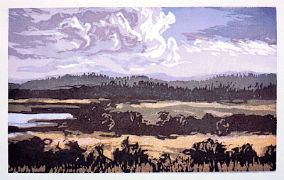
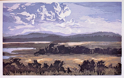
 Here are three more images I have been sent for the critique project. I have had a good response to this, perhaps it should be a regular feature of this blog. Kind of makes it OUR blog. Above is a pastel done on location and below are two woodcuts made from that pastel.
 These are very nice indeed and the artist who did them should be proud of them. There are strong things about each of them and I am unable to say whether I prefer the top or the bottom image. I like the horizontal shape with this subject, and the color of the images is pretty as well. The upper piece is of course the most naturalistic in color. The lower piece has a quiet interpretive color laid onto the same composition. I think the middle piece is less unified and doesn't hang together as well as the other two. The addition of the distant mountains to the woodcuts is nice and might have been a good thing in the pastel too.
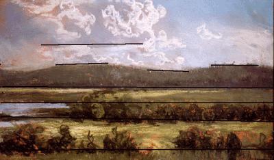
Here is what I can say about these three images that I hope will be of use. I am tying each of these critiques to a subspecies of design fault, and I will do that to these as well. They have a variety problem I call WICKED STRIPEY. Below I have drawn lines on the image to illustrate that.
 All of the elements in this design march across the painting in straight lines paralleling each other and the frame. They are stripes. This is an overly symmetrical and static design. You could probably get away with it in a single image that has as much charm as this. But if you hung a show of paintings and many of them bore this fault it would become a problem.
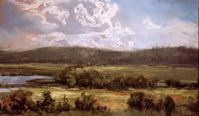
 This is the original image above. I put it here again so you could see it and my suggested corrections next to each other.
 In the image above I have pushed some of those stripey lines into a little more diagonal configuration. I tied the foreground bushes on the right into the middle ground row of trees. That should send the viewer into the painting and break up that first major field so it doesn't run all the way straight across the painting. I have also softened up the hard line of the bright field at the base of the distant hills, again trying to downplay the horizontal lines . Both that very distant field and the nearest field were the same value, so the distant field did not recede and they both called equally for our attention. One or the other needs to predominate.
I have tonight discovered another nice thing about critiquing work in photoshop rather than in the original. I can offer a second version. If I had done this to a students painting in a workshop they would have walked out, and it would have been my fault too.
So here is the heavily reworked version below. I have made every line I could into a slanting one and added atmospheric perspective to the distance. I have added more light to the sky, more drawing and color in the foreground bushes and I have made that first field much brighter and much more diagonal.I have cheated another bit of bright field behind the middle ground trees to get a little more recession there and I have pushed one of the trees up and in front of the distant hills breaking up that line. I have also put more variation into the top line of the distant hills .
 CHARM IS THE ONE QUALITY THAT WILL REDEEM A PAINTING BEARING ANY OTHER FAULT.
This little painting has so much charm that fixing its design flaws didn't really make that much difference. It was already "going over" despite its stripe problem. I hope whoever our mystery artist is, polishes their design skills without losing that friendly and welcoming feeling their in work.


4 comments:
STape,
You are the only artist I would consider sending something too ( i will ) for critique. Your very thorough and even handed approach is just what I need to get to the next level. I like Plein Air painting but I have never dedicated my self to painting outdoors consistantly until this year.
You also must be a fast typer!
I like the use of the word CHARM, very effective, makes sense.
I read all the right books and study the right DVD'S but nothing compares to my understanding than watching and seeing what you do with these critiques. This is the best way to get me to my next level. I notice how my eyes dropped down to the foreground as soon as you softened up the bright field at base of mountain. Amazing how our eyes can be directed. Clever how you tied the foreground bush into the middle ground. Could this also be done by just toning down the contrast between the foreground and middle ground. There seems to be a lot of dark contrast throughout, even though this painting has lots of CHARM, could toning down the contrast add more harmony to this CHARM?
JAMES
Thanx Frank:
It is nice to hear you say that as you are a pro. You know that I follow your blog too. "On being frank".
http://frankordaz.blogspot.com
Someday we will paint together out there on the other coast. I would be flattered if you would send me a picture to crit. Be certain to send me one with something wrong with it.I think it will become a regular but I am going to space them out. They are really time consuming. But it seems like it is a useful thing to do. I am used, therefore I am useful.
James;
you could tone down that middle ground but you would lose the big impact of the light on it. I guess its a matter of what your conception is.I felt like the painting had a fine impact as one of its qualities because of the boldlly stated values. There is so much high key outside painting these days that I like to see some darker stuff as well.
Being from New England and so heavily influenced by the Rockport painters I am less likely to paint those high key backgrounds. Out west where you might see a mountain 50 miles away their is an expectation of lot of atmospheric perspective. I think many New England painters are less likely to do that. I will do a series of posts on Aldro Hibbard soon and talk about values and using or not using atmospheric perspective.. It doesn't have to be right, you know, it just has to look good..........Stape
Post a Comment