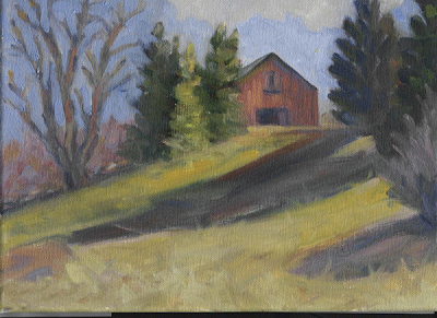
Here's is a painting sent in by a member of our studio audience. I asked for unwitting victims of this blog to send me some images to critique. I got quite a few and will return to these several more times to illustrate design principles. I want to do a post on variety of shape and the two ideas seemed to come together.
Before I tear into anybodies painting I always like to say the same few things. I am critting this painting, not you, You is you and the painting is not. It is very hard to paint a good picture and the painting above is the product of a lot of effort and experience, there is a lot right with it. I have painted pretty much seven days a week for forty years. I was painting full time when Hendrix was still alive. The fact that I can totally rework this painting, in no way diminishes the achievement and effort of the anonymous artist who sent it to me. Nor will it earn them a shred of mercy.
 My job here is to find its problems and shake them out onto the floor so we can paw through them, and thereby learn to avoid them in the future. When I teach workshops people are often a little crestfallen when I find fault with a painting. I have to remember that any one painting is a whole lot less important to me. I have made thousands. If one ain't so good, how about one of those thousands over there?
The problem that jumps out at me is a lack of variety of shapes. Now I have never been to this location, so this is not about what the place really looked like. I am describing design flaws.
Design is imposed on nature, not discovered there.
If you are thinking about getting a tattoo, say, on your neck? you might consider that. Neither a viewfinder tool, close observation, or careful copying of a photo will give you good design. To have design you must think and make decisions. Some of those decisions involve variety of shape.
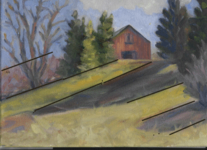
I have drawn some lines on the painting above and they show a repeated series of shadows and lights, all of nearly the same breadth and spaced equally apart.This is a fault called repeated intervals. The same measurement is happening over and over.
Repeated shapes look unnatural but that's not their biggest problem. Perfect symmetry is uninteresting because it makes a painting look static. The most beautiful painting contains an interesting and decorative arrangement of shapes having different areas and values.
SEE TO IT THAT THE SHAPES IN A PAINTING ARE AS DIFFERENT FROM ONE ANOTHER AS POSSIBLE.
As a guy who makes a living selling paintings, my work is routinely shown on walls alongside other artists works. I want to grab that viewer and hold them as long as I can. Now I can grab their attention with violent color ( and about half of em like vulgar subject matter too). But that won't KEEP them looking at the picture. That takes design. Different angles, thrusts of line and form, interlocking shapes that weave into one another and shapes that form patterns are all interesting. I routinely "police" my paintings to see that I am not repeating shapes or intervals about my canvas.
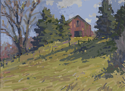
Below I have photoshopped the painting to give it greater variety of shapes, particularly in the shadows across the middleground. I have never worked on a painting in photoshop before and I felt pretty clumsy. It was like a fancy etchasketch, or painting with a Popsicle stick dipped in electrons. I just used the brush tool in varying sizes and hacked away at it. It came out looking sort of like gouache. I know C.G. artists can do miraculous things, but I am a brush and paint guy. I can see it will be a marvelous teaching tool though. In workshop settings I sometimes will rework a students painting as a demo. The drawback to that is they no longer have their painting, and they can't see a before and after shot displayed next to one another.
 Here is what I did. I hooked all those stripey shadows together to make one big shape of them and threw lots of variety into their edges, little bits of grass sticking up, etc. I added fence posts in silhouette to get some interest into the mid ground and again to vary the edges of that shadow even more. The fence posts also cut up that light band between the tree shadows and the barn getting some of the stripyness out of that area too. The vertical fence posts also look good amidst all of the horizontal and diagonal lines in that passage. The right hand post has a support that runs counter to, and contrasts nicely with the downward thrust of the tree shadows on that hill.
I have tried to get rhythm into the line bounding those cast tree shadows in the midground. I also threw some bright spots where sky holes in the trees have allowed beams of light to pass through and enliven the shadow. This is to get a lively and interesting shape there.
I have made all of the elements in this part of the painting interlocked or overlapping. They are all tied together into a larger decorative unit, instead of each being alone and calling for our attention only to itself.
I made each of those pine trees have a different size and shape , the three of nearly equal shape to the left of the barn, have been made into two. One is large, the other small. The tree to the right of the barn is now taller and thinner, I have a fat tree over on the left so a thin tree here gives more variety of shape. The tree against the edge of the canvas has been beheaded. Again for variety of shape, now one of those trees goes all of the way, boldly out of the picture and one stops well short of the edge. I have also reorganized the overly repetitive sawtooth shapes of the sides of those pine trees making larger and smaller V shaped negative spaces about their profiles.
Then I decorated each of the large open areas of the painting with varying colors to enliven them. I am using texture and variation to enliven but not cut up the large grassy field. I put grass stalks in a vertical pattern in the lower right corner to counter the diagonal lines of the shadows. Plain flat color like a house painter uses, looks plain and flat, so I put in varying notes to entertain my viewer. Again this is another form of variety.
As best I could in my photoshop express program I made different and varying sorts of marks, thin lines and larger slabs of color and the dots that painters call pointille. That's again another form of variety. I broke up and made the clouds more lively.
I made the bare deciduous tree on the left more convincing by using more values there.The lights on the trunk and large branches are broken up so as to give variety and make the limbs look as if they pass in and out of the light as they twist towards the sky. I have also indicated the sort of hazy blur of the finer sticks and branches against the sky at the top of that tree. I also tried to get a little more rhythm into those branches and made them of varying diameters.
Finally I threw some different shades of red into the barn along with some green gray notes to dirty it up. I don't want it to look too perfect and new. That's another form of variety. Of course I installed all these things . I wasn't on this location and had no reference photos, nor did I need them. My point in the studio is to add art, not information.


2 comments:
I love how you are sharing your knowledge here, this is great. And the fact that you weren't afraid to dive in and redo a painting in Photoshop having never done that before. The fact that you ARE unfamiliar with it means that I can follow your thought process, not to say that you haven't done a great job describing it which you have, but had you worked over it in paint, it would have been more subtle and we wouldn't be able to follow your ideas as well, it would simply be a great painting. (hope you follow what I'm saying here.) And also, despite the unfamiliarity with Photoshop, it is a wonderful image. I mean it is really wonderful, you made it into a really dynamic painting. Hopefully the person who was brave enough to submit to this will be happy in what he was able to learn and gain from it and apply it to his own painting which he should be very happy about.
Anyway, I'm really enjoying your blog and find it very rewarding, I'm learning a lot. It's like being able to follow along with Edgar Payne.
Thanx Walter:
I am afraid I am hardly in the category of Edgar Payne but I have better web skills.Think what he could have done on a blog!
Sign me up for John Carlsons blog too.I think he writes in dos on an old Tandy computer.
The artist whose image I used took it magnificently. I have been worried about that. I think that is the risk in doing this, but I it really does solve a problem for me in getting examples to use for criticism and it does give a private crit to one of my readers.Sooner or later I will freak someone out,I need to get a disclaimer going of some kind, like;
Caution! Stapleton MAY be critical of your work., and exhibit other unpleasantness!
Incidentally I am working out the niceties of linking to Amazon so I can use their books, to do posts on classic art instruction texts. Coming soon.
There is just so much to write. The more I write the more I see that could be written.
I was photoshopping another as your comment dropped in.It may be you will see a growth curve on my photoshop ability, although tonight I am tired having painted all day and I want to keep this project simpler.I am not really out to be a master of CG. I just need to get my point across. The last one was a whole lot of work............Stape
Post a Comment