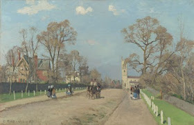
 The Pissaro above, from artrenewal.org is an example of a painting that has been keyed beautifully.
The lights are low enough in value that they still retain color rather than going to chalky glare, yet the entire painting has a delicacy and ethereal lightness. Pissaro has keyed the road just low enough that he can operate in values above it to paint the church and those fence posts on the right . Notice the figures and even the architecture are arrayed in a decorative band across the middle of the image.
I was reminded by a reader that I have written about keying a landscape before. I am pushing 600 posts and I don't really remember all that I have written. Here is a reprint of that information.
Keying a painting is setting the range of light to dark, and where the different elements will be placed on that value scale. Generally this is done by establishing the values of the sky and ground, and hopefully, something like a tree or a hill where the landscape meets the sky. The difference between these is how the key is first established. With the introduction of a few dark accents and a higher note in the landscape, you have layed out the gamut of values that will be used in the painting. Note I am talking about key as it relates to values and not as the set of colors used to make the painting. I could key a painting in black and white.
Imagine a set of ten shelves with each shelf representing a value in our scale of one to ten. If the elements of the landscape are the toys scattered about on my playroom floor, key is how I pick them up and order them on those shelves. I might for instance, put all of my toys on only the middle four shelves. Or I might put one on the top shelf and all the rest on lower shelves, but none on the bottom shelf. I can put those toys in any arrangement on those shelves I want, using all of the shelves or only a few. But I decide. The toys don't tell me where I have to put each of them.Toys are not good decision makers.
I paint in a relatively low key. That means there is more colored pigment in my lights . If I were a high key painter there would be a lot of white in my notes in the light. Most outdoor painters work in a pretty high key so this gives my work a little bit of an unusual look. By lowering my key it enables me to keep more color in my lights, because I am not using so much white there. Much more on this later, but I mention it because I am a bit out of the usual in the aspect. It is important to find how YOU like to key your paintings. I point this out because I want to teach you in the broadest manner I can, that is, how to do things, rather than HOW I do things. Much of the time what I do is pretty universal, but in key I am a little out of the ordinary, so there's a heads up.
There are several large themes running through this blog and one of them is the idea of observing, thinking and deciding. Here is today's version of that.
YOU MUST DECIDE HOW YOU WANT YOUR PAINTING TO BE KEYED, RATHER THAN SIMPLY TRANSCRIBING THE VALUES PRESENTED YOU BY NATURE ON THAT DAY.
So keep in mind that the sky is the giver of light and the landscape merely the receiver of light. You are the designer of the painting, not nature. Arrange your lights and darks to make an effective composition, rather than having the same biggest contrast at the horizon installed automatically in every picture you make. The eye is drawn to contrast, if your biggest contrast in a painting is always in the same place, all of your pictures will arrest the viewers eye in the same place.
KEY IS, LIKE EVERYTHING ELSE IN A PAINTING, SUBJECT TO THE MACHINERY OF DESIGN. YOU CANNOT OBSERVE DESIGN INTO A PAINTING.
A handful of people have expressed an interest in a California workshop in the early fall. I think I probably have the nucleus of a class. If you are interested e-mail me. This does not commit you, of course, but it does allow me to measure the interest out there. I like this idea, I would love to come out and do my thing on the other coast.
This is a great post. Six years of art school (eons ago when only conceptual art was cool) and not one mention of this. The Pissarho is exquisite.
ReplyDeleteLucy;
ReplyDeleteMy art school was the same way.I think Pissaro is my favorite of the French impressionists
......................Stape