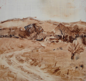
 Here are better graphics for the road post I did yesterday. Above is the road jammed up against the edge of the canvas. As you can see it is an annoying distraction. The eye follows it and is directed nowhere.
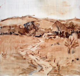
 Above is the road again, leading the viewer into the painting and to it's subject matter. Of course there are a lot of variations on this design , but the idea is not to dump the viewer into the side of the painting.
This road is whats called a LEADING LINE. A leading line is the main line of a design that leads you through the painting. Not all designs have them of course, but many do. There are few absolutes in the design game, but many examples of better and worse.
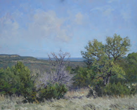
 Above is a painting I made yesterday, its a 16 by 20. I will probably fool with it in the studio, but just to clean up a few edges and drop in a few highlights and a few accents.
Beautiful painting, Stape! Thanks for the "road" to better knowledge.
ReplyDeleteFantastic painting !!!! And thanks for the fix of the dumb design.
ReplyDeleteTo me, though, that dump of a road still leads my eye back to the village/house, because it turns around and connects to the center. It seems to me it'd be worse if it just kept going off the canvas and never reconnected.
ReplyDeleteI think you just forgot how to paint bad. You'll have to practice.
Stape, nice painting!
ReplyDeleteGorgeous painting. Put it into the museum right now.
ReplyDeleteI actually like the first road example.
I LOVE stupid design examples-
ReplyDeleteplease continue and raise up our intelligence.
Also....I see green arriving through the dead leaves of Vermont and in your paintings. Any time you want to address stupid greens vs. your very restrained and delicate ones, I'm downloading. Thanks,always.
Love the painting Stape! Those clouds look great!
ReplyDeleteLove the balance of colours and composition Stape!
ReplyDeleteSolid painting, done in one day too.
ReplyDeleteVery sobering but encouraging for a slow painter like me.
Nice painting Stape. A bit off topic, but your lay in's in the post reminded me I wanted to ask if you're still using that Red Lion Polyflax and if you still like it? Thinking of trying it..
ReplyDeleteStape, I prefer the shape of the road in the first one better. That quick S bend in the second feels too abrupt to me personally. The more generous radius of the first feels nicer, it ambles. I think it just needs about 2 or 3 more inches on the left!
ReplyDeleteBeautiful painting! I think I need to dissect it in grayscale.
land;
ReplyDeleteThanks.
............Stape
Antonin;
ReplyDeleteThanks.
............Stape
T. Arthur;
ReplyDeleteOh no! I still paint plenty of bad!
...............Stape
Philip;
ReplyDeleteThank you, sir.
..................Stape
Lucy;
ReplyDeleteI will make the next example dumber.
............Stape
Clarkola;'
ReplyDeleteI don't think I will be in Vermont soon.
................Stape
bill;
ReplyDeleteThanks, I made therm up, the sky was actually clear.
.........Stape
rahina;
ReplyDeleteI, myself, am unbalanced.
..............Stape
Steve;
ReplyDeleteThanks, actually I went out on two consecutive days.
.............Stape
MCG;
ReplyDeleteI am not using the polyflax as I decided its surface was too hard.
...............Stape
John;
ReplyDeleteIt is necessary to kill something before you can dissect it.
..........Stape
Stape,
ReplyDeleteA fine landscape painting! Is the subject at the Cape? (Looks like maybe dunes in the background.)
Oh, Stape! It is absolutely fabulous!!!! I'm telling you, not every artist can grab the essence of those oaks, but you nailed it!!!! I am so sorry I haven't been more available, my schedule has been insane.
ReplyDeleteI am so glad you are painting the area, though. Gorgeous!
Great painting. It reminds me of the Texas Hillcountry. Also, really appreciate the post on "roads" as a friend and I just had that conversation -- I've forwarded your blog on to her...
ReplyDeleteThis painting looks like young palo verde trees in the foreground of a sonoran desert paintng .
ReplyDelete