Wednesday, August 31, 2011

shapes and masses kept large


Maynard Dixon, The Forgotten Man

Here is a question I received lately.

Bullet #2 about shapes and masses kept large, is something I want to make work for me better- can keeping the value the same within the mass, and keeping lines soft, enough to get a bunch of little objects read as one unit?
Ms. Prim N. Shrivley

Ms. Prim;
Keeping your masses simple and your shapes large is one of the skills that develops over time. It is part observation and part installation. It results in a breadth of vision that can please the viewer with clean design and lend dignity and import to subjects that are mundane or commonplace. Here are some bullets;
  • The idea is to subordinate the smaller variations or details to the larger shape on which they ride. Look at the Maynard Dixon above, if you squint at the mans jacket you will see that it is really just a small light area and a big dark. Notice the shadow of the lapel and the shadow next to that where the sleeve sits against the side of the coat. Those deep shadows are only a little different than the area around them. They have been subordinated to the larger shape of the jacket shadow. The passage says DARK JACKET with shadows, rather than, dark jacket WITH SHADOWS.
  • This is a matter of emphasis. You can look at any scene in two ways, piecemeal, that is as an inventory of its parts, or you can see it broadly. Seeing broadly detail is minimized and the whole scene is apprehended in its entirety. The first time I was told about this I didn't get it at all. I eventually learned to apply it, but for me it was a long process. Ives Gammell (my teacher) used to tell me, don't look into your shadows. He meant to get the "big look" rather than scrutinizing the variations within the shadow field.
  • Squinting will simplify the the shapes in a scene and help you get the idea BUT, really this is a convention. This is a deliberate simplification of the little stuff in order to sake the big stuff dominant. Any time you paint details you can imagine turning down the volume on them a little.
  • Connecting lights and connecting dark shapes are both ways of helping along the "big look".
  • Look again at the painting up top, notice the marching trousers behind our dejected hero. See how simplified they are? They are just lights and darks, in all of those pant legs and skirts there is one (1!) fold. There is nothing there to hang up your eye. This gives the painting an artful look. Vision is busier than this. This formalizing and distancing makes the image read as something special, an altered more acute and discreet vision.
  • Edward Hopper used this all the time. Below is "Earl Sunday Morning". This picture has had the hell simplified out of it. There is nearly no detail. Look at the awning in the middle of the painting for instance. It is just a long shape. there are no folds or details within it because Hopper left them out. There are no little brick details in that facade either.
I will return to this subject again in my next post.

Tuesday, August 30, 2011

A Gruppe and some fast food

Here I am again, blogging from McDonalds. Maybe tomorrow I will have my internet connection back. I am going to shoot some bullets at this Gruppe painting.
  • All off the greens and blues are pthalo of course, the green grass at the foot of the barn, the foreground shadows, even the deep color of the pines at the right.
  • All of the shapes and masses are kept large, that is they aren't chopped up with distracting, interrupting details. Every nuance within the shapes is subordinated to the larger shape. That is , when you look at it you see the big shape and THEN the variety within in it.
  • The trees are handled as a blur of fine sticks against the sky. Both have to be wet to do this and it takes a bit of practice. I always liked that effect though and have painted a zillion trees that way. This is more a convention than something you will always observe. It is a simplified explanation of what is actually seen.
  • The big squared off shape of the sky as it descends above the pine tree at the right makes the sky the positive shape. It is painted over the trees and makes the sky the "big" shape. This curving, thrusting form also brings the viewers eye around that corner and down towards the river. Gruppe does the same thing again to the right of the barn roof.
  • Notice how Gruppe has linked all of the light shapes of the rocks beginning at 9:00 and continuing along the stream into the picture. The upright trunks of the trees are tied into that series of shapes too.
  • The dark pine next to the barn's roof and the pine that "ends" the stream bracket and close in the illuminated tree and barn "punchline".
That's about as much McDonalds as I can take. Be back soon.

Monday, August 29, 2011

WHEN I GET SCARED

Emile Gruppe

I am typing away in a MacDonalds, The hurricane didn't much any damage here, lots of rain, a little high wind. I still have power, many people around here don't. But I did lose the internet.
I am writing a post on the picture above, if the internet is willing I should be able to get it out tomorrow.

I should throw something of value out here tonight. Lets try this;

WHEN I GET SCARED I DROP BACK TO A THREE COLOR PALETTE.

As you all have seen my palette in previous posts, I won't list my colors, but I have both chromatic and earth colors on my palette. I am not requires to use every color on the palette though. Embedded within my palette are several smaller three color palettes. For instance I could use cadmium yellow, cobalt blue and cadmium vermilion. Often when I decide to use just three pigments I move them in front of the other pigments to remind myself I am only using these three.

When I am floored on how to paint something, at least its color. I will simplify the problem by only using three colors. It makes a smaller problem because there are few choices to make and the notes I do make are easily repeatable. So When I am stuck or just "getting killed" out there. I switch down to a smaller palette.

Gotta go the Macdonalds is closing. More soon.


Thursday, August 25, 2011

A Gruppe painting discussed

As long as Emile Gruppe has surfaced I think I will talk about a couple of them. Emile is one of the artists who from about the 1920's through the late 70's was one of the most sucessful and well known painters of the Cape Ann school. The other "big guy" was Aldro Hibbard. Although I like Gruppe well enough, he is eclipsed for me by Hibbard. The Gruppes seem a little "quick" for my taste. But that is what they were about, and people who like Gruppe like him for that reason.

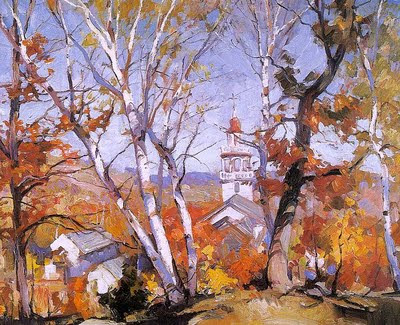
Gruppe was a splendid designer and pattern maker. The autumn scene is of the Congregational Church in Rockport, sometimes called "Old Sloop" church. The big dark tree on the right is balanced by three or four lighter birch trees leaning away from it at the opposite angle, on the left. These trees include a pattern of darks against the brightly colored midground. Gruppe has used counterchange all over this picture, setting the dark parts of the trees against the light parts of the sky and on the left darkening the sky so the white birches are boldly relieved against it. The strong darks make the colors "pop". A strong shadow is usually called for in order to get a strong light. It is the contrast between the light and the shadow that makes the picture "pop. This pattern of darks is liked together into a web like net thrown over the midtones of the distance.

The strongest and biggest dark (on the right hand tree) is placed next to the church, which gets our attention to that area. Sometimes artists call that a tonal climax, the darkest dark and the lightest light are placed together at the subject. It is a useful device sometimes.

The foreground and the base of the tree look to be painted in the mixed "umbers" that I mentioned last night. They contain all three primaries. The foreground grass looks like it was painted with ocher, but Gruppe used no earth colors, so it was mixed from chromatic color.

I wish Gruppe had taken a ruler to that steeple though. Gruppe lovers don't care, but that would bother me if I owned the painting. Its lean would haunt me. The bottom left corner of the lantern (that part of a steeple) needs to be kicked out a little to look "square". Gruppe was an excellent draftsman, I just think it wasn't important to him. It is that sort of thing that puts me off Gruppe sometimes. I never have that problem with a Hibbard, he adhered to a higher standard in his drawing.

Notice the repeating gables of the buildings across the middle ground. They have a relationship to one another that is rhythmic. The repeated shapes differing in size and perspective give a jaunty bebop sort of a feel.

One of the advantages of painting loosely as this is that you can get away with a lot of arranging. The more literal you are, the less poetic your arrangements will be.

YOU CANNOT OBSERVE DESIGN INTO A PAINTING!

In order to have rhythm and design in your painting it is necessary to push it around so it has those things. They will not mysteriously appear , they have to be consciously installed. A meticulously rendered highly accurate rendition is often arrhythmic.


Wednesday, August 24, 2011

The Montana trip and some remarks on Emile Gruppes book and palette

Above, Emile Gruppe

I have returned from a week in Montana. I was a guest artist at the Western Rendezvous of Art. I met a lot of really fine painters that I had long heard about but never met. A few of the artists I met were, Matt Smith, Josh Elliot and Ralph Oberg, I also met Robert Lemler and John Potter. There were a lot of fine paintings in the show, and we had several large banquets together that provided an opportunity to talk to each other. One of the days was a paint out.

I stayed in Montana for a couple of days after the event and painted with two blog readers who had come a long way to meet me. I took them each out for a days lesson and painted myself too. I really enjoy meeting, and when I can helping the readers of this blog. I am used, therefore I am useful!

One of you contacted me and asked if I was going to do a fall camping workshop in Acadia this year, I dunno? Maybe I should, any interest out there? If you are willing to camp, this is by far the cheapest way to take one of my workshops as camping is very cheap. I like the camping part of that workshop. We hang out till late at night and drink tonic.
There are motels nearby too for the fainthearted.

A reader wrote
Hi Stape,
I am reading Gruppe on painting. He explains that yellow is warm, red a modifier and Blue cool.
In his palette he has a cool and a warm for each primaries. He also says to not introduce a warm yellow into shadows. Until then I have no problem.
My understanding will be to use the cool primaries for the shadows and the warm primaries for the light and never mix a cool primary with a warm primary but ...
When he shows how he creates complements with his palette (see attached) I start to be confused. For the green he uses phthalo blue with lemon yellow but lemon yellow should be the cool yellow. But I can understand that any yellow can be considered warm .... I guess. He goes on with umber and that is confusing. He mixed the cool purple with madder or cad red or cad orange ??? Cad orange has a warm yellow in it ! ??? (but maybe it works because red a modifier)
If I had to do cool umbers I would use ultramarine, madder and lemon yellow (cool yellow). And for a warm umber I would use phthalo blue, cad red and cad yellow.
How should I think to make Gruppe's palette work ? HELP !!!! Thanks !
....................Larry Mantlebiter Jr.

Larry;

Whoa! you are losing me. I think I will just talk about the Gruppe palette a little and offer one possible answer to your dilemma.

Emile Gruppe ( 1896-1978) was one of the best known painters of the Cape Ann school. He kept a studio in Gloucester for many years and was known for his rapid style of painting. A major influence on many New England landscape painters, Gruppe is best known for his harbor scenes with fishing boats.


As you can see from the chart above, Gruppe used a relatively small chromatic palette. That means it contains only pure colors, no earth colors. I have used this palette a little in the past, but not extensively. This palette contains a warm and a cool pigment in each of the three hues, red, yellow and blue. If you want punch in your colors, this palette will help. If you have been using a three color palette, this might be an interesting way to expand your choice of colors

I think you should chart your colors. Richard Schmid explains how to do this in his book "Alla Prima". Here is a basic description of how to do that. On a piece of Masonite or canvas about the size of a place mat, lines are drawn to divide the surface into as many columns as you have pigments. Here is a link to a blogger who has written about that and explains it well.

If you "chart" your colors you will then know all they they can do and I think it will answer your question and any others you might have. With a relatively small palette such as this charting it should go more quickly.

There were once three Gruppe books. I have them all, but they are out of print except for one. I have posted a link to the one that is still in print below and a link to a used copy that is affordable. These are excellent books.

Gruppe talks about mixing "umbers" from this palette.He does this by mixing compliments together. He believed that making your own "umbres" gave you more interesting and varied grays and taught you more about mixing than actually having dulled earth colors on your palette. I don't use umber, but I would miss my earth colors. If I had to choose:

I WOULD GIVE UP MY CADMIUMS BEFORE I WOULD GIVE UP MY EARTH COLORS.

The Gruppe on Painting is a restrike and while its quality is acceptable and you can learn from it, the older original book like the one above it is a better printing. The Gruppe books contain a large assortment of his paintings and even if they were not excellent as art instruction they would still be valuable on that count.


Thursday, August 18, 2011

Some comments responded to and a mentor's advice

I am writing this from a motel room in Helena, Montana. I am here because I am a guest artist this year in the Western Rendezvous of Art. The painting above is my piece in the show. I had a dreadful flight here, That went on for two days but I arrived last night so tired I was staggering. Now my days and nights are reversed it is after midnight and I just woke up. I love to travel and do it a lot, but sometimes it is disorienting. Hotel rooms are a great place to write blog posts, I have no distractions and no studio in which to work. As you all know, if I am awake I am working.

I think I will tackle a couple of the questions from recent comments, comments are often the impetus for good blog posts. I was asked several times about my formula for Pornstar Pink. I use
quinacridone red and pyrrole orange and flake white. Willamsburg's Persian Rose is very close but theirs is made with quinacridone violet and zinc white, I think. My Pornstar Pink is a little more electric pink, but if you want to try this color that is what you should buy.

I also received this comment;
Thanks Stape, but must staunchly disagree with you on your art and do nothing else philosophy. I have been a health practitioner for 30 years--get balanced man!!, exercise, eat well, relax, etc. I was a workaholic, going into an early grave. Terrible cholesterol, prediabetic, etc. and I quit, began eating well and exercising and taking time off. Hope this view gets across that you don't have to kill yourself to be a successful artist. Paint 5 hours a day, do yoga, meditate, take a vacation, have a balanced life and be successful artist too. Sorry, just my point of view.
................Pastor Defenses

Dear Pastor:
Does it seem a little ludicrous to you as a health care professional to advise a successful artist on how to be one? For many, even most people that is sound advice. But there is a level of performance and ability that cannot be achieved with that level of commitment. It all depends on what you want from your art. This is incidentally true of most of life's endeavors not just painting.If you want your art to be something that you do for a fuller life or are gainfully employed elsewhere that sounds like a good plan. BUT if you want to play in the major leagues, five hours a day won't take you there. The players at that level work incessantly and you won't operate at that level working part time. If you are in your twenties and have no children and no mortgage as I did, it is possible to concentrate on getting your "chops" together. Real application at this age when learning is easier and distractions are fewer will build a foundation that allows you to concentrate more on what you are trying to say later, rather than the mechanics of saying it.

Retired people who take up painting never catch up with those who have spent a lifetime honing their craft. I know that sounds hard but I believe it to be true and not heard very often in the popular art press. If you take up painting late in life and work at it only part time you may become a strong amateur painter, but you will not become a real case hardened pro. You might even put together a successful art business, but there is a level of ability that is closed to you. If you think about it I am sure you can summon up a list of the names of those who play in the upper brackets.

I am thinking about hiring someone to do yoga for me. My body is only a shopping cart I push my mind around in. I did drop 45 pounds since May though.
.....................Stape

I was advising a friend recently, as I mentor a few people. I recommended that they pick a favorite painter, for them it was Willard Metcalf, but it could have been almost any painter who was first rate and then learn to work in that artist's style. This is a step beyond copying a painting by that artist (which is a good learning tool also) because it makes you really understand how an artist thought. I suggested that they go to a location and try to make a Willard Metcalf out of it. My intention was not they they become an imitator of Metcalf but that they thoroughly examine one way, a good way, of doing things. That gives them a sort of baseline. When confronted with a painting problem they will know at least one approach to solving it.

Thursday, August 11, 2011

A tool for smuggling red

One of the continual problems for the outdoor painter in the summertime is the color green. Green is everywhere. I do a lot to replace it or shade it towards red to tone it down. I often push my greens towards olive or ocher or heat them up or purple their shadows. I don't want to make paintings that are green all over, so I smuggle red. There are three colors, blue, red and yellow. Green contains blue and yellow so I want to use as much of a different color from those two as I can . That leaves red. So I smuggle reds. That is, I try to sneak it into my greens to "step" on them and get greater variety in my color rather than green, green, green.

I am particularly wary of a certain green that occurs everywhere in the lights during the summer. It is a high key chartreuse color most easily made from a combination of lots of white, plus viridian and some cadmium yellow light. Note I am not talking how to "hit" a given color outside. I am talking about modifying or even replacing the actual note of nature with something I think will make a more attractive painting. You have heard me speak of design a lot, here I am designing my color. Sometimes I want my paintings to be the color of 500 dollar suits. High key lemon greens are not something I would want in my suit.

I make up a custom color for myself that I think of as the anti-green. I call it Pornstar Pink. It is a hot pink with indelicate overtones of chewing gum and feather boa with a hot undertone that is nearly biological. This cheap lingerie color is the opposite of the green outside, and is the antidote. I can throw it into any of the mixtures I use to make greens and it will reduce or "step on" that green. I feed it into the painting here and there to "smuggle reds".

Painters I knew years ago sometimes carried tubes of "flesh color" into the field. They would never have used "flesh ( now I believe it is labeled "Caucasian flesh") in a portrait but it was really handy out doors. My homemade mixture, Pornstar Pink is a lot more vibrant than the old flesh color but the idea is the same, a red modifier pigment. In the winter this is a good color to have for painting snow, too

When I make this color I tube it not only for myself but for a friend or two who liked mine when they tried it. So I make about a quart at a time. I have experimented with it for a number of years and have arrived at a formula that works for me. But you probably don't want to tube paint, so there is this, Williamsburg Persian Rose

I started out using Persian Rose and then formulated my own version over the years from a mixture of precursor pigments I buy from RGH, my paint supplier. Their link is over in my sidebar.
------------------------------------------------------------------------------------------
Snowcamp I my winter painting workshop in the White mountains is filled. I have a few a spaces left in Snowcamp II. If you want to come click here. If that fills, maybe I can do another session, I don't know.

Sunday, August 7, 2011

John Pike


Here I am again. Thank you for tolerating my reduced schedule on the blog, again I am not going away, just spacing things out so I can paint more. I wrote almost a thousand posts in a row without missing a day. I need to adopt a less driven system for a while., but I may return to that when winter comes. If you are new to reading this blog, I would point you towards the archives. I began this with the intention of writing down everything I thought an artist ought to know. That turned into a big project. The first 400 or so posts are like an art school, I started with the materials and worked outwards from there. If you want to get the most from the blog I suppose the best way is to go back to the beginning and read forward from there.

The blog has been described as a rabbit hole. There is no good way to know what is in it in order, but a reader is working to build an index to the site, an enormous task, and I am grateful to him for undertaking that effort. When it is ready I will post a link to it. I am afraid it will take him a very long time.

John Pike was an American watercolorist, who was born in Boston in 1911. Pike was a student of Richard Miller, and Charles Hawthorne. Pike did a lot of magazine illustration and ran a watercolor school in Woodstock, New York, the same town as John Carlson's summer extension of the Art Students League. He died in 1979.


I bring John Pike to your attention because he wrote a wonderful book on painting, "John Pike Paints Watercolors". There is an Amazon link below if you want a copy. I have read my copy many times. The book was originally published in 1978 right before the authors death.

Pikes paintings are far less direct than my own work, he is a broad watercolorist. There was a school of American watercolor that existed up until about his death that had a look to it and many practitioners. Someday there are about 10 blog posts to do on that, but that is a ways out there. Many of them were from California, although Pike was not. Watercolor now seems to be a drug on the market ( I always wondered why that means hard to sell, you would think the opposite) and few of my galleries show them anymore. The best watercolorists I know are now painting in oil. I am sure That is cyclical though and watercolor will come back.

As I am exclusively an oil painter it might seem odd that I am recommending a watercolor "how to" book. But this book is useful to anyone painting in any medium. The book is mostly demos.
Each of the demonstrations in the book begins with the charcoal drawing from which it was made and most of the plates are in color so you do get a good look at how the paintings were made.

Pike shows how he progresses from sketches to the paintings which are done in the studio from them. The second half of the book is a gallery of his paintings, and he was very good. The paintings are in a style that seems a little dated today, but they are very well done and if there were no art instruction in the book I would recommend it on the strength of his art. I have little interest in books about painting by people who don't do it well.

This was in the comments from the last post. I thought it was great and am posting it here.

Maineland
said...Something that works for me. I make all my appointments on Wednesdays. Dentist, hair cut, car repairs. I used to do this for environmental reasons now that and so I don't have to cut into studio time.

THERE is a great idea. Thanks Maineland whoever you are. That seems so obvious. If I had to guess, I would guess that this is an idea from a mom managing small children a home and operating on a tight budget. They are a special class of experts with expertise in time management and accustomed to the challenge of pecking away at tasks that are open ended and larger than can actually be accomplished.


Wednesday, August 3, 2011

Time management for artists

I received this e-mail:

I think a lot of us, especially if we are doing this full time, have difficulties in managing our time properly. Its difficult to organize a day when there are 20 things you'd like to paint, emails to respond too, late night deadlines that screw up the next days plans, people knocking on your door thinking that because you are a self employed artist and don;t punch a "normal" clock, you don't have any proper responsibilities and can drop anything you are doing because someone needs a favour. We have commissions to handle, money to manage, shows to submit to.
Some of us (me ) actually live in the studio so the line between what is work and rest gets blurred easily resulting in nothing really getting done. Some have rolodexes, some have schedules, "to do" lists that they make before they go to bed, big charts, or keep everything in their head.
What are some of your tips, and what have you learned to avoid throughout your career? Any pitfalls we should watch out for?
.........................a European friend

I am probably the last person to speak on time management. I get a lot done, but I am not orderly. My trick is that I work all the time. From when I get out of bed in the morning till I go to bed at night I am working. I have been doing that for almost 40 years. It works, at least in the long run. I sometimes am talking to a student in a workshop, or one of the people I mentor, and I realize that they think that any one day is going to make such a difference.

I have known many well organized
daybook planner types who migrated into the art from the business world, and I haven't noticed they had any great advantage. The race is very long and won by those who get up and run every morning till the light fails. So the short answer is


IF YOU WANT TO BE AN ARTIST, HERE IS THE SECRET. GET UP EVERY DAY, AND DO IT ALL DAY.


I am not well organized, forget to write stuff down and would rather paint than do all of the the things that those creepy books written by career counselors recommend. But I guess I can come up with a few things.

  • Find Earl Nightingale and study his material. Here is a link to a post I have written on that. I am not a devotee of self improvement literature. Earl is different.
  • I often carry an index card in my left pocket with five things that I want to get done during the day. I check them off as I go.
  • I avoid making appointments. I want to paint, not meet with people so I try to keep my schedule freed up. I will obsess about the damage to my work schedule caused by an hour long appointment sometime next week. If I have an appointment during an upcoming day, I look at that day as lost. I try to get as many things done after the light fails as I can, grocery shopping, laundry, family etc.
  • I have no hobbies, I don't play or watch those sport things. I don't play video games or Farmville (whatever that is).
  • I don't have a television. If you watch two hours of TV a day and wonder why you are not making it as an artist, you are kidding yourself about the size of what it takes to do this.
  • I don't seek to earn money from other sources than my art. I don't own a rental unit nor do I buy stock, I am afraid it will divert my attention from my work, part of which is to make a living. If a dollar comes into this house it has to be from the art. I don't do jobs or employment.
  • I have a a mental list of my contacts the people who are my dealers and fellow artist travelers. I call them routinely and check in. Speaking with my friends who are professional artists who are also at their easels helps. I have about a half dozen of those, and talking to them helps me build a model for my own efforts. We are working together, separately. Their lives are very like mine. We provide emotional support for one another. You need to have a network of people who you want to be like. I have that in spades, very important to me. These are successful painters, you would know their names. We become like the people we hang out with.
  • I keep mental track of my time at the easel. Doing business things, talking on the phone, etc is all essential but it is not time spent on your art. You have to account for it separately.There is a lot of advice for artists out there on business management, most of it written by people from the business world who want to help us spaced out artists. I know a few artists who do all that stuff too. Often their work takes on the same quality though. It is real important to put your art first. ALWAYS THE ART COMES FIRST. Then worry about marketing it. Good art will sell. I don't mean to say that you don't have to do all of that phone calling a list keeping, but it is not as important as the art. I know a very successful artist who has no e-mail, no web site and no business card. He does do the phone a lot though.
  • I use Google calender it is on G-mail. It notifies me before appointments and I can look in there and see what is coming up. Many computers are sold with calender and event programs and you probably have one.
  • Once a month or sometimes more often, I call all of my dealers. I don't do it to ask if they have sold my work. I do it just to talk, I need to work with friends. If I can't be friends with a dealer usually things don't work out.
I will think about this some more and see what else I can come up with. I will do a post aimed at the serious amateur who has to have a life outside of the studio, which I don't.