Wednesday, September 28, 2011

More fiber

The Wave by Alexander Harrison

I was asked "what pigments did the artist use to get such luminosity ?"

I don't think it is in the color. It is in the drawing. When I say drawing I am not restricting that to line drawing, there is also mass drawing. Somebody once said

DRAWING IS THAT PART OF PAINTING WHICH IS NEITHER COLOR OR DESIGN

Below I have reproduced the painting in black and white, and it is still luminous. A large part of why this painting looks as it does is the great delicacy with which the edges are handled. Edges are a part of drawing, not color incidentally.

I remember Ives Gammell telling us :

THAT WHICH IS WELL ENOUGH DRAWN WILL BE WELL ENOUGH COLORED!
Harrison could have used a different color scheme, such as rose or poisoned gimlet and the painting would still have been luminous. Ives also used to say;

COLOR IS A DECORATION YOU HANG ON YOUR DRAWING!

If you can draw the thing, color it is the easy part. Academic or pre impressionist paintings were often executed in a single tone or in black and white, sometimes called dead color, and then the color was glazed over that. Most of you who read this, are I suppose, landscape painters and are aware of, but unacquainted with those older methods. There is no reason that you have to work that way either, but the men (I know, and women, from here on out the word men will signify not gender, but membership in the species homo-sapien, lighten up, jreez!) who worked in that method clearly understood the importance of drawing.They got the drawing on the canvas, and then dealt with color.

It is no less important in an impressionist painting, but those of us who work in "straight paint" can be less aware of it as we work in colored paint executing both our color and our drawing at once. Below is a black and white of a Waugh. I have a huge collection of 8 by 10 photos taken during Waughs day of his work.

Below in this lousy cell phone photo is a set of gradated tones prepared with ultramarine, titanium white and ivory black.

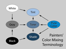
Remember long ago I wrote about tints and tones and shades? Below is a little chart that explains the difference. Since I have both White and black added to the blue, these are TONES. When painting seascape I find it very useful to have a premixed set of shades like this to work out the water. I can draw the thing out with these and then "inject" my color into them.
Saturday, September 24, 2011

A seascape lesson, from Charles Vickery

painting by Frederick Waugh


Twenty or so years ago I had the good fortune to know Charles Vickery (1913-1998). Charles was a very fine seascape painter, the best I have ever known. I think that in his era he was the best living seascape painter, following the death of Waugh. He came into my little gallery and painted a demo seascape at my easel.When he taught a three day workshop at the Rockport Art Association, I took it. Somewhere I have the notes that I took, I have looked for them many times and never been able to find them. I have way too much stuff.

One of the things that he taught was this;
The waves have a triangular or pyramid shape, the form of the wave moves under the "skin" of the water. If you were to throw a paper boat onto the wave it would be lifted but not carried along as the wave moved beneath it. Though the underlying shape of the wave moves forward, the little paper boat remains pretty much in the same place.

Vickery referred to the largest wave forms as PRIMARIES. At sea, these are sometimes called rollers. When we are looking out at surf these rollers are where the whitecaps and then the turning over to surf happens. This is the where the tube shaped "curl" happens that those unattractive surfers ride. Here is where it gets interesting.

The primaries carry on their backs smaller forms called SECONDARIES. You can see them clearly expressed in the Frederick Waugh painting above. They have the same characteristics as the primaries they are just smaller and live on the backs of the primaries.

Sometimes in very extreme conditions there are TERTIALS. The tertials live on the backs of the secondaries. Look at the surf and the waves next time you are at the shore or studying a seascape painting and you will see the primaries and secondaries. Vickery called the study of the moving anatomy of the sea, HYDRAULICS. I always liked that .

The Vickery seascape above is from the Tutwiler gallery, here is a link to a page on their blog showing some ofVickerys paintings. Check out their art while you are there, they are fine painters and I have known them for many years.

Wednesday, September 21, 2011

A seascape lesson

all paintings in this post are by Frederick Waugh

Dear Stape,
I love the Waugh paintings you show on your blog and can't help wonder. Why is it so gosh darned hard to understand water? I've read a bunch of books with titles like "How to Paint Water" that give a basic diagram of a single wave, talk about the importance of perspective or that explain how reflections work, but how do I find instructions for painting majestic choppy seas full of value and color changes? What do I need to understand about the structure of choppy water that Waugh and other maritime painters knew, allowing them to paint such realistic drama from foreground to background. What is the structure of rough seas and what are the principles for coloring the individual chops?

Noah Levi Liddup

Noah;

That's a really big question. Seascape is (at least for me) extremely difficult I have been working on it for years and it still feels really experimental. I am very comfortable painting in front of nature, painting the sea is a whole different animal.

My experience is that a surf painting has to be invented in the studio. Sketches can be done on location, and a lot is learned by doing that, however when you see a Waugh, it is a studio painting. If you really set up in his vantage points the incoming wave would probably kill you.

I am going to lay out a basic explanation of the biggest idea in painting water.

WATER IS A MIRROR, BROKEN INTO FACETS THAT ARE OF DIFFERENT VALUES DEPENDING ON WHAT THEY ARE REFLECTING.

Above is a Waugh, and below I have clipped a passage from the foreground to illustrate what I mean. In this example, the water is reflecting the sky on the planes that are "level" or what I call the "floors". The broken mirror facets on the "floors' reflect the sky pretty well, but not perfectly, they subtract some percentage of the light they receive as some of it passes down into the water. So they are darker in value than the sky.

The facets or planes of choppy water look a little like a mountains slanting surfaces rising up from a broad base in a tapering pyramid shape. Each of those planes either reflects a different part of the sky or is in shadow. Those facets which take no light from the sky, that is, stand between us and the light, are the darkest. The more vertical the facet, the darker they will be. Seascape painters frequently use a back light because it simplifies the representation of the wave structure and it looks wicked cool. Remember that the world of the shadow is always darker than the world of the light. That means there will be a dark line bounding the top of the wave and the smaller little "mountain spurs" riding on it. That line will be the darkest thing in the wave.

You will need to work with at least three separate values to explain the structure of the wave. Those are needed for the shadow, the less vertical planes which are taking less light and the floors or surfaces which reflect the sky most. If you look at the detail below you can pick out these three values.

I will talk a little more about the structure of the "chop" in the next post.

Saturday, September 17, 2011

Pouring from a gallon can

There is a trick to pouring from a new can of solvent. For years every time I did it I got turpentine all over. Then I had someone show me how to do it. The trick is to turn the can over. Pour the solvent ACROSS the top of the can, like in the grainy cell phone picture above. You will need to hold your mouth just right for this to work, but try it, no more turpentine filled shoes!
There are about a million little tricks in painting.

Here is the Ocean House hotel in Watch Hill Rhode Island I have been their guest artist for the week and lived like a king. They even feed me two meals a day in their 5 star restaurants. I noticed one of my paintings hanging in the bar. What a great place.

This is the view from the ocean side. If you want to come, bring money, lots of it.

Wednesday, September 14, 2011

A few pointers on painting skies


Here is a question from a reader about sky design:
Dear Stape:
As a pleine air painter that may or may not finish most paintings in the studio, we often move things around for better compositional results. Churches, barns, trees, rocks, you name it, we can move it.

There is one huge part of the painting though that is always dynamic and ever-changing, the sky and cloud-formations. Often fleeting and ephemeral in nature, they are one of the few elements of a painting that are not tangible, so we have to truly design them in to every painting we do, and I often find that a badly designed cloud pattern can ruin a painting. An impressive sky can be the most dramatic thing to see, and its extremely difficult to capture that.
Any specific approach other than doing countless studies? Any tips on who we can look to who has great sense of sky-design?
...................Wyatt Fissure

© The Estate of Edward Seago, courtesy of Portland Gallery www.portlandgallery.com

Wyatt:
  • I have found that the painters who worked in the lowland and flat countries often excelled at skies. This would be the Dutch masters and the English. They often devoted more than half of their pictures to their skies so they had to make them excellent. The two examples on this page are a Constable above and a more contemporary Englishman Edward Seago (a great hero of mine).
  • John Constable said: "The sky is the chief organ of sentiment in a painting". Much of the emotional and expressive quality of landscape comes from the sky. Forget that at your peril. A blank sky is easy to do, but often doesn't help the expression of feeling. Landscapes should make the viewer feel something.
  • Observation and painting sketches of the sky are useful, but that is only half the puzzle and maybe a smaller piece than that, DESIGN is in my opinion, the important thing. A sky is an abstract arrangement of lights and darks first and meteorology second.
  • Skies are an arrangement of three or sometimes four value shapes arranged over top of, or interwoven with one another.
  • It is the warm yellows and reds in a sky that make it have light, besides its value. You can pound all the blue in the world into a sky and it won't light up. I am sure you have seen paintings in a thrift store or yard sale that have a sky that has been painted with pthalo blue and look totally amateurish. I like to underpaint a sky with a warm tone and throw my blue down into that. This way I assure that the warm notes are embedded there from the beginning.
  • The sky is the source of light, therefore it will generally be higher in value than all in the landscape that merely receives that light. The sky is almost always higher in value than the land and trees etc. This goes for the whole sky, by the way, usually including the clouds as well.
  • Often a sky will progress from one quarter of the painting to another. The clouds are coming from somewhere and go marching to somewhere.
  • Perspective is important in designing clouds. they have subtle lines suggesting where they recede to the paintings vanishing points.
  • Sneaking colors from the landscape up into a sky will help tie them into the world beneath their "feet". Be aware of, and use warm and cool variations in the color of your skies. For instance, rather than painting the undersides of clouds gray, ask yourself is this a warm or a cool shadow? Is there another sneaky color in that gray as well? There are a zillion possible grays, and all of them are better than a generic mixture of white and ivory black. Try mixing complements to form the grays of your clouds. Easy does it too, it is easy to overdo the shadowed parts of clouds and thus make them too assertive and heavy. They are made of water vapor, not depleted uranium.
  • Watch out for repeated shapes and intervals. It is best to have a great variety of shapes and sizes in a sky. Of course the nearest clouds will usually be large and the more distant, small. Play that up, in order to get recession.
  • It often helps to add a little red at the top or zenith of a sky. That will help bring it over the viewers head, rather than rising as a wall behind the landscape.A sky is a dome not a flat plane.
  • Strive for an artistic and uneven distribution of your clouds, rather than a 50-50 allotment. Either make the sky more clouds than open sky, or more open sky than clouds.
  • Overlap your cloud's forms to show that some are in front of others. I have seen many paintings where the clouds are like potatoes of the same size distributed evenly across the heavens like big polka dots.
  • Some painters to study for their skies are, Constable, and Seago, of course' but also, Inness, Edgar Payne ( very abstract and designy), Ruisdael, Jan Van Goyen and Eric Sloan and Fredrick Church.
  • I photograph interesting skies and keep a file of them. I don't copy them into pictures but deconstruct them. I try to figure out what it is that characterizes their shapes, edges and value patterns. Copying a photo of a sky above your landscape seldom works very well. A sky need to be tailored to its landscape like a suit needs to be tailored to its owner. Off the rack skies are ill fitting and cheap. Avoid em!
  • Try putting butter in your shoes, it will make of your entire body a giant electromagnet.

Thursday, September 8, 2011

No postcards please

Etchings by Charles Meryon, French 1821-1868

Here is a question from a reader that I found interesting. I appreciate the questions you all provide me. I have a small file of them to trot out when for blog ideas. I do feel sometimes as if I have picked all the low hanging fruit. The first 400 posts or so are real nuts and bolts art instruction. If you haven't read them I encourage you to do so.

Hey Stape!! Question, if you have an answer - How do I keep the compositions of my paintings (of important structures) from looking like postcards?
...................... Rachel from Cardholders Services

Rachel;
Here are some points with BULLETS;

  • Postcards usually choose the most generic and obvious view. Perhaps you shouldn't. Balance the important structure with another less important one or.....
  • Choose a detail or an unexpected view. I joke with my friend T.M. Nicholas every time we paint a picture with a prominent house in it (in the voice of an obnoxious gallery visitor) "I suppose it's nice, but I wish it was MY house". The solution to that is often to
PUT THE HOUSE INTO THE LANDSCAPE, RATHER THAN PUTTING THE LANDSCAPE AROUND THE HOUSE.

I often will paint the landscape and THEN drop the house into it to make sure that happens. The painting then says "LANDSCAPE with a house, rather than landscape with a HOUSE.
  • We all enjoy sunny, blue skied days, but so do the people who make postcards, avoid that big blue background and use something with a little more edge. Try not to paint too "sweet" postcards are always stupidly cheerful and happy, happy, happy. A less major key look will be less postcardy.
  • The deep fault you are having is (I think) that you are choosing your pictures cropping and design from an object standpoint. That is : I am going to paint a picture of this house, better to:
FIND AN ARRANGEMENT OF LINES AND SHAPES IN NATURE THAT SET ONE ANOTHER OFF, WORRY ABOUT THE SUBJECT MATTER LATER.

If the shapes are good, the painting stands some chance of being successful, if they are not, and you can't bend them so that they are, you are never going to make a good picture at that location. Perhaps it would be better to introduce some tropical fish.
Postcards tend to be in all happy and bright colors too, introduce some grays and unexpected or even slightly discordant notes. Think Led Zeppelin ( Whole lotta love) not Bread (Baby Im-a want you). That's where power comes from, no edge, no power! Postcards are too "happy" to cut into the viewer much, you have to have some "attack" to get beyond the "pretty picture" problem.
  • Ask yourself what YOU are bringing to this picture,YOU need to be on that canvas. That could be in the brushwork or in your "take" on the subject or in your color. A painting needs to be poetic, a postcard needs to be just what the average person expects to see. It might be better to shy away from those subjects when you can. If you are making postcards hoping that they will sell, my experience has been that the viewer knows that and feels that they want something more artful. Of course if you have a commission to paint a certain subject, you do what the client wants and sneak the art in there as best you can.
Here are a few notes on Charles Meryon. The son of a doctor, Meryon became a lieutenant in the French Navy. Upon leaving the navy he decided to become an artist. Because he was color blind he restricted himself to black and white, particularly etching. Working first as a copyist in a production house he later went out on his own focusing on scenes of Paris. He made great series of them.

Meryon was technically brilliant but as much as his art appealed to, and was understood by other artists who revered him, it didn't sell particularly well. In later years Meryon went mad and was committed to an insane asylum. I am feeling a little "off" myself.

I a guest artist this next week at the Ocean House, in Watch Hill Rhode Island, a very grand place indeed. If you are in the area, stop by and see me paint, I suppose I will be working on the grounds of the hotel or on the shore pictured here.

Monday, September 5, 2011

The Forgotten Man, detuned


Above is Maynard Dixons "Forgotten Man": on below I have "detuned" it.
Here are some bullets;
  • The idea is to subordinate the smaller variations or details to the larger shape on which they ride. The passage above says DARK JACKET with shadows, rather than, dark jacket WITH SHADOWS. My bowdlerized version below says "DARK JACKET with SHADOWS". I have placed as much emphasis on the folds of the jacket as the larger shape of the jacket (the larger form) itself. I also revved up the shirt so it is overstated. It is no longer a variation on the value structure of the larger form. Now the shirt is over assertive and leaves its place in the structure. The shirt now calls too hard for our attention for it to stay on the surface and be part of the form of the "forgotten Man".
  • You can look at any scene in two ways, piecemeal, that is as an inventory of its parts, or you can see it broadly. Seeing broadly, detail is minimized and the whole scene is apprehended in its entirety. In my version on I have installed a "piecemeal" sort of vision. I have cluttered the scene up with lots of inessential details, that distract from the design. The surface of my version bristles with nasty curlicues and and insistent annoying doo-dads.
  • Vision is busier than the Maynard Dixon. His picture draws power from its spare and elemental presentation. This formalizing and distancing makes the image read as something special, an altered, more acute, and discreet vision. My version over on the right looks like head comix from the 60's. All of that visual "noise" reads as vulgar, dirty, and cluttered. How the image is presented........ is the picture, not the verbal description idea of image itself.