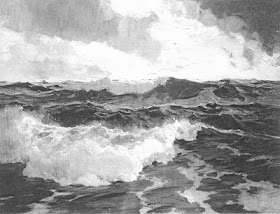
 The Wave by Alexander Harrison
 I was asked "what pigments did the artist use to get such luminosity ?"
I don't think it is in the color. It is in the drawing. When I say drawing I am not restricting that to line drawing, there is also mass drawing. Somebody once said
DRAWING IS THAT PART OF PAINTING WHICH IS NEITHER COLOR OR DESIGN
Below I have reproduced the painting in black and white, and it is still luminous. A large part of why this painting looks as it does is the great delicacy with which the edges are handled. Edges are a part of drawing, not color incidentally.
THAT WHICH IS WELL ENOUGH DRAWN WILL BE WELL ENOUGH COLORED!
Harrison could have used a different color scheme, such as rose or poisoned gimlet and the painting would still have been luminous. Ives also used to say;COLOR IS A DECORATION YOU HANG ON YOUR DRAWING!
If you can draw the thing, color it is the easy part. Academic or pre impressionist paintings were often executed in a single tone or in black and white, sometimes called dead color, and then the color was glazed over that. Most of you who read this, are I suppose, landscape painters and are aware of, but unacquainted with those older methods. There is no reason that you have to work that way either, but the men (I know, and women, from here on out the word men will signify not gender, but membership in the species homo-sapien, lighten up, jreez!) who worked in that method clearly understood the importance of drawing.They got the drawing on the canvas, and then dealt with color.
It is no less important in an impressionist painting, but those of us who work in "straight paint" can be less aware of it as we work in colored paint executing both our color and our drawing at once. Below is a black and white of a Waugh. I have a huge collection of 8 by 10 photos taken during Waughs day of his work.
It is no less important in an impressionist painting, but those of us who work in "straight paint" can be less aware of it as we work in colored paint executing both our color and our drawing at once. Below is a black and white of a Waugh. I have a huge collection of 8 by 10 photos taken during Waughs day of his work.
 Below in this lousy cell phone photo is a set of gradated tones prepared with ultramarine, titanium white and ivory black.
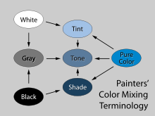
 Remember long ago I wrote about tints and tones and shades? Below is a little chart that explains the difference. Since I have both White and black added to the blue, these are TONES. When painting seascape I find it very useful to have a premixed set of shades like this to work out the water. I can draw the thing out with these and then "inject" my color into them.

Hi Stape, look here, these guy is doing exactly what you say:
ReplyDeletehttp://www.edwardminoff.com/synthesis.html
It should be mentioned that the Harrison painting which you show is quite large: 30"x118". In my mind that makes it even more impressive.
ReplyDeleteI like the particular way you emphasize drawing in this post. Good stuff.
You wouldn't know it by looking at a Picasso painting,but he could draw and draw well. Know one will ever be a really good painter if they can't draw....
ReplyDeleteKeep practicing as often as you can.
By the way Mr. Kearns Im sure everyone has noticed your new look in your blog photo. Was that because of your recent stay in that swank hotel in Rhode Island. I'm very impressed. You look great. I did the same thing a few years back and it made my wife very happy and I liked the look myself and have kept it.
ReplyDeleteI convess that even though I grew up on a rocky shoreline on one of the Great Lakes that had plenty of big waves, I'm usually not drawn to "wave" paintings. This Harrison really is one of the best of that group!
ReplyDeleteWhether one calls it "drawing", "design" or "composition" this guy exploited the expressiveness of his shapes to the maximum. Which is intriguing as it's a fairly quiet sea he was painting. Nice painting and a great post, once again.
On another note, I'm wondering if the new Stapleton profile picture means we'll be seeing him on the cover of Gentlemen's Quarterly soon?
Interesting!
ReplyDeleteMany painters don't keep black on the palette for landscape. Do you mean that you change it up for painting the sea, and use More black in your mixtures?
I love the idea that color hangs on a good drawing!
I paint a lot on Long Island sound which is flat, flat flat.
Stape, This was a really good tutorial on what to consider in terms of drawing, value and edges in a seascape before committing oneself to color. I'm burning this in my memory!
ReplyDeleteWhat a thrill to open the blog this morning and see the Wave! So, if I'm hearing you right, as long as you have a good solid drawing and value structure installed in your seascape, your color choices are almost secondary, and the painting will involve using pre-mixed tones. Simone is quite right about the large size of the original adding to its impact. It blows my mind that this was painted from memory! I splurged on the giclee from PAFA and plan on attempting to copy it - one day. Did I mention, this is my favorite painting? Thanks again!
ReplyDeleteThanks for the easy-to-remember color mixing chart. I'm confused (normal state); the cellphone photo shows five 'blobs'. You state that this includes white, black, ultramarine, and that the mixtures are SHADES because BLACK has been used. In my mind I imagined the blob on the left as white, the blob in the middle as ultramarine, the blob on the right as black. Is the blob between WHITE and ULTRAMARINE a mixture of these and therefore a TINT? The blob between ULTRAMARINE and BLACK a mixture of these and therefore a SHADE? If you added WHITE and BLACK to the ULTRAMARINE, as you have stated, then wouldn't that be a GRAY with a PURE COLOR, and therefore a TONE instead of a SHADE? Perhaps I need to read the post you made about TONES, SHADES, AND TINTS? Where can I find that?
ReplyDeleteMaike Josupei;
ReplyDeleteWe are both using a premixed palette but differently. He is premixing the entire painting. Very meticulous, I am throwing colors from my palette as I usually might, but using my premixed grays to help me make the water. I will show you in a coming post how I do that.
...Stape
Robert Sesco;
ReplyDeleteOh sorry, I have been unclear. I will explain that in the next post.
..........Stape
I found another Harrison wave painting (not the same one, look close) where you can get to brushstroke level and see a bit more. He is one of my favorite seascape painters, he manages splendor even without a lot of drama. here is the link http://www.thomascolville.com/index.cfm?pg=2&pgtitle=Inventory&m=a&k=78 use the enlarge zoom on the left. Thanks for this post it helped me see where I'm falling short
ReplyDeleteRobert Sesco;
ReplyDeleteYou are correct. I made an error and corrected it so that it should read tones, and not shades. I am sorry to have confused you.I need, but do not have an editor!
.................Stape
Hello Stape, I love your new image, very dapper! I just might have to update mine now. Gone are the funky days, time to look refined, right? Anyway, I liked this article because I was just about to paint a four foot wide seascape and this image pops up on Facebook today. I wanted to add that I have been using premixed colors/values for a few years now. I love using two blacks, Mars and Chromatic Black by Gamblin. I can blend any of my pure colors with these two in different proportions. That way I get a warm and cool shade. Then I use white for the tints of course, especially with the white water. Premixing allows me to speedily build a seascape or marine painting when doing plein air impressionism. Drawing in the shapes is very important, I agree. It is extremely difficult to do en plein air. So, I just build it with larger shapes in gradating tones and carve into a shape to make the drawing more believable.
ReplyDeleteI did chuckle at the gender comment and I noticed your new look too.
ReplyDeleteLots of good info on your blog. A good lesson and explained well too.