Tuesday, November 22, 2011

Surface and impasto

Images courtesy of artrenewal.org They have become a login site. For 14 dollars you get access to a lot of hi-res images. I have downsized these and cut details from them, those on the site are much larger. I believe the library of images they offer is worth the small investment and would encourage you to join. I receive no kickback, funding etc from them or anyone else who I recommend over there in the side bar, well, except for RGH paint who gave me a quart of white once.

I want to talk about surface in this post. There are two main sorts of surface, enameled (as it is sometimes called) ie. very smoothly painted without ridges or areas of deliberately roughened paint, and an impastoed, or 3D surface where the artist has intentionally allowed the paint to project from the surface to carry his illusion. Great painters have fallen into both camps.

The head at the top of the page is a detail of a Raeburn. He has used the thickness of his brush strokes which follow the forms of the sitters face to express the structure there. Until the early twentieth century painters worked with lead white. Lead white comes in a variety of handling qualities from ropey or stringy, to liquid and flowing, to crumbly and dry. The most common was an unguent and easily manipulated version such as you see in the painting above. One of the few drawbacks of flake lead (other than its toxicity) is that it becomes more transparent as it ages. Knowing this, artists would often load their whites ( paint them thickly) to make sure they retained opacity over time. However this gave an added benefit, these thick lights contrasted with the thinly painted shadows and a heightened dimensionality appeared. The artist gained another means to express the illusion of volume and dimensionality on his flat surface that an enameled surface didn't give him.

Painters who work over canvases with carefully transferred drawings on them tend to work very smoothly. Often they are coloring in or glazing these drawings in transparent veils to make their paintings. This is an academic approach. Painters who use impasto tend to paint directly from nature. They drag paint here, load it there, or use a palette knife to create the illusion of texture and form by various kinds of manipulative paint handling.

Below is an example of Rembrandt painting a sleeve. He was perhaps the greatest manipulator of impasto. The globs and striations in the paint surface appear at a distance to be the brocaded details of the material. In the upper left of the detail is a good place to see that. Incidentally, this is some of that crumbly look I spoke about earlier as opposed to the more liquid handling in the Raeburn above.

Art is what the artist brings with him to a painting. It is not found in nature itself. Art is man made and the result of an artists decision making process. It is not resultant from observation or accident, but is deliberately installed through intention.

The use of impasto requires the artist to make decisions about the nature of his paint application and its the varied effects he wishes to obtain. It cannot be more than inspired by nature in front of him, it must be invented. The same sort of passage can be painted absolutely smoothly to great effect as well.

Above is a sleeve and hand painted by Ingres. It has great complexity like the Rembrandt yet it is smoothly painted. In the hands of a master either approach can result in triumphant verisimilitude. I don't mean to say that one approach is better than another, however the use of impasto does require an additional set of decisions for the painter to make about how his surface will look.

Here is a detail of Rembrandt's' Hendrickje bathing. The impasto emphasises the simplified and broad planes with which Rembrandt has described the forms of his subject. The use of impasto and the expression of form are entwined and work together to further the artists purpose. More on this in my next post.

------------------------------------------------------------------------------------

I also received this e-mail:
"I, of course, noticed that you've ceased your superhuman habit of daily posting. I've grown so fond of spending evenings scouring your archives. Your blog is the art instruction I didn't receive back in the sixties/seventies, and your views and wonderful humor have become a comforting light in my search to improve my paintings. I've looked for a post that might explain your absence, but haven't found anything. I hope you are well, and that you'll be back soon. Thank you, for all your generosity and the effort you've put into what you have produced for us".

I have backed off to posting about once a week for now. I may return to greater frequency but I need to do this for a number of reasons which are:
  • Unspecified and serious difficulties in my private life.
  • A need to concentrate on my painting, I have to get my inventory up, which is off partly due to the unspecified difficulties opaquely alluded to above, but also because I have been making such difficult studio paintings, seascapes and such that take forever. I am much faster out on location than in the studio.
  • The blog was intended to be a one year project and instead extended to a thousand posts, which are archived and available should anyone want to read them. It is an encyclopedic "book" of what I have learned over the years I have painted. It should be useful to many who are looking for that information ( or perhaps slant is the better word ) which is hard to find in the mainstream art world.
  • I have written most of what I set out to write. The technical and design posts most importantly. I don't want to become repetitive. The low hanging fruit has been picked. There are lots more posts I can write and will, but they are more time consuming and difficult. The Encyclopedia of Dumb Design Ideas are a great example of that. I will do more of those but each one takes about 20 hours. They are worth the time and a lot of fun to do, providing I have the time to use doing them.
  • The blog will continue, but as I said above, I will have to keep to a reduced schedule for now. I do want to be useful. Thank you all who have continued to follow along.

Friday, November 11, 2011

Some rambling thoughts on inexpensive art


Carl Faberge 1846-1920 The head of a famed Russian jewelry workshop, Faberge produced thousands of fine objects but the best known are the Faberge eggs. Often their creation was the work of thousands of hours of highly skilled craftsmanship. Most were made for the Tzar as gifts for his mother and wife. The jewelry firm was destroyed by the revolution and Faberge escaped to Switzerland.

Here's a question I received the other day:

"I have a problem selling paintings to friends and/or family. I feel they expect a discount, a hefty discount, and somehow I feel guilty if I don't give them a REALLY good deal... I get this knot in the pit of my stomach every time a good friend or family asks about buying a painting because I know I'm going to have to practically give it to them. I recently sold one that way, and gave the person about 75% off gallery price, and they still haggled with me about paying the shipping. sheesh!!! I was hoping they wouldn't buy it....but they liked it.So, do you have a standard "friends and family discount" or do you just tell them the price, and that's it....? "


That' a difficult question to answer for everybody, but here is how I have handled that. My most recent, favorite, or most likely to sell paintings are never gifted to anyone. I must make a living, first and foremost, before I give anything away. I cannot feed my children snowballs all winter. However I make a lot of art and sometimes things come back from the galleries unsold, even though they might be paintings that I am proud to have made. Sometimes I will give these to people. I have friends who will never be able to afford my paintings and, I try to make sure that my close friends in this category have one of my paintings.Often they get a painting that while well made, is a field sketch or not something that would be as appealing to the general public . That is what is sometimes called an "artists picture"

Anyone who I know that can afford to buy one of my paintings, has to buy them. If I know them quite well I will negotiate a lower price for them. Usually it is a generous but not ridiculous discount. I would rather just give the painting away than take obscenely short money for them. Again my art is expensive. If you are making paintings that sell at workingmans prices, say 300 dollars, I suggest you never give any of them away or discount them at all, except to the most impoverished of your close friends.I think their is a lot to lose by not valuing your own paintings .If you want others to value them, you should begin that yourself.

I often hear an artist who has just been praised on his art make excuses for its quality. I always tell students in workshops to never disparage their own art. Don't make excuses for it like"its not done" or point out a defect you believe it has. In fact, recommend you never make excuses for your art at all. I don't explain em much either, I present them and if you like them, fine. If you don't, I wont try to talk you into it or waste much time wishing that you did. Their are lots of other people and if the picture is any good someone else might. There is a saying in the art gallery world that "there is a buyer for every painting". I am not sure that is true of weak paintings, but it might be true of paintings at or above a certain level of quality. It can sometimes take a long time to get that painting in front of that buyer though.

If someone praises one of your paintings, even if they are totally uninformed and you know they are, smile and graciously accept the complement, don't tell them they are wrong.Even weak paintings are fiendishly hard to make, and it takes years of work and study to make a middling quality painting. If you can do it even a little, be proud of yourself and claim what laurels are offered. It is so hard to make a decent painting that it is a wonder that anyone ever does it! Take credit for your efforts, it will be more than a reward for the time spent it will also be a comfort and encouragement to you as you work towards making even better paintings.


I have noticed a funny disconnect in peoples thinking about art. They want it to be cheap when they buy it and valuable when they own it. I suppose that's just human nature, and everybody loves a bargain. When I had my gallery I had some small reputation for knowing my way around old paintings. Often people would bring me paintings that they had bought at auction. They would invariably tell me that they "knew" the painting was by Corot or some other master. I knew at a glance that it was not. These treasure hunters were always going to find some expert who would certify their find as being a real Corot,although unsigned, and they would resell it for a fortune.

Usually the works they lovingly presented me were amateurish and worth very little. Their owners were treasure hunting, and they didn't know enough about painting to know a good old painting from a weak one. There are LOTS of old paintings out there for sale and many of them are inexpensive. In the 19th century just like today there were plenty of amateur painters and also a "production" art industry making art much like the imported motel paintings of today.

I suppose that it makes sense that antique dealers and resellers of auction finds who have no idea what old paintings that are valuable might look like would have trouble pricing them. I have noticed many times that they usually price worthless, damaged, or old production paintings ridiculously high. The same folks sold me many etchings for ridiculously low prices, often marked as being "ink drawings". I built a nice little collection of old prints that way, they are not particularly valuable, but they are good art and original. These etchings have provided me with much pleasure and instruction.. I suppose the dealers are hipper than that now, that was a while ago, but I always check the price of etchings in the antique shops when I see them. I guess because they are black and white, dealers and perhaps their customers don't particularly value them. If bargains are to be had, that seems to be where I, at least, have found them.

I was once invited to visit the home of an old man ( now long deceased)who had spent a lifetime buying cheap paintings at auction. His limit was about 25 dollars. He had paintings stacked everywhere, on the stairs against the walls of every room and even in his kitchen cabinets. I grew bored pulling through them looking for anything that I though was fine or of any particular value. I am not sure he thought he had any masterpieces, he probably was satisfied just to get his 25 dollars worth. He was an interesting guy and had taken a number of photographs as he accompanied his mother who was working for the WPA documenting life in the impoverished depression era south. I bought one of his photographs of sorghum harvesting behind horse drawn wagons and met him when I sought him out to sign it for me. He placed no particular value on his photographs and I think I paid about 25 dollars for it.

Thursday, November 10, 2011

Several new books

An autumn painting of mine 24 by 30 from 2006. Painted near Jackson, New Hampshire

I am proud to have been invited to sit on a panel of speakers at the Boston International Fine Arts Show. If you are in the Boston area come out and say hello.
Saturday afternoon, November 19, 2011

Boston International Fine Art Show (BIFAS) at the Cyclorama

3-4 pm

Shaping the Present: Realist Art Then and Now

For years, people have been saying realist art is coming back. Judging from its growing visibility and the mushrooming of realist art schools nationwide, it’s more accurate to say it’s here. How are top contemporary realist artists inspired or informed by their historical counterparts? Is it wise to collect today's realist artists when many museums and critics are reluctant to highlight them? Join us for this intriguing panel, moderated by two national magazine editors and popular BIFAS presenters: Joshua Rose of American Art Collector and Peter Trippi of Fine Art Connoisseur.

Panelists

Julie Bangert, Gallery Director, Tree’s Place Gallery, Orleans, Massachusetts

Elizabeth Ives Hunter, Executive Director, Cape Cod Museum of Art
Stapleton Kearns, Artist, New Hampshire

Dana Levin, Artist, Massachusetts
----------------------------------------------------------------------------------------------
I am going to do a couple of book reviews today;I buy a lot of art books and recently two of them seemed good enough to recommend. The first is the new book "The Landscapes" by Richard Schmid. Schmid has long been a hero of mine since I found one of his books in the graduate stacks at the University if Minnesota about nearly forty years ago. I thought that no one could paint like that anymore having been led to believe that Philip Pearlstein was the figurative artist of that era. Years later I saw a show of his work at the old Grand Central galleries in New York. I thought it was amazing. I have his book Alla Prima and perhaps I have already recommended that, I think, it is excellent. But being a landscape painter I was excited when I found out that Schmid was putting out a book of just his landscapes. I have always liked his landscapes the best of all of his art. A lot of focus has been placed on his still lives and figures and I am glad that his landscapes will now get their due.
This book costs around a hundred dollars so it is not a cheap thrill, but it is printed on good paper and is entirely filled with full page reproductions of the art. I think it is well worth it and I will study it closely. Is Schmid Americas best landscape painter? maybe so.....


The other book I have been studying is a giant new volume on tonalist painting. "A History of American Tonalism byDavid Cleveland. Tonalism hasn't received the scholarship it has so long deserved. It was the dominant art movement in America for around the end of the 19th century. Tonalism was an art movement that valued aesthetics and achieving a mood in the picture far more than the representation of any specific identifiable place. They tended to paint ordinary places and not grand views. In a way tonalism was a reaction to the literalism of the Hudson River School on one hand and the often scientific matter of factness of the impressionists on the other. There has been so little written about tonalism and I have always wanted to see a lot more of it. Clevelands near encyclopedic work has filled in that hole. I hope other writers will follow with monographs on the individual artists of the movement. There is almost nothing in print on any of them except for the handful who are best known and then often in other contexts than as tonalists.

This is a monstrous 600 page long book that weighs as much as a four cylinder engine. Its a fat One! And it is full of pictures of paintings you will find nowhere else. I am still reading mine a little bit at a time. It is text heavy and the pictures could in my opinion have been given more prominence. The author seems to be overly enamored with Charles Warren Eaton, a lesser known American tonalist painter. There are many others I would have given greater prominence. Cleveland also lumps a lot of painters into his tonalist camp that might or not be in there depending on how big a stadium you need to fill. So the book is idiosyncratic and labyrinthine. Still its eccentricity is a benefit as there is so much information in here. Pathfinders, visionaries and world changers are often eccentric. After they have blazed the trails the more sober but less adventurous follow their leads.

Cleveland does a nice job of examining Whistlers enormous influence on the painting of that era. Whistler is best known today as a footnote,everyone seems to know Whistlers mother and not the man himself. But he was revered in his day and influenced a whole generation of artists who became more concerned with mood and evocation and the idea of beauty as a value apart from that represented. It is not what it is a picture of....but HOW it is a picture of that is important!
The book is priced well considering its size the wonderful paintings in this book are now available for study and have been impossible to see until now.


Tuesday, November 1, 2011

Fooling with other peoples art


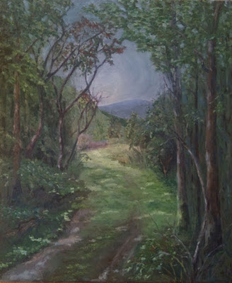
Above is a painting that was sent to me to critique. I have never been to the place where this was painted so I have no idea what was really there. I also have no idea of the artists original intentions. So I have put my "spin' on it. There are a lot of different takes that could be applied to a painting but this one will point out some problems in the original image and their possible solutions. You may have different solutions of your own. I want to be careful to point out that I have used some of my means of dealing with the problems in a landscape, but not necessarily the only ones.

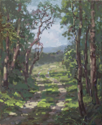
I fooled with it in Photoshop. I am not an expert in Photoshop so I just go at it with the brush tool. It always feels like I am painting with gummi-worms. However it does allow me to rework a painting without ruining it. So it is a pretty good teaching tool. Below is my version. Below that is a bulleted list of what I did to it and why.


The original was all in a few middle tones. I spread out the values, clearly defining what is in the light and what is in the shadow. No value exists in both!

EVERYTHING IS EITHER IN THE LIGHT OR IN THE SHADOW, THERE IS NO OTHER PLACE FOR IT TO BE!


The lights in the original are scattered about in repetitive sizes and shapes and not sufficiently different than the shadow value to "light up". There are gray days that have no dappled light at all but that is a different painting problem. You might look at the work of Richard Schmid for that, he handles gray days so beautifully.

  • Here's a detail from the middle left of the original showing a repeated group of V shaped forms. Repeated forms are visually boring and "manmade" looking. I made them into a single tree, but of course there are lots of different way to break up a passage like this. The important thing is variety of shapes and intervals. A painting should contain a great variety of shapes that are different from one another. yet interlaced or rhythmic.
  • Here is another problem, called a tangent. A number of unrelated lines all meet,for no good reason at a single point. This seizes the viewers attention, all of those lines draw the eye and then short out against the tree limb. Also the upper line of the mountain and the line of the hill below it are opposites, that is they echo one another in reverse. This is overly geometric looking, and makes the distant mountain into a teardrop shape. Below is my fix. The lines of the mountain and the hill now operate independently of one another and pass BEHIND the tree rather than butting up against it.
  • I reworked the trees varying their widths, again to get a more natural look, and to get more variety of shape. Repeated dimensions and intervals are boring. Those in the original were too straight, like phone poles. I put some twists into them as they writhe towards the light, and broke up their lines with some flecks of sunlight, emphasizing their twisting shapes and deemphasizing their repetitive perimeter lines. Rather than all being bounded by a dark edge their edges now are broken by patches of light. The trees are now made of three values. A highlight, a half tone value and a dark shadow. These three are woven together up the trunks to give more variation there.
  • There is a mechanical looking diamond shape in the sky right in the middle of the painting. I reworked this again to get greater variety of shape. If you look at my version above you will see I have added some sky holes into the trees and some branches hanging down in to the "diamond" area. This weaves the sky and the branches together more, rather than the sky being HERE! and the ranches being over HERE! I have worked to get a greater variety of shapes and intervals into the sky holes. Remember that sky holes must be a little darker than the open sky outside of the foliage mass. Because a sky hole is a narrow aperture, diffraction "steals" some of the light. If you make the sky holes as bright as the open sky areas they will appear overstated. John Carlson said they would appear like lights hung in your trees, rather than as holes through them.
  • The edges of the road needed to be softened up as they were too assertive and mechanical looking. Below is a detail from Willard Metcalf handling this sort of passage nicely. See how the boundaries of the road are downplayed and melded into the ground around them. This keeps the road from looking like it is pasted over the landscape. A minimal amount of definition is fine to suggest a road in the landscape, and avoid a primitive look.
  • I lightened up the sky too, although sometimes it works well to "fake" a dark sky into a painting, particularly behind autumn color, generally the sky should be as bright or brighter than anything else in the light. It looks unconvincing for an object receiving light to be brighter than the sky, its source of illumination.