Tuesday, February 26, 2013

James Gurney show!


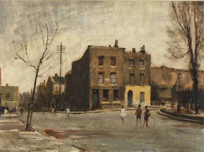
Here are James Gurney and I at the opening of his show in Manchester, New Hampshire. The strong down lighting of the gallery made us both look like we had no hair, so I have corrected the image to  preserve ( and enhance) my own self respect, and having done so, I couldn't leave James looking any less hirsute.

Dinotopia: The Fantastical Art of James Gurney
 New Hampshire Institute of Art  from Wednesday, Feb. 20 through Wednesday, Mar. 13, 2013.
77 Amherst St. in Manchester, New Hampshire.
Monday - Wednesday, Friday 9 am - 5 pm Thursday 9 am - 7 pm, Saturday 12 pm - 4 pm

The Norman Rockwell Museum is sponsoring a show of the jaw dropping illustrations for his Dinotopia books and it's a great One. Those of you who read this blog know that I care mostly about what a painting actually looks like. I have little interest in fantasy art, and I hate dinosaurs, (what with all of that biting and other unpleasantness). But I love James's work for its beauty and  worksmanship. I am an awestruck admirer of his drawing ability. James can draw as well as anyone alive, I think. He is able to put together pictorial compositions that are as ambitious and well realized as the salon painters of the 19th century. Only a few folks walking around today can do that.

 The pictures I am posting by James are actually in the Manchester show. They are the best known and some of the largest tours de force of his long career. James grew up in California, and after a brief stint doing background art for Hollywood, moved out into the illustration world. His book "Color and Light" has been the best selling painting book in America for 120 weeks now. Get your signed copy here.

I was introduced to James Gurney by Tom Kinkaid in the late eighties at a party in Connecticut. I had met Kinkaid at Art Expo in New York when he was just beginning his career. We got to talking about 19th century painting, which at that time was "secret" knowledge, there were virtually no books on the subject then, and no internet. Finding we had similar interests, we arranged to meet at the Metropolitan Museum the next morning. At lunch, Kinkaid leaned across the table at me and told me he was going to make a MILLION dollars! He laid  out the plan and I remember thinking, well, he probably will. He invited me to join him at a party up in Connecticut. The party was all young New York illustrators. The illustration market was rapidly collapsing around them, as magazines and book publishers began to use only photography. These young illustrators had all been doing book covers for bodice-ripper novels and magazine work. That world was ending and they were all scrambling to reinvent themselves. I was the only fine arts guy there, having been included by happenstance.

Several people did presentations of their art. I was in New York to retrieve a painting from the biannual exhibition at the National Academy of design and I had my exhibition piece with me (below).


I  showed some slides of my outdoor paintings. James remarked that I was a plein air painter. I knew the expression from books, but had never heard anyone actually use it. In those days we just painted "outside".

James had one of the very first of his illustrations for Dinotopia with him that night.  I don't think the particular illustration he showed us had yet been tethered to the Dinotopia idea which had yet to emerge. Over the intervening years we chatted a few times on the phone. When I began this blog I was inspired by James long running blog Gurney Journey. Over the last few years we have chatted more than a few times about art technique, comparing notes and philosophies. James did me the enormous honor of making me the only living artist quoted in his book, Color and Light. But we had never actually stood face to face in about 24 years. I approached him at the opening and we posed briefly in front of his magnificent picture before he was swept away for a photography line up. I heard him lecture later that night.


I never saw or heard from Kinkaid again. A funny thing happened next though. When I was spending the day with Kinkaid he asked me if I would introduce him to John Terelac, a friend of mine in Rockport, whose painting technique Kinkaid had emulated in his own art. I told Thom that Terelac was a very private guy and I couldn't do that. I could introduce him to lots of New England painters, but Terelac wasn't on that list. A few days later when I had returned home I was in my studio and the phone rang. It was John Terelac telling me " I have a friend of yours here!". I said "who?" and John told me "Thomas Kinkaid" in a perturbed voice. I told John that I had not been willing to introduce Kinkaid to him. John said "I thought so!" and hung up the phone. I don't know what happened next, but John was a former high school football star and had moonlighted as a bouncer early in his career. I suspect Thoms' exit was swift and ignoble.


It has been repeatedly pointed out to me that my punctuation is dreadful. I am sorry, sometimes I can get an editor to help me, othertimes they are disgusted by me. I dropped out of high school and  missed too many English classes. Please forgive my punctuation, someday I will figure that out too!
---------------------------------------------------------------------------------
I have several workshops in the offing. For instance there is;
SNOWCAMP MINNESOTA!
This workshop will take place March 9 through the 11th near between St. Paul and Stillwater. When last I taught in Minnesota several in my class asked if I would do a Minnesota snowcamp, so here it is. I have made it as late in the year as is possible to get a little milder weather and I hope there is still snow. I think there will be, but if there isn't, I will still hold the workshop but I will call it Stickcamp.
This will be a transplanted version of the yearly Snowcamp I do in New Hampshires' White Mountains. I will teach the methods of painting snow including color vibration and the planar structure in snow and the landscape itself. I intend to emphasize the idea of form in the landscape rather than a purely visual approach. I will show how to express the convex outward bulging forms that express the structural "bones" of the landscape. I think this gets ignored by some plein air painters today and taught less than it ought be. I will also show you how I build the color structure of the snow using color laid over color to assemble the structure of the snow.
There is no need to stay an any particular lodging to attend the workshop and it will be an easy commute out from Minneapolis or St. Paul. The price of the three day workshop will be three hundred dollars. As per usual with my workshops I run a twelve to thirteen hour day and try to cram as much into the three days we have as possible. I make workshops as intense as I possibly can. We will meet for breakfast and then move to the painting site and work until dusk. Then we will meet for dinner and I haul out my computer and lecture on design and other aspects of landscape painting while we await our meal. If you live in, or can visit the area I hope you will come. To sign up, click here!
---------------------------------------------------------------------------------------
I will also be teaching in Lafayette, Louisiana from March 22nd to the 24th . You can contact Maria Randolph to sign up or get more information.
 Here is the information copied from their website;

  Stapleton Kearns Plein Air Workshop – Mar 22-24


Makes no difference what kind of painting media you prefer. If you have ever been interested in plein air (in the open air) painting, please don’t miss this unique opportunity to take a plein air workshop in style with all the amenities of home—and dinner—and most importantly, with a fantastic internationally renowned artist and teacher. Sign up today!


LAFAYETTE ART ASSOCIATION PRESENTS


PLEIN AIR WORKSHOP


With Renowned Landscape Artist


STAPLETON KEARNS


MARCH 22-24, 2013


This Lafayette Art Association sponsored ‘outdoors’ plein air workshop will feature the talented teaching professional from New Hampshire, Stapleton Kearns.


Stapleton is a professional landscape painter who will fill your workshop experience with valuable techniques, ideas, and methods based on a classical impressionist approach.


This excellent workshop is open to all media areas, not just oil painting, because primary plein air painting rules concerning colors, value, lighting, etc., are essentially the same. This is not only an oil painter’s plein air workshop, although that is Stapleton’s chosen media, and all media painters are welcome to learn and enjoy!


The 3-day workshop will be conducted on privately-owned land in Cankton, LA which is approximately a 20 minute drive from downtown Lafayette. There is a cabin on the property with bathroom and kitchen facilities.


So don’t tarry and let this opportunity slip away, There are only a few seats still open so call now and register to get your name on this select list!


Click for more info… Contact the Lafayette Art Association, Lafayette, LA at 337-269-0363 

Monday, February 18, 2013

Some thoughts on Isaac Levitan


 A reader sent me  some pictures by Isaac Levitan  (1860 1900) and asked me if I would comment on them. Levitan was a Russian painter who specialized in the landscape. Over the last decade or so there has been a  growing appreciation of the Russian painters in America. Prior to that, the only one I knew much about was Ivan Shiskin, who I only knew from obscure books printed in Russian.

The painting above "A day in  June" was made in 1895.  Despite this academic background this picture shows, at least to me, the influence of the impressionists. I don't know if this was painted outside, but it has that look. Like many of the "academic" painters of that era he learned from the discoveries of Monet and the French impressionists. Much has been made of the rejection of the impressionist artists by the academic painters of the era, but that is only part of the story. Some of the academics rejected forever the impressionist ideas, but many did not, and within a generation almost all of the academics had added impressionist working methods to both their work and their teaching. Many became hybrids of the two schools of thought. There was too much good and useful there to be ignored. The French impressionists complained " they shoot us, but then they go through our pockets"

When first I examined the painting above I was perplexed by its' design. I didn't seem to have much organization and the strong lines leading diagonally into the picture seemed to lead the eye to .....nothing in particular. I knew the thing worked but I couldn't see quite how. Here was my initial idea of its' design.


But, as I studied it longer I began to suspect how the thing worked. It was a vortex, a circular design. Below is an indication of that.


A Vortex design creates a circular trail about the canvas for the viewer to follow. Levitan has concealed the device particularly well. He has also used that odd straight cloud in the center of the sky that conceals his means. At first glance it seemed so isolated and quirky, but it is a segment of the vortex, as is the sky incursion into the line of trees to the right and the trunks of the birches. The iridescent and beautiful flowers sprinkled across the fore ground puzzled me for a while too. But as I examined them I found they too had directional signals buried in them. Below is a diagram
showing that.


Levitan concealed his design carefully, so that initially the painting appears to have the unedited naturalism that nature presents to the plein air painter. But a careful arrangement is concealed beneath the "random" look of the painting.


 This painting "At the Lake" is very different form the one above. It looked at first glance like a luminist painting done in naturalistic color to me. Like the luminist painters, for instance Fitz H. Lane or Sanford Gifford, it has stillness and contemplative quiet. Below is a luminist painting by Sanford Gifford.


Below I have drawn some explanatory hot pink lines on the Levitan


The "leads" in the painting carry the viewer about the painting in a "Z" but unlike a luminist painting, the leading lines are more rhythmic then in a painting of the generation before. See how many of the lines are in arches?  Those sectioned lines swoop in waves through the foreground and out into the distance in repeating parabolic curves. The boats in the foreground show the use of repeating arched lines. Note also the downward arch of the distant pines and hill leading down to the waterline. The nets at the foreground left are also scalloped across their bottom in decorative rhythm. Like in the painting above, Levitan gives the initial impression of the the random and truthful appearance of nature, but conceals beneath that veneer an artful geometric skeleton.


Levitans' allocation of space is not unusual but I will point it out. Artists try to allocate their lights and darks in paintings into an artistic, but unequal balance. Levitan has given 2/3 of the space to his lights and 1/3 to the darks. The same area covered by both would have made a static design. He has then accented those darks with some small lights. The darks and the lights are arrayed into two large and clearly unequal portions rather than scattered all over the canvas.


Here is our painting again, unaltered. I wanted to point out something about the color. Note Levitans depiction of the light. Rather than getting his light effect from radically different values, although his lights are a slightly higher value,  he does it through color temperature shifts. His shadows are cool and his lights are warm. I suspect he did this to avoid chopping up his landmass with too many differing values and preventing it from being read as a single large shape. That and it looks cool. The whole painting is keyed higher ( painted in a lighter value scheme) than a typical academic landscape of the preceding era, also an adaptation of impressionist methods by Levitan.

He holds back his darks for accents within his shadows, like in the overturned boat in the foreground. That gives a luminosity and the appearance of soft luminescence to his shadow areas. Those dark accents decrease in size as they fall away from the foreground and into the distance.


I remarked above how at first glance the painting looked like a luminist painting. But here is a closeup showing another crucial difference. This painting has handling. Luminist painters concealed the hand of the artist. Their paintings had an enameled look devoid of brushwork. This painting however, has brushstrokes and impressionist variety of separately stated  color notes within the forms. That is particularly observable in the roofs of the 19th century trailer park and the blue (how impressionist is that?) shadows in the distant trees. There are no transparent brown shadows in this picture as one would expect to find in the work of an academic landscapist of a generation before.The handling in the water is impressionist as well, with its "wiggly" brushstrokes instead of transparent downward dragged brushstrokes that would have been in a more academic type of painting.


Here for comparison is our Levitan (painted in 1893) and then below, is a little section of a Thomas Moran from 1864. I am comparing an American painter with a Russian, and I have no idea whether Levitan knew anything about Moran, he might well have not, although Moran was shown in international exhibitions. I show them for contrast in intent and handling and not because the two are historically related, they are not.


The Moran contains a zillion tiny carefully painted details, the Levitan is broadly seen and painted. There is a sophistication in the Levitan treatment that the Moran is without. Levitan has suppressed the detail and given a simpler and more artistic treatment to his subject. The Moran ( I do love Moran....but) is full of bristling  detail that makes the picture a conglomerate of separately observed parts. The Levitan presents itself as a one single unified picture. The Moran seems a little primitive next to it, a little naive. It was this fault in the work of the Hudson river school painters, who were essentially landscaping pre-Raphaelites to fall quickly from favor after a generations time of glory. Oddly, Moran survived this crash, but most did not. With the rise of the Barbizon school, the tonalist movement, and later impressionism, the careful Hudson river school rendering fell sharply out of favor.

The myriad thousands of carefully observed, insistent and hectoring details made their paintings fascinating when you stick your nose in them, but less artistic when viewed in toto. For all of the effort made by the earlier generation of painters to capture every jot and tittle of nature, the Levitan is far more natural and convincing. This attention to endless detail tended to make the earlier 19th century artists into view painters, delineators of particular, grand,  and relentlessly specific views. The broader way of seeing that came later made sentiment and the mood in painting more their subject. Levitan and his generation often needed only a simple field and some trees as in "A day in  June" to make a picture. For them it was more about emotion and evocation than about presenting a careful and awe inspiring transcription of some scenic view.

---------------------------------------------------------------------------------

I have several workshops in the offing. For instance there is;

SNOWCAMP MINNESOTA!

This workshop will take place March 9 through the 11th near between St. Paul and Stillwater. When last I taught in Minnesota several in my class asked if I would do a Minnesota snowcamp, so here it is. I have made it as late in the year as is possible to get a little milder weather and I hope there is still snow. I think there will be, but if there isn't, I will still hold the workshop but I will call it Stickcamp.

This will be a transplanted version of the yearly Snowcamp I do in New Hampshires' White Mountains. I will teach the methods of painting snow including color vibration and the planar structure in snow and the landscape itself. I intend to emphasize the idea of form in the landscape rather than a purely visual approach. I will show how to express the convex outward bulging forms that express the structural "bones" of the landscape. I think this gets ignored by some plein air painters today and taught less than it ought be. I will also show you how I build the color structure of the snow using color laid over color to assemble the structure of the snow.

There is no need to stay an any particular lodging to attend the workshop and it will be an easy commute out from Minneapolis or St. Paul. The price of the three day workshop will be three hundred dollars. As per usual with my workshops I run a twelve to thirteen hour day and try to cram as much into the three days we have as possible. I make workshops as intense as I possibly can. We will meet for breakfast and then move to the painting site and work until dusk. Then we will meet for dinner and I haul out my computer and lecture on design and other aspects of landscape painting while we await our meal. If you live in, or can visit the area I hope you will come. To sign up, click here!

---------------------------------------------------------------------------------------

I will also be teaching in Lafayette, Louisiana from March 22nd to the 24th . You can contact Maria Randolph to sign up or get more information.


 Here is the information copied from their website;

Don’t Tarry! Sign Up Now for Stapleton Kearns Plein Air Workshop – Mar 22-24

Makes no difference what kind of painting media you prefer. If you have ever been interested in plein air (in the open air) painting, please don’t miss this unique opportunity to take a plein air workshop in style with all the amenities of home—and dinner—and most importantly, with a fantastic internationally renowned artist and teacher. Sign up today!

LAFAYETTE ART ASSOCIATION PRESENTS

PLEIN AIR WORKSHOP

With Renowned Landscape Artist

STAPLETON KEARNS

MARCH 22-24, 2013

This Lafayette Art Association sponsored ‘outdoors’ plein air workshop will feature the talented teaching professional from New Hampshire, Stapleton Kearns.

Stapleton is a professional landscape painter who will fill your workshop experience with valuable techniques, ideas, and methods based on a classical impressionist approach.

This excellent workshop is open to all media areas, not just oil painting, because primary plein air painting rules concerning colors, value, lighting, etc., are essentially the same. This is not only an oil painter’s plein air workshop, although that is Stapleton’s chosen media, and all media painters are welcome to learn and enjoy!

The 3-day workshop will be conducted on privately-owned land in Cankton, LA which is approximately a 20 minute drive from downtown Lafayette. There is a cabin on the property with bathroom and kitchen facilities.

So don’t tarry and let this opportunity slip away, There are only a few seats still open so call now and register to get your name on this select list!

Click for more info… Contact the Lafayette Art Association, Lafayette, LA at 337-269-0363 


Sunday, February 3, 2013

Controlling M-Faces


Above is a Sargent watercolor of Venice. I have written before about unity of effect and subordination of detail to the larger masses in which they are contained. In this post I want to show what happens if you don't control your emphasis. To do this I have messed up a few fine paintings using Photoshop.

Where you put your emphasis is desperately important in picturemaking. You might have intended to say "building with some windows", but instead said "building with some windows" by not subordinating the windows to the facade of the structure. Below is the same Sargent with the windows and details in the building exaggerated.


The building is no longer subordinated to the Gondolas in the foreground. It fights with them now for our attention . The picture no longer clearly tells you where to look, it is beginning to have two subjects rather than one, the boats. In the upper version the gondolas are dominant, in the lower they no longer are. This is a matter of emphasis. Just as in a stage play there is a star or lead role and there are supporting actors, if one of the supporting actors gets self important and begins blocking or outshining the lead he has to be chided, if not eviscerated by the director.

You as a picture maker are the director and it is important to keep the actors on your stage in check, lest they steal the show from your lead and distract the audience from the story that you want to tell. 

IF EVERYTHING IN A PAINTING IS OF EQUAL IMPORTANCE, THEN NOTHING IS IMPORTANT!

When making a design it is usually a mistake to give everything an equal emphasis, although it might be good in a blueprint or a schematic drawing. Part of a design is deciding what is important and what is not, what is the dominant, and what needs to be subordinated to that. Often this is about keeping your masses "big". That is, not chopping up every shape into an assemblage of the smaller shapes within it.


© The Estate of Edward Seago, courtesy of Portland Gallery www.portlandgallery.com
 Above is an Edward Seago, I know I post a lot of his paintings but he is a great hero to me.  Below is the painting again, after my tender ministrations.


I have overemphasized the detail in the buildings behind the pointy feet children. It throws the whole thing out of whack.  Seago  subordinated the windows and doors beautifully to the larger and more important shape of the building itself. I have reversed the polarity, now the details are more  assertive than the larger form upon which they ride, and the unity of the painting has been destroyed. The building, formerly a supporting actor, has taken over the stage like a girl in the chorus line naked with a traffic cone on her head.

© The Estate of Edward Seago, courtesy of Portland Gallery www.portlandgallery.com
 Here is another Seago, and below is my damaged version.


I have exaggerated the windows in the ocher colored building on the left, and lightened the contrast in the group of boats at center. Now instead of quietly occupying that side of the painting, the building is too assertive. It is stealing the show from the boats which were the artist's intended focus in the painting. Now the boats lead you through the painting to the building.

Every element you put into a painting has to be appraised for it's importance. Ask yourself "is this object important or should it be subordinated to the whole, so what is important can shine?" Sometimes during a critique an artist will hold their hand up to block from their view a part of the painting. When they do that it is usually because some element  has been overstated and is interfering with either the balance or the unity of the painting. You only get one subject per picture, if you try to have two the picture will fail. It has a problem I call "one for each eye" There must be
 one dominant subject and the other forms must be subordinated to that.

How you set your emphasis is a matter of your personal choice, and when you make choices you are making art. There are cameras that are made to be left strapped to trees in the forest to shoot pictures of passing wildlife. When the unwitting animal steps into the machines vision, it takes a picture. The machine is not an artist. It makes an image, but no decisions as to what that image will look like. Transcription is only accounting. Noise is not music. Like form, or arrangement of shapes, emphasis is a design decision and a human imposition of selective order onto nature. Nature in itself is not art, art is the product of a human decision about how to portray nature. This explains entirely why so little truly great art is currently being produced by the deceased.