Showing posts sorted by relevance for query Seago. Sort by date Show all posts

Friday, April 24, 2009

Endless information on edges, pt. 3, continued

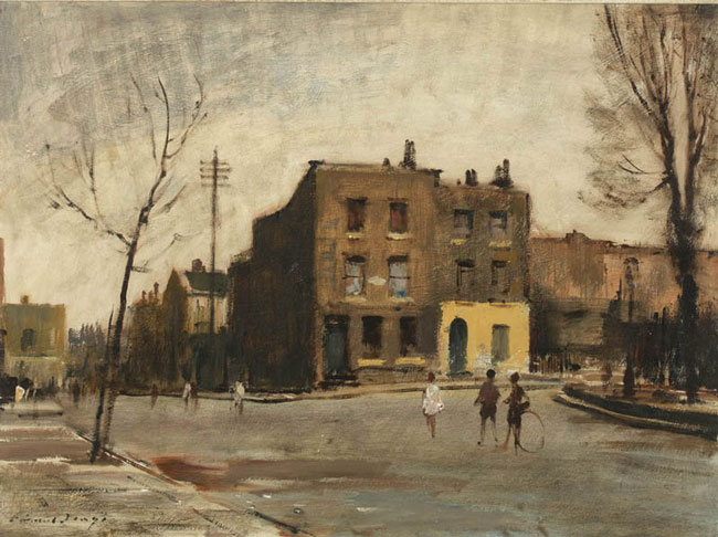
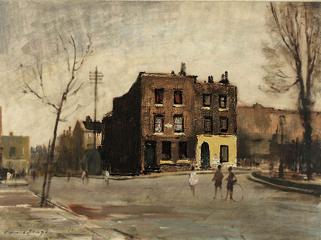
© The Estate of Edward Seago, courtesy of Portland Gallery www.portlandgallery.com

Above is an example of a painting by another great landscape painter, Edward Seago. 1910-1974 I apologize for having cropped the right hand side of the picture slightly, although for our purposes here it shouldn't matter too much.As I am sure you have noticed I champion a lot of lesser known 20th century artists. I have every book on him I can find. They are all British and till now, out of print.

Seago used to be absolutely unknown in America but that is evidently changing. He was very well known in England, and was collected by the royal family. Seago sold out shows routinely. Although he was very successful financially, Seago was ignored or dismissed by the art press of his day. Perhaps a little like Norman Rockwell, he was thought of as lowbrow, I guess. Time has raised our brows some. He lived and worked at the low ebb of traditional painting. I will tell you the story of his somewhat tragic life tomorrow.

There are now two available books on Seago,
Both are full of excellent color reproductions.


1.
Edward Seago by Ron Ranson (Paperback - Jan 28, 2002)
Buy new: $29.74
17 Used & new from $20.00
Usually ships in 2 to 3 weeks
Eligible for FREE Super Saver Shipping.
5.0 out of 5 stars (3)
Other Editions: Hardcover

2.
Edward Seago: The Vintage Years by Ron Ranson (Paperback - Aug 28, 2003)
15 Used & new from $24.70
Other Editions: Hardcover


They may be had through Amazon .I wouldn't be surprised if studying these books radically changed how you approach landscape painting. Ron Ransom is himself a painter and has spent many years studying Seago, so his notes on the paintings are useful in contrast to so many art books with good plates and dim commentary.

Seago was a master of handling and edges, and design, he could do it all. However I will begin by talking about his edges, because that is the subject at hand, isn't it? Lets look at this detail of the piece.


Seago has done something I briefly mentioned a post or so back. You see it done with the branches of trees, by a lot of landscape painters but Seago uses it all over his paintings. That is the dragged paint application you see in the branches on the right hand side of this detail. Now this painting is 22 by 36 so what you are seeing is pretty big, so Seago is a loose painter. Real brushy too.

Look closely at the branches there and notice something else. They are dragged over a texture already existing on the canvas. That texture is not part of the brushwork or impasto of the day that Seago painted that branch over it. He has pre-textured the canvas. In a future post I will describe several ways of doing that. What this does for Seago is it gives him a way to soften or obliterate his edges and he uses it everywhere. It is one of the "secrets" of his technique.

If you click on the top image you will get a larger view of the painting and can see this crumbled brush stroke is all over the painting. So long as he kept out of his medium, this edge was automatically "softened". He had to thin his paint to get a hard edge such as that on the houses in the middle of the painting. Notice how the bright one with its gable end facing us, is layed in with a knife. Crisp.

The whole foreground is just big overlapping brushstrokes of different colors but the same value. That also gives edge control. He throws in a couple of accents and the viewer does the rest. You can almost watch this picture painting itself.
Tomorrow I will dissect this painting some more, particularly how the various means of controlling edges have aided Seago in controlling the viewers eye.

Monday, April 27, 2009

Dissecting a Seago

August afternoon, Champs Elysees, 20x26 © The Estate of Edward Seago, courtesy of Portland Gallery www.portlandgallery.com

Here is our Parisian Seago again. I would like you to notice a few different things about it. First is the extreme velocity of the painting. It is LOOSE, this is not a small painting and it looks loose shrunk down to the size of a playing card.This painting is also colored almost entirely with shades of ochre and earth reds. Even the sky was pre painted in the warm ochery color and then the blue was thrown down into that. Then the decorative accents are applied on top of that foundation. One of these accents is of course that marvelous red awning. That was painted with vermilion, which is a lovely mercury based red. It is also extremely poisonous. When I learned to paint in the Gammell studios in the early 1970s it was still in common use, at least, by traditional painters. It w s often used by portrait painters as a color for the lips and cheeks of the maidens with which that age seemed so well supplied. I don't believe they make maidens any more. Today we would probably use cadmium red light instead. That's a hotter color than you'd use on a maiden, I think.


The painting is full of lines that direct the viewer in and to the "punchline" area of the painting. The red awning attracts our attention, but notice also the negative shape formed by the light to its left. It is, like the awning, a big arrow shape directing you deep into the picture. Seago reaches out and grabs you by the hair and drags you into this painting.

Here's another device Seago is using. Its called the string of pearls. Look at this, and compare it with the unaltered image at the top of the page.

Seago has arranged all of this interesting stuff, those little people and umbrellas and white dots along a horizontal line across the middle of his canvas. This makes a sort of decorated band. Which is like.....a string of pearls. Watch for this , you will see this device used routinely not just in the work of Edward Seapo but in lots of other landscape painters work as well. I believe I will throw an old Dutch painting at you with a string of pearls . Here's our old friend Jan Van Goyen, stringing some pearls 300 years earlier.

Seago lived in a lowland marshy area of England that was a lot like the lowlands countries. It was logical for Seago to model some of what he did on the little Dutch masters. He was routinely confronted with the same sort of painting problems.


Above is a simplified view of the darks in the painting. For the most part they are all linked as I have discussed in a previous post. This linking of the darks transforms many small "busy" shapes into a few large decorative ones. There is a strange sort of repeat relationship between the white awning on the far right hand side of the picture and the negative shape of the sky to the left of the red awning.I believe this is a rhythmic device, as it seems too planned looking to have just happened. Very little in the art of someone at Seagos level happens by accident. In fact I think I will now repeat one of the mantras of this blog which is:

NOTHING GOOD GETS INTO A PICTURE BY ACCIDENT.


There are now two available books on Seago,
Both are full of exclellent color reproductions, and are available from Amazon.

1.
Edward Seago by Ron Ranson (Paperback - Jan 28, 2002)
Buy new: $29.74
17 Used & new from $20.00
Usually ships in 2 to 3 weeks
Eligible for FREE Super Saver Shipping.
5.0 out of 5 stars (3)
Other Editions: Hardcover

2.
Edward Seago: The Vintage Years by Ron Ranson (Paperback - Aug 28, 2003)
15 Used & new from $24.70
Other Editions: Hardcover

Tomorrow I will lecture on counterchange. That is a great way to make a picture dynamic, rather than a static.

I am going to do another critique of a readers image, so please send me an image of something you have made, I will probably choose a landscape, but not necessarily, lets see what you've got. You can send it to me at stapletonkearns@gmail.com. I will photoshop your signature off of the piece and I will tell no one whose work I am critiquing.

Saturday, April 25, 2009

Edges, deweighting for eye control

© The Estate of Edward Seago, courtesy of Portland Gallery www.portlandgallery.com

Here's our Seago again. Did you get the book?

I am going to break out some passages and speak about what is going on in them. Particularly as concerns expression of edges. For that is what the control of edges is, expression, not transcription.
I have had a side conversation with a painter who was concerned about the turning of form with color and was having a hard time getting both his values and his color . There has been some instruction on this blog where I have mentioned turning form using color (but not much) I clarified something for him, and I thought I might repeat it here.

Values are part of drawing.


Color is a decoration you hang on your drawing. Therefore go after the values first. You can inject the color later, if you have the values "right". Drawing is always the first consideration, not color. Anything well enough drawn will be well enough colored. I remember Ives Gammell saying that and I am sure it is a quote. But I am afraid I don't know whose.

Turning form with color is a means of simplifying the halftones, out in the lights. It will not build the "bedbug" line. That calls for a value shift.Rermember thepost on the parts of the light? You may want to review that if you aren't sure about the bedbug line, and its significance as arbiter between Gods pure light and the stygian darkness of shadow. Now I am going to get all the Hensche students after my hide. Henry Hensche put a great deal of emphasis on turning form with color. None of his students are young anymore, I will" puff up" and intimidate em.

I am going to throw a new idea at you , ready?

Here is a detail of the left hand side of the painting. Compare it with the full image above and notice something. The sky is light on the right side of the tree and dark on the left. Seago is doing something I call "deweighting". Don't go looking for that phrase in art instruction books because I made it up. But not recently. What I mean by deweighting is the downplaying of an edge in order to lessen visual interest.

Seago has darkened the edge of the sky as it meets the branches of the tree in order to direct the viewer elsewhere. He has arranged his values in such a way that the eye doesn't stop there but continues on to where he really wants you looking. He has put a bright sky contrasting strongly against the branches on the other side of the tree in order to direct your attention to that area.

You may remember in an earlier post my saying to imagine visual interest as having weight, and a painting needs to create an artistic balance of those different weights. Seago lessens the visual interest that would have been drawn to this area had he allowed the contrast of a bright sky with the gnarled and complex branches . He has removed visual weight from the area . Hence deweighting.

Here is the opposite. Seago has weighted this passage. He has done it with edges and values. Look at the razor sharp edges on the top of those houses out there, they haul our eye to the area with their contrast with the darks behind them. He has also loaded his lights. He has used a great deal of paint to get a textural attention grabber there. That house stands out better than if he had painted it the same value, but thinly. Seago of course wants us to look here.

I have shown you Seago drawing attention to this passage and called it weighting, after all I am using the word deweighting, surely there must be weighting? Well the important idea is really deweighting, I think we all know about drawing attention to an important area within a painting. Subordinating other passages to it by reducing visual interest at our edges, is a more subtle matter.

ALL OF THIS IS ABOUT EYE CONTROL


I am going to be talking a lot more about eye control.

Seago image from: Edward Seago, the vintage years by Ron Ranson, available through Amazon

Thursday, December 1, 2011

The surface of an Edward Seago, examined

© The Estate of Edward Seago, courtesy of Portland Gallery www.portlandgallery.com

Above is a painting by Edward Seago that is full of bold impasto. What a fine One it is! As you probably know Seago is one of my heroes ( the others are Aldro Hibbard, Willard Metcalf, and Jeff Beck) If you click on it you will be able to see some of the different textures and thicknesses of paint he used. I will unpack what, in my opinion, he did in various parts of this picture.

Seago texture his canvasses before he painted on them. Here is a link to a post about that. In the passage above, Seago has dragged the branches across his sky, already textured by his ground. It looks to me like he did this with a knife. The rough ground grabbed the paint unevenly from his knife. This had to be done ONCE! This method doesn't admit for much correcting or alteration.
He added the larger branches with a brush, a sable rigger ( sometimes called a scriptliner) would do that nicely. Notice how he allows interuptions in those lines of the branches made with a brush. That makes them look of a piece with the rest of the dragged looking passage. Had he drawn those too carefully and consistently they would have looked too different from the knife work around them and pointed out the paucity of the means used to produce the spotted foliage and twigs against the sky.

Above is a passage from the middle of the painting. I wish I could get better details to show you but this is what I have to work with. The house there is heavily loaded paint, mostly white with a little ocher added to it. Notice how loose and barely suggested everything in this passage is. Seago has made a point of putting a dark contrasting value in the line of trees behind the buildings. the contrast makes the passage pop and draws our eye there. Seago wanted to be sure we didn't miss the buildings down at the bottom of the field. He also dragged his brush strokes across the rough ground in the warm red tree that is just above the white gable of the house. This softens his edges in a different way than a painter would do on a smooth surface by pulling colliding edges together with a soft touch of the brush. Although the mechanics of arriving at that demephasized edge are different than more common methods, the result is about the same.

Here is a passage from the foreground I believe it was mostly painted with a large stiff bristle brush. You can see the marks of the individual hairs in the strokes. That gives it a striated grass-like appearance. Seago varies his paint application in order to best describe the particular texture of the elements of the landscape. He was a very fast and fluent painter and the ability to do this was developed over many years. He spent his early career painting society portraits and horses so his draftsmanship was impeccable. Usually loose painters that are good, have started out painting tightly.

LOOSE HANDLING WILL NOT DISGUISE WEAK DRAWING!

Say, that might make a dandy neck tattoo!


Here is the sky, here Seago is pulling strokes from a large bristle brush over his textured ground again. See the darker clouds soften because they are dragged across the sky beneath them. Seagos ground, besides being rough was absorbent, He added gesso ( real gesso not the contemporary acrylic counterfeit) to the lead mixture that he used as a priming so that his thirsty ground sucked in the wet paint and allowed for rapid overpainting in a way that a normal ground would not. The rough canvas aided him in his ability to work rapidly.

Here is a bit of the distance from the left hand side or the tableau. This is thinly painted, see how the ground shows so clearly through it? Seago is varying his paint thickness for two reasons. Firstly to give the illusion of distance and less resolution, thinner passages tend to drop back from a roughly handled fore ground. But the other and perhaps more important reason, is to provide contrast to his roughly painted passages. In order for some passages to look rough it is most effective to have them share the canvas with thinly painted passages. The thinly painted passages heighten the effect of the thick ones by contrast, just as a spot of dark near a light passage will draw attention to the brightness of that area.

Above is the immediate foreground. It is very thickly painted. See the rough crudeness of the paint? this was probably troweled on with his knife and gives the illusion of texture to the field's freshly turned earth . Seago has thrown some directional signals in there too, the furrows encourage us to follow them deeper into the middle ground of the painting.

WHEN YOU PAINT A PASSAGE, BESIDES THINKING ABOUT COLOR AND VALUE ETC. IT IS IMPORTANT TO DECIDE HOW THAT PASSAGE WILL LEAD THE VIEWER. WHAT IS ITS THRUST? HOW WILL THE EYE LEAVE THE PASSAGE AND WHERE WILL IT GO NEXT? YOU SHOULD BE IN DELIBERATE CONTROL OF THAT!

-----------------------------------------------------------------------------------------------------

A view from the back yard of the Sunset Hill Inn

As many of you know, each year I teach a series of workshops called Snowcamp at a historic inn up in the White Mountains of New Hampshire. The first session is filled but I do have spaces left in the other. This is a course in winter painting skills and open to all levels of expertise from beginner to self important semi professional.

The Sunset Hill House, a charming old wooden hotel from the days before automobiles, takes care of all our needs including meals served in our own private dining room. Because we eat together, the workshop is a total immersion experience from breakfast until evening. We get a lot done on that schedule. We also get the opportunity to meet and befriend fellow painters.

I teach the workshop right outside the enormous back veranda of the inn, or under that if it is actually snowing. There is no need to carry equipment any distance and if you get cold you can run inside and warm yourself by the fire. If you would like to be there this year here is the link to sign up!

Saturday, May 2, 2009

A short bio of Eward Seago

© The Estate of Edward Seago, courtesy of Portland Gallery www.portlandgallery.com


Edward Seago from Edward Seago the landscape art by James W. Reid Sothebys pub. 1991

I will do another post or two on Seago and then Monday I will change gears and begin some critiques of readers art. You still have a day or two, so send me images of your paintings. I already have more than I can do so it will be a sort of sweepstakes. I will sit on some of them and do another crit in a month or so. This will be a regular feature of this blog until I drive it in to the ditch.

I want to give you a brief history on Seago. He was born into a comfortably well off family in the East Anglia region of England in 1910. East Anglia is a low country of fens and moors. Although he traveled the world painting, it was East Anglia that most inspired him and he returned to its low and windswept moors and estuary's throughout his whole life for subject matter.
As a child he developed some kind of a heart problem that made him nearly an invalid. Seago was kept home from school and was not allowed any rough play or athletics, he instead spent his time drawing. No one really ever knew what the problem was with Seagos heart and it may well have been psychosomatic.

At 17 he was befriended by a neighbor lady of the highest social caste and introduced to the world of the noble and wealthy. All of his life these connections provided him with clients and sponsors. He spent the first part of his career doing portraits of the wealthy and their horses. Seago traveled with the circus and, and illustrated several books on those experiences.
During world war two he was able to fool a medical inspector and enter the army and became a major in the camouflage service. Again he came to the attention of the top brass and became a companion of the highest generals. When his lifelong heart problems recurred he was brought before a medical board and dismissed. Rather than send him home the generals he had befriended, and some of whom were amateur painters themselves, gave him a jeep and a driver so he could document the war with his art.

After the war these drawings were shown in conjunction with their publication in a book. Over the following years he became a favorite of the royal family allowing him grand patronage and putting the ultimate seal of approval on his art in the eyes of the buying public. People lined up before the opening of his shows for a chance to buy his art.

He was however either ignored or sometimes savaged by the critics in the newspapers. He was also never admitted to the Royal Academy. His several gay lovers in his youth had both died tragically, his relationship with his overbearing parents was stormy and he never had anything but the deepest doubt in his own worth as an artist. All of this added up to make him a deeply unhappy and haunted man.
The last years of his life were spent with a young man, Peter Seymour who was a lover and personal secretary to him until his death from a brain tumor in 1974. Together they traveled the world and made a beautiful home together they called Dutch house in his beloved East Anglia. He could paint his back garden, as the English call their yards and at the bottom of that was moored his sailboat . He could and did, sail from his back door to Paris.

His fame has continued to grow since his death and the prices of his paintings has risen continually as well. There are a LOT of them. He was extremely prolific and he painted at lightning speed rarely spending more than a few hours on a picture.
Seago used an unusual palette mostly of duller or earth colors. Here it is:

  • yellow ocher
  • alizarin crimson
  • ultramarine
  • blue black or indigo
  • chrome yellow
  • viridian
  • Indian red or light red
  • vermilion
  • sometimes burnt sienna
  • flake white
Seago usually worked on canvas and on panels that he himself applied a thick brush stroke texture to in lieu of a more conventional priming. This texture had a profound effect on how his paintings were made. Tomorrow I will tell you how to do it.

Sunday, April 26, 2009

Hunting Seago in Paris

August afternoon, Champs Elysees, 20x26 © The Estate of Edward Seago, courtesy of Portland Gallery www.portlandgallery.com,

About eight years ago I took a painting trip to Paris to put together a show for Galerie Kornye in Dallas. I did a number of shows with them and we sold most of them out. George Kornye became both a friend and and my dealer We had many long telephone talks where he would tell me about dealing paintings for so many years, and I would tell him the things I am now telling you, in this blog. He died a year or two ago and I miss him. He had a lot of style.

I walked into his gallery in Dallas about ten years ago and we hit it off. He had been a dealer of 19th century European art for about 40 years and felt like his clientele would enjoy what I did. For a number of years most of my work went through Galerie Kornye. It was, and is a lovely space with oriental rugs, marble floors, sparkling chandeliers and ormolu ( look it up ) mounted furniture. He gave me a showroom to myself he called the A salon.

I would do several major painting trips a year to supply Kornye. I made several trips to Europe to paint for George, and many to the deserts of West Texas.

I took my Seago books in my luggage to Paris with me and while painting there every day, I also went on a Seago hunt. Seago had a little sailboat called the Capricorn that he would take across the English channel in the 50's and 60's. He would take it up the Seine and park it at a yacht club near the Place de Concorde. I found the mooring and was able to work outwards from there and find his painting locations around Paris. I painted some of them. This is a means I have used to study the work of several artists. If I set up and painted in the same place an artist worked in the past I could get a feeling for the decisions they made there. By subtracting what they painted, from what is actually there, I am left with the decisions they made.

I guess you might look at my work and say "Stape, I don't see much Seago in there". But I have learned a lot from him. I am not, nor do I want to be a super loose painter like he was, but I learned a lot of design ideas from him and he continues to influence my color. When you see me using a reduced palette featuring earth colors, that is Seago influence.

I found this location and it was still there, pretty much as you see it in his painting. There was a sidewalk cafe right where he must have set up. He either pitched his French easel ( for that is what he used ) in the roped off area of the cafe, or perhaps it wasn't there at the time. Directly in front of this position is a heavily traveled sidewalk leading to the entrance to a large building and I doubt he would have obstructed that. I'd like to think he set his easel up in the cafe and painted there, flirting with the waiters bringing him cafe creme, while he smoked Galoise caporals and astonished the Parisians with his rapid and facile painting.

Despite the appearance of a lot going on, this painting is masterfully simplified, both in color and in drawing. In a way that is the same sort of reductionism that typified this whole era which gave us the stripped down glass architecture of the international school, the chrome and leather furniture and the A line dress. However Seago is able to use the minimalist aesthetic and still operate as a traditional painter.
Edward Seagos' art is a direct continuation of the English landscape tradition and he deliberately appended himself to the open end of it.

Notice the big simplified shapes he makes, for instance the Arc de Triomphe is one large shape. The variations within it, that describe its form are subordinated to the larger tone, rather than chopping it up into an assemblage of small pieces, it is one thing. The trees on the left are reduced to nearly one big shape and the architectural details of the upper right corner are all joined up into only a few shapes.

Seago made it look this way. He didn't see it any differently than you or I, but he knew how to make it look cool. He did this by making decisions based on logical ideas and principles. At high velocity. This painting was probably made in about 2 or 3 hours.

The color is minimal also. The whole painting is really a drawing done in yellow ocher, indigo, and an earth red. He put a minimal amount of blue up in the sky. It didn't take much in a painting as warm as this. Then he put in that red awning and there it was. The trees, the sidewalk and the buildings are all pretty much the same color. In the foreground the woman has a coat that is accented with a little yellow that is not an earth color like its surroundings. The spots of color he does use are so effective because they stand unique in a field of very restrained earth colors.
Tomorrow I will return, strap this squirming picture onto my gurney and begin its dissection, with the twin knives of opinion and experience.
I would like to do another critique feature in the next week or so. Send me some images and I will choose a few and critique them. I will of course photoshop your name off of the images and I will tell no one whose work I am critiquing. I will probably choose a landscape to crit, but send me what you like. I will survey what I get and see what seem like the best pieces from which to teach to the larger audience reading this blog.

Seago image from: Edward Seago, the landscape art, by James W. Reid
Published by Sothebys 1991

Tuesday, April 28, 2009

Juxtaposing different values and counterchange

© The Estate of Edward Seago, courtesy of Portland Gallery www.portlandgallery.com

Here's the first Seago I showed you again. I want to point out to you a design tool that Seago is using in this painting, juxtaposing different values. It is the practice of deliberately relieving objects on top of dark ones and and dark shapes on top of bright ones. This gives a "snap" and visual excitement to the piece. Look at this detail;

Sometimes an artist wil modify the value os an object so that it is light as it passes infront of a dark object and light as it passes in front of a dark object. This is called counterchange. It is a means of juxtaposing your values. See how Seago has arranged this passage so that the trunk of the important tree sits in front of the dark grouping of trees behind it. That makes it jump. A little further up the trunk is dark and the landscape is now light behind it. Then several of the branches above that are counterchanged against where the trunk itself becomes dark.

Here is that little grouping of houses out to the right of the trees, look how they are juxtaposed against the dark copse of trees behind them.Then there is a dark in front of them. Below is another Seago that is full of the same techniques.

© The Estate of Edward Seago, courtesy of Portland Gallery www.portlandgallery.com

Every shape in this painting is silhouetted against its opposite value. But notice another thing, if you squint at this painting, there is really just one big light, which cover 3/4 of the painting. The darks are arranged in a decorative pattern over that large light. It is almost like one of those cut out black paper silhouette portraits, of which our colonial ancestors were so fond. Here is a detail from the center of this painting.

The trunk is counterchanged it is light against the darks behind it, but as it rises into the sky it becomes light against the sky.Seago is using stacked lights and darks or value juxtaposition in the picture in many places. For instance the branches on the left side of the tree are dark against the bright sky, while those on the right side of the trunk are light against the darks behind them. The front wall of the house is bright, behind it the roof is dark and the sky behind that is light again.

Now I know you are still spinning from the confrontation with these new ideas, counterchange and stacking or juxtaposing values.. These are important because they have an enormous implication about the artistic thought process.

HE MADE THINGS DARK OR BRIGHT IN VALUE, BASED ON WHAT FURTHERED HIS DESIGN, RATHER THAN HOW THEY ACTUALLY APPEARED IN FRONT OF HIM!

That is an absolutely huge idea. Now think about that, even his values are subject to the machinery of design. All of the effort you put in as a student to learn to record values accurately, while essential and useful, is only the default way of doing things. Values are, like any other element in painting, just another tool for the designer.

Now that is one of the things that thrills me most about landscape painting. I don't mean to say that portrait painters or figure painters don't have these opportunities, but landscape painters do have the leeway to do more of these things because of the nature of the genre.

Pity the tyro landscape painter, fresh from still life class or naively clutching a promising photograph who tries to compete with a designer who will ruthlessly use his values just as he pleases, rather than respecting the capricious arrangements of styleless nature.

If you don't learn how to arrange the landscapes values yourself, that man will eat your lunch, every, single, goddamn, day.

Seago images: Edward Seago the landscape art by James W. Reid published by Sothebys 1991


I am going to do another critique of a readers image, so please send me an image of something you have made, I will probably choose a landscape, but not necessarily, lets see what you've got. You can send it to me at stapletonkearns@gmail.com. I will photoshop your signature off of the piece and I will tell no one whose work I am critiquing.

Monday, April 12, 2010

Some Seago decision making

One of the things I like about writing the blog is that it has put me into communication with other artists scattered about the planet. I never really thought about that when I started it, but things grow. Either way I got an e-mail from an artist with whom I had traded mail before. He sent me a couple of very interesting images I want to show you.

As those of you who have read this blog for sometime know, I am very fond of the work of an English painter, Eward Seago (1910-1974). A number of years ago I took my Seago books on a painting trip to Paris. I figured out where he moored his boat on the Seine ( for that is often how he traveled) and worked out from there to his painting sites. I then painted his locations in Paris. I found where he had set up his easel and made my own "takes" of those places.

The artist who contacted me today was doing the same thing, although he didn't know it at the time. He set up on a location on the Norfolk coast but was unhappy with the painting he made. Upon returning home he found a picture in a book of a Seago made on the same site., It is very informative to notice the changes that Seago made. Below is the location as it really is.

Below is the Seago painting. Notice that he has changed the house into an old barn. That's a big improvement, as it is a much more pleasing shape, and dilapidated and weathered buildings often look better than well maintained structures in a painting, they are more interesting from a textural standpoint, have less mechanical lines and they are evocative. Seago has also added a line of trees to the background replacing what my English friend says is an uninteresting view of reeds. A good painter brings a surprising amount of the painting to the landscape with him in the form of experience and invention.

IT DOESN'T HAVE TO BE RIGHT, IT JUST HAS TO LOOK GOOD!


© The Estate of Edward Seago, courtesy of Portland Gallery www.portlandgallery.com

Notice all of those left leaning lines in the masts and the posts holding the embankment, even in the barn itself. They are nicely countered by the right hand sweep of the river, the foreground sand and that tree over on the left by the barn. Thank you to our friend across the pond for the photos.

Wednesday, April 14, 2010

Seago mystery

© The Estate of Edward Seago, courtesy of Portland Gallery www.portlandgallery.com

Several of you writing in the comments have suggested that perhaps the Seago painting was of another building on or near the same spot. I e-mailed my trusty English friend and he has done some research for us all. Thanks, over there!


He has unearthed a photo of the place from 1965 showing the building above in this landscape, although from a different angle. It is more like what Seago painted, but not a barn. So, who knows? My English confidante also sent a pair of Seago pictures which look to be the same location, one with a house and one without. I believe they do illustrate Seago slicing and dicing out there. Now you see it, now you don't


© The Estate of Edward Seago, courtesy of Portland Gallery www.portlandgallery.com

I flew back to New England today, via Atlanta. It is evidently a hard place to reach by direct flight. I am grateful they didn't send me the Great Circle route over the pole.

Sunday, May 3, 2009

Seagos materials updated

© The Estate of Edward Seago, courtesy of Portland Gallery www.portlandgallery.com
Edward Seago The Urn from Edward Seago by Ron Ranson ( available on Amazon )

Here's another Seago. If you click on it, you should be able to see the rough prepared texture of the ground. Even in areas that are just stained with color like most of the left hand side of the painting, there is already thick impasto. This little trick allows for a lot of nice handling.

Lets say you wanted to do some paintings using Seagos methods, how would you go about that? Here's what I would suggest.

A whole lot of the colors Seago used are archaic, impermanent or unavailable so some substitutions need to be made. This is not really such a big deal as it is the artists mental processes that determine what his work looks like more than his pigments . If you had handed him the palette I am about to suggest I guarantee you he could have made a Seago.

  • Yellow ocher most of our yellow ochers today are actually lab made or whats called mars colors. That's not a problem. I think they are better, however if you want a real yellow ocher Sennelier makes one. You probably won't like it, compared to the ocher we are accustomed to today, it will seem dirty. I got a tube once and I was surprised by the difference.
  • Alizirin Crimson is still available today but it is impermanent and has been replaced by quinacridone or "permanent alizirin" a much better product. If you haven't moved to the permanent alizirin I recommend you do.
  • Ultramarine, French type preferably
  • Blue black is available from several manufacturers, no one makes a real indigo today so far as I know. The real thing is impermanent . However Winsor and Newton, Williamsburg and others make an approximation that works just fine.
  • Chrome Yellow was a lead based color and is now extinct. It was impermanent and has been replaced by cadmium yellow. Permanent yellow would work here also.
  • Viridian is of course still manufactured and is expensive, but easy to find. RGH makes a very affordable one.
  • Indian red is a common earth color available from most color makers.This has a surprising amount of pigmenting strength.
  • Vermilion, I have written before about this color. I used it a lot when I was young but it is deadly poisonous and is no longer widely available. It is mercuric sulfide, lead is one thing, mercury is a whole nother animal, don't use it. Many manufacturers make a vermilion hue that is based on cadmium and they are pretty good. People still argue if they are as good, but they will certainly do.
  • Burnt Sienna, Winsor Newton makes a nice one.
  • Flake white. Use titanium, I guess, don't get me started. Old paintings have a lovely sort of look because of flake that is unobtainable in no other way. Soon we will be unable to buy flake anyway, and the difference will be academic.
Seago bought all of his colors from Winsor and Newton. The other thing besides his choice of colours that greatly influenced how his paintings looked, was that peculiar ground. Here's how he made it. He heated real rabbitskin glue based gesso and when it was hot he stirred in White lead from a can.Then he laid that onto panels with a stiff brush. The thick priming material preserved the visible brushstrokes. Its hard to believe you can mix water based gesso and oil paint, but you can, and I have done it. Besides having a textured surface it also has a weird absorbent quality that makes the paint set up REAL fast.

I have also stirred oil paint into acrylic gesso and used that. I have no idea if that is archivally sound, but it works and lasts at least several years unchanged. I do not recommend you do this. If you do and its a problem don't come whining to me, because I warned you.

The most reasonable and probably the soundest way to arrive at that sort of a textured ground is to choose a thicker brand of titanium white (Utrecht in a plastic tub for instance ) and add a small amount of alkyd to it so it will dry in your own lifetime, and lay it down thickly onto your panel with a bristle brush You will have to do a few to get the hang of it . White lead works best for this too, but I think we had all better learn to do without it.

This incidentally MUST be done on a panel, the flexing of a canvas under this thick priming is sure to crack. So never on canvas, OK?

Tomorrow the great critique project begins.

Saturday, January 21, 2012

More Seago and minimalism

© The Estate of Edward Seago, courtesy of Portland Gallery www.portlandgallery.com
Last night I wrote about Seagos use of very downplayed, restrained or "minimalist' color. Tonight I want to look at his shapes for the same thing. Making fine shapes is a root skill of design. Sago was a master of this in an era when that skill was common and highly prized. The fine arts arena was dominated by modern abstractionists who, like em or not, often understood well the making of fine shapes . But more importantly the great age of illustration was still going on, it wouldn't really die until the late 60's or so. Those guys really knew how to design and used fine shape making to get elegance, punch and appeal into their work. They had to design well, because their designs had to carry subjects like soap, girdles and kitchen ware that were not compelling images without some very creative arrangement.

While more interesting than a corset or cheese grater, this is still just a street scene and it would not be very interesting if it was presented in a matter of fact way. A straight photo of the scene would hardly draw our notice. Seago has "sold" us the picture with his dynamic treatment of it. The subject of the picture is his bold shapes and creative and expressive color.

IT IS NOT WHAT IT IS A PICTURE OF, BUT HOW IT IS A PICTURE OF THAT IS IMPORTANT!

As I have remarked before, that would make a dandy neck tattoo, maybe with some barbed wire and lightning bolts.

The shapes in the picture above are large, simplified almost to brutality and have great carrying power. Look at the right hand side of the picture. All of the buildings there are simplified into one big almost black shape. There are a few very subdued grey incursions back there, too subdued to break up the large forms, they are just enough to imply some variation in the structures back there. Then Seago hangs that white oval sign right on top of them. That's an attention grabber and an elegant exclamation point in the design of the painting.

Up in the right hand corner the roof top contains another passage made of the same elements, a big dark decorated by similarly reduced gray shapes.

The windows in the central white building are all different. No two are alike.If you squint at the picture you can see the pattern of darks formed by windows, dormers, shadows and lawn dart legged people. Seago is using a decorative pattern formed of deliberately unique and dissimilar shapes to grab our attention and then entertain our eye as we course through the painting examining them. There is a lot of variation for us to perceive and it holds us a long time as we examine them. That is one of the goals of great shapemaking, holding the viewers attention for as long as possible. Badly designed paintings are used up in an instant. We see all there is to see and move on on search of something more interesting. Seagos shapes are wild, unexpected, individual, and interesting above all.

Notice the pattern that Seago throws across the top of the painting with all of the differently shaped rectangular chimneys superimposed on the sky. Look at the negative shapes in the sky, the "lights". Again it might help to squint at them. Each shape of the bright sky is totally different from its brethren. they all have different areas (in the geometrical sense). There is a big One on the right, a small one in the middle, and a medium sized unit on the right. That's variety and Seago made that happen. He installed that! Every boundary of these shapes has a different angle and little chimney pots and the corners of dormers give even more variety and lace like crenelations to the edges of the shapes of the sky that shows through the apertures between those black chimneys.

Though there is a shadow across the foreground it merely decorates the larger shape of the road, not subdivides it into two smaller areas. He has kept the shape of the road BIG. Part of the skill of an accomplished designer is keeping shapes large rather than chopping them up. Variations within the large shapes are subordinated to the larger whole.

Gee, thats was not the easiest thing to describe! I hope you could follow all of that.

Sunday, February 3, 2013

Controlling M-Faces


Above is a Sargent watercolor of Venice. I have written before about unity of effect and subordination of detail to the larger masses in which they are contained. In this post I want to show what happens if you don't control your emphasis. To do this I have messed up a few fine paintings using Photoshop.

Where you put your emphasis is desperately important in picturemaking. You might have intended to say "building with some windows", but instead said "building with some windows" by not subordinating the windows to the facade of the structure. Below is the same Sargent with the windows and details in the building exaggerated.


The building is no longer subordinated to the Gondolas in the foreground. It fights with them now for our attention . The picture no longer clearly tells you where to look, it is beginning to have two subjects rather than one, the boats. In the upper version the gondolas are dominant, in the lower they no longer are. This is a matter of emphasis. Just as in a stage play there is a star or lead role and there are supporting actors, if one of the supporting actors gets self important and begins blocking or outshining the lead he has to be chided, if not eviscerated by the director.

You as a picture maker are the director and it is important to keep the actors on your stage in check, lest they steal the show from your lead and distract the audience from the story that you want to tell. 

IF EVERYTHING IN A PAINTING IS OF EQUAL IMPORTANCE, THEN NOTHING IS IMPORTANT!

When making a design it is usually a mistake to give everything an equal emphasis, although it might be good in a blueprint or a schematic drawing. Part of a design is deciding what is important and what is not, what is the dominant, and what needs to be subordinated to that. Often this is about keeping your masses "big". That is, not chopping up every shape into an assemblage of the smaller shapes within it.


© The Estate of Edward Seago, courtesy of Portland Gallery www.portlandgallery.com
 Above is an Edward Seago, I know I post a lot of his paintings but he is a great hero to me.  Below is the painting again, after my tender ministrations.


I have overemphasized the detail in the buildings behind the pointy feet children. It throws the whole thing out of whack.  Seago  subordinated the windows and doors beautifully to the larger and more important shape of the building itself. I have reversed the polarity, now the details are more  assertive than the larger form upon which they ride, and the unity of the painting has been destroyed. The building, formerly a supporting actor, has taken over the stage like a girl in the chorus line naked with a traffic cone on her head.

© The Estate of Edward Seago, courtesy of Portland Gallery www.portlandgallery.com
 Here is another Seago, and below is my damaged version.


I have exaggerated the windows in the ocher colored building on the left, and lightened the contrast in the group of boats at center. Now instead of quietly occupying that side of the painting, the building is too assertive. It is stealing the show from the boats which were the artist's intended focus in the painting. Now the boats lead you through the painting to the building.

Every element you put into a painting has to be appraised for it's importance. Ask yourself "is this object important or should it be subordinated to the whole, so what is important can shine?" Sometimes during a critique an artist will hold their hand up to block from their view a part of the painting. When they do that it is usually because some element  has been overstated and is interfering with either the balance or the unity of the painting. You only get one subject per picture, if you try to have two the picture will fail. It has a problem I call "one for each eye" There must be
 one dominant subject and the other forms must be subordinated to that.

How you set your emphasis is a matter of your personal choice, and when you make choices you are making art. There are cameras that are made to be left strapped to trees in the forest to shoot pictures of passing wildlife. When the unwitting animal steps into the machines vision, it takes a picture. The machine is not an artist. It makes an image, but no decisions as to what that image will look like. Transcription is only accounting. Noise is not music. Like form, or arrangement of shapes, emphasis is a design decision and a human imposition of selective order onto nature. Nature in itself is not art, art is the product of a human decision about how to portray nature. This explains entirely why so little truly great art is currently being produced by the deceased.

Wednesday, May 20, 2009

Every brushstroke 5


  • The brushstroke may obscure the form. Think of this as a basket weave pattern, or a flurry of small strokes. There are times when an artist wants to describe form and there are times to obscure it.The Monet above is painted with a "woven" brushstroke. The shimmering strokes dissolve the edges and give the whole thing a gauzy mysterious beauty. By reducing the focus and subordinating the detail Monet gets poetry, The Monet above has almost no edges at all. Had he tightened it all up , the painting would have been matter of fact.
Treatment is nearly everything. There have been great paintings made of grapes, and bad paintings made of gods.

  • The brushstroke may be a pointille dot. That is a small spot of paint placed usually as an accent, nearly round or squarish in shape, but not greatly elongated. Usually a painting is not made out of these but they are a decorative accent within a painting.
Here is Vermeers, Lacemaker, courtesy of the worlds largest online museum artrenewal.org.
Pointille is always pointed out in Vermeer, he used it extensively, but plenty of others have as well. It is because of these that some contemporary critics have suggested Vermeer used a camera obscura. That's a sort of primitive camera that captures an image for viewing but not onto film. Perhaps he did. But you can't make a Vermeer by acquiring a camera obscura. Pointille are great for accents. sparkle on water, jewelry, and eyeballs. Pointillism is the practice of making an entire picture out of pointille. Don't.

As I am writing this I realize there are still some sorts of brushstrokes to mention, for instance the slashing quill like brushstroke that Sargent sometimes employed. Here's an example of that in the foreground of his painting of Paul Helleu sketching with his wife.

image:artrenewal.org


Oh, and I suppose I could throw in a Seago, for its dragged dry brushstroke over a rough ground that I have pointed out before. Click on it and you should be able to see it large enough so you can see that dragged stroke. I did a number of posts on Seago that go into that in depth. I love that guy!

© The Estate of Edward Seago, courtesy of Portland Gallery www.portlandgallery.com
EVERY TIME YOU PUT A STROKE ON THAT CANVAS, YOU HAVE TO STOP AND CONSIDER HOW THE EDGE SHOULD BE HANDLED!

I have written extensively on handling edges and you might want to go back and read those posts. But the important thing to get from this post is the idea that you check your edges as you make your brushstrokes.Automatically. Develop the habit so you dfon't have to remember to do it.

Here is the checklist. Every time the brush touches the canvas you must think about the following things.
  • 1) Is this brushstroke in the right place?
  • 2) Is it in the light or is it in the shadow?
  • 3) Is it the right value?
  • 4) Is it the right color?
  • 5) Is it the the right chroma, that is, is it too saturated or is it too grave?
  • 6) Is the temperature of the color correct, is it too warm or is it too cool?
  • 7) Should the brushstroke be be visible or invisible?
  • 8) Should the brushstroke run along, across, or obscure the form?
  • 9) Is the edge painted correctly?
Perhaps you might print that out and tape it to your easel. Try to learn to use this checklist. It will seem like a lot at first, but it will soon become second nature. It sounds harder than it really is.

Well that's enough of that! I will start something new tomorrow.

Edward Seago painting from: Edward Seago, the vintage years by Ron Ranson, available from Amazon .