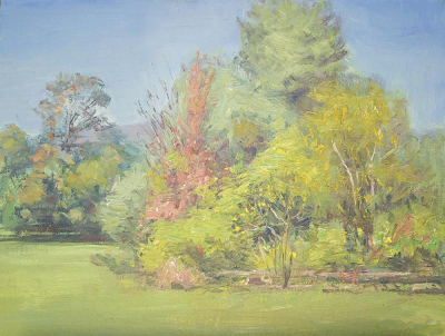
 Here is the painting of which I spoke yesterday, I think this is really sweet. I love the tonality and it has a nice airy look to it. The color is all well observed and it is well related across the canvas. I like the reddish notes the artist has interspersed among the greens to balance them. It has a lot of unity and is a very professional piece of work. This piece is by our mystery artist, with whose evisceration I will now resume.
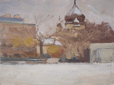
 The piece above has great tonality but it has two problems that jump out at me. The first is that the snow across the foreground ends abruptly, nearly cutting the painting in half. Also the lack of gradation or modeling make it stand vertically like a wall, rather than laying out flat like a field before us.
The biggest problem with this piece though is the intersection of the onion dome with the top of the painting. It forms an uncomfortable tangent (intersection) there. This is often a difficult situation to deal with, but it is made more so because it is such a compelling shape to put up against the frame. Since this dome is the subject and most finished area of the painting, putting it against the edge of the canvas is a design problem.
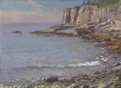
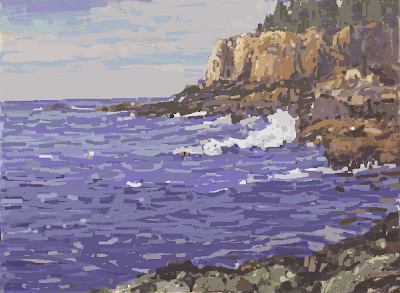
 Above is a scene from otter cliffs in Acadia National Park. I have extensively reworked the image in photoshop, using my extremely limited CG skills. Here's what I did and why;
The water seemed sort of empty to me so I threw some surf in there. The contrast and action made that the subject matter area of the painting because the eye now goes there. That also gets you over the footlights and into the picture. Most of the painting was about the same value and I wanted to get some punch into it. I dropped the value of the water so the foam of the breaker and around the shoreline rocks would light up.I used bits of foam to make it clear where the ocean met the rocks and got some darks in there to define things. I also defined the shoreline rocks and gave them some vertical sides that dropped down to the water. I upped the contrast in the right hand foreground rocks too. I also united the smaller similar shapes into fewer larger shapes that were more different from one another.
The top of the cliffs seemed too straight to me and cramped up against the top of the canvas so I dropped it down a little bit and developed the trees up there. I cut some sky holes down into the trees to make a more interesting profile that interlocks with the sky. I also dropped the horizon a little bit. Since the horizon is our eye level, this lowers that too. That makes the cliffs tower over us more. I needed that because by cutting the sky down over the cliffs I had shortened them up some.
I wanted to find ways to get value variations and get light shapes against dark so I dropped the value of the cliffs on the right side so the rocks would stand out in front of them.
On the left hand area of those rocks below the cliff was triangle of blue gray the same value as the water that didn't identify itself so I turned that area into rocks and got some darks in there as and then linked the darks across that area to simplify the shapes there.
The clouds in the sky echoed the shape of the cliff, they were the same height and were of nearly the same value. I reworked the sky so that it operated independently and also brought our eye across the canvas to the cliffs.
Lastly I scattered some little highlights and bright accents around to enliven the painting and also to "tune" its balance a little bit. Now of course this is my "take" on the painting and probably has nothing to do with the artists original intentions. This is just what I would do to it.
When I work on things in photoshop I just use the brush tool and it makes them look like they are made out of those multi colored rubber worms they sell in bait shops. Say, I think I will go get a snack...............Stape


2 comments:
STAP,
Excellent lesson with the rework of OTTER CLIFF. I learn so much by listening to the reasons why you change the things that you do. I paint with feeling and emotion and find myself getting stuck and not knowing where to go next in my painting and I think that is because I am not taking the time to apply conscious reasoning to my design intent like the way you do with your choice of words on this critique.
JAMES
Design IS reason...Stape
Post a Comment