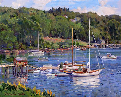
 Here's another of mine from Maine a few summers ago. I have no idea what it has to do with the discussion at hand, but I always start of with a picture and I thought this would do. I have been talking at length about getting light in paintings and this one seemed to have some light in it.
I was feeling a little tentative about the title too. I hope I can be more precise in the post itself. I am slowly getting my new computer set up. Its a 64 bit computer running Windows Vista, so I had to throw my old copy of photoshop express away and I am waiting for the new version to arrive. But other than the lack of photoshop I am pretty much up to speed.
I want to touch on a number of things some of you have asked me and I want to throw out another idea or two about light.
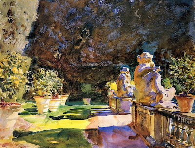
 Here's our Sargent again (from artrenewal.org) Look at that sunlight across the ground in the middle of the painting. The color of the light is described by the color of the shadow as well. Sargent has painted the shadows the green we would expect the grass to be, sort of the local color, he has painted the lights a bright yellow. As I said last night Sargent had a lot of little effects he liked to use. Maybe it really looked that way, but I doubt it. If you paint the shadows the local color or a cooler version of it, you can make the lights almost any color you want. . That is, if you keep the value up, in the light Value is a part of drawing and you need to get that right. But you can hang many different colors on that scaffold.
A reader asked;
Would you say that avoiding piecemeal work is the same as making sure you have a focal point with all else subordinate to it?
While that is a good thing to do, I mean something else when I speak of avoiding piecemeal observation. I remember when I was first told about this it seemed impossible to me. I couldn't get the idea for a while but the phrase "paint the hands the way they look when you look at the head, paint the head the way it looks when you look at the hands". was the key for me. Now I say that as a sort of a zen statement, rather than as advice for portrait painters. It is a bit of an exaggeration. But the idea is in there. If you are seeing the totality of nature, the "big look" you see both the head and the hands at once rather than first one and then the other. You paint the hands the way they look when you are doing that, rather than the way they look when you look at them alone.
When I am painting I am not laboring to do that, but I am careful to avoid giving some part of my painting a rendering that makes it a little separate painting on my canvas rather than a part of the choir singing the hymn which is my larger painting. If you have one singer whose voice stands out completely above the rest of the choir, you have to train her to keep her place so the choir sings with one voice rather than an cacophony of different voices.
A professional artists who reads the blog, suggested this;
A field of grass is a field first; you should be able to capture the color and tone of the whole before you add a single blade of grass. That seems to be another way of getting at the same idea, sometimes called breadth of vision.
I start out with a shovel and I finish with a needle. I think I got that from Ives Gammell. If all of this is confusing I apologise. I will continue to think about this and maybe I will come up with some more ways to describe this sort of seeing. For it is a way of seeing and not a drawing method.
Another reader asked me about whites ; I did a post on whites and my favorites, here is a link to that, Ta-Da.
- I almost never use white straight out of the tube I always add at least a little bit of some other pigment to it. That helps keep my whites looking less chalky and it gives a little more characterization to the high key notes.
- the brightest note you can make is not pure white, it is white with a little bit of cadmium yellow light or pale in it.
- every drop of white you use is a drop of color you don't.
- adding white may take you to the value you need to describe something in the light,but it will not give you the color of something in the light, generally in the landscape you will need a warm yellow- red color, that is very high key, but still perceptible.
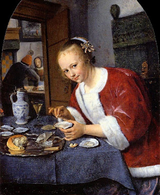
 Jan Steen, Woman offering oysters. (courtesy artrenewal.org)
I think in retrospect, that may have been just the right title. asjjfrkmokfjgpydipudatrefajarq! Kinda catchy.


12 comments:
Stape...You were coming off to me as a Blog God and you had to go mess it up saying you are using Windows Vista....a good computer is like working with the BEST brushes and paint and surface....next time check out a MacBook......;v)
Great post as usual my friend. I like what Gruppe said..."You should be continually looking around and even look straight up at the sky and come back to what you are painting to stay fresh with the over all first impression and big picture"...
Frank;
I like my new PC, it was a cutout from last year but it has a lot of power,and I got it cheap. We are Yankees out here Frank.
I actually prefer the PC, it is what I have been using for years and I am used to it,
I do love my iPod though.
I am about ready to move to Cali, it has rained every day for months. No one here has ever seen this before. Every day I wake up to rain.
..............Stape
" Piecemeal" The term has its roots in Old England. I think of these small morsels given to orphans like Oliver.
I have updated the concept and tell my students that if you paint this little section here and then paint and finish this little section there that their painting will end up looking like a PIZZA.
Somehow the food analogies work...hmmmmm
I was just reading about color intensity in Walter Sargent's book "The Enjoyment and use of Color" this morning. He makes a similar suggestion to what you pointed out in the other Sargent's watercolor; a green grass may be yellower in the light, and bluer in the shadow - both adjoining hues of yellow. This adds intensity and the illusion of light that cannot be as accurately obtained by varying value and intensity only.
The "pizza" description is perfect for when your focus is too narrow. Stepping away from the work helps, as does painting the whole thing; even when all you wanted to do was make a change to a detail, that change will also likely result in changes to the rest of the work.
Great post once again, Stape. I wonder if the way a picture is started helps to us focused on the "whole". I used to begin like Don Demers is quoted as beginning with a wash of local colors to cover the whole canvas. then begin to lay in color and draw more accurately. Now I begin with a burnt umber wipe away to 3 or 4 values. Then I mix a bunch of color and values that I see in front of me, and then I put the paint up. Either way allows a look at the totality before continuing and allows some adjusting before committing.
Also, about your terrific opening picture... Relating to the patch of grass at the lower left corner. I recently painted a scene and depated about including a similar patch of foreground. I did put it in, but I think your picture works well either way. What was your thinking on that passage at the time and what were you trying to do with it?
Buslax= (1) A fuel additive which allows big Greyhound deisel busses to pass exhaust fumes without damaging critical gaskets, etc.
(2) A patent medicine that allows one to maintain regularity on long bus and airline trips.
WillEK
By the way Stape, three point perspective actually comes into play when doing my portrait.
Jeremy"
I have that book. I had forgotten he spoke about that. The important thing here I think, is that Sargent made a decisions to do that rather than passively observing it.
.........Stape
Jean:
This ain't Franks blog.
...............Stape
Willek
Those are both fine ways to start a painting. I think burnt umber is a nasty color though. I have even heard it questioned as being a problem in the longevity of a painting. Perhaps you might consider burnt Sienna. Or that and ultramarine.
That picture needed that. I wanted to give the viewer a place to stand. Other wise it would seem uncomfortably like you are hovering in mid air. It provides an explanation of the viewpoint. It also gives one more layer of depth.
buslax= anthrax spread by public transit.
......................Stape
Jeremy;
If you had a wooden hat you could reduce the potential risk of lightning strikes.
.....................Stape
That's okay, I've got my wooden head.
Post a Comment