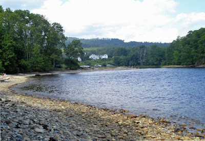
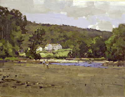
 Tonight I am going to talk about why I made some of the decisions I did in the painting above. For those of you long term readers of this blog, this will be a review for you. However there are a lot of new readers and I would like to talk about these ideas again for them. I will also present a link or two back into the blog where I have dealt with these same ideas in greater detail.The location is the mouth of the Ducktrap river, in Lincolnville Maine. You can see I have changed a lot of things to make a painting out of this place.
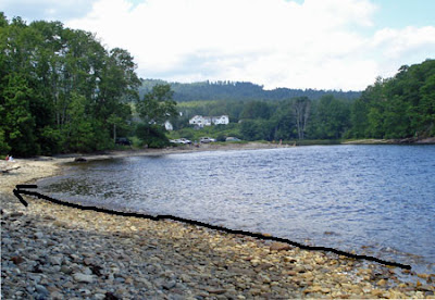 The first problem was the shoreline. that strong diagonal didn't lead into the painting, It takes the viewers eye to abruptly and slams them into the frame at the left. But there was another problem also. I felt that all of that water was rather uninteresting and the brightness of it drew attention away from the area in the middle distance that I wanted the picture to be about. I have painted along the Maine coast many times and I have experience with how the shore looks at low tide. Just because it happened to be high tide when I was painting, doesn't prevent me from changing it to a low tide.
The photo above doesn't show it but the sun came out several times and lit that area around the house. In order to make that area light up, I need to surround it with contrasting darks. If I shone a flashlight at you on a bright sunny day, you might not notice. If I shine a flashlight at you on a dark night, you are sure to see it. It is bright by contrast with its surroundings.
In order for something in a picture to light up, it is necessary to put in a dark against which your light can contrast.
So I painted all of that mud of low tide relatively dark. When I painted the middle in a high key it now lit up.
I did the same thing with the color. I used some bright yellow and reddish notes in that illuminated area, in order to get them to show up, I painted the surrounding area grave (lacking color).
In order to appear very colored, an area has to be compared to a nearby area that is not.
A wise artist I know, once told me "all color is no color" You need some greys and somber colors to mobilize your color.
Here is a detail of the middle of the painting. I have used counterchange to make those figures stand out and to make their relationship to their background more dramatic.Long term readers of this blog are rolling there eyes no doubt, about me going off on counterchange again. But it is on the list of design ideas I am trying to present in this blog. There is method to my madness, I am trying to sell you some simple ways to make deliberate choices affecting the design of your paintings. Counterchange and framing lights with darks and arranging my details across the middle of the painting are all examples of schemes I can impose on nature.
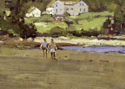 Look at the little guy on the right. His white shorts stand out brightly against the mud flats, his torso, although darker than his shorts is in front of a distance passage that is darker, and just a little higher, his head is dark against the illuminated passage behind it. The values in the figure are manipulated so that they are always contrasting with the background behind them
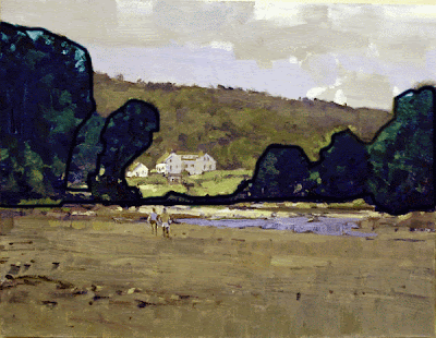 The detail above shows another element of this design. The trees across the middle of the painting are all hooked together into one big shape and it all sits in front of the lighted area. Like a window we look through, or one of those silhouettes that our colonial ancestors used to prize, cut from black paper and mounted on a white field. This dark aperture contributes to the effect of light, that I get in the middle ground. There's that contrast thing going on again.
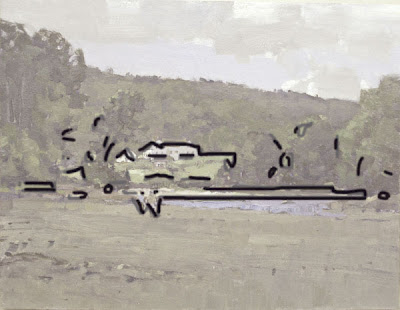 Here's another thing going on in the design. A lot of the little lights and darks and interesting details are all dancing across the painting in a band. The rest of the painting is made deliberately less interesting than this focus area of the painting.This is my climax, the rest of the painting sets things up so this "string of pearls" works. That link will take you to a previous post where I explain the string of pearls concept.
I am tired now, aren't you? More tomorrow. I will talk about underpainting in a monotone called grisaille


14 comments:
Hi Stapleton
I really enjoy your blog I just discovered it a month ago and I now have become a daily reader. You do a great job explaining the "art" part of art I.e. Composition and design I am learning a lot
I have a question about white, which might get answered in your next post. Why do you not use white in your underpainting. The 19th century French artist Eugene Carriere said to always use white in the underpainting, but he was more a tonal painter then a colorist I just can't remember why he said to use it.
Thanks Tom
Another really good post. Again. the thought process behind the picture is what is so valuable to me. I would say more but I and a friend are off to Pigeon Cove!! WillEK
What can I say... this is incredible! So helpful coz you illustrated in pics what you're describing in words.
Amazing that you make these design decisions while painting plein air.
Great review. I am glad to see that I actually understand what you are talking about and started to notice the aspects of design before you elaborated on them. That's thanks to your previous posts.
I am looking forward to your thoughts on underpainting since I hear so many things. I just started a burnt umber underpainting for a still life, and now I'm wondering if I should have done it in ultramarine, or a grisaille.
Excellent post Stape. Your pragmatic approach to design is surpassed only by your ability to explain it.
Boy, It was such a great day, great sun, Blue skies, great clouds, I covered a good size canvas, but it is really awful. The composition is really bad, my draftsmanship is off and all my color judgement seems off. I have to say that tide and sun were changing wildly and I was making snap judgements and hustling all the time about value and color... and it was hot as blazes out there. We quit after 4 hours. I'll attack it tomorrow here in the studio, to see what I can do before wiping it out. WillEK.
Tom
Thanks. I will answer that in tonight's post.
.................Stape
Willek: Thanks. I used to live in pigeon cove, just a block from the harbor you will be painting. It looks easy but watch out!
...............Stape
Woodward-Simons;
Thanks, I will work for praise! I make lots of decisions about design working outside, that's my focus ,I guess.
................Stape
Jeremy; I thought as I wrote it that the long term readers are going to feel this is a review, or at least a demo of ideas discussed some time ago.
..............Stape
Simone:
Thanks. I hope I can explain underpainting tonight. Every day is a new explanation.
................Stape
Willek:
Pigeon cove is a dangerous place.I have crashed and burned many times there. You are lucky to get to paint in a location that so many fine painters have worked.It always looks so promising. Anthony Cirino used to nail that place though.Do you kn ow his work? Did you know that Hassam painted granite pier, about half a mile a mile away?
.................Stape
Wow! I love these last two posts. I was (really, no kidding) going to mention that I'd love to see your process in working on a painting, and voila! here it is! This is really helpful, informative, and I also like that painting quite a bit. I love the way figures add a bit of vitality to the scene, and somehow make it not "just another landscape" but really a feeling of life going on in that place. Love it! Thanks much.
and oh boy, underpainting. My impatient nature rebels against it, but I do love much of the affects.
And I'm too tired tonight after chasing two grandkids all week to think of a definition for tonight's word: pyrati.
Deb:
Thanks.I am going to continue with this topic for a while. Tonight more on underpainting.
pyrati= led by captain hooki
...........Stape
Post a Comment