Monday, November 30, 2009

When can I varnish?

I was asked recently by a reader when a painting can be varnished? I don't know.


Well OK, I kinda know, but its complicated. The real answer depends on who you ask. Like much of the rest of life.

WHEN YOU CHOOSE YOUR ADVISERS YOU CHOOSE YOUR ADVICE

(that might make a great neck tattoo) When you read the official "how to" texts they suggest waiting about six months or a year. I have no idea at all how I could actually do that. I don't see how any professional artist could. But if you can make a painting, store it for a year and then varnish it, that's what you should do.

I have heard some painters say that if the painting is only days old it is OK to varnish it ,because the varnish gets incorporated into the paint film as a cohesive unit. Maybe, but I think that defeats the idea of varnish in that it wouldn't be removable. Varnish is like the wax on your car, it takes the beating instead of the paint and then you strip it away and put a new coat on now and then.

But the reason we painters use varnish is that it restores the look of fresh paint to the art. As an oil painting drys it goes matt in some areas and the color fades a little bit. Putting a gloss on the surface fixes that. Here is a post on varnish incidentally. We want the painting to look colorful and fresh because we want to SELL it. We cannot afford to wait for six months to a year. Pretty much everyone I know varnishes their new paintings, often with retouch varnish.

I am not a paint chemist, and I am sure some one who reads this blog is, or a restorer, you are free to weigh in.

Here's
an interesting bit of historical ephemera. In the 19th century salons, the day before the show opened was called varnishing day. Artists would be allowed to come into the exhibition space and varnish their work so it would show well. There are many stories of artists retouching their paintings etc on theses days. But I bring it up for another reason. I believe that then as well as now artists worked on pieces for an exhibition up to the last minute, if they didn't there would in fact be no need for a varnishing day as the paintings would have been done and varnished a year before. I think many were delivered wet or near wet and that is why they needed to dry and be varnished. I have had the same problem myself and solved it by visiting the showplace and varnishing my painting the day before the show opened. Therefore even 19th century academicians, master of technique, were certainly varnishing not only new paintings, but their masterpieces without waiting the requisite six months.

My conclusion is , if you can wait for six months do, but I don't see how a pro out in the market can. I varnish them because I have to. What you do is up to you and I take no responsibility for your results. Lets forget I even brought it up, OK?

Sunday, November 29, 2009

Another annoying dissection

Some unattractive event involving a spleen.

Our next patient is duct taped wide eyed to the gurney and yammering something about going home, and its mother, lets operate, and quickly, before it gets away!

Here is the piece as it was sent to me. Its a nice piece of work, done by a practiced artist with a real feeling of truth to it. I had a few little changes I felt like making and I resected its abdomen in photoshop and came up with this.

Here is what I did and why.With bullets, even were they not called bullets, I might still use them, it does give a well informed look to my writing.

  • Like I did with another piece this week I cropped the image on the right a little. That had several benefits, but mostly it got that tree out of the middle of the painting and off to one side. I felt that looked better, less static.
  • I cropped the bottom too, but for a different reason. I like to throw the "footlights" of a painting out a little further than the first image did. It is difficult to paint everything from your toes to the zenith. The reason for this is that it makes the viewer feel as if they need to move their head on its stalk in order to perceive all of the image. When they feel that way it is hard to keep them believing. It is something to watch out for on the horizontal axis too, although less so. Again it is easily done, the luminist painters did it a lot, but you have to be aware of what you are up to and account for it.
  • Cropping the image did tighten up to the best part of the painting and I feel like I closed in a the story and eliminated some non essential stuff. It is a tighter story now.
  • I worked on the tree branches a bit. I removed a couple that just ended on the left hand side. They were no doubt actually like that but I think they looked kind of amputated. They cause the viewer to hesitate, what happened to them? Lets not give that viewer a reason to reject our picture, shall we?
  • I upholstered the branches of the left hand tree and the one in the middle of the painting with the fine haze like twigs which often occur against the sky this time of year. I also threw in some little dry leaves that the wind left on those branches. I like to do that because it gives a decorative look to those situations and allows me some accents and implied detail.
  • I removed a fence post and some branches that were clawing their way in on the right. I felt the area would be better if it was "decluttered".
  • In the middle distance I mixed things up a little more. I dropped some notes recalling bare branches over that blue and I toned the whole blue passage down. I also made that group of trees a little more important.
  • Lastly I straightened out that back field where it met the tree line. It seemed concave. Concave lines are generally to be avoided in landscape, the earth tends to be formed out of bulges, convex lines. Concave lines give a sickly look to a landscape.
The snow camp workshop is full. Several people e-mailed me at one time or another saying that January is not so good for them. Is any one out there interested in a February snow painting workshop at the same inn? Please e-mail me at stapletonkearns@gmail.com and let me know.

Saturday, November 28, 2009

A little off the top please


Dissecting the genitalia of the male Cactus Moth by Richard L. Brown of the Mississippi entomological museum

Its dissection time again here too. So spritz a little alcohol on those moth abdomens, grab your
Dumont Forceps and lets open a few of them up!

I got this image to critique and I scratched my head for a while. Its got nice color and the values are pleasing, but it lacks something. The artist was smart not making it too symmetrical, but it still just misses. It is I think one of those situations where it seemed really cool when you were standing in front of it. A great concept and the waterfall was exciting. But it just didn't work as well in paint as in reality. I have made plenty of those myself.

I think It would probably have been advisable to back up a bit and get something else into the painting. I was reminded of these two paintings by deceased Gloucester artist Frederick Mulhaupt, both feature arched bridges like yours. I don't know that they are so similar but he was working with the same problems. There is also a Theodore Wendell of the Ipswich bridge that I went looking for and couldn't find online.


I think both of these, but particularly the upper, play a structure of verticals against the arched shape. They show two different kinds of shapes juxtaposed against one another, the arch and the vertical tree shapes.

Contrasting one sort of shape with another group of shapes that are very different is often a very effective way to build a composition. This is a concept that rock nd roll uses all the time. Think about how rock musicians often set up a tune, They will have a very sweet A section and than contrast it with a very brutal, minor or crashing B section, they alternate back and forth, each contrasting with and relieving the other. The British invasion bands were extremely fond of this, the Beatles used it all the time.
There are only three spaces left in the snow painting workshop. If you want to sign up, you can do that here.

Friday, November 27, 2009

Snow Camp 2


Here are a couple more shots I took the other day at the Sunset Hill House

I have had a long day. I visited my little sister and her husband for Thanksgiving and we ate and ate . We had turkey (did you know there is a chemical in turkey that makes you thankful?) and stuffing and three kinds of pie. I took my own Moxie as I knew I couldn't count on them to have it. Now I am exhausted. So tonight's post is going to be a plug for snow camp and then, maybe I can find one small thing that I can say to be useful to those of you who are unable to come. Every night when I write the blog I always ask myself, have I said something that will be useful to the readers?

The details of the inn package are worked out and on the page for reserving the workshop, that's here.
The only thing I missed before is that the inn is including a three course meal for all of us in a private dining room that Sunday evening. When I do workshops, if I can, I like to do a total immersion thing. That is, paint all day and then get the whole class together for dinner so we can talk art and experience the camaraderie of the other artists. I think it is possible to squeeze a lot more in that way. So when I do a workshop we generally eat, sleep, and breathe art for the entire time. Being in an inn up in the mountains is the perfect way to do that. I was up there again the other day, scheming with Nancy the innkeeper about how best to do the workshop and I think I have really broken the code this time. It is just such a perfect setup. The class is half filled already, so if you want to sign up , now would be a good time. I think it will fill quickly as I am deliberatly limiting it to ten students.

Now lets see, something useful, but not too ambitious, How about this...........

Opposite colors, or compliments as they are called, have opposite effects depending on how they are presented together. They can either make their opposite brighter, or more grave, here's how. If you mix two compliments, you get a gray color, but if you put two compliments side by side, they each look their brightest. So always be aware of whether a colors opposite is already, or should be, introduced into a passage to accentuate that color. Conversely if you want to keep a color from speaking too loudly, and hold its place in the choir, rather than sing a solo, you add its compliment. So a colors compliment is the key to making it both brighter or grayer!

Watch that you are managing compliments intentionally rather than having accidental compliments control your color for you. Color is a great servant but a lousy master. There.

Thursday, November 26, 2009

Thanksgiving

Norman Rockwell image from artrenewal.org.

Above is "Freedom from Want", painted in 1943. The world was in flames. In January of 1943 The battle of Stalingrad ended with the surrender of the German sixth army. Stalingrad was the bloodiest battle in the history of the world, leaving two million dead. America fought the battle of Guadalcanal earlier that year. Sicily and then Italy were invaded by allied forces .We know now how the Second World War would end, but in 1943 the outcome was, of course, not known. All over the globe men fought and died to stop totalitarian Germany and Japan from enslaving the world. Seventy million lives were sacrificed to the Moloch of Nazi ambition.
Many who saw this painting must have wondered if they would ever see their familys again, and many of them didn't. Those at home wondered when they would see their husbands and sons at a happy Thanksgiving table again too.

This must be Grandma and Grandpa at the head of the table with the turkey she has cooked, after setting it on the table Grandpa would have proudly led the family in a prayer of thanksgiving for all that they had. I think he would have prayed for victory overseas and a safe return of their family and neighbors from battle. He would have prayed for an economic recovery as the nation had been in the great depression for over a decade.

We are in a war overseas again today, the casulties are numbered in the hundreds and not by the millions, and our nations economy is weakened, but it isn't nearly as damaged as it was in the thirties. Our food is not rationed as that families certainly was, and while we are concerned about the future, it has never looked as bleak in my lifetime as it must have in 1943.

I suggest that we try to feel the hope and thankfulness that Americans did when this painted prayer of thankfulness shone like a candle in the darkness. This Thanksgiving I will thank God for my family, and ask his blessing upon my friends, and my comrades in art, for you who are reading this, and for our nation.

Happy Thanksgiving and God bless you................Stape

Wednesday, November 25, 2009

Snow Camp!

Tonight I am announcing the snow painting workshop. It will be here, at the Sunset Hill House near Franconia Notch in the White mountains of New Hampshire. The views are out of this world and the Inn is going to be a great place to do a workshop. Here is a picture of the Inn with the mountains behind it. Here is their web site.

We can walk out the backdoor of the inn and paint on their enormous grounds with views of the whites and we can run back inside by the fire and drink coffee if our feet get cold. If we want to leave the inn there are great locations all over the area. This is sacred ground for American landscape painting, Bierdstadt and McEntee and most of the Hudson river school once painted in this area. The workshop will begin on January 30 and end on the evening of February the 1st. That's three days. I am charging $300.00 per person and I intend to limit the class to ten this time.

I have been able to arrange with the inn for a discounted rate for the class, that is $278.00 for the Saturday and Sunday nights lodging. That will include breakfasts at the inn. So the whole show comes in at just under six hundred dollars for the weekends lodging and three days of instruction. This is a lovely, grand inn in the 19th century New England tradition. I think we should all be very snug and comfortable. Up there in the mountains I think we can count on plenty of snow.
If you want to attend the workshop click here and you will be able to make a a deposit of 150.00 to reserve your place in the class. E-mail me if you have any questions at stapletonkearns@gmail.com

I have been painting snow outside for more than thirty years and it is my favorite subject. I think snow is probably the thing I do best and I am looking forward to disclosing what I have discovered about painting it. Snow is of course not white. There are some logical step by step ways to approach the problems of painting snow.

curled up in the cozy dissection lab on a chilly November evening


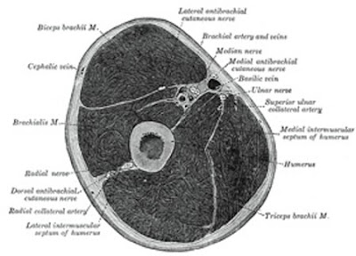
Here is a cross section of the upper arm from Gray's Anatomy. I'll bet you thought it was a Thanksgiving ham,didn't you? Its dissection time again! Here's our first subject now, relax, this won't hurt a bit.

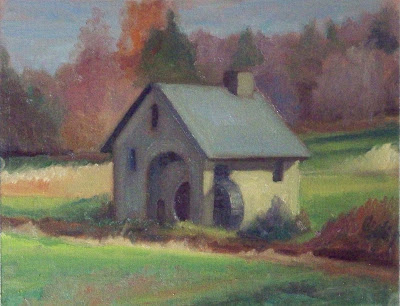
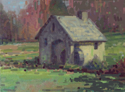
Heres a little mill, the original is above and my photoshopped version below.

Here is what I did to it and why.

  • I cropped it so that the mill no longer was right in the middle of the canvas, but had a little more open space on the left than the right.
  • I altered and strengthened the shadows at the lower right to carry the eye into the mill. That also gave me one dark corner and one light one. That is more interesting. I did the same thing up at the top too, closing off one side and showing the sky on the other.
  • I made the effect of the light more pronounced. I lightened the roof a little, and I darkened the shadow side, then I threw some reflected light from the grass and some variation into the color of the shadow,
  • I darkened all of the grass to get the illuminated wall of the mill to light up by comparison.
  • I tied all of the darks across the foreground and in the shadow side of the mill into one big shape.
  • I scattered some little accents about to give the look of a little more detail and get some vibration here and there.
Thanks for the image, mystery artist, I hope you find something of use in what I said, and remember this is only my opinion. I don't have THE only answer, I can only tell you how I would handle the problems presented in this painting.

Tuesday, November 24, 2009

Late November disssection time.


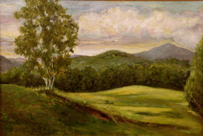
Its dissection time again! Hand me that Ginzu knife and lets get to work, there are several squirming volunteers duct taped to the gurney now, lets open em up! Here is the first, I of course do not reveal whose art I am critiquing and I don't always choose the best image I am sent. I am always looking for problems to point out. This artist sent some other images that were to my mind, more successful. I also like to mention that painting is HARD and I am thankful to the mystery artist who sent me an image to critique.


I will begin by talking about color. The painting is too much the same green all over, the distant hills are the same color as the foreground hill. The values AND the hues of the greens are too similar. All of the greens in this painting are in the same family. A good way to avoid this problem is to only allow yourself cadmium yellow in the foreground. Try painting the distance using ocher, or at least a lot less cadmium. If you put two notes on the canvas that are the same, the eye will assume they are equidistant. It is good to drop the yellow out of a painting as it recedes into the distance.

I did couple of posts not to long ago on greens they are here. and here and here. Those posts show a number of different sorts of ways to make greens. I heard a story once that the Eskimos had dozens of different words for snow, each describing a different sort. If you think of colors as words you will need a bunch of different ones to tell the story of this valley and hills.

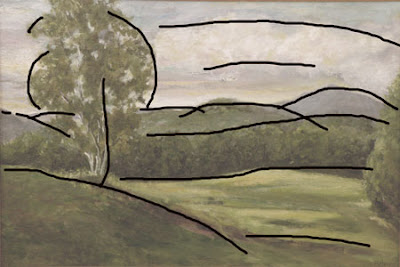
Here are the lines in the painting. They all march from one side of the painting to the other, well all except for the first hill on the left. Also as soon as we get out to the middle distance they are all nearly parallel and equidistant. Like the color the shapes or lines of this painting need greater variety. Perspecting lines that lead into the painting are generally the antidote for this. Sometimes I refer to this problem as stripeyness.

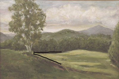
If you look at the overlay above you will notice that the strongest lines and the greatest contrast lead you to an intersection of the foreground hill, the base of the tree and the distant row of trees.It all seems a little coincidental I think it would be more natural if the line of the distant trees met the foreground hill lower.That will help to bring the foreground hill up and in front of the distant one.
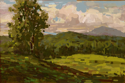
Above is the original, below is a version that I have beat on in photoshop a little.

I have of course no idea of what the place actually looked like and I have imposed my own ideas on the artwork which are probably a long way away from its original intent. Here though is what I did and why.

  • I divided the tree into a light area and a shadow area to get form and a more interesting storyline there. I also implied a more "springy" S curve into it that makes it a little more lively.
  • I deemphasized the meeting of the field and the treeline in the middle distance.I thought that passage called too hard for our attention and when we arrived, there wasn't a lot to see.
  • I raised the value of the darks in the distant trees, to get them to drop back.They seemed too inky and assertive to be so far away. I added air between us and them.
  • I eliminated that tree that was hugging the edge of the painting on the right, and threw a few accents out into the field to give it a little detail out there.
  • I redesigned the clouds to make them have more form and to get a little more visual movement up there, I also darkened the sky and threw some lights into the clouds to raise the contrast up there. That gives it a little more light.
  • I made the distant mountain larger than the hill in front of it so it would be the more dominant of the two.
  • I increased the contrast and put in more darks and lights as I felt the whole piece was stuck in a middle tone. The decisions I made were based purely on design considerations. It may very well have been all middle tones out there. I threw some bright accents on top of the foreground hill and some dark accents into the distant hill. I did that in both places to lead the viewer to believe there was some detail going on there.
  • I threw some different greens into the piece. Doing that in photoshop seemed real clumsy to me. In Photoshop I always feel like I am working in Gummi worms.
Thank you mystery artist for letting me rip into your painting. I hope something I said was useful to you. In the old days before Photoshop it was only possible to do this sort of thing actually on the victims painting. Ain't technology great?

Monday, November 23, 2009

On Rock and Roll, John Cage, traditional painting and okra.


Motion Ensemble rehearsing John Cage Variations III on May 9 2007.John Milton Cage Jr. (September 5, 1912 – August 12, 1992) Piece from 1963


The Beatles This Boy first released 1963 B side of I want to hold your hand.

This evening I want to provoke those lovers of modern "classical" (?) music. I am not comfortable with calling music which I think is a rebellion against classical music ,classical music ,but I am reluctant to call it orchestral music, this piece anyway. Cage did write for a classical orchestra and I believe he is usually referred to as a classical composer. Roll over Beethoven!

I am an aficionado of Rock and Roll, most of you who follow this blog know that. I have nothing against classical music, its just not what I listen to. I make no claims to being an erudite scholar of music. When I do listen to "classical" music I like the late 19th century guys like Chopin, Ravel , and Debussy, I also like the piece Iberia by Albinez. All of that is actually romantic music I guess.......

I happen to dislike the Cage piece, I also dislike Webern and Schoenberg but that's not the point. I also dislike tofu, okra, and sports. That doesn't make em bad, I just don't like em. You might. Its a matter of opinion. I won't eat tofu because its good for me, nor will I listen to music because its good for me. I go to music for enjoyment. If I was a scholar of music, or a musician, I might need to study John Cage and Schoenberg, but I only listen for pleasure I have no interest in that which I find displeasing.
I want to point out what I think is the similarity of traditional painting to rock and roll and that in my opinion contemporary ("modern art") painting is more like modern music. John Cage is a good example for a couple of reasons here. He hung out with "modern" painters and I think his music drew upon the dada sensibility that drives most of modern art. Here, laid out as bullet points are my arguments for these comparisons.
  • Rock and Roll is (was?) a widely popular art form, easily understood and enjoyed by a great number of people, very few people listen to or enjoy modern classical music outside of rarefied academic or professional classical musicians circles.
  • Traditional painting is easily understood and is the "peoples" art of our world, the greatest number of people are attracted to traditional painting and very few outside of the art schools or academicia follow modern painting.The big money is there, for sure, but it is a small group of people mostly in the urban high rises of several large American cities who are actively collecting and following modern painting. It is not a "peoples" art.
  • It is relatively easy for millions of people to tell whether a rock band is "good" or not. Now the lines here are fuzzy you may like this band, and I another, but in general we judge rock bands on the strength of their instrumental abilities, showmanship, song writing etc. There are some rough standards the the average citizen can understand and debate. While I might disagree with your assessment of a band, I would have no trouble understanding the terms you were using or how you were arriving at your opinion.
  • A critic arguing for both this John Cage piece and a "modern" painting is usually speaking a language that the citizens can't understand. Open a copy of Art News and try to read the dense prose that describes the Art. I like to think of my self as bright enough and I know something about art, but I'll be damned if I can follow what the hell they are talking about most of the time. I think its mostly a stream of pretentious nonsense designed to snow me. Compare that with the prose in Rolling Stone which actually makes sense.
  • There is an amateur non urban movement in traditional painting today, there are fine painters coming out of the West and from all across the country,besides in New York and LA. That's like Rock and Roll too. Modern classical music is generally coming from academia and the cores of a few large cities, like modern painting.
  • Traditional painting has subject matter, so does Rock and Roll, whether it is about, your girl, your car or your pants it has subject. Most modern painting sees subject matter as sentimental and tends to be opaque and deliberately hard to understand. Often titles are cryptic and what the piece is about is only to be discovered by reading the little tag beside it.
  • The role of the critic is enormous in modern painting and music. Critic's proclamations define which artists are "good" and which are not. The critics largely ignore traditional painting and we are left with having to decide for ourselves what we value and don't.We are getting by without em. The listeners of Rock and Roll paid little attention to music critics either, they liked Led Zeppelin, they don't care that Rolling Stone dismissed them during their hey day.
  • Modern painting is nihilist and elitest. Rock and roll, and traditional painting are romantic and sentimental.
  • Rock and Roll has stood the test of time in the popular culture. How many people can identify a modern painting from 1960 compared to those who can recognize an Elvis Presley tune? Did you ever pass someone on the street who was whistling a Schoenberg tune? Christiana's world is instantly recognizable, can you hum me a few bars of the John Cage tune you just heard. I didn't think so.

Sunday, November 22, 2009

A little more about the internet and artists marketing.

I think you need to have an internet presence, But I am not sure how much is really required. My own assiduous research seems to indicate that blogging is not a moneymaker. There is however plenty of work in it. I don't think that Facebook is a bad idea either, although I don't put in much time there, it is fun to network a little with some artists from across the country. Where that will lead I don't know. There seems to be a linked community developing and I have discovered some fine painters out there and probably gotten some name recognition. I don't think it its a moneymaker either.

You simply have to have a web site though. The first thing people do these days is go online and look you up. Gotta have it! If you don't, you don't exist. I think the phrase "award winning artist" is getting a little shopworn incidentally. I wrote several posts about writing bios and here is a link to one of them. Your site needs to have a good bio and it needs to show perhaps up to 20 of your best paintings.

When I had my first web site built in about 2001 it was an e commerce site. It was a data base driven behemoth that had prices on it, computed tax and gave dimensions , shipping costs and fed my cats when I was out of town. You hit that flashing "buy now" button, and the patent leather dirigibles came in real low, strafing the frightened customer with feather bearing leopards wearing balls and chains. Everything in my inventory was on the site, and it had to be updated every eight hours. I kept telling the web master I wanted flames coming from my name but he wouldn't let me have em, said that was only for porn sites. It was wicked cool, but it didn't sell art.

Now I see a web site as an advertising device, like a magazine ad. I put up about twenty of my paintings and now and then add a new one. But it is pretty static. If you want changing, dynamic content and you have to come to the blog.

I am a little torn on how to advise amateurs and students on whether to post their art. I know it doesn't make sense for them to buy magazine ads. My advice on that is that you shouldn't pay more for an ad than you are ROUTINELY paid for a painting. I see some advertisements in the art magazines that make me embarrassed for the people who bought them. They always begin with "award winning artist".

But I guess I feel differently about web sites. So long as they are not expensive and as your art improves you update them. But don't try to pretend you are something you are not, avoid the superlatives like "internationally known". There are so many artists out there making those claims that no one is impressed by them and what the artist is really selling is integrity. Tell people what the deal really is, and build their trust. In the long run, people buy from artists they trust. I don't generally think it good to post your prices on your web site, but people differ on this. I guess if they are very low and you don't need to look classy its OK. But if you have high prices and want to play in the upper market I think it looks a little off.

I am not a big fan of the daily painting thing, however if that's what you want to do, I suppose it is a good discipline. You will post prices for that though. I think it will make it hard to sell more expensive work in the galleries. If I were running a gallery I would be reticent to handle an artist who was selling his work online for less than the price of a decent pair of tassel loafers.

For developing your art doing a painting a day is probably a good idea, although I suggest you plan on doing a certain number like 60 rather than making an open ended commitment like this ridiculous blog, that just goes on and on.I wouldn't recommend it being ALL that you do. As I said last night I think the bottom of the market is a miserable place to operate. That's not to say we can all be the big Kahuna either, but there is a lot of room in between.

It seems funny to me that the idea has a risen that art can be sold in great quantities to Joe Bagadonuts for low prices and a living can be had that way. Maybe it can, I have to admit I have all my life been dealing with the well to do and the upper middle class with substantial disposable income. I make a formal sort of painting, so my art naturally goes into more formal homes. But if you can make it selling small inexpensive paintings, good for you. In 1983 I was selling 8 by 10s for eighty five dollars, framed.

Saturday, November 21, 2009

Ask Stape, about internet marketing

I am receiving lots of questions to use writing Ask Stape posts. I thought that I might write about one that I received here tonight. Below is the obligatory Ask Stape picture, which I have learned to make even smaller.

Dear Stape,

More and more artists are using the social media (Twitter, Facebook, etc)
to network and also market their art. Several artists have recently sent me invites to a Twitter live
"art reception" for an online exhibit. Are galleries going to become a thing of the past? I just sold a painting on e-bay for nine dollars and I am planning on quitting my job as a lecturer on hedgehog dentition. I understand that thousands of Americans are now making a living online with the painting a day phenomenon. What do you think of this trend?

signed Twitter-pated

Pated,

I am glad you have provided me with the opportunity to upset a few hundred more artists before bedtime. Here's what I think.

I don't believe that the gallery trade is going away any time soon. Things are changing in the art world, and art sales online are growing. I think Internet marketing is a good thing to add to your efforts to sell art. It may some day be enough, but I don't think it is yet. The Internet participates in many of my sales because buyers can research me before deciding to invest in my art. But most people still want to stand before a dealer and see the painting in the "flesh", they also still want the expertise of a dealer helping them select their art.

Imagine if you and I were having coffee one morning, the phone rang, and it was the local nuclear power plant asking "Say, as long as you're up, do you wanna grab a couple of those cobalt rods for us? So you and I run into Reactors Are Us, and we are leaning over the freezer case and scratching our heads, should we get the ten footers? or the twelves with the cesium filters?

That's what its like buying a painting for most people. They need a dealer to help them. The price of art is too high for people to guess. Just like you would buy a two dollar watch on the street, but not a two thousand dollar watch, when the numbers get high people want to buy from a vendor they perceive as expert and reliable.

There's the problem with buying art on the Internet. Up to a couple of hundred dollars people will buy art online, above that it gets scary. Some still will, but generally they are buying from a well established artist whose work they know, and they feel reassured that if they don't like it they can return it or resell it, because of its proven value. That is particularly true when the artist is dead and has a auction record that reflects consistent prices higher than that asked online.

In order to make a living as an artist you will need to sell art that costs more than a couple of hundred dollars here is a post I wrote about that. It assumes a dealer in the sale but the basic idea remains the same. you may sell some low priced paintings online, but I think that selling enough to make a living is a long shot. There are a few people doing it, but very few. The problem with playing at the bottom of the market is that some one is always racing you to sell even more cheaply. They can always underprice you and as the prices circle ever lower, it gets to be all about the price rather than the quality. There are people who are so delighted to sell a painting that they will sell their art at a price that barely returns them the cost of their materials, much less pays for their time. How do you make a living competing with that? If you want to put a little work into your art for qualities sake, you get underpriced . I don't mean to say you need to be fabulously expensive, but the bottom of the market is not a very nice place to play. It is cutthroat, Darwinian and vicious, and the last thing to bring there is carefully crafted art of quality. You will always be dealing with people who constantly demand lower and still lower prices, and then treat you with the contempt deserved by the creators and purveyors of shoddy goods everywhere.

I have some more ground to cover so I will return to this tomorrow night, as the lemurs are cooing softly for their suppers.
...............Stape

Friday, November 20, 2009

Bit by a hedgehog and square touch painting

I got bit by a hedgehog today. I was visiting a woman who had the animal in a cage. She indicated it was friendly and handed it to me. It was friendly, but it bit me anyway, and it took a while to let go. I told her that the hedgehog and I were not going to be close.


Here's that location in Vermont again. It hasn't changed much. I am using this location for my next blue night scene. I will post some pictures of my progress for you.

I have made arrangements with the Sunset Hill Inn for the Snow painting workshop. Here is a picture of the inn. It is in the White Mountains in an absolutely spectacular location near Franconia, New Hampshire. It is on a lot of acreage so we don't even have to leave the grounds to paint unless we want to. That means that if your feet get cold, you can run inside for coffee and a warm up by the fire. I can't believe what a great place for a workshop this is. How New England!

I will tell you more about the snow painting workshop soon. The Inn has made us a fabulous rate, because we will take a block of rooms, assuming we get enough sign ups. This will include Breakfast and dinner. A number of you have e-mailed me already. I have not set the dates yet. Lets talk. Some want January, and some want February. Do I do two workshops? What would you like? Let me know. Here is a link to their site.

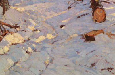
I am going to talk just a little tonight about "square touch" painting. I got a question yesterday about that. As many of you know I am strongly influenced by the historic Rockport school of painting. One of the things that characterizes that style is square touch. It is a kind of brushwork. Here is a bit of painting with a square touch by Aldro Hibbard, a master of the technique.

If you look at the painting you can see it is made from square marks made by a flat brush. That gives the artist several advantages. The first is that it gives a structural look. It allows the creation of clear planar representation of the form and the different planes or facets of an object can be painted in different colors or temperatures.

The second advantage of square touch is it gives a kind of pixilation. Rather than smoothing the painting out into a infinitely rendered appearance, the square brush mark is the unit of construction. If something is smaller than that mark it is effectively edited out, thus simplifying the representation. I think it is a powerful and interesting look in a painting and I generally have some degree of square touch in my work. Too much smoothing of the surfaces in a painting can give a slick or flaccid look. In a landscape square touch seems to me ideal for representing the texture and ruggosity of nature. I don't think it is so great for painting portraits of delicate little girls, but outside with rocks and snow and weeds it is great.

I plan on doing another reader critique. If you want to be a part of that e-mail me a reasonably sized image of a painting at stapletonkearns@gmail.com put the word critique in the subject line please. I will gather those for a week or so. I am going to limit submissions to landscapes as I feel most comfortable critiquing those online. Portraits, etc, it is best to critique with the model present. I remove signatures from the art I crit and I will not disclose whose art it is that I select.

Also I am going to write an "Ask Stape post for the Fine Arts Views site and I could use some questions. If you have art questions for me please e-mail those in and I will direct you to that post when it happens. Thanks.

Thursday, November 19, 2009

Snow painting, Vermont and brushwork

Here is a scene I shot twenty years ago up in Vermont. I am starting a blue night picture of the same location .

Below is a detail of a Hibbard that shows his snow painting technique.

This is just one method he used for painting snow, but I want to talk about this a little. The snow in this picture is divided into the two worlds, light and shadow. The light is pretty straightforward. It is warm and bright, and has a little cadmium yellow in it. All of the strokes that represent the light are angled the same way. toward the light source. Only the planes which face the raking light are illuminated.They are all in the same PLANE.

The shadow is more complex though. It is made of two different values. A deep value and a light one. The light value though occurs in both a warm and a cool version. The warm version seems to include alizirin and the cool version looks greener, perhaps it contains viridian. He uses those different temperatures the way you might expect separate values to be used. He portrays the different planes occurring in the snow with them. By portraying those plane changes through temperature changes, Hibbard is able to CONSERVE VALUES, that means a simplified way of representing the values by using less of them.

He is also making his color "vibrate". This is a form of broken or divisionist color. It is a kind of impressionist method. It is also very "Rockport". The painters from the Rockport school often used the square touch, broken color method of painting.The eye jumps back and forth between the warms and the cools and that gives a feeling of complexity that fools the eye into believing it is seeing nature.

Hibbard is also portraying the forms of the snow by characterizing where the edges of the forms and planes come together. He has accented these meeting places with either darker shadow lines or with a part in the snow revealing the ground between the masses. In the manner of a sculptor, Hibbard is thinking of the snow as a planar or faceted structure. Simplifying it into surface facets defines its place in space and what angle its surface faces in any particular area. Figure sculptors often do the same thing. An overly softened and rounded form is less descriptive of its surface volumes and forms.

The "square touch" for that is the name for this kind of handling, defines the form well. Also Hibbards marks march back into space as the snow recedes from us towards the top of the detail photo. If you squint at it you will see how the snow probably looked at a glance, the structure was explained by Hibbard as he painted the forms before him in the snow. This had to be installed as much as observed. It represents what was before him but is not pure visual draftsmanship. He is painting both what he sees there and he is explaining to us very deliberately the shapes and structure of the snow as it undulates over the ground beneath it.

This exuberantly painted little passage is a tour de force in snow painting. It is also not white!

I plan on doing another reader critique. If you want to be a part of that e-mail me a reasonably sized image of a painting at stapletonkearns@gmail.com put the word critique in the subject line please. I will gather those for a week or so. I am going to limit submissions to landscapes as I feel most comfortable critiquing those online. Portraits, etc, it is best to critique with the model present. I remove signatures from the art I crit and I will not disclose whose art it is that I select.

Also I am going to write an "Ask Stape post for the Fine Arts Views site and I could use some questions. If you have art questions for me please e-mail those in and I will direct you to that post when it happens. Thanks.

Wednesday, November 18, 2009

A little more about winter painting

I am rather proud to present you with this. It is an image of Aldro Hibbard from the late 1930's taken from the Rockport Art Association ten year book from the year 1940. He does not have the strut across his Gloucester easel and has a weight hung from the center of the easel.
For those of you in far away countries or warmer climes, wondering whats with all of this Aldro Hibbard stuff? He is my hero and an absolutely fabulous snow painter who lived into the 1970's. All of us snow painters in New England model ourselves on Aldro, Emile Gruppe and Willard Metcalf.

Beside him is a pair of snowshoes and behind him is his sled for hauling his equipment into the woods. Judging from the picture on the easel he was in Vermont.

I want to write just a little more about winter painting clothes. We have covered boots and gloves.You will also need a good pair of long underwear, I use the polar weight from Cabelas, and a flannel or turtleneck cotton shirt. On top of that you will need a pair of insulated nylon snow pants, the sort sold for snowboarders, skiers or snowmobilers. I wear a fleece top and then an insulated Parka. Mine is a very inexpensive synthetic unit but it is large and looks like Arctic gear. The highway crew outfits made by Carhartt are OK and the down Trans Alaska parkas from Cabelas are the absolute best. You probably already have a winter parka that will do if you live in the North. If you have good boots the rest of the equipment is negotiable. If your boots aren't good, nothing else you wear will help. The boots are like the foundation of a house. I don't wear special socks but I have those arctic boots, if you don't, you may need layers of wool socks. Sometimes painters bring a piece of carpeting, cardboard or plywood to stand on, it will insulate you a little from the cold ground. A thermos full of coffee freezes more slowly than a can of soda, but I prefer my MOXIE.

There is an old saying ,"If your feet are cold, put on a hat". Most heat loss is out of there top of your head, so have a good hat and probably a stocking cap over that if it is real cold. Polyester fleece is a wonder product and fur is even better. It is always good to bring all of your winter gear in the car, if it suddenly gets colder, you can return to the car and get more clothing, if you are working far from your car, you may want to bring a little extra gear, too much is better than not enough.

I am sure you know, but I should say for safety's sake, save the alcohol for when you get home at the end of the day. Alcohol will make you colder, not warmer and leads to accidents in the woods. Leave it home.

I carry my camera and little music machine-ipod outside and they all seem pretty unaffected by the cold. I mentioned before but you should have a book of matches because you never know. A butane lighter becomes unreliable in the cold. Cell phones are nice these days and if you did have a problem like your car not starting, you might be very happy to have one.

I plan on doing another reader critique. If you want to be a part of that e-mail me a reasonably sized image of a painting at stapletonkearns@gmail.com put the word critique in the subject line please. I will gather those for a week or so. I am going to limit submissions to landscapes as I feel most comfortable critiquing those online. Portraits, etc, it is best to critique with the model present. I remove signatures from the art I crit and I will not disclose whose art it is that I select.

Also I am going to write an "Ask Stape post for the Fine Arts Views site and I could use some questions. If you have art questions for me please e-mail those in and I will direct you to that post when it happens. Thanks.

Tuesday, November 17, 2009

Easel shoes

Aldro Hibbard winter painting outfit. From "A. T. Hibbard, Artist in Two Worlds" available from the Rockport Art Association here.

I was asked for an image of our New England snow painting hero Aldro T. Hibbard. Here that is , it is not possible to tell too much about his winter costume but we can tell some things. He is wearing gloves and what might be very heavy wool coat. His hat has the pull down earmuffs that I favor myself. The cigar looks to be of an average ring size and length. I can't tell much about the boots but they were probably leather. Hibbard could spend all day outside in any kind of cold but I don't think he could have done that in this suit. This must have been shot on a warmer winter day.

I wear a brimmed hat like the one he has on, but it is made of polyester fleece and is black. I like at least the inside of the brim of any painting hat to be dark blue or black, that is less distracting. When it gets real cold I can pull my stocking cap over top of that. Mine is as I have mentioned before bright orange and made out of some unnatural material that is unbelievably warm.

He is painting on a Masonite panel on a Gloucester easel,. All of his equipment came to the location on a sled. He had some sort of a palette holder that looked like it was a box that closed when he transported it, and was a stand when opened.

I am surprised with how low he has set the easel. I extend the legs all the way, but he only has them about half way out and the painting is set lower than I would like, I wonder if that was because of the wind, he is out in the open .

Here are some shoes for your easel. They were invented and given to me by my friend Mike Graves. They go onto the end of the leg of a Gloucester or a French easel and keep it from sinking down into the snow. Slick trick. They are of course merely squares of leftover plywood about the size of a beer coaster with a hole in the middle. I throw them in my backpack at the start of the winter they weigh next to nothing and take up little room, but in deep snow they really are handy to have.

Monday, November 16, 2009

Gloves for painting outside


Above: A pair of 17th century gloves from the Victoria and Albert Museum, London.

The Boston Art Show is over . I enjoyed seeing those of you who stopped by the Guild of Boston Artists booth where I worked as a volunteer. There was a lot of great art to see. It was as good as a lot of museums and cheaper than the big one up the street. I like going to shows like this because I see a lot of things that are rattling around outside of the museums. I am going to do a short post tonight on painting gloves.

Some of you have remarked that I seem to be wearing some form of gloves in the profile picture on this blog. They are nitrile gloves. I wear those just to keep the paint off of my hands when I am working outside and not to stay warm. They can be bought at auto parts stores as mechanics wear them. I can buy a box of 100 for about ten dollars.They wear well and a box lasts me for months.

For outdoor painting I buy ordinary winter gloves off the rack at Walmart or one of those sorts of stores. I do look for those lined with thinsulate though. The cheap gloves seem to be fine for my purposes. They get gummed up with paint that makes them stiff so I throw them away after a season. I have found that unless it is very cold, if I keep my core temperature up by using good winter gear, I may not need to wear gloves until I have been working outside for a while.

Painting in gloves is not a problem , the action is of the wrist or the arm. It can be difficult to turn the top of of a paint tube but the brush is not a problem. It is a stick, you hold on to one end. It doesn't really bother me to paint in gloves, although if I can take them off I do.

Sunday, November 15, 2009

Boots for winter painting


Cabela's® Trans-Alaska™ III Pac Boot

I am going to start a series of posts on winter painting equipment with one on boots. Every other part of your clothing needs for cold weather painting is negotiable, this works and that works. However when it comes to footwear I think most of what the average person thinks of as adequate gear won't cut it. Boots that might be OK for shoveling the walk or taking a winter hike will not allow you to stand in snow or on ice for hour after hour without getting cold feet. You have to keep your feet warm. Your Sorels will not cut it. I would impress on you that you think your boots are OK, but they will probably not be. You are going to ignore this and then your feet are going to be cold and you will be unable to work. "I won't be there for you to whine to, but if I was, I would say, Hey, I warned you!"

Here are the sort of boots I recommend for painting outside in the winter. There are a lot of different winter boots available but I think these are the ticket. Cabelas is a reasonably priced gear merchandiser mainly aimed at the hunters, rather than extreme sports, elitest gear freaks.
I think a woman could probably find boots of this sort there also.

If you can keep your feet warm standing out painting everything else is relatively easy. There are lots of good parkas and hats, snow pants and suits etc. But it doesn't seem to me that there are many boots that are as serious as these. I have lent mine to other guys who then bought them the next day. If you are worried about getting cold painting, buy these boots and everything else is just a matter adding layers of clothing. But if your boots don't cut it you can't add another pair.

Here is a link to the page on Cabelas site where you can find them.

There is one more day of the Boston International Fine Arts Fair, Sunday. If you live anywhere near Boston this is the place to see a whole lot of really good painting. Here is a link to the information on that.

Friday, November 13, 2009

Here is the Guild of Boston Artists booth at the Boston International Fine Art Show. I spent the day there again. I heard a talk given by both Joshua Rose of the American Art collector and by Peter Trippi of the American Art Connoisseur
Tomorrow will be a big day there I think. Here are a few shots I took today. This is Quidley Gallery of 118 Newbury Street in Boston.

Theres a nice Sergio Roffo in the middle, I painted that location with him this summer. It is one that was painted by all of the 19th century luminist painters and is from a place called Echo lake. Below is a shot of a nice Waugh, you know how fond I am of him.

This is a wonderful painting the photo doesn't do it justice. It is shown by Peter Rudolph of McClees Galleries from Haverford PA.

I must get some sleep, but I will see you again tomorrow .

Being who you is.............

The Dion quints, all with unfortunate "post" like lower limbs.

Today was a long one. I spent the day at the Boston International Fine Art Show at the Cyclorama. It is sort of an art trade show and there are thousands of paintings to see , and many of them are very good. Tonight was the gala 250 dollar a ticket benefit for the Handel and Hayden society. There were many elegant people there , I wore a sports coat and tassel loafers but wasn't really competitive. Tomorrow the doors open to the public to come in and see all of the art. There are some wonderful things there. Varieka Gallery from Newport Rhode Island has brought enormous William Trost Richards seascapes, they are about eight feet long I guess. They are so bright and high key. Its surprising to see paintings from that era in that high a key.I expect that sort of key from an impressionist painting but not one from the luminist generation. There was also a good Waugh, speaking of seascapes.

The editors of the art magazines are coming, I talked to Joshua Rose of the American Art collector magazine tonight, I was on a panel he moderated a few years ago and I always enjoy seeing him. Peter Trippi of the Fine Arts Connoisseur is speaking this weekend too.

The Vose gallery is there with a very nice Hibbard I haven't seen before. It is of Jefforsonville, Vermont, they said. The next time I am up there I will try to figure out where he set up. Another dealer has a very nice Emile Gruppe also from the Jefforsonville area of some trees and a glimpse of the Lemoille river beyond.

There is a a gallery that does nothing except French Barbizon school painting that I like a lot. Near that is a nice Frank Benson watercolor, the price is more than I paid for my house though.There are plenty of good 19th century academic paintings, both American and European.

The galleries showing living artists are there too. Arcadia from New York has nice things , I liked a Joseph Todorovich of a shop girl in a pretty dress a lot. They have Malcolm Liepke too. Argosy gallery from Bar Harbor is there showing my friends Scott Moore and T.M. Nicholas. Quidley Gallery from Newbury street is there with a real nice Sergio Roffo. Trees place from Orleans, Massachusetts is there with a great Joe McGurl. Over at the Guild of Boston Artists I am showing a 30 by 40 blue nocturne picture in a big art deco influenced gold frame. It is one of the odder things in the show, and I think it will get some notice.

Winston Churchill once remarked on a fellow who he said "bore perfectly the imprint of whoever sat on him last". When I walk around and look at all the wonderful paintings in a show like this, I get so excited, I stand in front of one and say, "Oh that's so, I could do that!" Then I stand in front of a real tight academic piece and think : that's what I want to do!" A minute later I am standing before a loose Rockport school impressionist piece and I think "Oh! no, that's what I want to do!" It only lasts for about as long as I stand in front of the particular painting and is really an expression of my excitement over the art. When I see a painting I like, I start thinking about how it was made and then I am imagining making it. When I get home I am perfectly happy to be me, and make my own art though. I often leave a show like that with a general sort of observation like "remember how much of that painting was in a high key? or remember how simple those trees in the Gruppe were. Basic stuff. Those are learning things not imitative things, and that's important.

When I named all of those artists above, if you knew art history well, you would know what their work looked like. I don't read the tags bedside the paintings generally, I don't have to. I know who the painters are by looking at them from across the room. All of those fine painters had their own voice. They made things that looked as if they could have been made by their hand alone. That's important for you too.
As you learn to paint as a student, it is important for you to imitate your teachers and natural that your work will resemble theirs. That's part of learning. The next stage generally is one of imitation of some historic figure, you fall in love with Rembrandt or Raphael and try to paint like them. But the adult stage of a painter is when you paint like yourself. Even though there are books open in your studio to paintings that love, and you are thinking about how well so-and-so handled a particular kind of passage, what you are making looks like something only you would have made. It is personal. I don't know for sure if you can really get there by intention . But if you avoid copying another artist and you make lots of partings I think a personal way of doing things appears. You do want to make sure that you know as much about your craft as you can. That's important because you want your style to be based on the abilities you have developed rather than having it formed by that which you have left unlearned.

I will return to winter equipment and painting soon, I promise. And then I am going to do more art history for a while.

Thursday, November 12, 2009

Ask Stape 4


Dear Stape:
Hello
I looked up alizarin blue and found your web site. How do you make gray with complementary colors?
How do you avoid black?
I use water soluble colored pencils and everyone here just says: What??
signed ; Loratadine

Lora;
Gray by definition contains white, I guess. It is possible to mix two compliments of a medium hue and get gray of a medium hue. Since you said you are working in water soluble colored pencils, I think you are not using white and there's where you are having the problem. Perhaps you can get white to lighten things up, or perhaps you can use a gray that is already in a pencil and then "step" on it with another color to influence it. I will refrain from saying "what?", but I have never used water soluble pencils.

I might suggest you try oils , watercolors or gouache, and you will have less problems with those.There is a reason why the three I have just named have been standard in the art world for so long. Most of the new mediums and systems bring with them little problems that were long ago solved in the historical mediums.

Dear Stape:

When painting plein air, how do you get figures into the painting?

Signed ; One Ulna

Dear One Ulna:

I generally go after that, this way. If I am in a location where people are around I will wait until somebody walks where I want a figure and then put them in as best I can. Then I grab my camera which I have laid out ahead of time for this purpose, and shoot a quick shot of them. I can use that in the studio to help me get from my rough location sketch to where I want it to go.

Often though, no one is where I want to put some one . I then ask whoever I am painting with if they would run down to where I want the figure and stand there for a minute or so. Then I put them in as best I can, that gives me the proper scale for the figure in the landscape, which can be difficult to achieve. Then, again in the studio, I work it up, with or without references into what I want the finished painting to look like. I also have been known to clothe figures in landscapes out of LL Bean or other mail order catalogs. You may be hipper to fashion than I am, and if all of our customers were men it might not matter, but it is good to get the right "look" on the clothing, and that is a way to do it.

Dear Stape:

I have been looking for untempered Masonite to use for making panels. The high school girl who works at the local hardware store has never heard of untempered Masonite. Her boyfriend, the owner of the store, says he hasn't had it in twenty years. Do you use the untempered? Does it matter?

signed; Mick

Mick:

The untempered has become hard to find, the tempered which is impregnated with a little oil to make it more resistant to water, is the only sort I see around now.That's one of the reasons I like to prime in oil based primer rather than acrylic gesso. If I am priming in acrylic that oil is a problem but the oil based primer should be compatible with it.

Dear Stape:

What mediums do you use as the paint stiffens up in the cold? I remember another artist mentioned that Neo- Meglip by Gamblin was the ticket. Many others gum up like the paints themselves. Also my girlfriend down at the store likes Hannah Montana and I mostly listen to Petula Clark and Gale Garnett, do you think we can ever find common ground musically?

Signed; BMOC

Dear BMOC;

I am not real familiar with the working qualities of neo- meglip at low temperatures, but I have had no problems with Liquin original or a varnish, turpentine and oil medium. Here is a post on mediums from the archives. If you are a reader using, neo meglip outside in the cold, why don't you weigh in on this.

Also, BMOC, I think both you and Lolita will groove out on Neil Diamond, he's a lot like Gale Garnett AND Hannah Montana, but you really should go back to your wives, you know they love and miss you ...

Stape

Oh yeah, I almost forgot, the Boston International Art Show is on this weekend. I helped set up the Guilds booth and got to see some of the art that other exhibitors have brought. The general caliber of the art is VERY high. There is some very serious stuff there. Come see it, there are wonderful 19th century paintings, and there are important galleries selling contemporary art too. If you are a painter and live in the Boston area this should be on your to do list, it is a real experience.