Tuesday, May 31, 2011

More Rockport reminiscences

Rockport from Front Beach. Bearskin neck is the spit of land on the left. Notice the red granite in the foreground. Rockport was aquarying town in the 19th and early 20th century and this hard red granite was exported all over for building bridgges monuments and office buildings.
There is another Encyclopedia of Dumb Design Ideas post ready for tomorrow or the next day. but it seems like I am on a theme here. I will talk a little about the art colony as it was in the early eighties. THis may read a little like a laundry list, and you may not know many of the names here. But it is useful that they get written down.I don't know that anyone has written anything about Rockport during this era. Rockport was past its heyday but there was still a a lot going on there.
Here are some of the artists who had galleries at the time.
  • Paul Strisik ( National Academy)
  • Tom Nicolas (National AScademy) -T.M. Nicholas
  • David and Line Tutwieler and Charles Vickery
  • John Caggianno (opened a year before me)
  • Bruce Turner
  • Lou Burnett and Martha Moore
  • Dorothy Ramsey and Mike Stoffa
  • Al Ruben
  • Ferdinand Petrie
  • Wayne Morell
  • Joe Santoro (on Railroad ave) also National Academician.
  • Shumacher (deceased but still showing seascapes)
  • Charlie Stepule
  • Nathalie Nordstrand
  • Betty Lou Schlemm
  • Mildred Jones (on a side street, later ran over her close friend Marian Williams Steele in the parking lot of ther Rockport National Bank, almost killing her.
  • Allenbrook a portrait painter, I never knew him.
  • Domenic Demari
  • Don Mosher, Christine Mosher
  • Stilson
  • Dorothy Robbins
  • Sven Orville Carlson
  • John Terelak and Martin Ahearn
  • Rudy Colao, Pam Fox and Fred MacNeil
  • Peter Vincent
  • Al Czerepak
  • Helen Van Wyck home and teaching studio
  • Charles Gordon Marston
  • Jack Callahan was around but I think had given up his gallery.
There were as many more in Gloucester a couple miles away. Artists like Charles Movalli, Dale Radcliff, Ken Gore and Bertnie Gerstner, Ward Man and more I have forgotten. There was also Roger Curtis painting seascape and Cheslie D'Andrea painting fishing boats and marines. Bernard Corey was member of the Art Association so I saw him around some. There were other galleries, I have forgotten some I am sure, and there were even more artists who didn't keep galleries. I knew all of these artists well, except for Stilson and Allenbrook. There was a lot of community and we knew one another through the Art Association and the grocery store. The artists spent a lot of time standing around on the street in front of their shops and if you walked around town you would stop to talk.Openings and artists demonstrations drew crowds at the Rockport Association on summer nights. After dark the streets were full of strolling locals mixed into the tourist trade. There was a lot of interaction. Again, we were all SMIMMING in people most of the time. I always walked in the street because the tourists on the sidewalks stumbled along in a daze.

Ellens Harborside restaurant was a good affordable place to have a seafood dinner and I often saw artists there. Alan Davidson and Lucien Geraci were always there together. In the summer Charles Vickery came to town and occasionally sat down at my easel and painted seascape demos for me. Joe Santoro used to come in and put his arm around me, very Italian. He was a watercolorist and a member of the Guild and a National Academician. Walker Hancock another Academician was still making sculpture in nearby Lanesville I was invited to draw the figure in his studio with a small group several times a few years later.

There were a lot of soms and daughters of artists from the previous generations still around. There were Elaine Hibbard, Aldro's daughter, John Manship who was Pauls Manships son. And The Beals, Ren, Bill and Telka. Ren was the grandson of Renolds Beal and the nephew of Gifford Beal. I believe he was related to Stow Wengenroth too. Richard Kuehne the son of Max Kuehne the American impressionist and gilder.

Harry Ballinger was still around and I met him on painting jury for the art association I think he was about a hundred. His seascape painting book is still a classic. Marshall Joyce still sent watercolors to the shows at the Association. There were also some good retired illustrators around at the time, like John Wentworth and some GI combat artists. My head is spinning, there were so many artists there at that time,Not all were great, but just the energy of so many people painting in such a small town was exciting . Painting was the industry of Rockport. Most or all of these names may mean nothing to you but they are who was around in Rockport at that time. Aldro Hibbard, Anthony Cirino and Lester Stevens, and Carl Peters were more or less recently deceased when I arrived.

There was also an army of retire commercial artists making art in their retirement and top flight amateurs trying to ramp themselves up to professional. Every summer also brought visiting artists from around the country, come to see what Rockport was like. I met a number of artists from around the nation while sitting in my shop.

I started going on painting trips to Vermont with some of the older guys, Tom Nicholas, John Terelak and Don Mosher I think this might have been a little later. I did paint landscapes a lot with Bruce Turner.

With a few exceptions everyone on the above list is dead. If in 1983 I had made a list of the established Rockport artists I could have listed thirty or more. Today, all but a handful are gone. I guess I should have thought about that coming, then, but I didn't. Many of them could tell stories of painting with Frank Dumnond or studying with Soyer or Brachman at the Art Students League before the second World War. A few knew Gruppe and Hibbard. A few old women had studied with William Merrit Chase. Genevieve Wilhelms, who I hardly knew, hung out with John Sloan and Edward Hopper, I think. Many could describe the art colony during the fifties when it was really full of artists and many of that great first generation were still alive. I should probably write down more of this stuff as it will be lost and forgotten soon.

Monday, May 30, 2011

Stephanie

The Old Harbor, Rockport. Thanks to a reader for the photo. The shop was in the blue building at the center of the shot. At its lower right hand corner were the granite stairs that went down to the harbor. This is low tide of course, and at high tide the water washed against the seawall that is the foundation of the building. In the foreground is Lumber Wharf, were coastal schooners were loaded. The cylindrical stone pillars are bollards, posts to tie a ship up at the wharf.

The comments had several requests to tell more about Stephanie and her advice to me. It has been so long, but I will see what I can remember. Steph had done a lot of outdoor fairs and had an idea of how a shop should be run. I had no idea. Stephanie told me that people are scared. You had to be non frighting. She said that customers don't want to enter a shop unless they can see inside and check that it is not dangerous. She insisted on no dark corners. We positioned spot lights to make sure that the corners were well lit. The shop was painted in gay colors,her part was a garish pink, mine a more restrained yellow. She always wanted the door open, she said people aren't likely to open a door, even a screen door.
When visitors would walk in Stephanie would always ask "are you visiting Rockport today? I always thought that was a dumb question, when I pointed that out, Steph said "that's the idea". It was a harmless question, one she knew the customer could answer. I gradually adopted it and used that for years. I felt dumb saying it, but people responded well to the simple question
A piece of glass or a painting would sometimes get "hot". That is, all day long people would admire it or contemplate buying it. We made a point of noticing trends in which items they were and where in our tiny shop the piece was located . Often a sale would result, after many people had focused on the same piece.

Stephanie told me a story about a bead shop a friend of hers had owned. It was in a tent, so it could be set up at outdoor art fairs. Those were big in the 60's and 70's. This tent-shop was a long rectangle with a long table down the center, and tables around the walls. You could walk in the door and make a circumference of the shop with that center table as an island in the middle of the space. On each of the tables were dozens of muffin tins, the aluminum ones. Each tin's little cups were filled with beads. There were thousands of them. That's all the business sold, beads for stringing. They had every kind of bead there ever was. Customers would walk in the door and around the tables then stop and pick up a tiny bead to examine it. They would replace it and go on their way. In a few minutes another customer would enter and pause, and then pick up that same bead! With thousands of beads to choose from, they would pick up the same bead! All day long that same little bead would get picked up, until finally it sold.

We had long discussions on why this might happen. Stephanie thought it was karma or that the bead was sending out a signal to be picked up. I didn't. What was obvious though, was that the same thing happened in our shop too. There seemed to be something about the location, And we quickly figured out where pieces would sell first. I learned that every gallery has a sales wall. You put the new and coolest piece there and it was most likely to sell.

Stephanie also taught me never to talk about the piece in the front window. If you brought that up, the customer would go out the door to look at it and then wander off. She used to say"we're always open" and insist on leaving the open sign up all the time. I have no idea why. But the sign always said open, even if we were not. Her favorite expression was "they lost all sense a perspective, man" This could be applied to any situation, and I heard it frequently even though often I couldn't figure out how it fit.

Stephanie wore red lipstick and had long thick hair, the kind that the Victorians used to fill sofa cushions with. She would tie her breasts up in those bandanna's and fire up her torch. She enjoyed working with the glass and made all of the little pieces that a lamp worker is supposed to have. There were little cats and various animals. But the biggest, and fanciest piece was the piano. Made out of loops and myriad little ropey swirls of glass, the tiny grand piano seemed to be the demonstration piece to prove you could practice this art. Stephanie and Michael, her partner, also made a fine line of unusual little glass pipes that they occasionally sold.

Stephanie has been dead many years now. I think of her as a creature of the sixties-seventies. I can't imagine her in the world of today. The gypsy, on the road, counterculture, traveling artisan thing was big then and I don't know if it really exists much any more. I guess as times changed, she might have evolved into something else. But I remember her as an example of the free spirited hippie, who cheerfully made her little place in the world entertaining people by fashioning tiny glass figures in front of crowds. She taught all of the neighborhood girls to do it too. Often there was some young girl at that hot torch learning to make a cat or elephant. It used to scare me to see their fingers near that roaring blow torch, but I don't remember any of them getting burned. She would lean over them and show them the right way to allow gravity and centrifugal force to flow the molten glass just where it needed to go. The young girls always left happily with the little figures that they had made.

Glass doesn't rot or evaporate, so except for those that are dropped or played with by cats, there must be thousands of Stephanie's little glass animals out in the world. They aren't signed in any way, so I guess I will always wonder when I see one,"did Stephanie make that?"

Rockport shop recollections

Everybody over in the comments seems to like hearing about the Rockport years, so I will go on merrily with that.

When summer came, having the gallery seemed like entertaining. I waded in people on the streets and talked to them in the shop all day long. In the summer Bearskin Neck had a population density like Hong Kong. There were T-shirt shops and even schlock art. You know what schlock art is, don't you, that mass produced dreck from Asia somewhere (probably the Chi-Coms again). The retailers buy it from catalogs in bundles of hundreds of unstretched nearly identical paintings. All of the paintings had a funny oriental look to them. Their Cape Cod light houses had a subtle pagoda aftertaste, and there were lots of trees made with a fan blender that looked like feather dusters, and bad seascapes with grass covered dunes impaled with red wooden snow fences. The foam in these monstrosities was white paint swirled into S patterns with their fan blender again, horrible. Done using decorative painting techniques they appealed to the most budget minded collector. THEY ARE IN THE WORST IMAGINABLE TASTE

Of course, with a 24 by 36 for fifty dollars in a frame, they were selling a lot of "art". The customers would enter their shop and there were hundreds of paintings stacked on the floor in piles three feet wide. The walls were covered in schlock art, it was all the color of the literature the Hari-Krisnas used to hand out. Sunsets, way too many of those. The customer would linger over a painting and the crafty salesman would show them the painting in a different frame. The frames came in colors too, not just gold but green, orange and citron. All of the customers would be trading paintings in and out of the frames and conferring with their loved ones as the salesman moved each canvas into each new frame, using schlock-o-clamps. That's what I call the little U-shaped pieces of toothed spring steel that will hold a canvas instantly into its frame. The pictures would dance through the lurid frames until the customer liked one best, and then they bought it. Fifty bucks, no big deal, hon.

Then the salesman would send them out the door with their painting in a Hefty bag. All day long people walked back down the neck with those big plastic garbage bags. I saw millions of them. All the artists joked about the art in the garbage bags. But it was a little dispiriting sometimes when you weren't selling your art.

Our shop didn't have a bathroom There were four shops in the same big old building, the other shops did have a door to the single bathroom. To go there you walked through the shop next door. The shop next door sold schlock art. The new schlock art gallery next door (actually a second feeder location for the larger schlock art store on the Neck) was managed by a young guy from New Jersey. He turned out to be a nice enough guy, not an art lover, but he was OK and we were all around each other a lot. I would sometimes get bored and go next door to his shop to chat. When the town was really busy, he stuck his head in my door and said "Stape, will you watch the shop for me? I am going to go pick up some fried clams". So I sat in his schlock art shop happily greeting the tourists. I don't remember ever selling a painting, but I did this favor for him a number of times. Since I had partners, I could come and go if I wanted to.

I heard stories that one of the "other" schlock art dealers would tell tourists that these paintings were by "local artists" who didn't have swollen heads and priced their worked reasonably, unlike the artists they saw in the galleries, who had big egos. The paintings often had folksy American sounding names signed on them, half of which had the surname Frank.

In my own shop I would routinely have people ask me why my paintings were so expensive? I wanted more for an 8 by 10 than the gallery down the street wanted for an over the sofa sized oil! They already knew which they were going to buy, and I tried to avoid telling people they were wrong. I learned a few things about running a gallery in those days and one was,

DON'T TELL PEOPLE THEY ARE WRONG!

Even if they are, you can't win. They don't want to hear it, and if you get a win by "setting them straight" the sale is over.

Stephanie the large breasted glassblower who was my business partner, had grown up with parents in the jewelry trade and she had spent years doing outdoor shows. She was a hippie girl and a part of the great craft and pottery diaspora that once wandered the nation during the decade after the summer of love. She gave me a number of gems of wisdom she had picked up on the road.

She would secure those same breasts with two red bandannas knotted up around her neck somehow. She would then stop traffic on her roller skates with her long raven hair blowing behind her and those bandannas on. I believe she had a three legged dog named Egypt. I don't remember ever meeting Egypt though. A few years later she died rather young and tragically. I still have her skate key.

Sunday, May 29, 2011

The demand surge and buy switch phenomenon

Bearskin Neck. Thanks to Renee Lammers for the photo.
I received a lot of comments and people seemed to be interested in hearing about when I was running my first gallery in Rockport, Massachusetts. I have written a little about this before, but I will elaborate a little upon my previous writings.
The window at the far left is my old shop. I began that business in 1983. I had no money, I was working a very part time job, as a janitor at the Rockport Art Association. So I went into business with no capital. I was able to afford a few gallons of paint and luckily the shop had tracklights.

The small shop had at its backdoor, the Old Harbor. This was Rockports first harbor, with its early 19th century seawalls made of enormous blocks of granite. There were stone steps from behind the gallery onto the mud flats of the partially silted in harbor. In those few steps, you could leave behind the thousands of tourists and enter another part of Rockport, the tourists didn't know. The backs of the buildings on the harbor were on stilts or huge granite seawalls. On foggy days you could hear the fog horns and groaner buoys out on the water. Bearskin neck is the last thing before England, and the Atlantic washed the back of the shop. It was enclosed in stone seawalls, but in the storms of winter the surf was high and the neck seemed like a narrow stone ship at sea.

When the tourists walked into a gallery in Rockport they expected to meet the artist running their gallery. That was an old tradition in the town. Anywhere else, the visitors wondered, who is this guy and is this a real gallery? But in Rockport they didn't That was a big advantage. My operation was threadbare and rinky-dink, but that was perceived as charming and just what the crowds expected. A REAL artist!

My apartment was next door and my whole life was about the shop. I seldom strayed more than a few yards from it, except to go the the grocery. I was there seven days a week, Sunday mornings the blue laws kept us closed. But at noon on Sunday we opened to the largest crowds we saw all week. It was crazy sometimes, there were wall to wall people on the Neck. But on Sunday, they didn't ever buy anything. We saw ten times as many people and sold nothing, every Sunday. I was learning that it wasn't a numbers game, it was not who you saw but if they were buying. Monday mornings could be good though, travelers had checked out of their inn rooms and sometimes bought a painting before they left town.

Some weeks we would sell nothing and then the next week I would be selling an oil painting every day. Sometimes I would sell more. BUT sometimes in the fall something very strange happened. I had noticed that it seemed like people had an invisible switch somewhere on them. If that switch wasn't set to "BUY" You couldn't sell them art, no matter what. They wouldn't buy the Mona Lisa for a ten-spot. That was the default setting and most of the time people came in set to "not buy".

You have probably looked down from he edge of a dock and seen a whole school of little fish suddenly reverse direction all at once as if cued by a director. The tourists were like that. On any given day there was a mood, a tenor, to the crowd. The crowd was an organism. One day they would all be goobers from the hayfields of Silesia, and the next day befuddled moonbats from Cambridge. The crowd had a group personality. like a coral reef or a school of fish. One day everybody was on crutches or in a leg cast. People were missing arms and walking on artificial limbs. All day I didn't see a whole man. I thought I did once, but when he turned to go I noticed he was missing an ear.

Every once in a while demand went from zero to some heightened surge that would suck all of my inventory out the door. If I had ten paintings hung, I might sell seven. If I had been able to produce a hundred paintings, I would have sold seventy, or maybe all of them. There were demand spikes. It was easy to sell art to these people, their switches were set to on. They had come to Rockport to buy art and it was only a matter of which artist they found appealing. The artists would meet up on the street after the crowds had died back and we would all be selling art.

The town sort of lit up, like the proverbial pinball machine. I would have upper class mom and dad visiting New England to visit their children in expensive private colleges, lined up at the door to my tiny shop. That tended to happen in the fall, on crisp perfect days, I made as much across the span of a few fall weekends as I did the rest of the year. When I went home at night, I would get phone calls from people wanting to buy the painting in the front window. I had a little card there with my number on it.

It was an inventory test. In the winter and early spring I was sitting in the shop working every day and selling nothing. An older artist already many years in the gallery business there told me "keep painting em, when the summer comes you are going to need art, and there won't be time to make new ones when you are selling". I had feverishly followed his advice, hoping what he said was true. When the feeding frenzy would start it would decimate my little collection of painting and I always wished I had more. I would make three or four paintings to be ready for the next weekend and those would sell too. I would start each week with inventory problems. In the late summer and fall I was shoveling paintings out the door. They were cheap, but it added up. I had more money than I had ever had before. Not that it was very much in comparison to a very average working stiffs income, but I had lived real poor for many years. I thought I was rich.

Saturday, May 28, 2011

When my art was cheap

Blue Motif, Rockport, Massachusetts.

I think I will reminisce a little tonight. Hopefully it will be informative. I was speaking to a woman tonight who is selling lots of very inexpensive paintings. Her business model is to make small pictures and keep her costs low enough that everybody can afford to buy her art, and everybody does. I used to do that, I said. I don't think she knew that.

In 1983 I opened my first tiny art gallery in Rockport. Rockport was an old art colony on the water north of Boston. There were many artist owned galleries there and had been for many years. I would suppose their were about thirty then, and many more artists lived in town but didn't have commercial galleries. I split the rent on a tiny shop with a glassblower and her boyfriend. They made those little glass animals, what they did was actually called lampworking.
Laura in the play "The Glass Menagerie" collected them. My partners had done years of traveling from outdoor show to outdoor show in a big van and were hippie-gypsy's. When they turned on that big oxygen fed torch it made a lot of noise and lots of people came to watch and buy.

That meant traffic flow. we were on a very busy tourist street, about 10,000 people a day were visiting Bearskin Neck on a summer weekend. We saw a whole lot of em. I had the back half of the tiny shop. I painted it and built myself a little workbench-artists station into a nook in the wall. My whole operation was perhaps six feet square. I had a couple of sets of track lights and a stool to sit on. I could open my French easel up in my little work area and sit and paint all day as the people came and went. Often I would paint outside in the morning and watch the shop from after lunch till ten or eleven at night. As long as there were people on the street we were open, sometimes after midnight.

I made nothing but 8 by10's. I bought boxes of these little mass produced frames with horrid little linen liners chopped at the corners. About a quarter of the frames were damaged right out of the box, but they were so cheap it seemed worth it. I think one of my favorites was an 11 dollar unit. There were no mass produced closed corner frames then. I could hang quite a few on the walls of my tiny space.

I sold my paintings for 85 to 125 dollars a piece. Money bought a little more then, but that is still really, really cheap. I sold them like crazy. I think I sold about 130 that year. I didn't make very much compared to what most folks expect to live on, but I lived real cheap. I had a 300 dollar a month apartment next to the shop and I fixed my shoes with duct tape. I had no car, and could walk to the grocery store or hardware store.

The gallery was set up using the glassblowers tax number and she signed the lease naming us Earth and Fire galleries. I guess she thought that was appropriate for a business that used a torch on sand. I thought it was tacky, but since we didn't have a sign, it wasn't well known that that was our name. It was dated even then.

There was a payphone in the gallery, hanging on the wall. I guess the landlord had had problems with tenants running up phone bills and leaving. We seldom used it, and if someone wanted to buy a painting with a credit card, we had a grinder affair that impressed the information from their credit card onto a little stack of carbon paper and duplicate receipts. Once I had that done, I would run to a friends shop down the street and use their phone to call in the sale and get an approval number from the nice folks at MasterCard. I took the receipts to the bank myself, it wasn't till years later that the electronic gizmos that batch out your sales automatically to the bank appeared.

I remember sweating out whether I should charge 95 dollars or 115 dollars for a painting, and then changing the price tag the next day, afraid I was asking too much. People wanted them cheaper still of course. They would make lowball offers and always want a better deal. Usually I went for the cash. I always needed groceries or paint.

We had as boom box playing old Dylan most of the time and being in a beach town all summer was great. I talked to about a zillion people a week and that was interesting too. The little business actually worked, I sold enough painting to live very simply and I was living by my art. I had already done that for a few years then, but this was the first time I had a steady cash flow and and knew I had found a way to make a living painting. I was about 30 at this time and had been painting full time about ten years. I had atelier training behind me, which was scarce in those days, so I had some chops, and that helped a lot. I was well enough skilled to do paintings of a quality that people would buy.

I did almost none of the paintings from photographs, I started stuff outside and finished inside, or I made up seascapes, ( I did lots of those) and I worked in both an old timey Dutch style and impressionism. It really was a great training experience to actually paint to earn my supper. If I didn't sell, I didn't eat. That makes you very earnest in your painting, you want to make them as well as you can and get food!

Thursday, May 26, 2011

A post of odds and ends

Philip De Lazlo Mrs Claude Mullins

I had hoped to get the next Encyclopedia of Dumb Design ideas written for tonight. Those posts take a lot of time as the scholarship is so demanding. Hopefully I will finish it tomorrow. I am actually putting in about twice as much time on the blog and I can't get out one of those a day. I am having a great time writing them, but I have had to space my posts out a bit. Here is a post to last until then.

I get lots of e-mail and I try to respond to most of it. Sometimes people have questions that I can answer, others send me an image for comment. I wish I had the time to crit them, but I don't. Sorry. I will do some crits on the blog again sometime.

Here is an e-mail;
Hi Stape, I was at your Lyme Art Association workshop this last weekend. We never got to talk about the nuts and bolts of making a living at art works. I would like to read some feedback on your blog relating to that subject if there is any other interest about it! Great workshop. ps. I now have a Stapleton Kearns Signature Easel. An awesome piece of furniture. thanks.
........................Basil Strathmore

There are a couple of things here, first I have written a lot of posts on the business of art, but it was a while ago. Here is one; and two also three and four followed by five. There are many more but there are a few. If you want to read more of those look in my sidebar on the right and there are two archives labeled business. Don't ask why, it is just to hard to undo that.There are so many posts back there now that even I don't know whats in the blog anymore. There are 892 separate posts.

The Stapleton Kearns Signature model easel is now available from Take-it-Easel.This is their newest style easel with a couple of important tweaks and custom accessories, so it is set up like mine. I don't make anything on these easels. I just want to see this small company do well, they make a fine product and I depend on them . Get one at Take-it-Easel Tel: 802.999.7123.

OK lets see if I can throw out something educational. How's this:

At my workshop I had two people wearing sunglasses. One had lost her real glasses and was wearing prescription sunglasses, and the other was afraid of exposing her eyes to all of the UV sunlight for fear of damaging them. I have heard people say that it is OK to work in sunglasses as you see nature, your palette and painting through the same lenses and it therefore won't change your color. I doubt that, I think it has to throw some kind of a color bias into your painting. But there is no reason to wear sunglasses. A pair of ordinary clear eyeglasses should protect your eyes from the harmful UV light. With a brimmed hat you should be able to see fine.

Hopefully tomorrow night I can get the next installment of The Encyclopedia up, see you then.

Tuesday, May 24, 2011

THE ENCYCLOPEDIA OF DUMB DESIGN IDEAS, subchapter X

THE ENCYCLOPEDIA OF DUMB DESIGN IDEAS
ACCIDENTAL CONTENT
Shown above is another of the recently discovered "lost" paintings of Jan Van Assaerts. This daub contains a dreadful error. Sometimes an artist accidentally paints something that looks like a little face or a fish perhaps, and when you see it, the picture is ruined for you. You can never look at the painting without seeing that accidental "thing" in there. Artists take a lot of care to avoid those little gremlins.

Van Assaert accidentally included a half naked Hula Dancer. His wife was, by this time, a large pink gelatin, weighing as much as a tiled parlor stove, and he may have seen a Hula dancer from the far off Dutch colonies in the Polynesian islands or an engraving of the dance in a contemporary men's magazine. He certainly expressed his own subconscious yearnings in a way that seems as fresh today as when it was painted so long ago.

So don't let this happen to you! Before a painting goes to a show, or gallery, sit down in front of it and look carefully to make sure there are no little faces, pixies or frogs legs in there.

Dirk and his wife moved from the one room hovel on the canal to a larger home in the village. With his rapidly growing family Dirk knew he would have to find more income. Studying on the weekends, Dirk worked hard and in less than two years earned his masters degree.

Dirk still needed more money for his family, so he approached an artists career counselor. She was a little scary, frankly, she was mostly just bones and a few strands of oily ligament, her grey hair was pulled severely back on what must have been her head. Dressed in a shapeless, slubby raw linen bag the color of mildewed oatmeal, with broomstick pleats and a shirred round neck, she was feeding on a small salad. She had on wooden earrings the size and shape of Doritos. Like an enormous lizard she hissed through her thin lips and triple chins that artists make a living by getting grants. Then she looked disdainfully at him over the top of her rusting iron glasses as she ate another handful of organic vitamins for her numerous allergies. She waved him impatiently out of her damp office.

Dirk needed to apply for a grant from the Assembly of Compliance or one of the numerous Peoples Art Assistance bureaus. Training generations of children to be artists meant that upwards of 60% of the adult population were now artists. In order for that to work, a society had to provide lots of grant money and other stipends. Dirk knew that with Access to Creativity legislation recently signed into law, he stood a good chance of becoming an approved artist, particularly with that new degree! Unseen workers somewhere stood ready to pay, he had a right to make it as an artist!

Non post, blog post

The blog will appear in good time, friends. The discovery of another Dirk Van Assaerts painting has temporarily slowed down blog production. The amount of research and speculative scholarship required is greater than can be produced in a single day. You get MORE science, but some service interruption.
.........................Stape

Monday, May 23, 2011

AMIEN, a painters resource

Childe Hassam, Church at Old Lyme

I am returned from the weekends teaching at Old Lyme. As usual I had a great group. I always wish I knew these folks better, but I teach em for a few days and off they go. Something about a workshop must preselect for a certain kind of people. I get such good groups. Years ago that was not the case. In the eighties when I taught a few workshops I had a lot of very mean old ladies. Often they complained incessantly and didn't want to hear anything other than encouraging praise for their paintings. Those folks are now either to old or too inert to take workshops and teaching has become a lot of fun. I am willing to teach about twenty or twenty five days a year, after that I have my own art to make.

Thomas Kitts provided a link to a site called Amiens.org which is a conservators advice forum for artists. I looked at that and it seems to be a good reference. Here is a link to that. I read a good deal of it and learned a few things. They seem to strike a reasonable balance between caution and the artists need to create in the real world. I am not about to start grinding my own marble to make gesso, or breeding the rabbits for the glue either .

I did extract from my readings there some more information on mineral spirits vs. turpentine. They are definitely in the odorless mineral spirits camp.They do not use damar or recommend it, but if you use that, turpentine is a must. But from a safety standpoint they strongly advise against turpentine. I generally use the hardware store kind, but the really cautious among you may want to use the Gamsol. They didn't specifically endorse it, or any other product, but it has had most of the volatile (easily evaporated) evils removed from it.

Amien also seems to be very opposed to Zinc white for longevity reasons. They say it forms a brittle paint film. I never use it anyway, but some folks do. If you are using Zinc you may have some soul searching to do.

In their discussions of canvasses they surprised me a little. I have often used a good quality heavy cotton canvas and been happy with it. They don't argue against that and feel that cotton is an acceptable material for canvas. I am currently using the Centurion oil primed so right now I am using linen but I have no idea what I will be using a year from now.

I must unpack my kit and get back to work in my studio.

Sunday, May 22, 2011

18th century French gastroenterologist's dredge, from the Louvre.

Here I am in Old Lyme Connecticut.I taught a workshop today and will again tomorrow. I think I will write just a little more about canvas as the comments have been filled with various ideas, some good and some confused about that. Bullets please.
  • YOU CANNOT USE HOUSE PRIMER ON CANVAS, DON'T DO IT!!
  • You CAN put an oil ground down over acrylic preprimed canvas. Let it dry for a good long time before using it. At least several weeks.
  • Gesso is made with rabbitskin glue and whiting, marble dust etc. The acrylic stuff in the jar from the art supply store is not gesso, They just call it that. I hate the stuff. It might or might not be a good ground for oil paint, but it is unpleasant to work on. Your paint will stand up on the surface better on an oil ground.
  • I often use TEMPERED Masonite as a panel. The untempered would be preferable but it has become hard to find. I use oil primer on it, I would not use acrylic primer over this though.
  • I use Zinsser oil timer. They are better known for shellac based products. You can certainly paint on shellac, but I think a primer is better, it has substance, tooth, and small degree of thirstiness that I think is good.
  • Shellac is made from Lac beetles, it is not a plant exudate or a varnish from a tree. It doesn't keep terribly well. It thins with alcohol and dries extremely quickly. You can shellac watercolor paper and paint in oil on it.
  • Here is a tutorial from the blog on making panels
  • If you can afford it, use Claessens type 12, mounted on panels that is the best fix I think, but it is expensive. Sourcetek has those. I can't afford them. I use acres of canvas.
  • I find the surface of the Polyester canvas to be too hard. It is a little like painting on a window screen. But I want to experiment with it some more. Synthetic is the future, it is stable and never rots.
  • Fredrix makes a very high quality oil primed cotton with an oil priming, called Scarlet O'Hara, you can get it here.Link
  • Here is a link to Jerry's for the Centurion oil primed linen made by the Chi-Coms.
  • Here is a link for cheap panels with oil primed linen on them. They are not the quality of Sourcetek, but the surface is nice.
  • Here is the same Chi-Com oil primed linen prestreched, sold in boxes.
  • Here is a link to Jerry's for Claessens type 12 a premium oil primed linen. It is expensive but a wonderful product.
  • I think cotton is as good, or nearly as good as linen, but it must not be the thin stuff that is sold at the mall craft supply stores. A 7 oz canvas is too light. 12 oz is about right. Notice the surface. I don't like a rough weave, but you might.I often use portrait linen that has a fine weave.

Saturday, May 21, 2011

priming and sizing


If acid in paint cause canvas to deteriorate HOW would oil primer (which is an oil paint) prevent it? ? Is a quality oil paint PRIMER from paint store great to use??
This question came up in a forum on the Internet, I guess I was cc,ed because my name was mentioned so I will answer it.

The acid in oil paint will cause damage over time to your canvas. That is why you cannot prime raw canvas with oil primer. It is necessary to first apply a size layer. There are commercially available products that are ready to go, but your canvas MUST be isolated by a sizing layer before the oil primer goes on. Rabbit skin glue and or gesso (real gesso not acrylic polymer) is the other fix. Of these I think the commercial sizing is the easiest and simplest. Also rabbit skin glue is hydrophilic, that is it absorbs water and that makes your canvas come and go more with the barometer.

For me the real question is why bother with priming your own canvas? There are so many kinds of preprimed canvas available and there is even an inexpensive oil primed linen available from Jerrys called Centurion. It is made by the Chi-Coms but it seems to be OK at least for its price.Frerix makes a nice heavy oil primed cotton, called Scarlett O'Hara, too. That is also inexpensive.

A coat of oil paint over an acrylic canvas might be a good solution too. Stretch the canvas and put the oil paint over it, then set it aside to dry.Cheap, and oil primed. Paint does sit better on an oil ground and it feels silky under the brush.

Oil primer made for house painting is OK on rigid panels, I use it a lot. But it should not be used on a canvas. I don't think that is good at all and I think it might crack.

I don't really see what is to be gained by priming your own canvas, my time is precious and I want to use as much of it as possible painting. Inexpensive acrylic primed cotton can be had very cheaply and is just fine, unless you are a pro. I feel the same way about grinding paint. There are materials freaks out there who really enjoy custom making there own materials and that's fine for them, but I just want to spend my time painting and let some one else prepare my materials. It ain't in the paint.

Friday, May 20, 2011

THE ENCYCLOPEDIA OF DUMB DESIGN IDEAS, ANOTHER DOWNTRIP

THE ENCYCLOPEDIA OF DUMB DESIGN IDEAS
ANOTHER DOWNTRIP

Another find from the Nevelson master, this painting above hopefully illustrates the downtrip. If you compare the two similar pictures you will see that the arrows signify the direction that the lines and forms carry the viewer. In the painting below, the upbeat, the lines and forms rise up from the lower left and churn up towards the upper right. In the painting at the top of the pamphlet the lines and forms carry the viewer down hill. The paintings are directional. Some of you were having a hard time figuring this one out, I hope the new artwork helps.

A few quick biographical notes on the life of Dirk Van Assaerts;

As an arts administrator Dirk was spending an awful lot of time shuffling paper and he really wanted to further his art career, so he began working on his masters degree in fine arts. The day care ministry paid his tuition, and promised him a raise when he secured the terminal degree in his field. Uncertainty nagged poor Dirk, he already had one degree and that didn't help him become a full time artist, why get a second? However many people did, and it was the usual way of doing things. Besides he could always teach and with that masters degree, he could maybe secure a job at the Peoples Conformity District art school.

At his home, children were being born and beginning to knock things over. His wife gave birth to twin sons. In those days fathers didn't join their wives as they struggled and complained giving birth. Fathers paced back and forth in the waiting room, smoking cigarettes and reading Argosy magazine. As he paced, Dirk wondered how everything had gotten so complicated and expensive, he was going to have to find a way to increase his income. With four children now, the little house by the fetid canal was starting to get mighty cramped, and his carriage hardly fit them all, particularly since his wife had now more than doubled in size. She also bought a small dog like the rich Hollywood starlets prefer, that snarled and bit Dirk whenever he got too close to her

So on weekends (instead of painting, incidentally) he and his humongous wife hunted for a larger house, with four bedrooms and in a neighborhood with better schools. The schools were all exactly the same, the state consistency monitors decreed that. But some of the suburbs where the swells lived did seem to get better average test scores and place more students into the prestigious bureaucracies. People insisted they weren't actually better, but they were nicer.

Thursday, May 19, 2011

ENCYCLOPEDIA OF DUMB DESIGN IDEAS, UPBEAT

ENCYCLOPEDIA OF DUMB DESIGN IDEAS

UPBEAT


Here is a question I got in the comments today;
"I'm a little confused Stape. You say the painting goes down (which I can see), but then you say that you want your paintings to go up - which the painting does actually do - it goes up to the right. If it is going down to the left, it is going up to the right. Isn't that what you said you want your paintings to do?"

Look at the example above also from the Nevelson master and the example from yesterday below. The lines and forms in the painting above, carry your eye up and to the right. The lines and the forms in the example below carry your eye down and to the left.

Part of the expression of sentiment in a landscape design is conveyed by the direction of the lines and forms. A painting can be designed or arranged in such a way as to be either full of spring, or sagging lines. Sagging lines are somber or even tragic. Springy lyrical lines are UPBEAT. Lines can be rhythmical or quiet, jagged or calm. The quality of the lines is decided by the artist.

There is another option, not to decide. Generally a photograph has whatever kind of lines were in front of it, some having one nature and the others, another. When I copy a photograph or studiously imitate nature with the greatest care, I often get a result which is arrhythmic. The lines aren't designed particularly, they just describe the objects in the view. In order to have my lines convey a mood, I must make them do so. I will be unable to observe this ordered scheme into a painting, this must be installed. This is bending the appearance of nature to suit your design ends. Gee, I hope that clarified it for you.


Here are a few more biographical notes on the rediscovery tyro painter Dirk Van Assaerts;

With a ravenous wife and big debts for education, mortgage and carriage, Dirk was motivated to work very hard at his master painter job in the conformity district daycare center. Being young and relatively quick compared to the other tongue swallowers at the center, Dirk naturally excelled in his work. He was promoted after several years and became an administrative director, overseeing a cadre of young art school graduates teaching three year olds how to paint. Because the daycare ministry was growing and had an important mission, they lobbied for and got "right to creativity knows no age barrier legislation". The District General stated in a well received speech before the Assembly of Compulsion "if we train all of our children to be artists in only a generation all adults will be artists too!". Dozens of able administrators were needed to run the massive program.

With a little more income from his promotion the little family flourished. Dirk named his second daughter, Flexibility, after one of the seven virtues. All of this working and reproducing didn't stop Dirk from painting, oh, no! Every weekend and occasionally after work (when he had the strength left) he would paint on location in the Dutch country side. But some weekends he had to work on the house, and worse than that, some weekends his wife insisted that "as a family it was important to go to the lake or visit her parents in Elitesberg". Her family had provided lots of potatoes for Dirks young family and they deserved to see their grand children at least every other weekend didn't they? Dirk found the time he formerly had to paint was rapidly being wasted on his family.

Tuesday, May 17, 2011

ENCYCLOPEDIA OF DUMB DESIGN IDEAS, THE DOWN TRIP

ENCYCLOPEDIA OF DUMB DESIGN IDEAS

THE DOWN TRIP
Here is another painting by the Nevelson master, Dirk Van Assaerts. Painted shortly after the artists marriage. The painting as usual has a problem, called THE DOWN TRIP! The lines of the painting have a sinking leftward depressing slant that causes the viewer to slump and rethink whether their lives are really that good. The painting is a drag at best and tragic when you are having a bad day.

It is OK to have one or maybe two of these in a grouping of paintings for a show or presentation (although having none would be my first choice) but too many gives a bummed out look. People feel things when they look at paintings, at least I want them to. I don't want to afflict the purchaser of my art (who will have to live with the picture) with a bad trip. Oh, no siree.

I'd like to be more positive, more UPLIFTING! I want to use rising lines that lift up the viewers gaze to the upper right of the painting in an ascending and affirming glide. Most of the time, paintings with lines that rise to the upper right are more pleasing, and cheerier. There are however, lots of paintings out there that are WAY too happy. They have spots of sunlight, and playing children, bright flowers and spotty backlit clouds and maybe a happy puppy playing with a satin ribbon. You can get really cheesy in a big hurry. There is a difference between making a painting positive and turning it into a fricking petting zoo.

A few more quick biographical notes on the Nevelson master. After graduating art school Van Assaerts married the daughter of a highly regarded officer in the shoe bureaucracy. His numerous connections in the other ministries gave him access to many goods. Dirk and his young wife, Sepsis, received bushels and bushels of potatoes through her father. Never would the little family know hunger, even in hard times Sepsis family provided more potatoes than they could ever eat. Often Dirk would barter with other subjects for tobacco or lottery tickets. Dirks young wife, accustomed to privilege and the prestige that officers are due, yearned for more than the young artist could really provide for her. Shopping made her comfortable, and eating helped too. As her body began to grow and extend protuberances of various sorts, Dirk knew he had a problem.

-----------------------------------------------------------------------------------------
Writing these Encyclopedia is extremely time con suming and I am trying to get my Texas art finished and out the door. The art has to come first and today for example, I had to get a whole days painting in before I could write the blog. If I am a little more random in my postings presently I apologize. All I do is work.
I have two open spots in my workshop, below is the broadside from the sponsors of the workshop.

Vermont River by Stapelton Kearns.jpg

JCAS presents Stapleton Kearns Plein Air Painting Workshop

prior to the Cranford Plein Air Event “Paint the Town”.

June 4,5,6th

The cost of the workshop is $300.00 for three intense days.

To find out more or to register visit www.jcas.org

visit us on Facebook

Monday, May 16, 2011

ENCYCLOPEDIA OF DUMB DESIGN IDEAS, FENCIN EM OUT

ENCYCLOPEDIA OF DUMB DESIGN IDEAS
FENCIN EM OUT

Here is another painting from the sorry ouvre of Dirk Van Assaerts, recently rediscovered tyro Dutch painter of the 17th century. As usual with Mr. Assaerts paintings this one carries a fatal flaw. In this painting he has fenced the viewer out of the picture. Instead of a graceful entrance carrying us to the subject, there is a barrier to our access. We are compelled to jump over this distracting foreground (tearing our culottes in the process and revealing our possibly non-compliant areas) in order to continue our stroll up to the mighty castle of the Knights of Cooperation.

Assaerts or the Nevelson master as he is commonly known, finished his stint at the government art school for his county. The 790 million dollar structure in which it was housed cost more than every artist in his conformity district had made in all of recorded history. The tuition was as much as the income a peoples union officer might earn in a year, but he was fortunate to be able to borrow it from his parish's Subsidized Loan Facilitators. His training was heavy on theory but rather short on painting skills, however his teachers had been very encouraging as his work did push the envelope like the other "best and more obedient" students in his cohort.

The people who were buying the paintings in the marketplace seemed not to care about "real art" and were only buying paintings that matched the colors of their hovels. His natural response then, was to inflate his thin ideas into a series of enormous paintings the size of boxcars, with abstracted representations of sparkling knitting needles piercing the potatoes around which his society was constructed. Dirk knew for certain that the political implications of his art were sure to give him a place in art history. The dealers, who cared only for profit, (and had recently insisted on being called gallerists, a title that recognized where they stood around, rather their burden of selling the art) were hesitant to represent an undiscovered artist of such enormous talent, no matter how he numbered or titled his work. His prices (as high as the most established artists in his conformity district) would have brought him the fine income he had been assured he was owed by his friends and relatives.

To hold him over until the world realized his genius, he took a job as a "master painting teacher" in a nearby daycare center, married, secured a carriage loan, and then a mortgage. His first child, a girl he named Anathema was born later that week.

Sunday, May 15, 2011

Palette knife customization


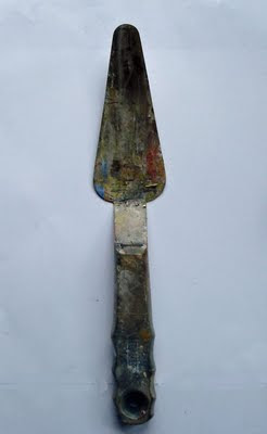
Above is an ordinary palette knife. I have been breaking these frequently enough that I needed to come up with a better solution. The first one of these I bought about forty years ago lasted me twenty years, the second, lasted perhaps ten years, the third about a year. Recently they have been breaking in a matter of weeks. The last one I bought broke the first day I used it. The part that breaks is where the tang (the wire neck that runs from the handle) is soldered to its spatulate blade. The second problem with these is that the tang, being round, breaks free from whatever glue holds it inside the handle and begins to swivel. That makes them useless too.

There are better palette knives made by Liquitex that have a flat one piece tang and a larger handle. They don't have a round tang that can become loose and turn in the handle during use and there is no weld where the tang meets its blade. Since I am 32 feet tall and weigh over 1600 pounds, I like that bigger handle too.

Below is one of those knives, the blade is huge, about 4 1/2 inches long. I like to clean my palette with it and use it for tubing paint, but it is really too large to use mixing piles of paint while I am working. This knife costs about six dollars, so it is inexpensive. These Liquitex knives are available through Jerrys artarama and many other places.


I put one of these knives in my bench vise and using an airplane shears, and a tin snips, available at any hardware store, I cut it down. First I drew on the blade with a felt tip pen the new profile I wanted, then carefully snipped it down to that profile. Next I touched it up with a file until it was smooth. I wouldn't want to use a grinder to do this though, I am afraid I would take the temper out of the steel blade if I heated it up too much. You want to be careful to keep your hand from slipping into the blade as you do this, of course.

Below is my custom palette knife with flat tang and power-grip handle. the reshaped blade is now three inches long. Of course you can create any shape or size blade you want this way. I think I have solved that problem and expect the new knife to last for many years.

Saturday, May 14, 2011

My current reading list

Cryptoprocta Ferox or Malgasy Fossa, undoubtedly bites.

The following is an e-mail I recently received and its answer.

Hey Stape,
I've got a couple of ideas for your blog posts.
You mentioned your reading list, I would love to see what you have on there! Historical, instructional or cotton candy(tastes great, gone quick, no substance). It's not that easy to find well written history books. Most of them read like history books.
Also, I'm taking a quick trip to the NE, and I would love to see a post on area galleries. Anywhere between Boston and Hanover would fit my bill, but any in general would be great to see.
Thanks! ............. Tupak Saday

Tupak:
The latter part of your question I cannot answer, if I list some galleries the others will complain at their exclusion. So I avoid that question. I will however give you a list of the books that I have recently acquired, some are in my studio and others are spilling from my bedside table.

1) The Judgement of Paris, is a history of the French salon painters Manet and Messionier. I am enjoying this and learning more about two of the great painters of the French 19th century.


2) de Lazlo A Brush with Grandeur, a monograph on the successful portrait painter who painted the swells of Europe at about the time of Sargent. I love this guys stuff. He is not the equal of Sargent, but he was real good. I am enjoying studying the clear exposition of the planar structure in his heads. This is a recently renovated artist who should be better known. Great book!


3) Thomas Moran; by Nancy K. Anderson. This 1997 book seems to be the best Moran book. I am enamored with Moran lately, an artist to whom I had previously paid little attention thinking his work too colored for my Presbyterian taste. I had always liked and clipped from magazines reproductions of his Long Island paintings but never really was sold on his theatrical western art for which he is fart better known.
I still like the East coast paintings better but I am certainly going to use some Moran ideas in the Texas paintings I am assembling for Kornye galleries in Fort Worth.


4) Thomas Moran, The Field Sketches. Crammed with reproductions of his location studies for the paintings. It is very useful to see the drawings from which the artist made the paintings. A great landscape draftsman, a little reminiscent of Constable of all people, seeing the drawings explains much about how the paintings were made.


5) The Hudson River School, Nature and the American Vision. The catalogue from the show I saw at the Amon Carter Museum. This contains many excellent reproductions and I have yet to read the text, I probably will but I have so many books going and I am often searching for pictures of paintings. Nicely illustrated and contains some excellent detail shots that are helpful to someone trying to actually paint landscapes. Social history of art is cool but I first of all am out to study these things to improve my own painting.


6) Raeburn, by Duncan Thomson, another monograph on a great portrait painter. This catalogue from a show at the Scottish National Gallery is full of good reproductions of beautifully painted heads from one of the greatest portrait painters. This is a big softcover book with lots of good reproductions. This guy was really fluid, I think him the equal of Sargent at portraiture but that's all he did, Sargent was good at so many other things too.


7) Soviet Impressionist Painting, a great big picture book of Russian 20th century realist painting. Far better art than you might expect, although some of the boy loves tractor stuff is well painted and colored but silly in its subject matter. These guys often had great color. The Russians kept alive their realist painting after the rest of the world went modern. Lots of ideas here for the landscape painter and for those interested in convincing society that communism is a good lifestyle choice.


8) George Inness and the Science of Landscape. A somewhat scholarly exposition of the thought processes of Inness. George was a bizarre man, this is an attempt to understand his perspective on designing paintings. It was not written by a painter but I am finding it useful anyway. I am only about halfway through this volume but expect I will walk away with some useful ideas. Very interesting ideas here, some so obvious to me that I get impatient with the author, but I am not a casual reader who just happened upon Inness, and others that are eyeopening. Perhaps I will do a book report on this one at a later date. I have often stared at an Inness and wondered "how does this thing work?" something I seldom have to do with other landscape painters.


9) Vicksburg 1863 I can't read about art all of the time and I read history also. I visited the Vicksburg battle field lately and am enjoying this history of the campaign by Grant to cut the Confederacy in two at the Mississippi. The western campaigns receive less attention than those in the east, but this was probably the turning point in the war between the states. Grant laid siege to Vicksburg until its fall, the revetments and landmarks of the battle are still there along with a huge and impressive ironclad raised from the waters of the Mississippi.

Thursday, May 12, 2011

THE ENCYCLOPEDIA OF DUMB DESIGN IDEAS, ROCK POTATION

THE ENCYCLOPEDIA OF DUMB DESIGN IDEAS
ROCK POTATION

The Nevelson master was born the son of a shiftless locksmith and cracksman in the risk averse 17th century town of East Delft. Across the canal from Delft itself, East Delft was a dangerous teeming slum with few opportunities for young men, particularly in arts administration and the then underdeveloped social services net weaving industries. Unable to afford a secure job with the compliance ministry, he drifted into a government art school where thousands of young men and women were groomed for the dozens of positions in the private sector art market. His story is a cautionary tale to all who major in the fine arts, obey their teachers and then are compelled to compete against the disobedient, incessantly slaving, wholly unlicensed entrepreneurs who infest the art world.

The painting above is another example from the recently discovered trove of the tyro's work. As usual it contains a glaring fault, POTATION. Many contemporary painters have filled their stream and river scenes with potatoes and other curds and lumps, but the effortless exposition in this piece is startling for its concise delineation of the potato forms.

Introduced only a few years before the tyros birth as ballast in the holds of swift Dutch triremes, the humble potato quickly became a staple of the low countries Kulaks diets. Suddenly available in massive quantities from the selenium rich alluvial plains of the tepid Azores and Peloponnesian islands, the potato captured the 17th century imagination in a way barely understandable to our contemporary ungulate fed society. The sight of various tuber cults, and secret societies drunk on starch and carrying burning torches, singing Foreigner's haunting "I Want to Know What Love is", while staggering with their stout bodies back to the slums of East Delft must have been a shocking one for a naive young boy raised on parboiled bulgur and ergot laden rye.

His natural reaction was to fill his paintings with the bulbous forms of the attractive and repetitive spuds. Perhaps you have done the same?

Wednesday, May 11, 2011

THE ENCYCLOPEDIA OF DUMB DESIGN IDEAS Potato edition

THE ENCYCLOPEDIA OF DUMB DESIGN IDEAS
POTATOES

Another find from the Nevelson master this painting is a fine example of a design flaw. Painted on the lid of a White Owl box, ( the artists white is suspected to be the ground up plastic mouthpieces from those same smokes ) this small painting contains a design problem called potation. What is that, you might well ask?

POTATION, THE REPETITION OF THE SAME SHAPE AND DIMENSION INSTEAD OF VARIED AND INTERESTING SHAPES, GIVES AN AMATEURISH AND ANNOYING ARTIFICIALITY.

If you again look at the painting above, or in your pamphlets, you will notice that the trees and the clouds are all of the same potato shape. Everyone who begins to paint makes this mistake. The ability to make interesting and varied shapes is developed and not instinctive. Like everything else in painting it must be learned, no one gets much for free.

When you see granny's paintings sold by her disgusted heirs at a yard sale, this is one of the most common faults. E-bay is full of modestly priced paintings by retired executives that are full of potato shapes. Someone once remarked that all amateur painting looks the same, and much of it does, because they all contain the same things unlearned.

So don't POTATE! as you paint, and when you study your work, police your shapes. Look for repletion of the same elements and intervals between them. The more different your shapes are from one another the longer you will hold the viewer.

Scholars researching the Nevelson master may have discovered his identity, one Dirk Van Assaerts from East Delft. Letters and civil records have come to light showing that he was a successful teacher and arts administrator too, winning numerous grants and subsidies. Van Assaerts left volumes of correspondence and opening to scholars a unique view into the life of a 17th century tyro. In coming posts I will reveal what contemporary scholarship has to say about this remarkable man.