Showing posts sorted by date for query Aldro Hibbard. Sort by relevance Show all posts

Thursday, August 22, 2013

Mediums and historic wisdom from rock and roll


Black Moumtain  Stapleton Kearns 24 by30, 2006?
I threw a few fall images of my own into this post.

Here is an ask Stape question, I received recently. I suppose I am repeating myself , but many readers have not read the archives and for them this is a magazine rather than a book. The blog is searchable via the little box up  in the left had corner of the page. But with over a thousand posts the archives are so vast that even I don't really know where things are back there. It was intended to be an exposition of everything I had learned in my time in the painting world, or my corner of it, New England traditional painting.

Arthur D Shroudpak, of Minot, North Dakota asks;
So what should I use for a medium when I’m painting outdoors ?
and
Is there a preferred brand of paint ?


Stape ........
I think you will want to use one of two mediums, either an alkyd like Liquin, or a varnish, turpentine and oil mixture often called VTO.

The ideal medium is probably no medium. Many of the painters of old New England had only a small cap of oil on their palette. To make many kinds of paint strokes though, it is nice to have the paint thinner, slipperier and more mobile.That is usually why a painter uses a medium. Varnish and oil mediums were pretty much standard practice for many years and artists often use them today for that reason. Their long and common use justifies confidence in their  permanence. When I was a kid we all mixed our Grumbacher paint. or Permanent  Pigments with Taubes Copal medium, which is an oil medium although made with the now scarce copal varnish. If you buy a bottle of copal medium today the small print on it's label will tell you that it contains not copal but alkyd.

  VTO medium is 1 part damar varnish, 1 part linseed or stand oil, and 4 or more parts turpentine ( not mineral spirits!). It has a little more glow than  an alkyd medium and  but it is slower drying. .It is easy to make yourself and Utrecht or Jerrys Artrarama can sell you big bottles of the damar varnish and stand oil very inexpensively. Get a plastic funnel and a big glass jar with a screw top like mayonnaise comes in and make a years worth of medium in about five minutes. This is a good medium for cheap Yankees too. Buy it retail in those little bottles and it will be more  expensive than The Glenlivet.

Or you might choose an alkyd medium, these are very common and promote quick drying and reduce "sinking in" problems.  Liquin is one brand name and Galkyd is another.Alkyd is an oil, often soybean, that has been modified with acid and alcohol. It dries insoluble, at least in artists thinners, resilient and a little rubbery.It makes a very tough paint film BUT it looks slightly different and I think not quite as "rich" as a traditional medium. Alkyds usually add a satin finish that has less glow than a VTO mixture.Some formulations are shinier than others but none have that deep luster of an oil medium.

Recently I have been using the VTO  rather than my usual alkyd medium. I am trying to use a lot less medium too.

There is no preferred brand of paint.

IT'S NOT IN THE PAINT!

 I use a lot of RGH (link in my sidebar) but I buy many of colors in quarts and tube them myself. All of the professional brands are fine, such as Winsor Newton, Rembrandt, etc. Every paint maker also produces a lower priced "student" brand. Those are absolutely unacceptable. If you want to know which colors I use , that's behind us about a thousand posts somewhere. Search "materials for a workshop".
Owls Head Light, Stapleton Kearns, 30 by 40 about 10 years ago.
I have a friend who is a rock and roll guitar hero, Kim Simmonds, founder of the band Savoy Brown. I enjoy talking to him, our "jobs"  have a surprising amount in common, and the discipline of daily practice and creation are very similar for each of us. Kim paints too, I don't think I actually know anyone who doesn't. Kim has a lot of stories, he started his band in London in the sixties. I want to share with you something he told me recently that I think has a lesson in it for painters.

Kim was at the home of John Lee Hooker .many years ago. Evidently John Lee Hooker's California home was a crossroads for musicians and lots of them visited and played together there. Someone asked Mr. Hooker "what do you think of so-and-so? ", another hotshot guitarist? And John Lee Hooker answered;

 "I LOVE him! LOVE him! I'm a big fan of his, and he's a big fan of mine!"

This was a standard response for him evidently. It is positive,witty and self promoting all at once. I am adapting this reply for my own use. I am frequently asked what "I think of another painter". I try  to always give a positive and nurturing reply . When I was young I used to blurt out exactly what I felt that artists shortcomings were, it's easy, everybody has em! It made me look small, and it served an insult to a stranger who might someday repay the favor. It usually disappointed my listener and it might have taken the bread from the mouth of a brother artist.

When you are out in the field with your painting buddies, say whatever you like. But in a professional setting, I think it is better to promote any artist who is mentioned to you. People will judge you on your work and form their own opinion of you. Dismissing another artists work won't make your listener like you and usually does the opposite. I believe this to be professional behavior. Knocking another artist (well except for Alex Katz, who is sure to survive it ) should be avoided

 When you are dealing with the public, that is a business setting and not a personal one. By "with the public" means when you are painting out in the field and someone approaches you, or when you are doing a demo or at an art gallery or event. A plein air paintout would qualify.You are there to get paid, not to feed your self esteem, educate the public or take the other guy down a notch. People want to like an artist they do business with, and if they feel you are jealous or negative they might not. I have a hard enough time getting people to like me anyway, being abrasive and all.

What goes around comes round seems a hackneyed phrase but it is appropriate here. In the long run, you will receive about the treatment from your brother artists that you dish out yourself. Sometimes people will hear that you had a good word for them or  promoted them heartily, they never forget that.

When next you are asked what you think of another artist, if you know their work at all, I suggest you answer:


WHAT A GREAT PAINTER!  I LOVE HIS (OR HER) WORK. I'M A BIG FAN OF HIS AND HE'S A BIG FAN OF MINE!

Stapleton Kearns 218 by 24 2010

Chromium thingy?


Here is another picture of last weeks chromium colored device . Someone guessed it as a paper towel holder. But it is a 2.50 cent toilet paper holder from Walwart that is supposed to hook onto the tank and beari an extra roll. That's a little to nakedly utilitarian for my bath, but it is a handy and cheap way to hang paper towels within easy reach of your easel.

----------------------------------------------------------------------------------
Leaf Season workshop
September 23-24-25

The Fall workshop filled weeks ago now and I have received a bunch of e-mail  from people who would like to have come. So I am scheduling another fall session. .. I have scheduled this workshop midweek rather than across a weekend to secure room availability. Inns are busiest in the leaf season in New England . Peak fall is a beautiful time of year here. Notice those mountains behind the inn in the picture below. I can't wait, it's going to be so cool!


This is the Sunset Hill House in Franconia, New Hampshire. I have been teaching workshops there for  years and it is the ideal location.  Because I have taught so many workshops there the inn keepers have learned what painters at a workshop need and they are now practiced at hosting my workshops and making sure we have what we need to operate without any distractions or responsibilities other than painting.There is a broad rear porch that overlooks the mountains so we can still paint outside no matter what the weather does. The lower level of the inn  is ours to store our paints and canvas so we don't have to haul it all to our rooms and it makes a good place to teach too. The view of the mountains is spectacular and in the fall it will be even better. The inn takes good care of us. We have our own private dining room too. They handle  our meals and even bring us lunch so  we can work all day uninterrupted. The inn is one of those big old historic affairs from the 19th century and is homey and informal. Most of the rooms have gas fireplaces, and it is cool in the evenings up in the mountains in the fall, so that is nice after a day outside. It is necessary to stay in the inn to take the workshop.

I love teaching workshops. Everyone is always excited to be there and hang out with the other artists. It is like a three day party. We go from breakfast until bedtime. This is a total immersion program and I run the class about 12 hours a  day. I do an evening lecture while we wait for dinner to be served.
. We don't need to leave the grounds of the inn  to find great subject matter so their is no problem with hauling easels around or caravanning cars to daily locations. We just walk out the back door and the whole Presidential range is spread out before us.

The schedule includes;
  • a demo every morning, on the first day I explain the palette and the various pigments.
  • In the afternoon the students paint and I run from easel to easel doing individual instruction and try to diagnose each students particular barriers to better painting.
  •  after the demo each day I run  a series of exercises  teaching root skills like creating vibrating color and the parts of the light (that is what you need to know to establish light in a painting) I will also teach how to most effectively "hit" the color of nature outside.
  • I do a presentation before dinner with images from my laptop. One is a history of White Mountain art so you can see what the greats of American painting did with the same landscape we will be painting during the day.  In the 19th century all of the great Hudson River painters made a point of being there too, just a few miles up the road from the inn. The other lecture is unpacking out  the design ideas in the works of great landscape painters, particularly Edward Seago and Aldro Hibbard, two favorite painters of mine.
  •  I will work you like a borrowed mule.

 The cost of the workshop is 300 dollars. Sign up here. I charge a 150 deposit up front when you register. In return for that I will hold your place in the class. I wont give away your place to anyone else, so I don't return deposits.
 Lodging reservations must be made with the inn who will provide a discounted room package deal to my students, it is absolutely required that you stay at the inn to take this workshop. Well, actually, if you must stay off "campus" call them and they will arrange a day rate for you which will cover your meals etc. Here is the Sunset Hill House web site


Saturday, August 3, 2013

A truncated sub-palette and a chromium mystery device


A demo painting done in front of a class on the Hudson River near Newburg, New York 16" by 20"
(disclaimer, only the sky was done with three colors)


Above is a shot of my palette.  I have mentioned in previous posts how although I have earth colors and a warm and a cool or each hue, I sometimes work in only three colors. Some landscape painters work in a red, yellow, blue, whiiich is a restricted (or chromatic) palette. They have no ochers, siennas, black or umber. I don't paint entire pictures this way very often, but you can, and it gives a lot of color harmony to a painting.It is possible to mix lots of different color notes from a palette like this.

 However you  trade the ability to strongly characterize nuances of the color before you, for color harmony.

 There are some advantages though.
  •  It is easy to make a "note" again for a second time, and rapidly, because there are only three possible ingredients in each mixture.That can save a lot of mixing time.
  • One of the "keys' to design is simplification. Simplifying your color means imposing a system or order on your color choices that will effect how the painting looks. There are lots of different ways to artistically choose your colors  and many far more sophisticated than this one. But a chromatic palette is sort of "set and forget", you use the palette, you get the "look".
  • It is relatively easy to learn your way around the combination of three pigments (plus white). I spent a year on a three color palette perhaps twenty years ago and I learned a lot about color doing it. 
  • I like to use a chromatic, three color palette for things that are high key, like snow, skies and surf. Varying amounts of all three colors in each note can gives a great deal of subtly.I will use the trhee color palette for a PART of my painting,.
  • If you are traveling real light, there are only a few tubes to put in your pack, not a dozen.
The most common three color palette today seems to be cadmium yellow, alizirin and ultramarine. My own three color palette is cadmium yellow light (not lemon), cobalt blue (clearer and bluer than ultramarine) and quinacridone red ( permanent rose, or permanent alizirn) Genuine rose madder is very pretty and gives a  lovely restrained tonality to mixtures but it is quite expensive. I don't set my palette with only the three pigments in practice, but I do remember that

 embedded within my full palette is a smaller chromatic one.

Below, I have mixed each pigment with white and made three piles of paint all about the same rather high key value. I would use these if I were painting a sky or snow perhaps.


Above, from mixing pool between my three pigments, or three pigments plus white  I can pull variations of all the possible colors.

Below I have a lower key version of the same thing.  I am still using some white but I am making darker, or lower key notes. Each of these notes derived from the original hues is composed of only two colors, like red and yellow or yellow and blue. These are the secondary colors, (at least those we can make on our restricted palette). I am making these samples with a palette knife, by the way.


 It is when the results of the notes we have made in the last photo are combined that we begin making that vast  array of more complex colors that are  frequently encountered in the landscape. Most of the colors outside come from this range, slightly to very stepped down colors with the occasional splash of something very colored (or high in chroma or saturation).


Olives, ochers, siennas and various russets, oranges and golds are created with these tertiary mixtures. They contain some amount of each of the three original pigments.


 Above is a sample of sky painted with the palette above. Except for a few touches of the white and ultramarine mixture in the undersides of the clouds it was painted with the three premixed colors


I can save premixed pigments easily and cheaply by wrapping them in cling wrap. They will last for months that way. If I am making a picture where I need a constant supply of a premixed note, I will make a pile of it and wrap all except for a small amount left on my palette. Notice a second pile of blue made with ultramarine on the left there. I sometimes add that to get the darks on the bottoms of clouds and the darkening of the sky as it nears the zenith. Ultramarine is heavier and redder than the cobalt, but I also mixed it to be a little lower value than the others..


Whats this?
-----------------------------------------------------------------------------------------------

FALL WORKSHOP
I have two remaining spots in my fall workshop October 26 through the 28th. That is a Saturday through Monday.


This is the Sunset Hill House in Franconia, New Hampshire. I have been teaching workshops there for  years and it is the ideal location.  Because I have taught so many workshops there the inn keepers have learned what painters at a workshop need and they are now practiced at hosting my workshops and making sure we have what we need to operate without any distractions or responsibilities other than painting.There is a broad rear porch that overlooks the mountains so we can still paint outside no matter what the weather does. The lower level of the inn  is ours to store our paints and canvas so we don't have to haul it all to our rooms and it makes a good place to teach too. The view of the mountains is spectacular and in the fall it will be even better. The inn takes good care of us. We have our own private dining room too. They handle  our meals and even bring us lunch so  we can work all day uninterrupted. The inn is one of those big old historic affairs from the 19th century and is homey and informal. Most of the rooms have gas fireplaces, and it is cool in the evenings up in the mountains in the fall, so that is nice after a day outside. It is necessary to stay in the inn to take the workshop.

I love teaching workshops. Everyone is always excited to be there and hang out with the other artists. It is like a three day party. We go from breakfast until bedtime. This is a total immersion program and I run the class about 12 hours a  day. I do an evening lecture while we wait for dinner to be served.
. We don't need to leave the grounds of the inn  to find great subject matter so their is no problem with hauling easels around or caravanning cars to daily locations. We just walk out the back door and the whole Presidential range is spread out before us.

The schedule includes;
  • a demo every morning, on the first day I explain the palette and the various pigments.
  • In the afternoon the students paint and I run from easel to easel doing individual instruction and try to diagnose each students particular barriers to better painting.
  •  after the demo each day I run  a series of exercises  teaching root skills like creating vibrating color and the parts of the light (that is what you need to know to establish light in a painting) I will also teach how to most effectively "hit" the color of nature outside.
  • I do a presentation before dinner with images from my laptop. One is a history of White Mountain art so you can see what the greats of American painting did with the same landscape we will be painting during the day.  In the 19th century all of the great Hudson River painters made a point of being there too, just a few miles up the road from the inn. The other lecture is unpacking out  the design ideas in the works of great landscape painters, particularly Edward Seago and Aldro Hibbard, two favorite painters of mine.
  •  I will work you like a borrowed mule.

 The cost of the workshop is 300 dollars. Click here to sign up.  I charge a 150 deposit up front when you register. In return for that I will hold your place in the class. I wont give away your place to anyone else, so I don't return deposits.
 Lodging reservations must be made with the inn who will provide a discounted room package deal to my students, it is absolutely required that you stay at the inn to take this workshop. Well, actually, if you must stay off "campus" call them and they will arrange a day rate for you which will cover your meals etc. Here is the Sunset Hill House web site


Tuesday, July 2, 2013

A demonstration from 1968 by Emile Gruppe


Gloucester is America's oldest seaport, over it's long history it has lost 10,000 men at sea. It has a long art heritage too. The harbor there is a beautiful and inspiring place to paint. Most of the artists came  to paint the fishing boats and wharves. Many famed artists have lived or worked in Gloucester seasonally. Fitz hugh Lane 1804 – 1865 ( who recently changed his name to Fitz Henry Lane) lived there, John Sloan, Frederick Mulhaupt, and Edgar Allen Poe, and Marsden Hartley summered there. There are paintings of Gloucester by almost everyone who matters in American art history,  Childe Hassam, Willard Metcalf worked there, other painters who have been attracted to Gloucester include, Winslow Homer, Frank Duveneck, Cecelia Beaux, Edward Hopper, Robert Henri and Maurice Prendergast, William Launt Palmer, and John Twachtman.

Emile Gruppe 1896–1978 was a Gloucester painter who remains a hero to New England painters and has had an enormous influence on the plein air painters of today. His unbelievably rapid execution and sure sense of design made him an enormously successful and productive painter. Born in Rochester, New York he was the son of a painter-art dealer who immigrated from the Netherlands at the start of World War I. Gruppe's father was a painter his brother was a sculptor. Rockport and Gloucester are both on an island at the tip of Cape Ann, Gloucester the larger of the two towns is where Rockporters go to buy anything more than a souvenir T shirt. Gloucester is the seaport featured in the Perfect Storm. The old wharves and fishing boats, now virtually all gone, were usually the subjects of Gruppe's art. Gruppe had a gallery which is still operated by his talented son Robert, who carries on the families'  style of painting. The gallery was, and is on a spit of rock jutting into Gloucester harbor called Rocky Neck.

Just next to Rocky Neck on Gloucester Harbor is the North Shore Art Association, founded in 1922. Gruppe routinely did artists demonstrations there. I always wished that I could have  seen one, but I didn't get to Cape Ann until about five years after Gruppe's death so I never had the opportunity.

A week or so ago I was painting on a street in Watch Hill, Rhode Island  and was approached by a man who excitedly shook my hand and told me how he had enjoyed reading my blog. Introducing himself as Al Kohnle, he mentioned that his father had been a friend of Emile and that he himself actually went out painting with Gruppe once. Then he told me about seeing Gruppe do one of the legendary demos at the North Shore, and that he had photographs he had taken at a Gruppe demo in 1968. When he voluntered to e-mail me copies of them I asked if I could share them on the blog. He graciously said that was fine. So far as I know these have never been reproduced anywhere and have only been seen by a few people. I am thankful to him for their use and am excited to show you what this legendary painter looked like in operation.


Here is Gruppe with his blank canvas, to his  left is a sketch that he brought with him and taped up on the wall as a reference. He has no photographs strewn about. His reference is reproduced below as well as I could pull it out of the photo using Photoshop.  I believe it was done in charcoal.
Note the rhythmic quality in the somewhat blurry reproduction of the sketch. Gruppes paintings are full of looping S curves and sinuous lines. If you squint at this and look at it through your eyelashes you will see the big simplified shapes that  are the armature upon which he built the painting.With such strong artistic geometry running under the image, the amount of detail he needed to add was minimal.This was a two hour demo by the way.


Thanks again to Al Kohnle for providing these for us to see.


-----------------------------------------------------------------------------------------------

FALL WORKSHOP
I am again doing a Fall workshop October 26 through the 28th. That is a Saturday through Monday.


This is the Sunset Hill House in Franconia, New Hampshire. I have been teaching workshops there for  years and it is the ideal location.  Because I have taught so many workshops there the inn keepers have learned what painters at a workshop need and they are now practiced at hosting my workshops and making sure we have what we need to operate without any distractions or responsibilities other than painting.There is a broad rear porch that overlooks the mountains so we can still paint outside no matter what the weather does. The lower level of the inn  is ours to store our paints and canvas so we don't have to haul it all to our rooms and it makes a good place to teach too. The view of the mountains is spectacular and in the fall it will be even better. The inn takes good care of us. We have our own private dining room too. They handle  our meals and even bring us lunch so  we can work all day uninterrupted. The inn is one of those big old historic affairs from the 19th century and is homey and informal. Most of the rooms have gas fireplaces, and it is cool in the evenings up in the mountains in the fall, so that is nice after a day outside. It is necessary to stay in the inn to take the workshop.

I love teaching workshops. Everyone is always excited to be there and hang out with the other artists. It is like a three day party. We go from breakfast until bedtime. This is a total immersion program and I run the class about 12 hours a  day. I do an evening lecture while we wait for dinner to be served.
. We don't need to leave the grounds of the inn  to find great subject matter so their is no problem with hauling easels around or caravanning cars to daily locations. We just walk out the back door and the whole Presidential range is spread out before us.

The schedule includes;
  • a demo every morning, on the first day I explain the palette and the various pigments.
  • In the afternoon the students paint and I run from easel to easel doing individual instruction and try to diagnose each students particular barriers to better painting.
  •  after the demo each day I run  a series of exercises  teaching root skills like creating vibrating color and the parts of the light (that is what you need to know to establish light in a painting) I will also teach how to most effectively "hit" the color of nature outside.
  • I do a presentation before dinner with images from my laptop. One is a history of White Mountain art so you can see what the greats of American painting did with the same landscape we will be painting during the day.  In the 19th century all of the great Hudson River painters made a point of being there too, just a few miles up the road from the inn. The other lecture is unpacking out  the design ideas in the works of great landscape painters, particularly Edward Seago and Aldro Hibbard, two favorite painters of mine.
  •  I will work you like a borrowed mule.

 The cost of the workshop is 300 dollars. Click here to sign up.  I charge a 150 deposit up front when you register. In return for that I will hold your place in the class. I wont give away your place to anyone else, so I don't return deposits.
 Lodging reservations must be made with the inn who will provide a discounted room package deal to my students, it is absolutely required that you stay at the inn to take this workshop. Well, actually, if you must stay off "campus" call them and they will arrange a day rate for you which will cover your meals etc. Here is the Sunset Hill House web site

Friday, September 28, 2012

A little about Nicolai Fechin


I was in Minneapolis this last week and returned to the Museum of Russian Art. If you live in that area, or are passing through Minneapolis, this is a wonderful museum  It shows a collection begun about twenty five years ago by Raymond E. Johnson, a Scottsdale, Arizona art dealer. Johnson bought an enormous collection of Soviet era art during the time when Gorbachev was thawing relationships with the west. About ten years ago the museum acquired a Spanish Colonial style church in south Minneapolis. After renovation and some inspired redesign of its interior space the building became a splendid display place for the largest collection of art of it's sort in the country. At 5500 Stevens Avenue South  in Minneapolis the museum is conveniently located. It is right at a the Diamond Lake Road exit on 35, that's the main freeway from the airport to downtown. If you fly in, the museum is right on your way as you go into the city and it is about fifty feet from the exit, so for a traveler, getting there is really easy. Unlike many city museums there is a free parking lot across the street and admission is reasonable. I make it a routine stop when I am in Minnesota, which is frequently.

I love the art of Levitan, Repin and Shiskin etc. but this museum is about the period after those artists, the era of what we once called "boy loves tractor" art, or social realism. Until just a few years ago Americans dismissed  this painting as propaganda and illustration for the evil empire. However Russia maintained the systematic and historically driven training of painters that was discarded by most of the rest of  the world. Many of these Soviet period paintings are very fine. They range  from impressionism to a sort of Norman Rockwell gone Marxist style.The level of technique is very high, higher for the most part than what was going on in this country.

I bring up this venue because they are currently displaying a large retrospective of the work of Nicolai Fechin (1881–1955).  This show runs until January 20, 2013.  Fechin was trained in St. Petersburg under Illya Repin, one of the finest Russian artists at the turn of the 20th century. In 1923, after the Russian  Revolution and the death of both his parents from typhoid fever, Fechin emigrated to America. Himself a  victim of tuberculosis, he ultimately moved  to Taos, New Mexico. Before antibiotics the dry air of the desert was often recommended as a cure. The last part of his life was spent in Santa Monica, California. He was successful financially as both a portrait painter and with his figure painting.


Above is a painting from the show. I hadn't seen many Fechin paintings in real life before the show and knew them from the one commonly available book on the artist.


  Fechin was a master draftsman but what really makes him special is his paint handling and his color. The painting above is typical of his work, the  head is rather smoothly painted and the rest of the painting is very broad and is full of various textures and rugosity of paint. Here is a detail of the painting above.


The paint is troweled on and only assembles into the little girls dress at a distance. The level of abstraction is higher than in a Sargent. This passage is thick and  highly textured. Notice something else, this painting is cracked, Fechin used zinc white which is brittle and prone to cracking. Nearly every painting in the show  showed a fine craquelure. I don't believe these  paintings are going to fall off their canvasses anytime soon, but they are not very old as paintings go and most of the art I have seen of their age has not cracked. There is a warning here for anyone who would choose to work in zinc white. Painters use zinc because it is much lower in opacity than titanium and they feel that it lets there color show more, rather than "eating'' it. That is true I suppose,  but at least when worked thickly, the price to be paid is cracked surfaces. I have seen a lot of Emile Gruppe paintings done with zinc and they don't seem to be cracked, but they are painted much  more thinly, usually in one shot and only a single brushstroke thick.

Here is another detail. Look at the rough texture of the hair and it's contrast with the smoothly modeled  flesh. I  think this is exciting painting and very effective. There is another thing going on here too, look at where the hair meets the face, most painters would soften that edge by stroking along it with a  brush,  possibly  a sable. But Fechin has used the broken surface of the paint to get his softened or minimized transition at the edge. There is another crack right through the cheek of this portrait.


Fechin has laced wonderful accents of bright color into the background here. There are violets and a cold blue and and other notes  dragged over his rough underpainting or ground. These  colors look like jewels because of their contrast with the dark and unsaturated passages onto which they are placed. The grave notes activate the colored notes by comparison. Again the rough surface gives him a soft edge and keeps those bright notes subordinated to the larger passage. Notice how just to the right of the eye he hardens the edge to indicate the abrupt  plane change and the bony zygomatic cage surrounding the eye. I have written a lot about Edward  Seago. Seago used a textured ground and got a lot of his subordinated edges the same way. 

Up close this handling or treatment is more interesting that a more matter of fact presentation. 

It is in this handling or treatment that the ART lives, not in the choice of  subject matter.

  Up close this thing says PAINT, from a  normal viewing distance it says NATURE.


Above is a painting by the late Leroy Nieman. Here is a painting with bravura handling of thick paint that is nowhere near the equal of the Fechins. It is a matter of taste, the Fechins  are beautiful and elegant, the Nieman of Miles Davis has heightened cheese content. This may serve well in a magazine illustration, but it is not fine art the same way the Fechin is. The comparison of these two paintings could serve as a test of sensitivity to fine painting. The Fechin is a waltz of both restrained and grave color contrasting with the accents of saturated  notes. Together the graver and colored notes in the Fechin are beautiful and balanced. The Nieman is all saturated color and looks vulgar.

ALL COLOR IS NO COLOR!

........................................................................................

Hudson River Workshop
with special Guest star Garin Baker


 The workshop will start on Saturday, October 13 and run three days through Monday the 15th. It will be held at the Carriage House Art Studios in Newburgh, New York. Well known and highly skilled artist Garin Baker will be our host and special guest star. If you live in the city or Westchester or maybe New Jersey this workshop should be within easy striking distance  for you

The schedule includes;
  • a demo every morning, on the first day I explain the palette and the various pigments.
  • In the afternoon the students paint and I run from easel to easel doing individual instruction and try to diagnose each students particular barriers to better painting.
  •  after the demo each day I run  a series of exercises  teaching root skills like creating vibrating color and the parts of the light (that is what you need to know to establish light in a painting) I am going to add a new exercise this time on color mixing.
  • I do a presentation before dinner with images from my laptop. One is unpacking  the design ideas in the works of great landscape painters, particularly Edward Seago and Aldro Hibbard, two favorite artists of mine. I will also  do a little presentation on the Hudson River school and their techniques.
  • I promise I will work you like a borrowed mule. 
  • I can save you years of screwing around

There should be some autumn color by this time. This is getting into the best time of the year to paint outside. This is sacred ground to American landscape painting. The early history of American landscape painting was written on this ground by  the Hudson River School.. I will talk a little about their working methods and show some examples of this art as well. You can sign up by going here.


Saturday, August 4, 2012

Another little trick I know 4


Here is a  little trick for stretching canvas. When I start stretching a canvas I put a staple in the middle of each side. As you can see above the tension is uneven around that first staple. Before I drive the next one, I grab the end of the canvas up at the corner and pull it taut. I still have the canvas pliers in my other hand pulling the canvas as you see above. I pull it just as hard as I can.


I grab the canvas up there at the corner and pull it so that the canvas is tensioned not only across the stretcher but along it's length as well. It would help to be an octopus to do this. I release the hand up at the corner and use it to hold the staple gun to drive the next staple between the initial one and the corner. I space my staples about two inches apart. I do this for the first two or three staples on each side. That little tug helps prevent buckling or an uneven tension across the length of the side I am stretching.

I thought I would throw this in here too. This is a reprint from a previous post, but it certainly falls into the little tricks category

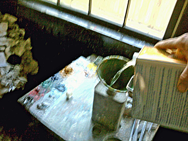
There is a trick to pouring from a new can of solvent. For years every time I did it I got turpentine all over. Then someone showed me how to do it. The trick is to turn the can over. Pour the solvent ACROSS the top of the can, like in the grainy cell phone picture above. You will need to hold your mouth just right for this to work, but try it, no more turpentine filled shoes!
There are about a million little tricks in painting.


 Above is pictured a device that sits on my easel. It is just a couple of stretchers screwed to the top and bottom of a length of 1 by 10. What it does is elevate the painting I am working on. I am 32 feet tall, so almost all easels are too short for me. I can't crank them up them up high enough to comfortably work on smaller canvasses, This one is an 18 by 24. The other thing it does is allows me to put a larger canvas on the easel quickly by removing this "easel stilt" rather than having to adjust the height of the easel itself. Notice that I have a half sheet of luan plywood sitting on the easel behind my painting. This allows me to tape my reference photos or inspirational reproductions of relevant master paintings next to what I am working on. It also eliminates the distraction of seeing whatever is behind the easel around my painting.


.....................................................................................................................

I have scheduled another workshop in the White Mountains for the autumn color season.  This is a first, I have never done a fall workshop up there. It should be a great time to paint the Presidential range from the Inn overlooking Franconia Notch. If you are interested, click on the link below and it will give you all the information about signing up. I limit the workshops to 10 participants, that keeps them a workable size and they almost always fill up so if you want to come, sign up before it is filled.


 Fall Color Workshop  September 8th through 10th


 This is the Sunset Hill Inn in Franconia, New Hampshire. I have been teaching workshops there for about three years and it is the ideal location.  Because I have taught so many workshops there the inn keepers have learned what painters at a workshop need and they are now practiced at hosting my workshops and making sure we have what we need to operate without any distractions or responsibilities other than painting.There is a broad rear porch that overlooks the mountains so we can still paint outside no matter what the weather does. The lower level of the inn  is ours to store our paints and canvas so we don't have to haul it all to our rooms and it makes a good place to teach too. The view of the mountains is spectacular and in the fall it will be even better. The inn takes good care of us. We have our own private dining room too. They handle  our meals and even bring us lunch so  we can work all day uninterrupted. The inn is one of those big old historic affairs from the 19th century and is homey and informal. Most of the rooms have gas fireplaces, it is cool in the evenings up in the mountains in the fall, so that is nice after a day outside.

 This will be the first fall workshop I have done there and I am thrilled. I love teaching workshops anyway. Everyone is always excited to be there and hang out with the other artists. It is like a three day party. We go from breakfast until bedtime. This is a total immersion program and I run the class about 12 hours a  day. I do an evening lecture while we wait for dinner to be served.The fall color in the White Mountains is legendary and people come from all over the world to see it. In the 19th century all of the great Hudson River painters made a point of being there too, just a few miles up the road from the inn. We don't need to leave the grounds of the inn  to find great subject matter so their is no problem with hauling easels around or caravanning cars to daily locations. We just walk out the back door and the whole Presidential range is spread out before us.

The schedule includes;
  • a demo every morning, on the first day I explain the palette and the various pigments.
  • In the afternoon the students paint and I run from easel to easel doing individual instruction and try to diagnose each students particular barriers to better painting.
  •  after the demo each day I run  a series of exercises  teaching root skills like creating vibrating color and the parts of the light (that is what you need to know to establish light in a painting) I am going to add a new exercise this time on color mixing.
  • I do a presentation before dinner with images from my laptop. One is a history of White Mountain art so you can see what the greats of American painting did with the same landscape we will be painting during the day. The other is unpacking  the design ideas in the works of great landscape painters, particularly Edward Seago and Aldro Hibbard, two favorite artists of mine.
  • I promise I will work you like a borrowed mule.


If you have never seen autumn in New England this is your chance to paint the most spectacular fall color in America.The cost of the workshop is 300 dollars, I charge a 150 deposit up front when you register. In return for that I will hold your place in the class. I won't give away your place to anyone else, so I don't return deposits. If you don't intend to come, don't sign up!
It is nessasary to stay at the in . However in the past several people have asked if they could stay with their brother in law or pitch a tent a nearby campground. If you want to do that, it's OK but you will have to pay a flat fee of 150 dollars to the inn for the use of their facilities. That fee will include your breakfasts, lunches and one dinner.The link to sign up is below;

http://stapletonkearns.blogspot.com/2012/05/workshops-for-sale.html

Tuesday, July 10, 2012

Some painting tricks I know 1


At the workshop this last weekend a student suggested that I should write a series of short blogs that would be about "tricks" of the trade. They suggested a series to be entitled 100 painting tricks. I am not sure I know a hundred of them, but I do know a few. So I will do some  and see how it goes....


I tube my own paint which I get from RGH ( link in my sidebar)  mostly by the quart. For years I have been carefully labeling the tubes. But they always get so painted up in my box that I can't read them anyway. So I don't even bother anymore. Now I squirt a little paint from the tube and mix it with Liquin on my palette. Then I paint a stripe about the neck of the tube using a number 4 flat. It is quick and easy. Then I stand them upright in a corner of my box for a day or two till they dry. Now I can identify  the tubes without all of that cumbersome reading.and they look really cool too.

Even if you don't tube your own paint, if you have a messy paintbox like I do, this might be useful to you. Incidentally that is the fabled pornstar pink there in the back row.


The Rockport Art Association in Rockport, Massachusetts is presenting an enormous show of over a hundred paintings by Aldro T. Hibbard which will run from October 6th until November 11th. There will be a full color catalog available too. Here is a painting by Aldro, one of my heroes.


 Hibbard has been long neglected by the museums and art establishment, this is the only show in many years of his work.There are few opportunities to see his art, and the best of Hibbards work will be there.. If you have never seen his paintings other than in reproduction you will be amazed.  My teacher, R.H. Ives Gammell counted him among the ten greatest American landscape painters and I agree.

Sunday, June 3, 2012

The historic use of molybendium in ancient cultures of the Euphrates

Frank W. Benson, Eleanor
I ran into this quote from Frank Benson online:

"This was to emphasize, again, the fact that it is the composition, the design, the creation of the artist's mine, which is important, not the representation of objects with paint. "I grew up with a generation of art students who believed that it was actually immoral to depart in any way from nature when you were painting. It was not till after I was thirty and had been working seriously for more than ten years that it came to me, the idea that the design was what mattered. It seemed like an inspiration from heaven. I gave up the stupid canvas I was working on and sent the model home. Some men never discover this. And it is to this that I lay the fact of such success as I have had. For people in general have a sense of beauty, and know when things are right. They don't know that they have but they recognize great painting. And design is the ONLY thing that matters."


Aldro T. Hibbard Retrospective      October 5 ~ November 11


The Rockport Art Association in Rockport, Massachusetts will be presenting an Aldro Hibbard retrospective this fall. I am a big fan of Aldro Hibbard and have presented his work many times in this blog. There will be a huge number of Hibbards, more than a hundred. This is the second Hibbard show the art association has done, the last was over than ten years ago. I  saw it every day it ran. There will be an illustrated catalog available for sale at the show. Hibbard was one of the founding members and was a president of the Rockport Association. He is the best known of the historic Rockport artists and I am looking forward to the show excitedly. I will be speaking and leading a tour of the show shortly after its' opening.

OK, I guess I should throw something useful in here. 

I just taught a workshop in Nashville, I had a big group, about twenty students. I was again reminded of something I see a lot when teaching. It wasn't particular to this group and I see it in every workshop I teach. Learning painters when working outside want to jam the whole painting into the lower, or lower and middle range of values. Often the whole scene is presented in three or four values from the middle of the scale.

When you have a painting  is not going well , get your contrasts up and running again. This happens to me too, I look at a painting I have been working on and realize it has become mushy, with the values that were initially clear and well stated blunted, and tentative. As we work on paintings it seems there is a tendency to lose the big pattern of light and dark. Often this happens as we add details and information and lose the big shapes that make a design go.

When your painting gets "stuck" or starts to get worse instead of better, boldly restate your darks and lights. 


Information is often the enemy of design.

-----------------------------------------------------------------------------------------------------


 If you would like to know about the upcoming July workshop in New Hampshire please
click Here. I have included the cost of the workshop and information on the location in the White Mountains. I can teach you a whole lot, and probably save you years of screwing around. Why torture yourself ? Don't get left behind! You are worth it! Everyone's doing it. Act now.


I have been developing a series of painting exercises to teach root skills. I have a bunch of them now and am adding them into the workshops. I set my easel up in front of the class and lead them through a painting exercise that will clarify either a skill, technique or principle. I will be presenting one of these each day at the July workshop.

Saturday, May 19, 2012

Landscape painting is a lie, well told!

© The Estate of Edward Seago, courtesy of Portland Gallery www.portlandgallery.com


 I received this comment on the last post:

 This is interesting and a bit confusing to me...if you 'key' your painting, don't you risk losing that lovely, oh so lovely atmospheric sense, the 'lightness' of nature that is almost like 'dew' to behold? I understand it all depends on what the light effect is of the particular scene you are viewing, but still, the phrase 'key your painting' troubles me and makes me think that it is similar to making NATURE conform to something she is not....of course, I am talking from a stand point of almost zero experience....and how does this translate to indoor/ still life painting? Personally, I love the Boston Painters, whose work, while it definitely utilizes dark darks and flat shadows, always feels 'light' and that the light effect 'was just that'.

Exactly! I want to make nature conform to something it is not. I wish to make art. Nature is one thing. Art is another. Arts a lie! The root of the word is artifice. Here's the definition of that. "Clever or cunning devices or expedients, esp. as used to trick or deceive others: "artifice and outright fakery. You cannot "observe design, color or emotion into a landscape painting. All of these things are installed by the artist. Look at the wonderful Seago above, would you mistake it for a window? Is it truthful?

It is possible to set up a still life in the studio and carefully transfer its appearance onto a canvas, at least if you have controlled lighting. But landscape is a different game. For a number of reasons.
  •  Outside, nature is always changing. Every time you look up it is slightly different. There is no "thing" to copy exactly. You cannot set up outside and copy your way to a great landscape painting.

© The Estate of Edward Seago, courtesy of Portland Gallery www.portlandgallery.com

  • The landscape is a warehouse of more props and details than you could ever want. It is essential to select the important, and reject the unnecessary clutter. It is impossible to paint every leaf in a forest and still get every blade of grass at your feet and maintain any semblance of unity or grace.
  • You can paint exactly what is before you as carefully as you can, but I will eat  your lunch, EVERY TIME. Paintings carefully copied from nature before you are usually ordinary. Usually fine landscapes bring a treatment or a "take" on  the landscape that is individual to the artist. Their paintings look as if they could only have been made by that artist. Their paintings are personal, expressive and individual. Edgar Payne doesn't look like Corot or Constable, nature may be constant, but each of these different artists have made paintings that are distilled from the experience of nature rather than a precision reproduction of the actual scene in front of them.
  •  
© The Estate of Edward Seago, courtesy of Portland Gallery www.portlandgallery.com
  • The range of values outside exceeds our pigments range. The value of a painted sky is often too dark even if you use pure white. It is necessary sometimes to approximate the look of nature. A blue sky might be higher key than you can paint and still have any blue pigment in your note for instance. But most importantly, the 'look' of nature is secondary to the "look" of the painting. If the painting doesn't move the viewer, you can't assure them that it looks just like nature. Art is one thing, nature is another.
  • There is a historic "language" of landscape painting, and it is inventive. The greats have rearranged and riffed on nature to make their paintings. Landscape painting allows for lots of re arrangement and artifice. it is that quality that for me is what makes landscape so appealing. If you play it straight you will usually end up with matter of fact paintings. It is not what it is a picture of, but "how" it is a picture of, that is important in the landscape.
  • No one would mistake a Corot or an Inness for a window. They are created illusions based on nature but arranged and presented in a manner unique to their particular creator. Landscape painting is best when it approaches poetry and weakest when it is an accountant's laundry list of the objects that happened to be in front of the artist.
  •  
  •  
    © The Estate of Edward Seago, courtesy of Portland Gallery www.portlandgallery.com
  •  
  • Imagine an historical account of the battle of Gettysburg. A 100,000 page description including how every single soldier put on their shoes and explaining their genealogy and sartorial preferences with a complete accounting of their high school grades, and body mass index thrown in for good measure, would not be more informative than a description that seizes on the salient points of the battle and tells the story of a few men's experiences that typify the experiences of a great number of the participants. Selection and simplification are the bifurcated roots of design.
  • There is a big difference between a believable or a beautiful landscape, and a truthful one. A great landscape painting is more than truthful. A map is truthful, a painting is a construct, an artificial creation that recalls nature rather than records it faithfully. Art is a lie! well told, that says more than the truth.
  • I love the Boston school too, my roots are there. But, the Boston school painters were largely studio painters. They painted figures and interiors and still lives. Except for Bunker, ( oh yeah, and Enneking!) I can think of few who really concentrated on the landscape. This is true of the current generation as well. Landscape painting is a peculiar and different discipline than studio figure painting. The New York and Old Lyme painters, like Hassam, Metcalf and others were more serious about the landscape. For most of the Boston school landscape was a sideline or the background for figures. Aldro Hibbard was a student of Tarbell and the other Boston School painters of the previous generation to his own, he was a landscape painter, was he still Boston school? Maybe, maybe not.....Kaula, a lesser known Boston painter did a lot of landscapes, Benson did a few, but he would be forgotten today if his pure landscape was all that he had produced. There is (in my opinion) not a particularly strong landscape tradition within the Boston school and most of it's great practitioners were figure painters and not landscapists. I bet I made a lot of enemies tonight.