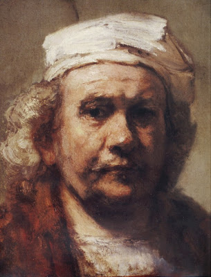
 Rembrandt, Self portrait image:artrenewal.com
Tonight I will continue with the series of posts I began last week.Every time the brush hits the canvas there is a list of things you need to know. I started the checklist several posts ago and if you want to catch up,go back and read those entitled Every Brushstroke.
The next point on the list is;
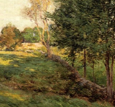
- Will the brush stroke be visible or invisible? There's the big division. I am not going to spend much time talking about invisible brushwork, it really is a lack of brushwork. I can't show you a picture of it because it is invisible after all. For most of you studio guys invisible is the norm. I can hear you thinking, I don't see any brushstrokes in nature. Outside though, the game is different perhaps there are no brushstrokes, but there certainly is a sort of pixilation. All of the leaves and branches and grass and patches of dirt etc. in the natural world appear as a fabulously complex myriad of dots of different colors like a tapestry. All of those dots are changing all the time, sometimes gradually sometimes rapidly. Pixilation is not the only way to capture the look of nature, but its a good way. It is what Monet and the French impressionists discovered. However there are plenty of passages in Hudson River school painting that have the same technology. A brush stroke is a pixel. It can be a big one or a little one, a slab, like in an Edgar Payne, or a grain of rice shape, like in a Willard Metcalf . I often joke with my buddies that when I lay in a painting that I am throwing hamburger sized chunks.
When you start thinking and installing, you are making artistic decisions. That leads to style. Brushwork is an element of style.
Below is a Metcalf showing a rice like brush stroke
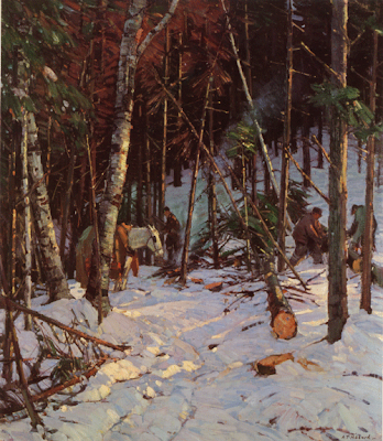
- A brushstroke can run with, or along the form. Often this is used to show strength, as perhaps in a leg that is intended to look powerful or tensed. Sometimes a painter will build tree trunks using vertical strokes. They tell nicely against a ground painted in horizontal strokes. Look at the vertical trees on the right side of this Hibbard.
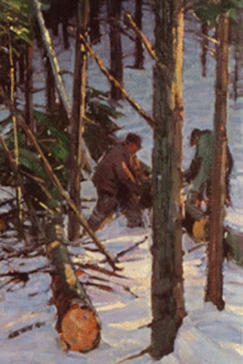
 Here's a detail. See the brushstrokes running up the trunks of the trees? It gives a wooden look. Incidentally you probably wouldn't do this to the leg of a beautiful young woman. It would look, well.....wooden.
 The kerchief that Rembrandt is wearing at the top of this post above, and the planes of his face are painted with strokes that run with the form and show its planar structure. Below is a Hibbard. Look at the snow in the lower left hand quadrant of the painting. You can see Hibbard building the forms of the snow.
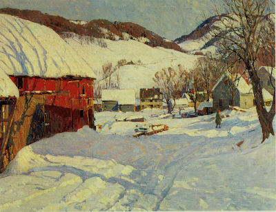 with his brushstroke. See him defining the surfaces of the snow as it turns towards the light, or faces upwards towards the sky. Do you remember me talking in a recent post about walls and floors? Here is an example of that logic.The next thing a brushstroke can do is run around or across (against) the form, like a ring going around or a plane laying horizontally across the surface of an object. Here's an example of that from the Hibbard.
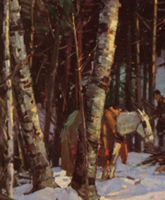 The Rembrandt up top has brushstrokes running against rather than with the forms of the muscles of his face to the left of his nose. That Rembrandt incidentally is a great example of building form with an expressive brushstroke. it looks like it was hewn with an axe.
It is generally best to lay your strokes against the form if you can. It almost always looks better. I guess that's because it shows the breadth ofobjects, and isn't as obvious a way of doing things. So to review, when your brush hits the canvas you need to know if that stroke is going to run with, or against the form.
More of this tomorrow, and then we will take all of this up a level, and talk about passages and what they contain.
Hibbard images from: A.T. Hibbard, Artist in Two Worlds by John L. Cooley
available through the Rockport Art Association, Rockport Massachusetts .


3 comments:
I love this post about strokes Stape! I also really like the post before this one about ateliers and landscape. I have a question though in regarding to strokes. I try to be more bold with the strokes in my paintings now, and when I do horizontal strokes the glare that I get seems too distracting to just leave. I see so many horizontal strokes in different paintings, but when i apply them too my paintings they become distracting because of the glare from my studio light. Now when I paint those strokes I do not use any medium, at times I do though and the result is a little better.
In regards to your previous post about ateliers and landscape, I think that mode of thinking is applicable too figures and still life's when a student is done with his or her training at an atelier. I went to the Atelier in Italy (Angel Academy of Art) and saw many students that just lived and breathed what the maestro or the assistant told them, which rightfully so should be, since we are there to learn from them. But I think they become to fixated to every detail instead of learning how to make things more beautiful than what they see. If you see a Bouguereau painting you know that he painted from life, but you know he made it more beautiful than what it was. Same goes with still life's, you can't just copy what you see, you have to breathe life to the subject, give it your soul, your signature, your unique brush stroke. I think at times certain ateliers fail to convey that message. Anyways I really like the message you are giving us about Ateliers and Landscape paintings! Thanks again Stape!
Jonathan.
Part of the message I return to over and over in this blog is reaching beyond the technical. You gotta have it, to climb up on,to reach the art button, but you still gotta hit the button.
The problem you are having has a name, suedeing.You have seen suede show where its fibers have been rubbed a different way. There are a number of things to try , I have had problems with that over the years. You will have to do some experimentation, try using Liquin as your medium, use copal if that doesnt work. Try a medium that will flatten your brushwork when you paint those passages, Try working under a light source to one side, or above. Don't change all of these things at once, try to only change one at a time,so you know what caused the difference.
As the picture dries it may lessen the problem. If all else fails,try putting butter in your shoes.
...Stape
Thanks Stape! I never heard of suedeing, very interesting. I will try those options you have given me including putting butter in my shoes!!! Take care.
Post a Comment