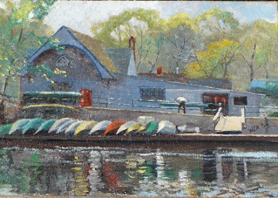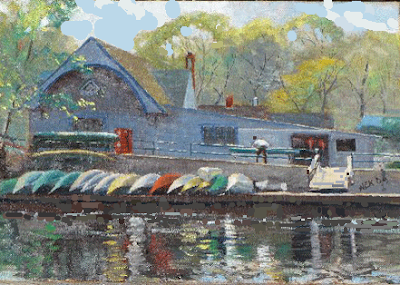
Going to be a short post tonight . I am on a painting jury tomorrow in Rockport, Mass. so I have to get up early. Lets look at that boathouse picture from yesterdays post again.
 I felt like the line of the dock across the middle of the painting divided it too much in half. What I did in photoshop was to pixilate it more. I broke the color up and lost a lot of the edges along that waterline area.
I broke up that overly insistent ramp thingy up on the dock. I also darkened the sky near the peak of that gable to deweight that passage a little bit. Also dropping the value of the sky a little made the spring trees tell better in front of it. I gave the little guy a head to make him look more human and I nailed it dark so it would be more compelling so he is of greater importance in the picture. He also helps attract attention up and away from that troubled waterline area.
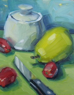
Here's a still life that has nice color. I think it could use a little more observation though. The stylistic convention of the blocky planar shapes is I think pushed a little to hard. The blocky shapes would look better if they were interspersed with some more rounded forms. All of the forms could use more volume but the yellow pear seems to need it the most.
 The color of that background is luscious but the brushwork there and around the knife parallels the forms in a rather matter of fact way. I think it usually better to paint in to an edge rather than along an edge. It makes the handling look more painterly.
I also think the edges in this piece are uniformly hard. It would benefit from having a mix of hard and soft edges. For instance in the shadow area under the front of that pear. The form would go around a lot better if the reflected light were grouped into the value family of the shadow rather than being as high in value as the planes which are out in the light. Too many hard edges make the eye jerk nervously from one to the next as they are all very assertive.
 image; artrenewalcenter.org
Above is a Soren Emil Carlson that exemplifies the qualitys I am suggesting . Notice the dynamic light and shade, the hard and soft edges on that white bowl and the mystery with which the form of that bottle disappears into the shadows. Also notice the control; of color temperature. See the hot notes down in the shadows, it gives them transparency so we look down into them, instead of at them.
The three small red fruit, Cherry tomato's? are arrayed about that knife at all about the same distance. A greater variety of intervals between them would give greater variety of shape. Perhaps the shadow of the knife might be tied to the tomato to its left to haul the two together into a group. Then that knife and tomato group would sit on one side of that foreground space and the pear and tomato balance against it on the other. Whenever you can, try to arrange your objects into groupings so that several of them become one thing, rather than each object sitting separately from the others. Grouping simplifies the design.
The handle of the knife is not in quite the same plane as the blade giving the knife an uncertain sort of twist through space.
My suggestion for this artist would be to observe the forms more completely and try to get a more fluid handling.They could also work towards a better control of color temperature, the shadows light s and reflected lights across their forms are all uniformly of the same temperature. If they were to use, say, cool lights and warm reflected lights they would get greater variety in their color.


10 comments:
Wow so much to reconsider now, what an informative critique. I have been reading this over and over. I am so grateful for your blog! Thank you so very much. I do find I place too much emphasis on completing a small work for the daily painting blog, (this was one of the daily works for the blog) that I rush and do not carefully observe. I particularly find the hot and cold advice about the lighting here intriguing, I see the need for so much change now! You are an amazing teacher!
Hi, Stape. Great job with the critiques. It is amazing how you can make the suggestions so effectively in photoshop. It sure beats an instructor grabbing your brush and running roughshod over your work. Putting the head back on the fellow in the picture was a good idea. Thanks. WillEK
STAPE,
You are part of a painting jury . Could you please tell me what are the important factors or points etc. that you are looking for every time you judge a painting. What are the top three things you look for every time in a painting that you are judging. I believe that with your answer it will help me to focus on these key points as I paint. I am getting ready to be judged by a few associations this year and I would like to know what the judges are looking for when I submit 5 paintings at a time of my work.
JAMES
I never know about Soren Emil Carlson. I will have to do some research on that artist.
Willek:
Thanks Last night I set the post to load at about 5. This morning I got up and looked at the boathouse and hated it, So I opened up photoshop and did the whole thing over, so if you logged on before 8 you saw a different version.
.......Stape
James:
I will write the next post on the art jury. Watch for it tomorrow, then I will resume with the great crit. project as I still have a bunch of images......Stape
Jeremy:
He is not real well known.Brings serious money, though. He was a great still life painter.They are really impressive when you see one in the flesh,like many paintings the photo of them doesn't give the whole experience.
Sandra
Thank you:
I always wait anxiously to hear back from folks I crit. I am always afraid I am going to flip them out. It doesn't haoppen much any more, but you cant keep it from ever happening.
Perhaps you should do a painting every day, every other day. Do you work all day long in your studio? If so, how about working a half day on one, and then a half day on another, the next day do it again. Even if you are not actually putting more hours into the same painting, they may be better considered.Perhaps you could stretch out and put several days into a painting every third canvas? Monet returned multiple days to make paintings and his came out OK.
...Stape
Hi again Stape, no you did not flip me out at all, I am grateful for your expert comments! The painting you critiqued was completed in about 2 hours tops, it is 8"x10." I will take your suggestions and work longer on some of the paintings so that I may produce more successful formal works. I have been working under the "daily painting" custom, trying to complete small paintings in an hour or less. The one you examined was one of the larger "small" daily paintings I have done recently. If you look on my blog, today I posted a painting I did last summer that I put some extra time into...on and off for a week. I have only been painting each day for a couple hours in the morning, maybe three hours a day at the most, usually on and off. I am hoping to extend that amount of time now in my life, because I do see the daily practice only gets me just so far in developing a formal image. I must begin to spend larger blocks of time on one piece in order to produce larger better developed works. I do hope to make it into some galleries over the next year or so with larger more serious canvases. What do you think of the daily painting custom, and do you think following that custom can help me "ramp up" to producing larger formal works of art? Maybe I have placed too much confidence in this custom and must alter my strategy.....I so see the wisdom in your suggestions to spend longer amounts of time on a work.
Sandra:
Let me think a day or so . Then I will do a post in reply to the "daily" question A lot of people,are doing that and I want to give a good answer,rather than just throwing out an opinion without some thought. Speak in haste,regretin leisure!
........Stape
Post a Comment