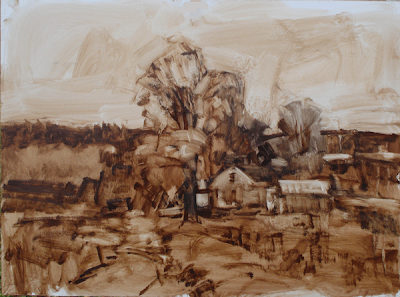
 Here is a step by step of the painting I did today. Here I am continuing to work up the painting using umber and a little medium, manipulating it with a rag. It was pretty gray out so I was able to work almost all day on it. On real gray days the light doesn't change too much so I am able to work on it much longer than I could under the changing light of a sunny day. The panel I am working on is an 18" by 24" piece of oil primed hardboard.
I returned and set up at the location for the day.This painting was not made from the photo references you saw yesterday.
I have moved slightly forward of the point where I shot the photos I showed yesterday and I have followed my plan by removing the phone poles and making the road into a gravel rather than a blacktop road. That minimizes it in size and assertiveness both.
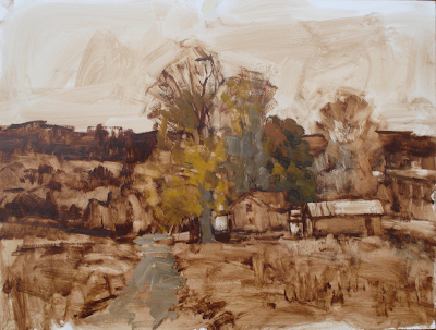 I worked up a pretty well thought out drawing , shoving things around until I had an arrangement that I was comfortable with. As always, at least for me, shoehorning the immensity of the scene onto the small canvas was the challenge. I also worried a lot about putting the house and tree unit into the landscape, rather than painting the house and tree unit, and then surrounding it with the landscape.
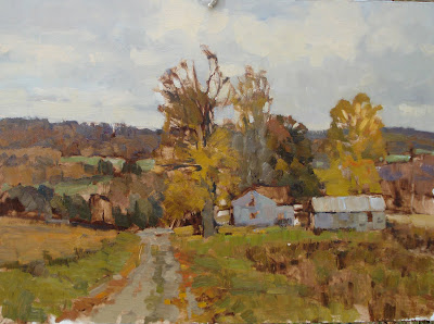 Above, I have continued to develop the painting adding color over my grisialle under painting. I worked that thinly and used Galkyd so it was pretty much dry. I put in a sky based on what was happening at the time that I thought looked good. I always give the sky a shot on location, but often I end up redoing the sky in the studio.
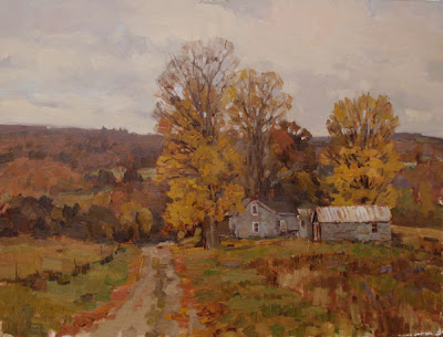 Here is the painting as I brought it home tonight. I wish I was able to tune the color of things in photoshop express a little better. When I am offered the ability to fool with the color I can adjust red, green and blue. I am sure there is a reason why I can't adjust red, blue, and Yellow, But that is the way I think. If any of you out there can tell me what the deal is with that, I would appreciate it.
Below is a detail of the middle of the painting so you can see my brushwork.
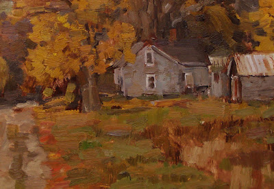
This painting is earmarked for the gallery of CNY in Cazenovia, New York. I will work it up a little in the studio, but I don't expect to do to much to it, as it has a nice rough and brushy feel to it now and I don't want to refine that out of it.


21 comments:
it looks beautiful.
Stape,
this is a really helpful post. I love seeing the process, and watching this one develop was very instructive. It is beautiful.(of course, I would have expected that), and seeing the structures is especially interesting, since you don't paint alot of buildings. What is maddening is that you make it look easy.
and, question: You have said before that unity of effect is the most important quality a painting can have. What exactly do you mean by unity of effect? Consistent light, color, what?
non-art related story:
I had to work in the studio today, which is in the attic of our old barn. Unheated. I wear approximately 537 layers, a hat, and gloves. But anyway, I heard a strange noise, and found that a wren had gotten into the barn. I don't know how. All the doors were closed. I spent the next 30 minutes trying to catch him, and finally did.When I went downstairs to let him out, lo and behold, ANOTHER wren was in the downstairs of the barn, also trapped. I guess they were a pair, but why they both got into the barn, I can't imagine.
Do wrens overwinter here, does anybody know?
Hello Stapleton,
You're blog is incredibly informative and I check it on a regular basis. Perhaps I can be of a little help ths time :) If I understand your question about photoshop and the inability to adjust the amount of Yellow in a picture, it is perhaps to do with the format of the file, i.e. RGB, CMYK, LAB... If the format was CMYK you could adjust cyan, magenta, yellow, black etc... so for RGB you'll just have to do with twiddling green and red at the same time or adding/remove blue by it's self to adjust for yellow. Hope this helps!
Good painting, I really like your edges. The edge btween those trees is real nice.
Is it a good principle to believe that to create a good sense of light and color...the more restraint you display the better.
I'm thinking of the upstairs window on the house...that tiny speck of white is powerful enough to convince me of the whole window. It shows up in other areas of your painting as well.
Is that something that you're purposely doing?
Paints use subtractive color mixing. Computers use additive color mixing. http://en.wikipedia.org/wiki/Additive_color
Hey Stape,
Another great painting. I really love the gray color harmony. It really feels like fall.
A good way to adjust color in Photoshop, and you can mess with yellow:
Click IMAGE>>ADJUSTMENTS>>VARIATIONS
A dialog box with pop up with a lot of fun stuff. It's basically a color wheel. Notice every thing says "more" and not "less", if you want less, click the compliment (across the wheel). Also notice you select highlights, midtones, and shadows. I think midtones is by default. Also to the right is a handy "lighter" or "darker".
I like it! Nice tonal quality. Something about neutral color that appeals to me immensely. Nice job with the step by step pics,too.
Stape your reply to my comment yesterday that I'm reluctant to publicly announce my painting plans ahead of time was great. You said:
"Working in my gallery with all of those people looking over my shoulder for all those years and painting on the streets so much I think I have grown sort of nonchalant. If the painting isn't great, the next one will be better. I have made and shown thousands. I feel more like a musician, I show up play and the gig as well as I can."
Guess the music turned out pretty well at your last gig.
What aefx said. you´re working on RGB, wich is Additive color. The way your monitor mixes light to produces the colors you need to see. You gotta go to image>mode>CMYK Color in order to change your image channels to work as if using subtractive colors, wich are the way pigments are mixed to create colors in a printer or in a painting.
Marcelo:
Thanks
...............Stape
Deb:
Unity of efferct means that there is a single image on the canvas rater than several sitting next to each other on the canvas.
...........Stape
aefx:
Thats is essentially what I have been doing.
................Stape'
Gregory:
Yes I scatter little accents here and there to give the look of detail when it isn't really delineated.
..................Stape
Lindsay:
I know about that much. It is not something I routinely work with. I am going to have to find a way to work in CMYK.
..............Stape
Jesse:
I am working in Photoshop express,not Photoshop., so I can't do that. My wife has photoshop on her computer, I wonder if I can put it on mine also.
............Stape
Simone:
Thank you. I like to think my painting is the color of 500 dollar suits.
...........Stape
Philip:
Thank you.I do painting demos for art associations, that's hard.
...Stape
Carlos,
I wish I could do that, but I am in the little version of photoshop and it won't do that.
...............Stape
Just a great post, Stape. I love clicking on those pictures and seeing that brushwork.Are you going to let those dry before going back into them again? You have not completely covered your preliminary drawing will you cover those areas before attacking what you did to this point?
Thank you Stapleton. Very nice. I like the way you did a grisalle out doors. I do the "wipe out" grisalle for studio work but haven't tried it out doors. Was your grisalle dry or had it set up by the time you started applying paint? What was the medium you used with your raw umber? How many different mediums are you using in this? I like this approach - the grisalle always helps me design the thing and get a handle on the choices I make of the millions of options out there...
Willek and Mary;
I will answer your questions in the blog tonight.
.............Stape
Post a Comment