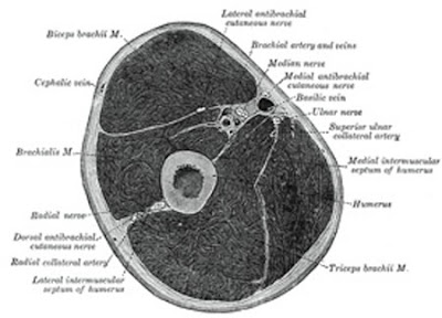
Here is a cross section of the upper arm from Gray's Anatomy. I'll bet you thought it was a Thanksgiving ham,didn't you? Its dissection time again! Here's our first subject now, relax, this won't hurt a bit.
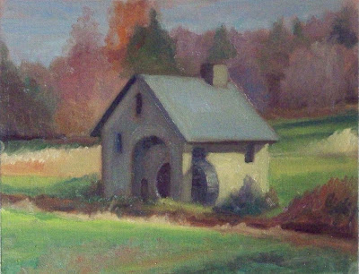
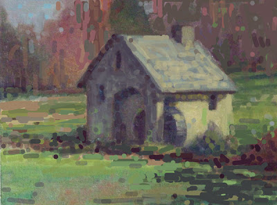
 Heres a little mill, the original is above and my photoshopped version below.
 Here is what I did to it and why.
- I cropped it so that the mill no longer was right in the middle of the canvas, but had a little more open space on the left than the right.
- I altered and strengthened the shadows at the lower right to carry the eye into the mill. That also gave me one dark corner and one light one. That is more interesting. I did the same thing up at the top too, closing off one side and showing the sky on the other.
- I made the effect of the light more pronounced. I lightened the roof a little, and I darkened the shadow side, then I threw some reflected light from the grass and some variation into the color of the shadow,
- I darkened all of the grass to get the illuminated wall of the mill to light up by comparison.
- I tied all of the darks across the foreground and in the shadow side of the mill into one big shape.
- I scattered some little accents about to give the look of a little more detail and get some vibration here and there.


6 comments:
Hey I almost missed this under the Snow Camp post. What a great critique. These are tremendously helpful because we all encounter these same types of situations in our paintings. And I have found myself remembering some solution you listed in a critique, either here online or from the workshop, and using that to solve a problem in a current painting. Good stuff.
A question and a request; Do you think that if the brush strokes and color changes, as you photo shopped them, in the Mill are preserved and then kept the original softer more vague background of the trees and sky, that the painting might be stronger? The differences in brush stroke, definition and color against the simplified background might give this piece another layer of interest? Could you indulge me and show that variation to compare?Just visual musings in the morning here.
awesome insights. it definitely helps to have a keen eye critique.
Deb:
Thanks. You know that all the mistakes are out there just waiting to be made.
.......Stape
Marian;
Sorry I don't have a means of doing that. I just work on the image and publish it,
......Stape
JT
Thanks
.............Stape
Post a Comment