Its dissection time again! Hand me that Ginzu knife and lets get to work, there are several squirming volunteers duct taped to the gurney now, lets open em up! Here is the first, I of course do not reveal whose art I am critiquing and I don't always choose the best image I am sent. I am always looking for problems to point out. This artist sent some other images that were to my mind, more successful. I also like to mention that painting is HARD and I am thankful to the mystery artist who sent me an image to critique.
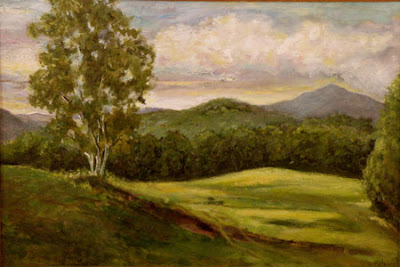
I will begin by talking about color. The painting is too much the same green all over, the distant hills are the same color as the foreground hill. The values AND the hues of the greens are too similar. All of the greens in this painting are in the same family. A good way to avoid this problem is to only allow yourself cadmium yellow in the foreground. Try painting the distance using ocher, or at least a lot less cadmium. If you put two notes on the canvas that are the same, the eye will assume they are equidistant. It is good to drop the yellow out of a painting as it recedes into the distance.
I did couple of posts not to long ago on greens they are here. and here and here. Those posts show a number of different sorts of ways to make greens. I heard a story once that the Eskimos had dozens of different words for snow, each describing a different sort. If you think of colors as words you will need a bunch of different ones to tell the story of this valley and hills.
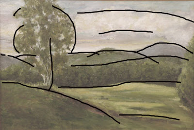 Here are the lines in the painting. They all march from one side of the painting to the other, well all except for the first hill on the left. Also as soon as we get out to the middle distance they are all nearly parallel and equidistant. Like the color the shapes or lines of this painting need greater variety. Perspecting lines that lead into the painting are generally the antidote for this. Sometimes I refer to this problem as stripeyness.
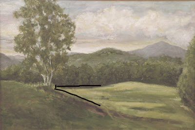 If you look at the overlay above you will notice that the strongest lines and the greatest contrast lead you to an intersection of the foreground hill, the base of the tree and the distant row of trees.It all seems a little coincidental I think it would be more natural if the line of the distant trees met the foreground hill lower.That will help to bring the foreground hill up and in front of the distant one.
 Above is the original, below is a version that I have beat on in photoshop a little.
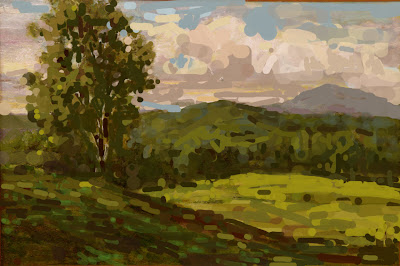 I have of course no idea of what the place actually looked like and I have imposed my own ideas on the artwork which are probably a long way away from its original intent. Here though is what I did and why.
- I divided the tree into a light area and a shadow area to get form and a more interesting storyline there. I also implied a more "springy" S curve into it that makes it a little more lively.
- I deemphasized the meeting of the field and the treeline in the middle distance.I thought that passage called too hard for our attention and when we arrived, there wasn't a lot to see.
- I raised the value of the darks in the distant trees, to get them to drop back.They seemed too inky and assertive to be so far away. I added air between us and them.
- I eliminated that tree that was hugging the edge of the painting on the right, and threw a few accents out into the field to give it a little detail out there.
- I redesigned the clouds to make them have more form and to get a little more visual movement up there, I also darkened the sky and threw some lights into the clouds to raise the contrast up there. That gives it a little more light.
- I made the distant mountain larger than the hill in front of it so it would be the more dominant of the two.
- I increased the contrast and put in more darks and lights as I felt the whole piece was stuck in a middle tone. The decisions I made were based purely on design considerations. It may very well have been all middle tones out there. I threw some bright accents on top of the foreground hill and some dark accents into the distant hill. I did that in both places to lead the viewer to believe there was some detail going on there.
- I threw some different greens into the piece. Doing that in photoshop seemed real clumsy to me. In Photoshop I always feel like I am working in Gummi worms.


8 comments:
Pretty slick, Stape, and extremely informative. Thanks.
Your dissection diagram Stape was quite an accompaniment to my morning coffee!
But your following quote ranks as great literature:
"In Photoshop I always feel like I am working in Gummi worms." Boy do I know that feeling.
Great post. It always seems so obvious, once you point it out.
Willek:
Thank you.
.......Stape
Philip:
I really should take some time and learn to how to use photoshop, but I am so maxed out! I my impressionist method will do for my purposes. There must be a lot of really hip young graphics guys laughing at me out there.
......Stape
Deb;
Thank you. I wonder if it is more obvious because you have been around this blog for a while and done the workshop.
........Stape
Stape, don't worry, there's a lot of young graphics guys out there laughing at me as well.
Stape, great critique. I am not at all threatened by cutting it up in pieces, I grew up learning that.It's a pleasure.
Post a Comment