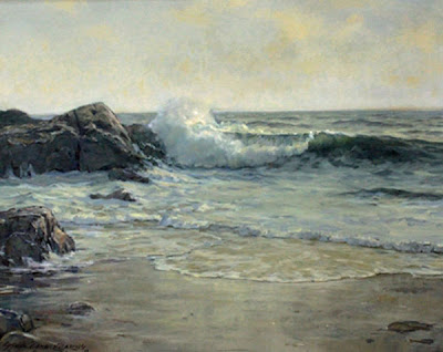
Above is a 24 x 30 seascape I delivered this week to the Guild of Boston Artists where it won the Frank Benson award. I worked on it till 3:30 in the morning the night before and delivered it wet, about five minutes before the jury showed up.
It looks a little like the seascape demo that I posted a week or two ago as that was a study for this project. I made about 3 or 4 studies before I finished this. I delivered it in such haste that I was unable to photograph it, so I downloaded this from the Guilds e-mail to me. I then photoshopped ( actually photoshop elements ) it to improve the color a little. I find that very difficult. If I had the capability to work red yellow blue when correcting photos I would be very pleased. Do you use a program that allows this?
As I said before, seascape is always sort of experimental for me and I seldom feel like I have a real handle on it. I do think they are getting better though. I have painted as lot of them but they are by far the hardest thing I do. Maybe I am figuring it out, they are getting better. When I paint landscape I feel like I am in my favored element, and although some come out better than others , I feel confident out there. In any event, I will share with you all what I do know.
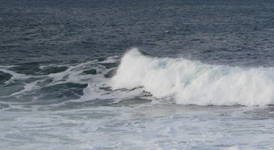
One of the commenter's asked what I would add to the lovely photos I have been showing to make them into a seascape. Below is a little section of a photo that is all I might use of any particular shot.
 I don't find a photograph and make a painted version of it. I design the seascape and then try to wing as much of it as I can, when I get stuck, I look through my photos and try to find one that show a particular effect I need. I will then have to alter that to fit in to my painting. I may have to change the color of that, or redraw it from a slightly different angle etc. My seascapes are not romanticized versions of photographs but instead, are abstract designs based on the appearance of the sea.
Tomorrow I will begin the next element in play in the seascape, the rocks. They are the foil for all that writhing hissing water. The two elements are opposites of one another. I think that is part of why seascapes offer so many great design opportunities.


32 comments:
Huge CONGRATS on the award!! Well deserved, in my humble,but accurate opinion. It's a beautiful piece.
I did get a chuckle thinking of you running, painting in hand, up to the jury room, just as they're about to start.
Not bad for someone who is making it up. Congrats on the award. I especially like the foam of the wave. Your colors are so subtle in the reflected sand. Great piece.
Awesome! Glad to read you sometimes have to pull a late nighter, 5 min before the jury shows up sometimes too! Regarding you images, you need to be shooting in RAW format. What camera do you have? Most midlevel DSLRs have this option, and some higher end compacts.
http://en.wikipedia.org/wiki/Raw_image_format
It is a bit of a learning curve, but worth it if you want to get the best options out of your photography. The software should be supplied with your camera if it has RAW capabilites.
Congratulations on the award, Stape. I'll stop by the Guild and get a look at your piece in the paint.
What I find so interesting is how closely related water and clouds are in terms of the effects of light. Some of the waugh paintings you've been showing look like cloud formations in the foam. I am almost certain that if you turrned them upside down you could see a landscape. Since clouds are made of water it seems natural that they would be related when light is effecting either.
Do you see that?
You're very modest about you're own seascapes. They are wonderful.
Congratulations... love the story of delivering this beautiful painting wet minutes before the jury came round. Priceless!
I use PS Elements too. And you can correct colour by colour.
Enhance - Adjust Color - Adjust Hue/Saturation - Edit: Master, press drop down arrow in this box, and you can adjust Reds, Yellows, Greens, Cyans, Blues and Magentas (different tones, more/less saturation, and lightness). You can also 'colorize' though I have no idea what this is.
Anyway, an invaluable and accidental discovery that's helped with posting paintings as close to their actual colour as possible. It's detailed enough for me, at least.
Congratulations. I especially love that this beautiful painting was wet when delivered to the gallery minutes before the jury came by.
I too use PS Elements and you can adjust each colour.
Enhance ➟ Adjust Color ➟ Hue/Saturation ➟ Edit: Master, click on the arrow for the drop-down menu. There you will see Reds, Yellows, Greens, Cyans, Blues and Magentas. With each colour there are options to change the hue, increase/decrease saturation, make lighter/darker. There's also an option to 'Colorize' but I have no idea what this is.
For posting my work as close to the original colours as possible this little option in Photoshop Elements has been invaluable.
If this isn't sufficient, I'd look for an add-on online.
Blather! I will use that word for a week! Ha!
I'd blather be painting..
Congratulations on the award Stape!
Your painting has a morning by the
sea feeling about it, very nice!
If seascapes are the tuffest thing
to paint, then good! I had read an artical at Matthew Innis' blog
where an artist should tackle the diffecult, and leave the easy stuff to the lazy people!
(I just went over there to find this and can't right now)
John Kennedy said "We do these things because they are hard.."
I guess I am blathering now, so see what you started!
Oops.. I was quoting from Armand Cabrera's blog, Art & Inflence.
My mistake.
I love the fact that you got the award even though your horizon slant upward to the right. And why not? My Mac comes with something called iPhoto, which I prefer to Photoshop Elements because it has fewer tricks to work--but it does have color adjustments. And you can straighten an image if it turned out to be the photographer that slanted the horizon, not your painting.
Stapleton, here's to a job well done. I think maybe the up-hill horizon is a photo edit problem made by the Guild. Or one of those
optical illusions....
I'm happy to hear you ran for the roses!! Keep on keeping on.
Stape, the full version of Photoshop gives you more color editing prowess, but all versions work with RGB or CMYK, not RYB (they are optically based so green is a primary instead of yellow). You can still edit them well enough this way. Let me know if you want some more info. RAW is also good if your camera and software allow...
Just a terrific posting, Stape and a fantastic picture.
Maybe, perhaps, limiting the pallett can help achieve "Envelopismness"
Mary, I want to come up there to paint with you, too! Get a tour, etc. WEK
fullesit" how a really young person might ask mom for help with his diaper.
Excellent news Stapleton. When is the opening?
Willek... sounds good. Looks like big surf weather is coming .
I'm not surprised you won with that beauty.You should have won, plain and simple.
But wet paint! Argh...I really dislike curating wet pieces in exhibits and having to make excuses for the artist when the poor hanger gets wet paint on themselves and then on a frame and then on the wall and then on the....
I bet you don't need Photoshop to tell you what to paint. I rather photo shop with my mind and I bet you do it too.
But what I really came on here to say was that it's important to get out of the comfort zone and struggle. I know how you feel because I am that way with portraits. They do not come easy to me. I don't have a real approach but struggling through and getting something special is a big sense of accomplishment. I don't think they will ever feel right but it's more important that they come out right. Go for it.
Mary , Willek and I are on our way.
Living 1000 miles from either coast, I doubt that seascapes will ever be my forte (imagine accent on the e). But I sure am enjoying your discussions on the subject.
You have scientifically dissected waves into more manageable bits of information.
Congrats on the award for a most beautiful painting.
Deb:
Thank you.I got there before the jury actually arrived.
.............Stape
Sharon;
Thank you.
..................Stape
Tim;
I pull plenty of late nighters. My camera does not shoot raw, at least I don't think it does. I will ask my wife.
...............Stape
Bob:
Thank you. Wanna varnish it for me while your there!
................Stape
Gregory;
There is certainly a dialogue between the sea and the sky. Often they can be painted as if they were one unit.Often they are in the same value unit.
...................Stape
Brenda:
Thanks! That might be a big help. I will try it.
................Stape
Bill:
Thanks, I do these things because they are beguiling.
..........Stape
Nora:
I would hate to have to replace the little pink camera my wife got for me! I don't think it shoots RAW it is however wicked cute.
...................Stape
Now I don't know if it was the photo or my painting. I will have to find out though. I measured it once though.Maybe I screwed it up as I worked on it.
barbara:
I am hoping it is an octopus pollution.
.................Stape
Jeremy
I now about optical color etc. But I have spent 40 years working another way and I am comfortable with it. The green instead of yellow just screws me all up.
................Stape
Thanks Willek;
I will do a post on envelope.
Someday I promise.
....................Stape
Mary:
The opening is Sat. April 10 5;30 to 7;30. I will however be unable to attend. I have another commitment.
...................Stape
Marian:
The Guild is small and I am well known there. I hung it for them as it was juried for prizes and not acceptance.
.................SZtape
Carol:
Good to hear it, I was afraid I was losing everyone who didn't live on one of the coasts.
..............Stape
Very nice work. Congratulations on the award.
I have to say this blog has helped a lot with my work. So far my spring landscapes have been improved by some of your offerings. I am just starting to get that I am in control. I can move stuff around to make the picture better if I want. I have the ability to slap mother nature around a bit. Occasionally she hits back, but I can take it.
Post a Comment