Showing posts sorted by date for query deweighting. Sort by relevance Show all posts

Saturday, July 24, 2010

Selective list of seminal posts 3

You can get an antique stove like this at antiquestoves.com

I am mining the earliest parts of this blog to make available some of what I feel are the most nuts and bolts entries I have written. In the early parts of this blog I covered a lot of how-to stuff. Because I have moved on from that to other subjects I wanted the readers to know they are there. These are probably the most useful posts for those learning to paint. I write about art history and art business etc, and those things are important too, but the sections on edges and brushstroke are essential. These may well be the most unique and worthwhile things I have written, and I wrote them before a lot of you found the blog.

About edges


More about edges


More about edges 2


Yet more about edges


Juries and injuries

Each brushstroke


Every brushstroke 2


Every brushstroke 3

Every brushstroke 4

Edges, deweighting for eye control

I hope you will go read those and I will meet you back here. I might do about one or two more nights of this, then I will return to the slaughter of the innocents. Critiques.

Wednesday, June 10, 2009

June Critique

I am jurying a show again tomorrow, so tonight's post will be a little shorter than my usual. Those of you who have frequented this blog for a while know what that picture means. Its dissection time! So hand me a couple of hemostats and a bone saw, and lets carve em up!
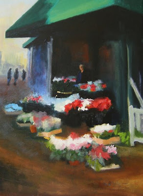
Here's an image with an eye control problem, see below.
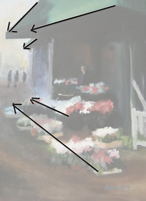
All of the major lines take the viewer out to the edge of the canvas on the left. This would be a better design if it lead the viewer to the woman selling the flowers in the stall.
Deemphasizing, which I often call deweighting some distracting elements would help with that. I have written a post on deweighting , here.

It would help this composition to "deweight" some of the bright notes that are out around the periphery of the canvas. The bright green triangle at 12 o'clock is an example. Put your hand over that and notice how the eye drops into the picture area. It is too bright for something that is so close to the rabbet (picture edge) and isn't really a main actor in the story. The white fence on the right is too assertive also. Not all of those white flowers should be super bright. If all of them were knocked down one value and those by the figure were accented with that high key white it would help draw our eye to our lead actor. I also think the three little figures on the left detract rather than add to the picture. They aren't really part of the story and they help those lines pull our eye to the left hand margin and away from the central action. They almost form a second subject. I also think this picture might benefit from a more careful delineation of the flowers. They are a fine subject, but if they are only a blur you are not extracting their full benefit in the picture. You need to get those passages to say flowers more.That will add charm to the picture.
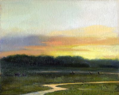
Here is another picture with the same flaw. It has that bright stream that leads the viewer rapidly over to.......the right hand rabbet. This would be a better painting if that stream either lead the viewer back into the picture, or stayed in the foreground as a pond and reflected the sky and the background in a pleasing way. This picture has a very nice tonality to it. That sunset really glows!

I also think that the way the left hand group of trees drops down suddenly as it nears the edge of the canvas channels our eye left into the rabbet there, rather than to the right and stay in the painting.It is really important to control the viewers eye as it moves through your painting.

Here is the Baptist church in Rockport, Massachusetts. It was painted from a spot directly in front of my old gallery there.
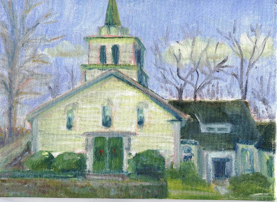
Emile Gruppe painted this church many times, here is one. lets compare what Gruppe did with this and the one up on the gurney.
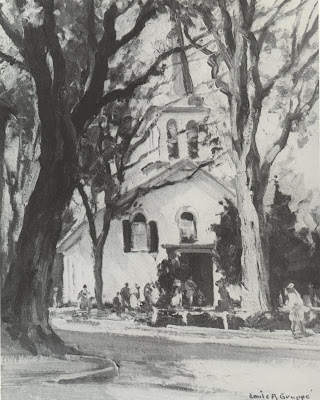
Gruppe has moved to the left, down in front of Bruce Turners old gallery. I have heard Bruce describe him making this picture. It happened real fast. Gruppe has a less frontal view of the church which is less static. he has also managed to bring some dark shapes up against the light of the church, That gives some visual excitement in the contrast there.

The big elms are long gone. Gruppe probably painted this after they were gone too. He painted this scene many times and continued to put them in long after the Dutch elm disease slayed them and millions of other elms.
Gruppe keeps finding ways to break up the lines of the church. He places the dark pines in front of it and runs branches across it. He breaks up the door by placing light figures in front of it. To the left of that he places dark figures in front of the light facade. He breaks up the dark pine at the right by placing a light figure in front of it. All over this painting there are bold contrasts to make it a dynamic and exciting painting. It is about that, and only nominally about the church.

IT IS HOW IT IS A PICTURE OF, AND NOT WHAT IT IS A PICTURE OF, THAT IS IMPORTANT!


One thing Gruppe knew he had to do is get the verticals plumb. Even in a loose painting like this one you have to get that right. People unconsciously look for it and if your verticals are off they will find it disconcerting.

I will return tomorrow and work over this church picture some more.

Gruppe painting from Gruppe on Painting By Emile Gruppe and Charles Movalli. which is now newly available from the Rockport Art Assoociation ( 978 .546. 6604 ) after many years of being out of print.

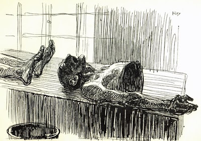
Here lies anonymous ( ink drawing ) by Heinrich Kley from More Drawings by Heinrich Kley, Dover Presss

Saturday, April 25, 2009

Edges, deweighting for eye control

© The Estate of Edward Seago, courtesy of Portland Gallery www.portlandgallery.com

Here's our Seago again. Did you get the book?

I am going to break out some passages and speak about what is going on in them. Particularly as concerns expression of edges. For that is what the control of edges is, expression, not transcription.
I have had a side conversation with a painter who was concerned about the turning of form with color and was having a hard time getting both his values and his color . There has been some instruction on this blog where I have mentioned turning form using color (but not much) I clarified something for him, and I thought I might repeat it here.

Values are part of drawing.


Color is a decoration you hang on your drawing. Therefore go after the values first. You can inject the color later, if you have the values "right". Drawing is always the first consideration, not color. Anything well enough drawn will be well enough colored. I remember Ives Gammell saying that and I am sure it is a quote. But I am afraid I don't know whose.

Turning form with color is a means of simplifying the halftones, out in the lights. It will not build the "bedbug" line. That calls for a value shift.Rermember thepost on the parts of the light? You may want to review that if you aren't sure about the bedbug line, and its significance as arbiter between Gods pure light and the stygian darkness of shadow. Now I am going to get all the Hensche students after my hide. Henry Hensche put a great deal of emphasis on turning form with color. None of his students are young anymore, I will" puff up" and intimidate em.

I am going to throw a new idea at you , ready?

Here is a detail of the left hand side of the painting. Compare it with the full image above and notice something. The sky is light on the right side of the tree and dark on the left. Seago is doing something I call "deweighting". Don't go looking for that phrase in art instruction books because I made it up. But not recently. What I mean by deweighting is the downplaying of an edge in order to lessen visual interest.

Seago has darkened the edge of the sky as it meets the branches of the tree in order to direct the viewer elsewhere. He has arranged his values in such a way that the eye doesn't stop there but continues on to where he really wants you looking. He has put a bright sky contrasting strongly against the branches on the other side of the tree in order to direct your attention to that area.

You may remember in an earlier post my saying to imagine visual interest as having weight, and a painting needs to create an artistic balance of those different weights. Seago lessens the visual interest that would have been drawn to this area had he allowed the contrast of a bright sky with the gnarled and complex branches . He has removed visual weight from the area . Hence deweighting.

Here is the opposite. Seago has weighted this passage. He has done it with edges and values. Look at the razor sharp edges on the top of those houses out there, they haul our eye to the area with their contrast with the darks behind them. He has also loaded his lights. He has used a great deal of paint to get a textural attention grabber there. That house stands out better than if he had painted it the same value, but thinly. Seago of course wants us to look here.

I have shown you Seago drawing attention to this passage and called it weighting, after all I am using the word deweighting, surely there must be weighting? Well the important idea is really deweighting, I think we all know about drawing attention to an important area within a painting. Subordinating other passages to it by reducing visual interest at our edges, is a more subtle matter.

ALL OF THIS IS ABOUT EYE CONTROL


I am going to be talking a lot more about eye control.

Seago image from: Edward Seago, the vintage years by Ron Ranson, available through Amazon