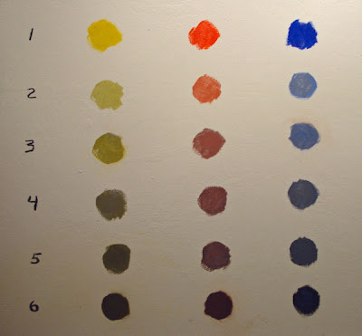
Above is a chart showing the gradual neutralization of the the three principal hues. I have added a, increasing amount of gray to each. They drop in both value and chroma. Notice how they become very different from the original hue. I did this with titanium white and ivory black. I mixed five piles on my palette ranging from a pale gray to a deep grey and then added this to the cadmium yellow, permanent red and cobalt blue.
The cadmium yellow drops through a warm yellow green to an olive color.
The permanent red drops through a brick red to a russet color.
The cobalt blue drops through a slate gray to a midnight blue.
Dropping the value and neutralizing the color effects the appearance of the color. The colors don't just drop in value, they become different colors. This is important to understand when you are mixing paint on your palette, as you neutralize your colors they are effected in ways that you might not expect.
You might try to remember these colors so you can recognize them. It is useful to know what the colors on your palette look like when they are neutralized. I am routinely "stepping" on colors to make them take their proper place in a painting.
ALL COLOR IS NO COLOR!
I went through a period when I was young, trying to get as much color as I could into paintings. I thought that would make me a colorist ( I did every dumb think you can think of when I was young). What I later decided was that "good" color was an arrangement of both saturated and neutralized colors. The neutralized or grayed colors activated my saturated colors and made them more brilliant. I heard about a jeweler in New York who filled a display case with dirt and then placed the diamonds he had for sale on that. The diamonds glittered and looked particularly brilliant against that backdrop. Just as you need some deep darks to make a painting light up, you need some grayed notes to make your color sing.


11 comments:
I love the "All color is no color" dictum. So much of effective art making comes down to turning the volume down on incidentals so peoples' eyes are drawn to what really matters.
This is true with color of course, but also with details, brush handling, paint surface etc. A good painter is like a ring master at a 10 ring circus. I had a wonderful teacher in grad school (Ron Markman) who's favorite word was "Orchestrate!" A good place to start is digging into the kind of practice with color intensities Stape is talking about in these posts.
Excelent post Stape. The last part of this post is what I have been waiting to hear. I got it. Thanks. This helps me out so much.
As they say, richness in a painting comes from variety of shapes, values, colors and edges. That includes variety in chroma as you state here. This post gets the Simone Seal of Approval. Bet that makes you sleep easier, don't it?
So true Stape. It's the greys that make the colors sing. I will add that this is where raw umber is a big help. I can darken and neutralize my yellows without going so green. I understand of course that some folks don't think it's worth keeping another pile on the pallet, esp. if your concentrating on landscape where so much green is needed. Thanks for keeping this posts coming. I really like sitting down to my coffee and seeing what you have to say. Keeps me thinking.
Hi Stape from your favorite New Englander in the desert SW! I have a question. You wrote, " I am routinely "stepping" on colors to make them take their proper place in a painting." Do you mean that you are reinventing colors, mixing them differently, to get to the same note? Not sure what you are saying. Please explain. Thanks,
Joy (currently working on a desertscape of the Santa Rita Mountain range and its arroyos)
Philip;
It took me years to learn that. I am such a slow study!
...................Stape
James;
Thanks. I am used therefore I am useful'
..............Stape
Simone;
It is really like the logic of variety in design, isn't it?
..................Stape
Steve;
I don't use umber, but it must work to dull greens.
....................Stape
Joylef;
By stepping on colors I mean reducing them slightly in chroma. For instance I wight add a tiny amount of red to a green in order to neutralize it.
.................Stape
Post a Comment