--------------------------------------------------------------------------------------------------------
From the book Pen Drawing;
I have thought it advisable in this chapter to select, and to work out in some detail, a few actual problems in illustration, so as to familiarize the student with the practical application of some of the principles previously laid down.
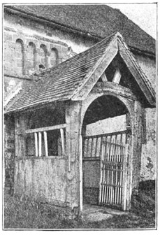 | |
| FIG. 35 | FROM A PHOTOGRAPH |
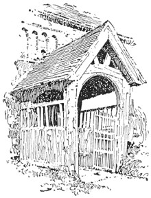 | |
| FIG. 36 | D. A. GREGG |
First Problem In the first example the photograph, Fig. 35, shows the porch of an old English country church. Let us see how this subject has been interpreted in pen and ink by Mr. D. A. Gregg, Fig. 36. In respect to the lines, the original composition presents nothing essentially unpleasant. Where the strong accent of a picture occurs in the centre, however, it is generally desirable to avoid much emphasis at the edges. For this reason the pen drawing has been "vignetted,"—that is to say, permitted to fade away irregularly at the edges. Regarding the values, it will be seen that there is no absolute white in the photograph. A literal rendering of such low color would, as we saw in the preceding chapter, be out of the question; and so the essential values which directly contribute to the expression of the subject and which are independent of local color or accidental effect have to be sought out. We observe, then, that the principal note of the photograph is made by the dark part of the roof under the porch relieved against the light wall beyond. This is the direct result of light and shade, and is therefore logically adopted as the principal note of Mr. Gregg's sketch also. The wall at this point is made perfectly white to heighten the contrast. To still further increase the light area, the upper part of the porch has been left almost white, the markings suggesting the construction of the weather-beaten timber serving to give it a faint gray tone sufficient to relieve it from the white wall. The low color of the grass, were it rendered literally, would make the drawing too heavy and uninteresting, and this is therefore only suggested in the sketch. The roof of the main building, being equally objectionable on account of its mass of low tone, is similarly treated. Mr. Gregg's excellent handling of the old woodwork of the porch is well worthy of study.
Second Problem Let us take another example. The photograph in Fig. 37 shows a moat-house in Normandy; and, except that the low tones of the foliage are exaggerated by the camera, the conditions are practically those which we would have to consider were we making a sketch on the spot. First of all, then, does the subject, from the point of view at which the photograph is taken, compose well?* It cannot be said that it does. The vertical lines made by the two towers are unpleasantly emphasized by the trees behind them. The tree on the left were much better reduced in height and placed somewhat to the right, so that the top should fill out the awkward angles of the roof formed by the junction of the tower and the main building. The trees on the right might be lowered also, but otherwise permitted to retain their present relation. The growth of ivy on the tower takes an ugly outline, and might be made more interestingly irregular in form.
[Footnote *: The student is advised to consult "Composition," by Arthur W. Dow. [New York, 1898]]
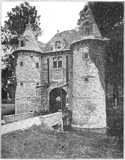 | |
| FIG. 37 | FROM A PHOTOGRAPH |
The next consideration is the disposition of the values. In the photograph the whites are confined to the roadway of the bridge and the bottom of the tower. This is evidently due, however, to local color rather than to the direction of the light, which strikes the nearer tower from the right, the rest of the walls being in shadow. While the black areas of the picture are large enough to carry a mass of gray without sacrificing the sunny look, such a scheme would be likely to produce a labored effect. Two alternative schemes readily suggest themselves: First, to make the archway the principal dark, the walls light, with a light half-tone for the roof, and a darker effect for the trees on the right. Or, second, to make these trees themselves the principal dark, as suggested by the photograph, allowing them to count against the gray of the roof and the ivy of the tower. This latter scheme is that which has been adopted in the sketch, Fig. 38.
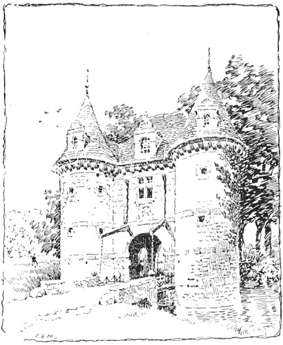 | |
| FIG. 38 | C. D. M. |
It will be noticed that the trees are not nearly so dark as in the photograph. If they were, they would be overpowering in so large an area of white. It was thought better, also, to change the direction of the light, so that the dark ivy, instead of acting contradictorily to the effect, might lend character to the shaded side. The lower portion of the nearer tower was toned in, partly to qualify the vertical line of the tower, which would have been unpleasant if the shading were uniform, and partly to carry the gray around to the entrance. It was thought advisable, also, to cut from the foreground, raising the upper limit of the picture correspondingly. (It is far from my intention, however, to convey the impression that any liberties may be taken with a subject in order to persuade it into a particular scheme of composition; and in this very instance an artistic photographer could probably have discovered a position for his camera which would have obviated the necessity for any change whatever;—a nearer view of the building, for one thing, would have considerably lowered the trees.)


16 comments:
Thanks, this is priceless.
which just goes to show how much really good stuff is available free on the web... you can also find "spider monkeys: but none on meth.
This is great stuff, Stape, thanks for pointing us in this direction....
PDF format on google books
http://books.google.com/books?id=n5tJAAAAYAAJ&dq=Pen%20Drawing%3A%20An%20Illustrated%20Treatise&pg=PA5#v=onepage&q&f=false
I downloaded this one a while back - it is very good as you say. I highly recommend it!
This is great, thanks!
Someone gave me this book as a gift this year. I really enjoyed it. I do a lot of pen and ink illustrations for which it was especially helpful. Though as with most good art books, it has bigger ideas that work with any media of art- except installation art.
Great suggestion. It is exciting to see all these great books online for free or showing up as affordable reprints.
Great resource! I've just found several out of print books there that I've been looking for. Thanks, Stape!
Thanks Stape!
Walter;
Thanks.
.........Stape
Deb;
You have to actually inject them yourself, not just find them on the web.
...............Stape
Sakievich;
Thanks for that.
.....................Stape
Jeremy;
It is certainly worth reading. Some of it is universal .
..........Stape
Barbara;
You are great too!
................Stape
Richard;
Who, tell me WHO, wrote the book of love?
....................Stape
Deborah;
I need to spend more time on archive and see what else I can find.
..........Stape
bill:
You are welcome.
.............Stape
Post a Comment