Sunday, July 31, 2011

Homeopathic whites

Here I am. I have dropped back the schedule on writing the blog to every other day or even every third day for a while. I have so much unfinished work in my studio. Those of you with various "feed" will get the blogs when I publish them and you who find me through Facebook will get the link on your home page when I publish. This is not a symptom of the blog ending. I have a lot more to write about. I keep a sort of flow chart so that when an idea for a post occurs to me I write it down, with little arrows like a genealogical tree showing how a series of posts might follow.

I am going to write about Homeopathy a little bit, not because of the practice itself, although I will tell you a little of that as an aside, but because I am going to describe a procedure in painting by comparison .

Homeopathy is an alternative medical philosophy invented by Samuel Hahnemann in 1796. Hahnemann was writing in an era when medicine was primitive, ineffectual and often painful and dangerous. He expounded a theory of "similars". That is, he believed that a very small dose of a substance that would give you a symptom, was useful for treating someone who had that same symptom. So if you had a problem with skin rashes he might have given you something that would cause skin rashes, like Poison Ivy. Because the remedies often contained noxious. or poisonous ingredients Hahnemann diluted them. In fact he believed that the more diluted they were, they more efficacious they would be. He would put a sprinkling of an ingredient, like salt or arsenic into a beaker of water. Then he would take a tiny eyedropper from that and dilute it with another entire beaker of water. From that beaker he would take another eyedropperful and add it to third beaker, and so on. Often the mixtures made contained no molecules of the original active ingredient actually present in the final remedy.

Homeopathy is discredited today although there are homeopathic remedies on the market. ZiCam for colds is a well known one, and there are people who compound and sell homeopathic remedies. Many of the products available today that say they are homeopathic, are not actually created by this dilution system. They just use the word to mean all natural, and harmless, selling their products to people who are unfamiliar with the actual definition of what a homeopathic remedy is.

The reason I brought all of this up is to talk about mixing paint on the palette though. My long suffering pink camera seems to have died, so I shot the following pictures with my cell phone. They aren't very good, but you should be able to see what I am up to.

I sometimes paint passages in extremely high values, notes that are very close to white but carry a smidgen of a color.This is useful in skies or the sides of boats in sunlight etc. I can mix up a pile of color to paint these passages this way, like a homeopath. I make a very high key (light) note using a lot of white and a pigment. In the picture below I used cadmium yellow.

Then I take a smidgen (like an eyedropperful) of that mixture and throw it into a new pile of white. That is shown below.


Often I will do this to three or so different pigments, with white, creating three piles that are very close to white but contain a little red or blue or yellow. With those three piles I can work in an extremely high value in broken color. I can use each of those different tints to express the turning of a form in bright sunlight.

-------------------------------------------------------------------------
SNOWCAMP

Snowcamp I is full. I have a few spaces left in Snowcamp II if you want one now would probably be the time to sign up. If there is sufficient interest I may be able to add a third session I am not sure. The link is over there on the right in my sidebar.

Thursday, July 28, 2011

Elected juries

Trial by combat, man vs. woman.

In my last post I discussed using previous winners as the next jury. Tonight I think I will lay out the moist conventional system for art juries, those elected by the membership.

The strongest argument for an elected membership is....well, they are elected. The artists who will be in the show decide who will be the judge. What could be fairer than that? Here is the usual process.

Most all art associations are governed by an elected board, who hire a director to actually run daily operations. Every year there is an annual meeting and the nominees for the juries are voted on by the membership at that meeting. But the process starts before that. The president, somebody on the board, or the director is detailed to call individual members and ask them if they would accept the nomination to the exhibition jury. If you intend to have a jury of, say, seven you need eight to ten nominees. If you don't have more nominees than positions on the jury it is hardly an election. That's third world dictatorship stuff. You simply have to have some nominees for the members to reject. Getting ten people to pledge their time, that are actually qualified, can be a lot of work. Many people turn down the responsibility, or served the year before and should are often eliminated from the jury pool. So being the guy who has to secure the nominees can be a big job, besides having to ask people to give up their time and possibly make a few enemies.

This system is not immune to being captured by a subgroup either, but it is less likely, unless that subgroup has critical mass at the annual meeting to outvote the rest of membership. Remember though, every year some people are going to be juried out. They will form a disgruntled cadre of rejected artists working to change or control the system. Sinced that seems to be automatic, when I hear that a jury is corrupt incompetent or blind I always remember that this is a constant in the system. Maybe the jury was corrupt and blind, maybe not. Every jury is accused of that
I have sat on many juries and overseen a lot of them. I have never seen a corrupt jury.

I have seen juries deliberately balanced between devotees of the traditional and acolytes of the avant-garde, to be "fair". Those juries often work this way, Real modern art won't pull vote from the traditionalists and extremely traditional work won't pull the needed votes from the moderns. You get a show full of Cuisinart fauve, things that straddle the boundaries of both schools without really exemplifying either one. Often these juries are flabbergasted at the shows their voting produced. No individual on the jury would have chosen that show.

Many organizations prohibit or at least discourage conversation about the pieces being juried. The work is placed before the jury, they vote and the next work is displayed to them. Very seldom have I seen an argument or anger during a jury. When I have, it was by a juror who was characterized by such behavior. Juries show up, and try to do a good job, generally. They are proud to be on the jury, it is an honor, so they want to pick out as good a show as possible. They will be judged by that. Most jurors try to select a broad range of work besides what they do themselves , believing they can reward quality in different sorts of painting. They almost never have it "in" for a particular artist. If you were juried out of a show, it truly happened because they thought your painting was weak. Maybe you should have a look at how you can improve your art by the next exhibition, instead of jiving yourself that the jury is blind or biased.

Tuesday, July 26, 2011

More about juries

I have spent the morning working on an illustration for the blog about oblique recession in drawing and it is still not ready. So I will write again on juries as I have further thoughts.

So, I think bringing in outside juries is inappropriate for an elected artists members organization. A one time show or art center will often have no choice but to do this, as they lack a sufficient "in-house" pool of informed jurors, or a least peers to the juried.

There is an odd difference between an art jury and a civil jury. On an art jury I think it best to have people with great expertise and discrimination. In a civil jury the best choice might be a reasonable "everyman" bringing no specialized expertise to the proceedings and representing all of society. The art juror represents a group of artists who can't all be there to make aesthetic decisions for the institution. There are more pictures clamoring for wall space than there are walls, not everything can hang, and some things are not of a quality that the other members would want to hang alongside so some pictures can hang and some cannot. Someone has to decide which is which.

Here is one solution to the problem . This would fit plein air events particularly well I think.

THIS YEARS PRIZE WINNERS ARE NEXT YEARS JURY


You win one of the top prizes, you are on the jury next year. This has a number of advantages. They are;
  • Since they won a prize last year they have been singled out, at least this one time as having done excellent or the best work in a given show. This plus the vetting they received when becoming a member argues for their expertise.Doesn't prove it, but places them in as a reasonable choice to make good decisions.
  • It removes last years winners from the prize pool this year. Jurors judge shows but are excluded from winning prizes. That gives others a chance to win a prize that year. A few extremely talented members can take all of the prizes year after year. I don't think that is desirable either. They can't do that if they are on the jury every few years.
  • There is now a payback to the organization by the prizewinner who can return the blessing that has been bestowed on him, by serving for a morning to help the organization do that for other members. With the prize comes a duty.
  • This is a real open system. People will become jurors based on their merit ( at least more often than not) not many surprises and not many ways for small cabals of the mediocre to manipulate the system for their own benefit, again a constant problem. To control the juries you have to make excellent work. Spiking the nominations won't do it.
  • It eliminates "spiking" the nominees. In many institutions some poor sadsack gets the job of calling around to members and asking them to be on the juries. It can be a drag because often the prospect will tell you no. Sometimes with a rude reason why. It is easy just to call your friends. When the membership receives the list of nominees for the jury about half of them are from the same circle of friends or amateur watercolor class.Unlike a slate of nominees from some one individual member or the president of the organization or harried director, the line of succession is clear.

Sunday, July 24, 2011

A thought about juries for exhibitions

Old print of trial by water


Several of the commenters on the last blog were very confused by the oblique stacking design stem I brought up in the last few posts. In order to explain that better, I have to make an illustration. Doing the blog is a time eater that I have to manage. I have done lots of illustrations already, but they are time consuming. The best posts I have done often had illustrations and they are worth the time, but they take about an entire day or more to generate. For someone posting every day, that quickly becomes unmanageable, I have to have them in the works for days as an addendum to my regular blog creation. Here I am doing that again. Someday there will be a pamphlet, and the illustrations will be useful then.

So as an aside I think I will talk about juries at exhibitions. I attended the Annual Metting of the Rockport Art Association the other night and much of the talk after the meeeting was about the juries. It often is. Virtually everyone rejected by a previous jury has a plan for re-doing the juries, a constituency of the rejected, calling for no juries, or juries from outside the organization. Maybe college professors, or newspaper critics or museum curators, REAL EXPERTS.

I have sat on dozens of juries, assembled more than a few and been the president of an art association where it was part of my duties to sit in on, and oversee, the juries to ensure that it was "straight". I have been an "out side juror many times. I have had a very good look at the system.

The other evening I was talking to a woman (or was it two? they were small) who told me that she (they?) thought an outside jury of experts from the REAL (official) art world should come in to separate the quick from the dead. Maybe an art critic from a newspaper. I disagreed gently , being 32 feet tall and weighing over 1,600 pounds. "No ", I said, waving a finger the size of a kids baseball bat at her, and beginning to puff up to a gargantuan size. I began flapping my arms and hunching over, as I hissed through clenched obsidian teeth the size of tombstones .
, I sez:

"This is a juried association of hopefully qualified members. They have been vetted by jury and allowed by the strength of their art to become an artist member. There are art associations that are open to all comers or have thousands of members that often operate on that system. But I think it is tyranny! ( As I said this I spit streams of red hot nails and brads out of my ears) I think that the member ship should govern itself, selecting that jury is part of governance. It is the aesthetic "conscience" of the members. The elected jury stands at the gate and says "This shall not fly! below certain levels of quality we will not go!"

Often there is only so much wall space and many paintings clamoring for that limited space. Some triage has to be done, they all can't hang. They must be sorted, graded. We may disagree on what quality in art is or "goodness" whatever, but it is the best way to put together an exhibition. Pick the "best paintings" and hang them, return the weaker ones to their creators who will now join the other exhibited, in planning the the installation of people who they believe WILL favor their own art.

The membership has a body of vetted artists from which to select a jury, they know those artists and will generally appoint those they think most qualified either by reputation, ability or judgement. They know the nominees and are generally aware of their attributes. Over the course of years they have probably rotated through juries and sat next to them at judgement time.

The members have the right to decide for themselves who will jury them. Bringing in an unknown stranger, usually one who doesn't even paint, to manage this for you, is likng inviting the guy down the street to mange your personal life. For an art association, what gets shown in the exhibitions is important. Exhibiting the art of its members is it's primary mission. A membership needs to summon from its own numbers artist who can represent them on that jury. Like a democracy, not everyone gets to vote in the senate, but you certainly want to a say in choosing who does and have a number of nominees from which to choose rejecting some and approving others.

The membership needs to decide for itself what it wants on its walls their decisions may be erratic, but they will be their own arrived at in the fairest most democratic way. Self governance and not governance by unknown experts from the worlds of journalism, philosophy or writing but practitioners of the craft. Very few are great judges of crafts they themselves do not practice.

An outside jury is usually imposed from above, by the board, or the director. Generally when a membership is informed of the outside juror it is as a yes- no vote (like in 3rd world dictatorships) or the next juror is simply announced to them ( like in the time of Dirk Van Assaerts) by a newsletter from the staff or the board or the exhibition committee or who knows who. Often it is convenient that a member knows so and so at the college and that seemed as an easy way for the board to deal with the jury problem. Everybody is always upset about it (remember jurying automatically produces a noisy tribe of the disgruntled carrying torches and at the gates).

A CONSTITUENCY OF THE MEDIOCRE!

There are definitely mistakes and preferences in jurying, it is an imperfect system. Sometimes an artist is rejected and you wonder why? "Looked good to me, well established artist too". But the greatest number of the rejected, were rejected for very good reason and almost any jury would have eliminated them. There is a wide range of quality in the paintings presented to a jury, with usually about half being very amateurish indeed. Its like the first shows of a season of American Idol, mostly train wrecks that make you ask "what made them think they could do this?" interspersed with the very occasional diamond".
Thats enough for today, more tomorrow.

Friday, July 22, 2011

A little more about drawn planar recession

Here is an Aldro Hibbard. This is one of my favorite Hibbard. I have written about him before and if you search the blog using the box at the upper left, you can find more. This Hibbard has a great passage that uses the "stacked" recession I was talking about in the last post about the light house painting.

I think this is a big enough idea that I want to stop and make sure that all the readers "get" this one. There is another idea implied by this and that is :

YOU CANNOT OBSERVE DESIGN INTO A PAINTING

You can look all day and not see this kind of recession, you may find places where it exists, but this is something you "install" into the landscape. It is an arrangement that is forced onto the actual appearance of the scene to maker a better, clearer design, rather than the more random arrangements presented by a natural location.

The detail of the lower right hand corner of the picture shows this tactic, I have photoshopped this image to make the planes a little plainer for you. The upper image has not been altered.

Below I have outlined some of those "stacked planes that recede away from us like dishes drying in a rack, viewed at a 45 degree angle.

The beauty of this device is that it Gives recession and variety to arrangements of things which actually march straight across the canvas in real life. Rather than having stripey lines of landscape elements arranged equidistant from the viewer, they are arranged in serried rows one behind one another. Think of rows of marching Egyptians from some tomb bas relief. The Egyptian sculptors used this device all the time.

Wednesday, July 20, 2011

Portland Head light beak avoidance and obligue form recession diagram

Here is the light house I painted the other day. This photo was taken in the late afternoon and I made the painting in the morning and noon hour but you can get the general idea . Below is my painting and below that a numbered diagram that I will use to discuss beak avoidance. I have written before about beaks here.. The actual site is wicked beaky.


Here's what is going on at each of those numbers.

  • #1, is the main beak area, I have minimized it by making it about the same value as the water around it, I dropped the contrast in the area to make the beak shape less assertive. There is also a camouflaging pattern of shadows and accents that break up the form and outline of the beak. There are accent values in the surf at its feet that also draw attention back and away from its sharp point.

  • #2, I pushed this shape up so it overlaps the form behind it, that reduces it's knife edged beakyness, and I also made it low contrast next to the water. The cracks in the rocks are sweeping away from the beaks vector, hopefully again overpowering it's beaky point, and distracting the viewer from that.


  • #3, The most distant beak was clustered or paired with the #1 beak. I made them into a single unit, again I downplayed it's value contrast with the water around it. So I could then.....

  • Make #4 a large bright attention getting area that gives the viewer something more assertive inn the area to look at instead of those evil beaks. This is the headliner of this little ensemble, not the beak structures. Again I am calling attention to a different area nearby instead of the beaks, by distraction. This large light area and the light house itself are clustered together as parts of the largest brightest shape in the painting.
Something else is going on in this picture too. I have "stacked" all of the receding planes in the rocks back into the picture, at a diagonal starting at #5. This gives me a clear progression back into my painting. This is recession through drawing. Everyone learns about recession through value change, or atmospheric perspective. But often it is a slick trick to establish your recession by bending the drawing a little to tell your visual story. Almost no one ever notices this blatant slicing and dicing, by the way.

Monday, July 18, 2011

A little trip to Cape Elizabeth

This weekend I went to a plein air event in Maine. It was one of those one day wet paint auction affairs that seem to be all the rage now. I have done a few in the past but it is not really my preferred sector of the art market, I would prefer to continue to operate at retail through galleries. I decided to do this one partly because I knew it was a spectacular area on the Casco bay. I know the next great bay above the Casco very well, thats the Penobscot bay. I have lived up there. I haven't "worked" the Cape Elizabeth area, well, I painted the light house there once with my friend Stefan Pastuhov about fifteen years ago.

I also like to do the land trust events. I have spent an enormous amount of my life painting on properties owned by land trusts. The owners who have great sweeps of wooded hills or pasture don't want to sell it for fear it will be cut up and built over, instead of continuing in it's rural, beautiful and often historic state (this is New England). In return for allowing the public access to the land, almost like a park, the owners get a break on their taxes so they don't have to sell the property, which seems inevitably to lead to construction of expensive vinyl homes . An awful lot of the quiet old New England nooks and crannies and unspoiled places are on these trust properties. You don't have to join a club or pay a fee, just set up and go to work. They usually love seeing painters around.

The artists and staff of the CELT (Cape Elizabeth Land Trust) met at about 8:00 in the morning at their headquarters where they handed us box lunches, maps of the area, guides to local something or other, and pages of instructions. I had chosen a location at the light house early in the process because I knew it was a fabulous view. The 25 or so participating artists were spread out around this small cape. There was a published guide to our locations with explanatory material.

I met old friend Caleb Stone in the parking lot and we drove to the big state park where Portland Head light is. It really is an unbelievably spectacular location. It would make a good Bierstadt or Moran subject. From the moment we got to the light house we both started back pedaling away from it . We backed up as far as we could, a couple of hundred yards until we were at the edge of the park, backs to a cyclone fence where private land began. We walked out a narrow goat path through dense fields of poison ivy till we emerged on the ledges overlooking the light house. This location, though hard to get to, allowed us to look up the coast at the light house, rather than at the light house with the sea behind it.

Caleb and I set up our easels by about ten, I guess, and worked in the sun nonstop until 3:30, when the "rules" said we had to return to the great tents of opulence with our paintings to be previewed prior to auction.
We put our easels up and put our wet paintings on them with no frames in a huge tent Brutal.The tent complex was enormous, here is a picture of that.

This is a very wealthy area and the estate on which the event was held was vast, elegant and looked like late 19th century New England with open fields with stone walls and mature hardwood trees, weathered barns and dirt roads.I know many people think of that stuff as sentimental but I love to paint it, and somebody ought to, because it is going away fast.

Me and a fine box pressed maduro with a 52 ring size moved up to the parking lot to watch the arrival of the "swells". The fields quickly filled with lines of expensive foreign cars and SUVs from Detroit. I thought the lot looked pretty good. I like to see all those fine automobiles it bodes well in these things.

I returned to the event through a gantlet of greeting women with elegant black evening dresses on. Of course I look nothing like the invited guests. They are all in jackets and ties. I am wearing a paint splattered jean and T shirt combo and have been baked in the sun since breakfast.I tower over everyone else and I have shoulder length hair. I stand right out. Its kind of comical. All the other artists are dressed as they have come from the field so we are readily identifiable to the paying attendees. I still have the cigar.

I take my gift bag and then one of the women hands me a little foil package, and I smile and keep moving with the now gathering crowd surging on up the hill to the great tent. I thought, did she really give me a condom? I can't imagine I am going to need one. On closer examination (which I had to do kind of surreptitiously until I knew what the mystery thing was) the little foil package contained a tiny, folded cloth soaked in insect repellant. The CELT organization REALLY does things right, they are well organized and with great style. This is the third year they have done the event and it is obviously growing.


Here is a view of the back of the tent with the auction beginning. We had about an hour and a half of wine and great spreads of food . I stayed out of the wine, it makes me fall down. I am talking to all the people and generally being 32 feet tall. I have done a lot of the meet and greet and am very comfortable in the artists role there. I think all the years in retail made any fear of strangers go away. I am not shy.


Here is the one shot 18 by 24 that I made. It was a morning and noontime picture. I shot the photo at the top of the page as I was leaving so that is why it has different light. Well part of why anyway. I had to paint like a madman to get all of that onto that canvas in the allotted time and make it finished enough that I could walk out with it signed. That's not really my thing. I want to make and sell paintings done in 30 hours not 3 hours.That is my usual practice. But that was the days assignment.

Sunday, July 17, 2011

Carrying paintings onto location

I was asked in the comments:
...so I've wondered this a few times from other posts, but this post where you disclose that you never take a carrier into the field with you really begs the question: How DO you transport your supports to and from your auto? Going in I imagine is easier, but coming out with a wet painting(s)? You have your gargantuan Stape Kearns Signature Gloucester-tower easel, your plywood Deadhead painting box, a case of Moxie and who knows what. I realize you are nine feet tall, 300 lbs and eat Modernists for breakfast, but...
...after painting all day on your favorite Metcalf 26 x 29, and perhaps starting the Masterpiece of your lifetime, how DO you get it and all your other gear back to the car? I can't imagine you carry it in your hands unprotected and risk tripping over an errant root.
Do you employ a Sherpa?
----------------------------------------------------------------------------------------------------------
No. I carry my canvas in my left hand. Here I am in Provincetown carrying my kit. So many great painters have walked that street with their easels. I don't often paint small so little canvas carriers are out. I can also take a couple of panels in a slot device on my paint box. Below is a picture of that. It holds 11 by 14's or 14 by 18's. I seldom paint more than a few hundred yards from my car. I can always walk back to that and trade canvases if I need to. I made that like the box, on my cheapo Sears table saw. I should do a post on that.


I also have the leather attache case in my car. It holds extra paint. brushes, batteries for my i-pod etc.

Here is a peek inside.


Friday, July 15, 2011

Panel Boxes

I received an e-mail asking me about panel boxes, did I have them and what kind? I have a bunch of them. None are however, the new vinyl and foam light weight store-bought kind.Those are good and light, but I want armor, not portability so I make my own. Also, since I work larger than many of the plein air painters, the available boxes are often not large enough for my needs. I have had the box below for many years and it holds 18 by 24's. It is luan plywood and pine held together by sheet rock screws. It is functional, heavy and ugly. This would never do for air travel, they live in the trunk of the car, I never carry a panel box with me out into the field. I have had most of my panel boxes longer than the new vinyl jobs have been made and I like the utilitarian crate look, but I would like to have a smaller vinyl one as they are light and good for travel.


Here is the slotted inside of the box, I cut the slots on my cheapo Sears table saw. There is a door hinge at the distal end of that lid I am lifting.

Here is a sash lock, that holds the box closed.

Here are a couple of shots of a box made for me by a carpenter, the top slides in a groove and this holds 9by 12's. It ought to have a handle though, or a strap.

Here is a really easy to make and soundly utilitarian box given me by a friend. It is made of rigid Styrofoam insulation joined with duck tape. Below with construction glued spacers in it's interior to keep the panels from mating. This 16 by 20 box is light. It has no lid and is again, something that lives in the trunk of my car. This thing will hold a lot of panels two to a slot and then maybe a few more crammed in there too. Ideal for a painting trip.


/

Thursday, July 14, 2011

Riggers

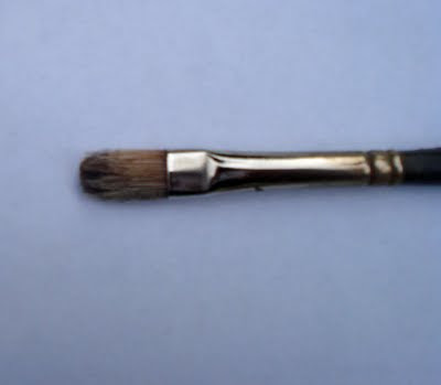
Here is the second of the two species of brush that I carry. I have but one of these, I carry three, or perhaps four bristle brushes (of course I have spares for each in my brush quiver) but only one little pointy brush.

This is a rigger, for many years I used sable riggers but now I am happy enough with the "golden Taklon" synthetic hair. The one I use is a #4 series 7050 script , and at present they cost 3.64.You can get them from Jerrys here.

I call all long, thin, sable- like rounds "riggers" as a convenience, however different lengths of hair or different manufacturers may actually call this sort of brush a script brush, a scriptliner or for the really whip like ones, a rigger. I believe that ship painters may have used those to paint the rigging on boats. I don't know much about ship painting, it is it's own little netherworld.

I HATE BOATS, THEY SINK.

I am particularly fussy about the condition of these brushes, because as they wear, the tips of the hair explode as they abrade to the unattractive thatched end that no longer provides a crisp line. As soon as they begin to lose their neat tip, out they go!

Don't leave a rigger behind uncleaned at the end of a painting session, if paint dries in one of these it will quickly be ruined. Even if you only clean them real well in your solvent, rather than with soap and water, make sure you never forget to put these away clean and protected in your brush quiver, wallet or pastry belt area.

The rigger is what I use to put little branches in, define the rake-boards of a house or other little details or things with man made straight lines. However! this little brush is dangerous, it tightens up and can rob your work of painterlyness . It's overuse can rapidly give your painting a brittle, seized up and crabbed look, so use it gingerly.

OVERUSE OF THE RIGGER BRUSH WILL GIVE YOUR PAINTINGS RIGGERMORTIS!

Say, that might make a dandy neck tattoo!.

Wednesday, July 13, 2011

A worn out brush


I wrote last about the importance of clean, sharp brushes. Someday when I am rich and famous I will just throw my brushes away, with my rags, every evening. I would buy my brushes by the gross, in three different sizes.

The brush ( a #4 flat) pictured above is ruined, worn out ( not good anymore). The pro's are rolling their eyes reading this, for they maintain a collection of fine tools. But a lot of people read this blog and most of them are in the earlier stages of their march to artistic greatness.

Now your brushes may wear more evenly than this abraded specimen but the wear happens the same way on a finer scale. The hairs have broken or been worn off in gradated lengths back to the ferrule ( the shiny part). Why its almost like a Mesopotamian ziggurat, or a layered haircut from the David Cassidy period! The same sort of unattractive wear and fragmented deterioration you would expect to find in a broom.

It makes a stroke or line with a chopped up edge, or drag marks at its side. Next to a sharp brush stroke it looks raggedy assed. Rather than acting as a flexible blade, different units of the brush operate in splayed and stiff independent scales or groups. Like a burr that sticks to your woolen sweater in the autumn ( under fading light at fields edge on a hillside in Northern Vermont, with big maples and a 19th century barn and the whole landscape woven into a tapestry of ochers, grays and violet. There's thistles there and sumac) Or imagine an anesthetized porcupine or large hedge hog, gently, kindly, but firmly, attached at its stomach area to a mop handle.

This is a worn brush, an evil thing, but there is something darker still. There are among us men and women (well, I think there are men) who carry with them a collection of brushes in which the paint has been allowed to dry. These brushes are a solid mass from ferrule to tip. They are like a tongue depressor or small pry bar. Obviously these people have to know that the brushes in this condition could never be used, Certainly there is no way they are going to resuscitate one out on location and work with it. But they still carry them, sometimes a dozen or more. They have brushes that once were an inch and a half long worn down to half an inch and totally rigid all the way to its heel. You could hammer one into a phone pole. But they have em, why?

They are not really being honest with themselves, they are engaged in "magical thinking". Or at best a low level simmering resentment, and yes, regret over the lost value of once useful brushes bought at high retail in some big box craft store. I'm not sorry for them, I just can't be.I don't have the time, I have my painting and my commitments. I don't really think about them that much.

Tuesday, July 12, 2011

New Brushes


I bought more new brushes the other day. I order the Winsor Newton artist's brushes. They are a white hogs bristle, the basic oil painters brush. The English company, Winsor Newton has been around for a long time and produce sound, quality products. These particular brushes have an odd tapered waist like a wasp. I am sure they are supposed to balance better in the hand, but I had no problem with the brushes before and I don't choose theses brushes for that feature. They are a consistent quality brush at a reasonable price. At least online. If I go to the big box craft retailers prices are nuts. I only buy a single brush there in an emergency. I always buy brushes online. I buy brushes regularly and eight or ten of each size at a time. Sometimes I will buy a dozen of each of the smaller sizes. The big brushes last a long time. I can use up a # 1 in a session or two.
The Jerrys online catalogue entry for these is Here.

I want my brushes sharp and new. So I use up a lot of them.There are painters who hold a different brush for each color in their painting. They might have a dozen wet brushes. This spreads the wear out over all of your brushes, just as it might with shoes. But' I only have three brushes when I paint outside, plus a rigger. They are; A #4, a # 1 and a #10, all flats.

When I teach workshops I only see a a few usable brushes. At least half of the students are working with a dried out, worn down brush that wouldn't do the job in practiced hands. I have gone for a look in peoples brush collections and not found a single usable brush. Appalling. You wouldn't try to sweep your kitchen floor with a broom in that condition, a worn out broom is grotesquely inefficient. Lots less hair contacts the floor and it won't cut into corners very well.
A brush is a sort of little broom. It works the same way and if it is worn it won't push the paint around crisply.

The real cost of painting is in your time and travel, brushes are not a real driver of costs, There was a time when Robert Simmonds brushes were the first choice and I will happily use those if I can get a good price on them, usually the WN are cheaper from my sources. The Chi-Com brushes seem to have loose ferrules and other minor quality problems and aren't much cheaper than the WN brushes.

Sunday, July 10, 2011

Figure Drawing for all it's worth

Andrew Loomis cover for the Saturday Evening post

Armand Cabrera has posted an excellent collection of quotes from the great American illustrator Harvey Dunn on his blog Art and Influence. you can read that Here.

A publisher call Titian is reproducing the classic texts by Andrew Loomis. They are very reasonably priced , used copies of these books sell for hundreds of dollars. I actually have an old copy of this book.

Andrerw Loomis (1892 to 1959) was a successful illustrator, trained at the Art Students League in New York, he studied with George Bridgeman and Frank Vincent Dumond. Loomis kept his studio in Chicago, and also taught at the American Academy of Art. He published his first instructing book "Fun with a Pencil" in 1939. The most sought after Loomis book is "Creative Illustration", hopefully this rare book will be available from this publisher too. These books are available online for free, but I prefer a real book to reading online. I get a better idea of the flow of a book from the paper version and find it much easier to study.

All that I show professionally is landscapes, but I draw figures one night a week with a group of atelier students in Manchester. You should too, if you want to improve your drawing. Drawing the nude is the best training for your drawing.. Nothing looks so wrong as a badly drawn figure, we all know what a figure looks like and notice any problems in a drawing of one.

Loomis drew hundreds of illustrations of figures showing proportions and tricks to remember them, He shows drawings of all the features, anatomy and construction lines for building the armature of the figure. His drawings from the golden age of illustration show different styles and techniques of drawing and although they are a little dated looking the figure hasn't changed much over the years. The information is as useful as when the book was written. The book is not scholarly but accessible and easy to understand

This classic text has been used by generations of artists and illustrators and is one of the simplest books on the subject.

Saturday, July 9, 2011

The Cleave and Heave show

Here are a last few words of advice for Xanthippe Cleavage-Heaver on preparing her show "The Bridges of the Hudson".

By about four months out from the show you should have all twelve paintings going and a hopefully some of them are finished. Now you set them up in your studio where you can look at the lot of them. I have a shelf running the length of my studio for this purpose. I can look at a big group of paintings at once.

I learned how to do this from John Terelac about 25 years ago. He was preparing big shows for the old and now defunct Grand Central Gallery, a very important gallery at the time. I would visit him in his studio and he would have all of the pictures for a show on narrow shelves about the walls of his studio.

Because you can see the whole show, even though unfinished you can make sure they have a common "look" without being repetitive. It will be important to have variety even though the show is a series.

If I work and work on a painting I can get dulled to what it needs. So, I take one down that I think I know what to do with and work on it for a couple of hours. Then I replace it on its shelf and take down another for a few hours. This allows me to work on them "fresh" without getting tied up and spinning my wheels on one particular painting. By the time I return to a painting it is probably dry and that is a nice thing to. If I am "pushing " a painting I like to get sessions on them when they are dry. I often want to throw a unifying glaze over passages or rework an area. To do that, I want to be able to scrape the offending passage down and not have wet paint under my corrections fouling my color.

I am currently working on about eight paintings in rotation and it is a good way to speed up your production. I am faster to make corrections if I haven't worked on a painting for a few days. It is also a good idea to put them on your easel in one of the frames you have already procured and see how they look in a frame.Keep one of the frames of each size for doing this, work on it in the frame and "tune" it a little so that it looks best in the frame. Working on a picture in its frame helps you craft the entire finished product, rather than being surprised at the end by the effect of the painting in its frame.

I sometimes keep a little index card for each painting , or write on a legal pad the steps I need to take to finish each one. If I can, I will get a painter friend into the studio and we will look at the pictures together talking about what the faults of each one are. Then I will produced a checklist for each painting with the necessary corrections. I will actually follow the checklist in order crossing out teach entry as I complete it.

Friday, July 8, 2011

Various things


Baby Goats


OK, here I am at the helm again. I am in my studio and hopefully I can get back into a paint-blog-sleep mode again. I am done traveling for a while, well actually not quite. I will be on Cape Elizabeth for a wet paint event on Sunday, July 17. But that is a one day affair, and not a massive road trip.

Above is a picture of the garden I have been fooling with, I showed in a previous post how I made a little template out of masking tape with pencil drawing on it for a bird house. I managed to throw another afternoon at it the other day and got to this point below.

I have a ways to go yet, I will have to repaint the flowers around the birdhouse and extend the pole on which it stands. Hopefully I can get it to take its place in the unity of the painting. Stapleton Kearns, the artist who actually lets you see the struggle. Everybody else makes it look easy, I pull my hair out and make faces. I am working round-robin on a gang of half finished paintings stacked around my studio, when I get another whack at this one I will post it and you can see my progress.

I got this question the other day;

Dear Stape
Can you explain the ideas, methods and practical
techniques that you think are most important in making a luminist
painting? Any information you give would be well appreciated.
..................Fissure Cutbait

Dear Fizz;
Your question points out a shortcoming of the blog format , at least the way I am doing it. I have written extensively about luminism and tonalism and wrote for weeks on Inness. But only long term and constant readers know that. There is a search box on the upper left and if you type query words into it you will get to lots of material that should help. This blog has grown so huge (933 posts and counting) that even I don't remember all that is on it, or how to find it all. It is a massive labyrinth. I really should figure out an index and make that available somehow, but the thought of indexing almost a thousand entries, while continuing to write others, seems daunting. I need staff.

The first 500 or so posts were almost all art instruction. If you are learning to paint, I suggest you go to the beginning of the blog and read forward. The first half of this blog is like a textbook. After that it grew more baroque and floral. It is now starting to seem more like writing a periodical or a magazine.

I want to do some more of the Encyclopedia of Dumb Design Ideas posts , I have some ideas for those. They are a lot of work, but fun to write and I hope informative. You also get a little story, a soap opera- Pilgrims Progress- distopia on the Zuider Zea.

Tobin Nadeu of Take-it-Easel has a page online now showing the Stapleton Kearns Signature easel here This is an easel tricked out with the improvements on my own. This is the cadilac of landscape easels. The Chi-Coms made a copy but this is on a wholly different plane. Fine Vermont craftsmanship and maple construction make this a lifetime easel. I have used mine routinely for nearly 15 years. I don't make anything on this, like RGH paints, I want my suppliers to stay in business as I need them. I feel good having my name on this easel. It started out as a sort of joke, "The Stapleton Kearns Signature Easel" like a Gibson model with a guitarists name on it, but now it really exists.

--------------------------------------------------------------------------------------------

SNOWCAMP

Held in late January and early February Snowcamp is the flagship model Stapleton Kearns workshop. Set in an old wooden inn on a high ridgetop in the White Mountains of New Hampshire, the views from the property are unbelievable. With the inn there at your back, if you start to freeze, you can run inside for a cup of coffee and a warm up beside the fire. We eat in our own dining room at a big round table and talk about art and our lives in it. These two workshops will fill, sign up if you want to go.

:Sjvzcdv'dvdang;n;dKA N"Wni'pqrqjw

Today's blog entry is in the works and will be posted sometime later. I am back from Maine, and then I went to Cape Cod to move paintings around. I have three pieces in a show at the Shipyard gallery in Hingham, Mass. All of the travel and deadlines lately have made it harder to be consistent with getting the blog written. Sorry, when I have to choose between business stuff and blogging I have to put the business first. Gotta eat.

I think things are going to lighten up around here now, and I won't be running so hard, I have a lot of unfinished art in the studio and dealers tapping their little hooves at me wondering when they are going to get it. My paintings often take a lot of time and I need to hole up with this unfinished art and get it out the door.
You who want to paint full time as an occupation, should know that you will get plenty of time painting and at the business of art (which I do poorly). You will get nothing else sometimes.

Wednesday, July 6, 2011

More about the Cleavo- Heavo show.


I found this sign at the ferry terminal in Rockland, Maine. It means you won't be allowed in, but with a lot more attitude.

Below is another question from the comments on the Xanthippe Cleavage- Heaver show.

"I think she'd be smart to do at least 3 or 4 paintings on her scouting trip. Why waste time? Paint smart and fast... after all, you see what grabs you in about 3 - 10 seconds...then she can use the studies for some of the big ones she paints in her studio".

Stape sez.............

This is a possible show you could do and it might be very fine. But I am not a plein air, one shot and into the frame guy. Lots of people are and for them that might be the answer. I am not disparaging that, it's not what I would do myself. I in no way intend to tell this commenter or anyone else how they should do their show, but I , having done a number of shows have my own way I can reveal and some of you will find it useful. Some folks are quick to hear "You should do it THIS way!" when I mean only to describe how I would" do it" based on my own particular temperament, abilities and experience. This is an "opinion piece" and not Holy Writ. Bullets!
  • I don't enjoy making small paintings as much as larger ones. I like the bigger canvas, I find it easier to think on. I enjoy working at least 16 by 20 and larger. I am very happy on a 24 by 30. I am not much slower at that scale either.
  • I get something in a painting that I make on location, that I lose blowing paintings up from little studies in the studio. Enlarging studies does give an advantage in that I can apply a treatment or raison D'etre to the painting in the studio that wasn't in the study. I am probably going to end up doing just that for at least a few pictures in such a show, but it is also laborious and time consuming in the extreme (for me).
  • If I am going to make a painting in the studio from a study done outside I would rather do that study 24" by 30". Here's why; If the study comes out real well, it's the painting. If it doesn't, I can either scrap it and try again (most likely ) or if it bears a fault that a redesign would cure, I might make a studio picture from it. When I do, I will have a full sized study to work with and not have the problem of enlarging a little painting, and the danger created by having to invent contents for the spaces that become empty and devoid of information as I enlarge the image.
  • A majority of the 24" by 30"s I make will see a bit of work in the studio, some a lot. But then they will go onto the walls of the gallery (and rather efficiently), not anywhere near as quick as a one shot study, but relatively quickly. They will however have some of the immediacy that a painting done on location can have. That often isn't often in a blown up study. My brushwork will also have a better look if it is done on location. I can fake a passage or two in a painting but my brushwork is usually better outside responding to nature dancing in front of me than in my studio.
  • Lastly, as you know, I do a bit of historicism in my painting and my heroes worked this way. When you go to a museum or gallery and see a Hibbard, Metcalf, Monet or other impressionist master, what you are looking at is the painting they made. It is not often the result of blowing up a little study. For the painters from a generation before, this would certainly have been the case, like Hudson River school work. But I do a more impressionist thing than that, generally.
--------------------------------------------------------------------------------------

Snowcamp is scheduled, here is the information on that.

Held in late January and early February Snowcamp is the flagship model Stapleton Kearns workshop. Set in an old wooden inn on a high ridgetop in the White Mountains of New Hampshire, the views from the property are unbelievable. With the inn there at your back, if you start to freeze, you can run inside for a cup of coffee and a warm up beside the fire. WE eat in our own dining room at a big round table and talk about art and our lives in it. These two workshops will fill, sign up if you want to go.

Monday, July 4, 2011

Carvers Harbor

I don't know what this post has to do with art, nothing I suppose, but it is very New England and I sometimes stop to show you images of that. People reading this blog are scattered all over the map and enjoy seeing the "old" New England. I shot these today with my little pink camera ( a gift from my wife "you don't care if it's pink do you? I got a deal on it!")

I was on Vinalhaven today. That's an island about ten miles out from Rockland, Maine. It has a small town on it called Carvers Harbor. I have been here many times. It was foggy and all the photos are blurry but they look cool. Below is a corner of the harbor. The economy of the whole island centers around lobstering. There are a lot of very historic and hidden corners of New England, I like to go to a few of them, they are the sort of places I look for painting locations.

Below is the gray ocean itself. Vinalhaven doesn't get much surf, but here is a little. Monhegan, another island outside the mouth of the Penobscot Bay gets more reliable surf.

Here we are on Main street waiting for the 4th of July parade, please note the architecture.

And up the street come the Shriners in little race cars. There were actually fire trucks and people dressed as lobsters and marching veterans. However I liked the little racecars.

And then up the hill behind us; towards the gallamander.


And I love old headstones, this one is in a tiny cemetery on Lanes Island, connected by a little bridge to Vinalhaven.