Showing posts with label critiques. Show all posts

Sunday, January 13, 2013

A snowscape flayed


A Village in Vermont
Something I occasionally do on the blog is critiques of readers' art that is sent to me . I choose those that I think will be most instructive to other readers. I cannot critique the work of everyone who would like me to do so, though.  I open them  in photoshop and quickly scribble some corrections on them with the brush tool, not very slick, but it shows what I intend and doesn't deface the original art. The picture below was sent to me and since it is winter and there is snow (at least in the north) I am going to take a scalpel to it. Thank you to my victim, who will remain unnamed, for allowing me the use of the art.


Above is the piece as submitted, and below is my Photoshopped version.


Here is what I did, and why;
  1.  I worked to create more diverse and interesting shapes. For instance, I felt the three pines across the foreground were too similar. I downplayed the one at the furthest left and I made the shapes of the two remaining trees more individual. I made sure each of the trees had a different size too. I want to get as much variety of shape as I can. Repeated shapes, sizes and intervals between shapes make a repetitive and uninteresting design.
  2. I dropped the pine on the right down behind that little bench. That is visually more interesting. I am value stacking, it helps get recession and  is another way to vary the shape of that pine from the pine on  the left. This ONE has  something in front of it. I like to stack lights on top of darks and then lights behind those. It gives more punch to a design.
  3. I opened up and simplified the middle of the painting. That makes it  circular design, a vortex. This makes the eye travel around the circumference of the painting like a big "O". Read  Edgar Payne if you want to know about design "stems", that is large geometric patterns concealed beneath the representation that give order and arrangement to a painting.
  4. I felt that the path leading through the foreground was to obvious,  I just hinted at it using shadows catching the now half concealed trail through the snow. It is really easy to be too obvious in painting. Often it is best to give less information rather than more.
  5. I varied the line under the pine trees, rather than HERE'S THE TREE AND HERE'S THE SNOW! I wove the two of them together. I used the shadows and lumped up the snow to avoid too straight and obvious a line where they met the ground. Dropping that right hand tree a little lower helped keep the three trees from sitting on the same straight line also.
  6. I added recession to the snow as it went back. If the foreground snow and  the background snow are the same value and color the eye will read them as being equidistant. I painted the foreground snow with a smidgeon of  cadmium yellow, the midground snow with a little  cadmium orange and in the distance I added a little cadmium red. As the  snow recedes the yellow gradually drops out and the red  increases.
  7. I  threw another layer of distance into that background line of trees too, and varied the line of the trees against the sky back there. There were two groups of two pines back there that I felt were too symmetrical, so  I removed one of the pair on the right.
  8. I warmed up the sky a little too, that explained the color in the snow, the sky being warm makes the picture more unified in the temperature of the light. I felt the color of the light was unexpressed, or too neutral.
  9. I added hazy drybrush "twigs to the weeds in the foreground. The transparency of that is more interesting and it allowed me to sneak a subtle violet color in there.
  10. I threw a little snow up in the  branches of the deciduous  tree at the right. I did this to add a little accent there, and also it is another example of a way to do a little value stacking. It is a little accent to enliven the passage. I often like to throw one little detail into each passage, the viewer perceives it and moves on assured that there is something going on in there. Passages don't need to be bristling with detail, one little observation of a detail will carry the whole area. It also adds sparkle.
------------------------------------------------------------------------------------

WORKSHOPS

There are now several on tap, I have already announced the White Mountain Snowcamp, I do have space left in this one, if you  are interested, please click here. Snowcamp is the most fun I have all year! The workshop is held at a rambling, late 19th century inn, The Sunset Hill in Franconia, New Hampshire which is very romantic and old timey. It might be cold, but the inn is right at our backs as we work, so we can run inside by the fire and drink more coffee if it becomes too much.The workshop will be held January 26 through 28.The inn is the perfect place to do a class and the scenery is fabulous. The White mountains are spread before the inn like a movie set.


-----------------------------------------------------------------------------------
Sarasota, Florida


Sandcamp! This will be held February 8 through the 10th.  I have had a local ask me to do this one,  actually several  people inquired about a Florida workshop so here it is. I will follow the usual protocol. In the morning I do a demo, and in the afternoon the students will  paint and I will run  from easel  to easel doing individual critiques. I will explain my methods and materials and give individual attention to each student. I will also do a seascape demo, as we will be on the water it is useful too know a little about how the surf works. 

This workshop will extremely intense, we will meet for breakfast and work until the light fails. Then we will eat dinner together and I will draw on napkins and wave my arms. I try to cram as much as I possibly can into the three days. I will, (as usual) work you like a borrowed mule.
If you want to come, here is the link.

Tuesday, November 1, 2011

Fooling with other peoples art


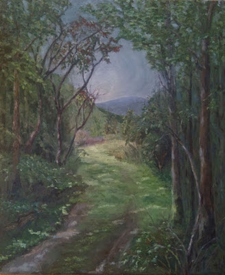
Above is a painting that was sent to me to critique. I have never been to the place where this was painted so I have no idea what was really there. I also have no idea of the artists original intentions. So I have put my "spin' on it. There are a lot of different takes that could be applied to a painting but this one will point out some problems in the original image and their possible solutions. You may have different solutions of your own. I want to be careful to point out that I have used some of my means of dealing with the problems in a landscape, but not necessarily the only ones.
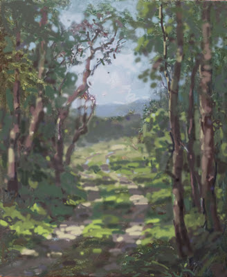
I fooled with it in Photoshop. I am not an expert in Photoshop so I just go at it with the brush tool. It always feels like I am painting with gummi-worms. However it does allow me to rework a painting without ruining it. So it is a pretty good teaching tool. Below is my version. Below that is a bulleted list of what I did to it and why.


The original was all in a few middle tones. I spread out the values, clearly defining what is in the light and what is in the shadow. No value exists in both!

EVERYTHING IS EITHER IN THE LIGHT OR IN THE SHADOW, THERE IS NO OTHER PLACE FOR IT TO BE!


The lights in the original are scattered about in repetitive sizes and shapes and not sufficiently different than the shadow value to "light up". There are gray days that have no dappled light at all but that is a different painting problem. You might look at the work of Richard Schmid for that, he handles gray days so beautifully.

  • Here's a detail from the middle left of the original showing a repeated group of V shaped forms. Repeated forms are visually boring and "manmade" looking. I made them into a single tree, but of course there are lots of different way to break up a passage like this. The important thing is variety of shapes and intervals. A painting should contain a great variety of shapes that are different from one another. yet interlaced or rhythmic.
  • Here is another problem, called a tangent. A number of unrelated lines all meet,for no good reason at a single point. This seizes the viewers attention, all of those lines draw the eye and then short out against the tree limb. Also the upper line of the mountain and the line of the hill below it are opposites, that is they echo one another in reverse. This is overly geometric looking, and makes the distant mountain into a teardrop shape. Below is my fix. The lines of the mountain and the hill now operate independently of one another and pass BEHIND the tree rather than butting up against it.
  • I reworked the trees varying their widths, again to get a more natural look, and to get more variety of shape. Repeated dimensions and intervals are boring. Those in the original were too straight, like phone poles. I put some twists into them as they writhe towards the light, and broke up their lines with some flecks of sunlight, emphasizing their twisting shapes and deemphasizing their repetitive perimeter lines. Rather than all being bounded by a dark edge their edges now are broken by patches of light. The trees are now made of three values. A highlight, a half tone value and a dark shadow. These three are woven together up the trunks to give more variation there.
  • There is a mechanical looking diamond shape in the sky right in the middle of the painting. I reworked this again to get greater variety of shape. If you look at my version above you will see I have added some sky holes into the trees and some branches hanging down in to the "diamond" area. This weaves the sky and the branches together more, rather than the sky being HERE! and the ranches being over HERE! I have worked to get a greater variety of shapes and intervals into the sky holes. Remember that sky holes must be a little darker than the open sky outside of the foliage mass. Because a sky hole is a narrow aperture, diffraction "steals" some of the light. If you make the sky holes as bright as the open sky areas they will appear overstated. John Carlson said they would appear like lights hung in your trees, rather than as holes through them.
  • The edges of the road needed to be softened up as they were too assertive and mechanical looking. Below is a detail from Willard Metcalf handling this sort of passage nicely. See how the boundaries of the road are downplayed and melded into the ground around them. This keeps the road from looking like it is pasted over the landscape. A minimal amount of definition is fine to suggest a road in the landscape, and avoid a primitive look.
  • I lightened up the sky too, although sometimes it works well to "fake" a dark sky into a painting, particularly behind autumn color, generally the sky should be as bright or brighter than anything else in the light. It looks unconvincing for an object receiving light to be brighter than the sky, its source of illumination.

Friday, December 17, 2010

Stape attacks the Irish


I was sent the image above for a critique. It is a charming little painting of an Irish cottage. I felt I could throw a few changes at it though. Below is my "improved" version and then below that, with lovely little bullets, are my explanations of what I did and why.


  • The tree was way too complicated. If you put too many branches on a tree, even if they are really there, it looks like an octopus. So I pruned it hard. I also dropped the value of most of it. That puts it into an upright plane. I wanted it's value to be below the highest notes in the grass, The grass is taking a direct light , more than the the tree would receive. I did spot some high lit areas into the tree to make the branches twist a little bit.
  • I reworked the shadows on the ground to make them lie down better. I also threw some spots of sunlight in there and varied the color some. It seemed too colored so I added some graver notes to make it more complex. I also divided the amount of grass in the light and shadow less evenly. Half and half is less effective than an unequal amount of both. That gives more variety of shape.
  • I softened up the path, a lot. Losing the edges of a path tie it better into the landscape and make it more a part of the ground, rather than looking pasted on to the ground.
  • The roof was painted in a value that said shadow. I pulled it into the light, as it faces up. I toned down the overly assertive red door while I was in there. I established a little more light and shadow on the front of the house and lightened up the heavy shadow under the eaves.
  • Lastly I simplified the shrubbery behind and to the left of the house. It had too much going on in it.

Saturday, December 11, 2010

Stape attacks! 2

Above is the painting as it was submitted. Below is my bowdlerized version.

Most of the changes I made were in response to the problems I laid out last night. Here they are, with bullets.
  • I lightened the sunlit areas up a little. Particularly the the sky.
  • I turned the mystery area in the background into a row of hills, that brings your eye across the painting and to the little house.
  • I passed the light behind the house, again to get more contrast and interest up into that which I am pushing as the "subject area". Now when you go back there you find something of interest the a lightest light and a darkest dark are gathered about my subject. That gives me a tonal climax there.
  • I eliminated a lot of the trees and varied those that I kept some more. I made their trunks more varied and thickened the closest one up so it would look nearer. Now they are not lined up like soldiers, that was too static. I also varied the grasses at their feet and threw some grass the same color over on the left side of the road to tie the two sides of the road together better. This gives more unity to the foreground.
  • I reworked the big shadow shape on the left making it more irregular, and a more interesting shape interlocking with the shape of the lights and no longer divided by a stripe down the middle. I pulled it across the road up by the house. That decreases the "acceleration" that was hauling you so relentlessly to to the distance. Now it takes you to the house and not past it.
  • I have eliminated a lot of the repetitive stripes that pointed along the bottom of the trees, along the road etc. They were way too insistent and regular.
  • I worked up the figure just a little, reducing the size of his head by perhaps 30 kilos.
  • I turned that stump on the left into a tree that broke the horizon line over there. That improved the balance of the piece and explained the stump better.

Friday, December 10, 2010

Stape attacks!!

Above is an image sent to me by a reader. I like that they have studied French Impressionist painting well enough to work in that genre. I think it is really valuable in training to choose an artist or school that interests you, and study it so thoroughly that you can work in that technique, Whether or not you remain in that method, it gives you a baseline. You will have at least one way of doing things, which is infinitely superior to no way of doing things. Before you reinvent the wheel, it is good practice to build a wheel or two in the way it has been done historically. My guess is that this is a studio piece, although I do not know that, and it must be closely based on a French 19th century example. I would suggest to this painter that the next step would be to go out on location and try applying this system on location. There is a lot right with this painting, and it has some charm, however I am here to criticize (find fault) with it. It is most useful to know what is wrong with your painting, that is where you will need to study. I would suggest to the painter that they not touch, or revisit this painting, rather apply my criticism to the next thing they make. It is easy to just make another picture, if you rework criticised paintings you lose the notes from class.

I think the painting has a problem with all of those receding lines that take you forcibly and deeply into the picture yet don't provide a "thingy" to look at when you get there. The house seems to be more of the pointing system, rather than pointed to.

There are repeated intervals in this picture too. Here is a set. It is best to form a variety of shapes, with irregular and varied intervals. The repeating of the same interval or distance from one thing to the next is static and looks mechanical.


There are things here which don't explain well. In a painting it is problematic to have the viewer stop and wonder, "what's that?" Number one must be a little tree, but I can't really tell. It may have looked exactly like that in nature, in which case the artist needs to modify the thing so as to explain itself. Number two might be a rock, or maybe a loaf of bread, I want to know. Number three is the head of a figure, but it looks too like a ripe olive. That needs to be more head-like. Number four is in the trunk of the tree, usually trees obey "constant taper" very seldom is there more volume above the trunk than below. If you search "constant taper" in the box at the upper left I have written more about that.

The picture is cut in half by the implied horizon line. The artist would be better moving this line up or down. This would require a decision, is the snow the thing? or is it the sky? Again this is a repeated interval problem.

The notes with the crude arrows pointing to them are all about the same, yet some are in the light and some are in the shadow. They are too much the same, both in value and color temperature.

The passage at the lower left is either in the light, or in the shadow, maybe both! The two worlds must be kept separate. Either the light hits something or it does not. There is no other location for a note than in the light or in the shadow. The rest of the passage is clear enough, I suspect that there was either more color there, or reflected light and that confused the painter enough that they split the difference. Every time your brush hits the painting you must know, "is this passage in the light or is it in the shadow?". ( I wonder if I am supposed to use a period in this place, please advise style editors pout there? it sure looks wrong).

Tomorrow I will rework the victim in photoshop and talk about what I did to it and why.

Monday, October 11, 2010

A charming scene from the Old Country, dissected


Above is a picture sent to me for a crit via e-mail. Below is my photoshopped version.


  • The painting had a problem called "one for each eye", the two Churches gave it dueling focal points. I moved one over to the left of the other and grouped them so they would read together as one unit. Moving one of the churches also rebalanced the painting in a more interesting and less symmetrical way. I know it is no longer accurate to the actual place, but this is art not a postcard.
  • I worked on eliminating the repetitive stripeyness that was a problem across the middle of the painting. To do that I cut down on the number of trees and arranged them into groups rather than a band from left to right across the picture plane. I varied their sizes and shapes some. The negative spaces between the trees formed repeating saw toothed shapes or pyramids. I got rid of that.
  • I got more variety into the shapes of the groves behind the white trees.
  • I made the roof lines a little more varied. I also rearranged the light on the distant hill to lead the viewer down into the town area.
  • I varied the borders of the road to make it more "organic" I also threw some little accents across the foreground to suggest detail and plane changes amongst the grasses.
  • I glazed a gray-red over the top of the sky to make it less flat.
-----------------------------------------------------------------------------------------

Announcing Snowcamp 2 which will be held February 5th, 6th and 7th. The first workshop is filled and I will run a second. Go here to sign up. Class size is limited to ten only, this is a small intense workshop at a beautiful inn located in the White Mountains of New Hampshire

Saturday, September 25, 2010

A quick crit

Above is a painting I had submitted to me for a critique. Below is my crudely photoshopped version. Below that I will discuss what I did to it and why.

  • I felt that the original version was too dotty, so I threw some broader strokes in to it. I made brush marks instead of dots.
  • I reworked the fence line. In the original the fence dived down in to the ground, taking the bush behind it along. I also ran some light and shadow patches on the fence to break up the overly insistent geometry there.The grass in the foreground closed in there too. This formed all of these converging pointing lines in a place where nothing was really going on.
  • I made the road follow through the foreground into the distance better. It seemed odd the the foreground road was covered in grass and the distance was not. I slipped some shadow variation along the fence line all the way to the boat, giving more variation into that area.
  • I used "value stacking" to put darks behind the lights and lights behind the darks in the river and boat area. Also in the sky behind the bridge. I now have a more interesting set of values there and the values set off the things I want you to see. Before, for instance the boat just disappeared. Now it lights up against the darker water.
  • I softened up the grass in the foreground and made it a little less saturated. It got more light and less color. Light "eats" color.
  • I made a less square top on the bush behind the fence. I also pulled it together into simpler less spotty values. It now has a big light and a big dark.
  • I accented the boat with bright white to bring your eye to it. I then scattered a little bit of that into the road, which takes your eye there like Hansel's breadcrumbs.
  • I made the tree in the upper left hand corner run up and out of the painting, rather than kissing the frame. That looks more natural. Before it looked as if that tree was being careful to duck it's head and stay within the picture.

Sunday, July 25, 2010

I decided to do a crit tonight. I know I said I would do more selected seminal posts, but I got a complaint that I was doing reruns. I did wish to point those early posts out as they are different and a necessary percuser to what I am writing now. So I would advise you to read the earliest parts of this blog, that is where the very technical and the explanations on edges and form, paint and brushstroke posts are. I also did a bit of analysis of the design moves of some of my artistic heroes. I am going to move on then, I don't want to do reruns. If I was not as useful as usual I apologize.

I received this image from an artist who lives in a far away land. I have a number of comments to make on it. Bullets!
  • The rows of whatever that is (radishes?) growing across the foreground lead the eye rapidly across the painting and against the rabbet on the right, instead of leading the eye into the picture.
  • The perspective in the house is off, at least the roof line. The lines of recession should be to a vanishing point that is the horizon and that is our eye level. Everything that is above our eye level will slant downwards and everything below our eye level will slant upwards.
  • The shapes in the mountain in the middle are too similar and need more variety.The shadows back there seem too heavy also. The darks back there are as heavy as those in the foreground.
  • I think the chroma should drop out of those greens as they recede. The lawn to the left of the house is a strong as the foreground greens. There is an old saying that yellow is on the tip of your nose, red is in the middleground and blue is in the distance. I think you need to neutralize the greens with a red as they recede.
  • Every note in this painting seems saturated, I think it would be a better picture if some notes were, and some were not. All color is no color. Good color is not a matter of the most color, (all color is no color) but of cunningly selected and applied color.
  • The sky is too blue. The light in a sky comes from the yellow and red notes flying in there too. You can almost always get enough blue into a sky, it is the other two colors that make skies have light.Perhaps you might have underpainted it with a warm color and then threw a little blue down into that.
  • The thing I most want to point out though is the paint handling in the sky along the left hand top of the mountains. That series of brush strokes echoing the line of the mountains kills the illusion of the sky. They need to either be invisible or pulled in strokes away from that mountain. That gives mean idea tomorrows post. I will write about how to handle a passage like that and work up a little paint demo to go with it. I remember learning that long ago and I don't remember ever writing about it.It is an important little part of handling in landscape painting and it comes up a lot.
I also received this e-mail;

I feel I’m against this big wall of “What to Paint?” This is mainly because, I want to sell my paintings not just do one painting after another. My heart goes out for still life and some Persian Modern/Easter paintings (I was born and raised in Iran until I was 17) and I am not too big on outdoor landscape paintings. I feel there is a very little market out there for Still Life or my Persian Paintings and most people buy landscapes and landscapes of places they know .So what is your advice for this confused Painter?

That's an easy answer to give. If you don't paint what you want, you probably won't paint it well. You say you like still life, perhaps you should be painting that. Still life painting has supported many artist, it is a dependable genre that never goes out of style. Still life is also an excellent way to build your drawing skill.

I would not assume that a landscape is the only thing that people want. You don't have to sell the most people, just a few. After landscape, still life is the most popular genre with buyers. I agree though, they may have an aversion to Persian.

Think about what sort of still lives people might want in their homes. Flowers are always good, people often like still lives containing kitchen or culinary subjects for their dining rooms. There are "genre" painters of still life too, I know an artist who has built a long career painting his collection of antique toys, and another who collects and paints colored glassware and bottles.

Buyers usually are fond of still lives that look real to them. The most salable still lives are generally tightly painted and illusionistic.Carefully rendered still lives are usually the most sought after. I think most of your customers will be women, so you might think about what colors and subjects women might want when decorating their homes. Many still life painters work in sight size. Do you know how to do that. There is a good market for smaller still lives I have noticed.They need to be nicely framed, still lives are generally a decorator item. People have an expectation of a formal sort of painting, that may seem a little unfair, but generally that is what they want. A small still life is often seen as a decoration for a formal dining room or hallway in a more traditional home. There is also a market for large tightly rendered highly colored still lives that are more "contemporary". You probably know the kind of thing you like, if you make it there are probably others who will like the same thing.

Do you know what type of paintings sell best? Good paintings. Take care of your art and it will take care of you. If you are having trouble with sales, don't think "how can I make more salable paintings?' Ask yourself "How can I make better paintings"

We are coming into the time of year when people begin to turn their attention to their homes, in the early summer it seems they are a little less likely to do that, perhaps they are in vacation mode or concerned with other things. I work hard to get my galleries stocked for the upcoming fall, that is often the best sales time in the year. Although that may vary depending on where you live. I always think that the longer the year runs the better sales will be. Early spring and the beginning of summer are often slow. So now it is essential to get those galleries stocked. You can't sell from an empty cart.

Wednesday, July 21, 2010

Barns and birches in brown

Above is an image sent to me for a critique. I have a bunch of them and am choosing them not by quality or the order received but because I see something in them that I can use to teach certain points.
  • I like the foreground of this painting. It looks to have been painted with a knife and has an interesting texture. Below are the "problems I think this picture has.
  • Almost everything in this painting marches from one side of the canvas to the other. This is a fault I call stripyness.That repetitive pattern of shapes doesn't lead the eye into the painting and is static rather than dynamic. It makes the shapes too like one another. Even the trees in the background are striped in the same manner as the rest of the painting.
  • The barns are too close to the rabbet on the edge top be as interesting as they are. Their decreasing size directs the eye into the edge of the painting, and that feels uncomfortable.
  • The birch trees on the left are too complicated and the artist was unable to communicate whether they are in the light or the shadow. They are represented as bright as the sky. Even though they are white, the could have been a lower note, or at least part of them could be. They are painted with their local color (white) rather than as they might appear under some particular illumination. White things are subject to light and shadow, value shifts and temperature changes like anything else. Also all of the branches reach from the trunks to the right, more variation in the direction the branches grow would be good too. About half as many branches would be about right. The branches should probably darken as they pass in front of the sky, and against the grass in the foreground. That is called counterchange. I have written about that here.
  • The shadows in the trees in the background are the same value as the darks in the very foreground. They are also full of deep color. I would expect to see less chroma at this distance and also a value shift as things go into the distance is often useful and would be in this instance I think.The darks back there are sort of inky. When you paint a dark passage try to think beyond just DARK, think about WHICH DARK? You need to have more value arrows in your quiver.
  • That thin strip of sky at the top is too narrow, it seems like an afterthought or that the artist just felt they had to squeeze it in. When the painting is framed the rabbet of the frame will hide about a third of it and the problem will be compounded. Remember that you are going to lose the width of a small brush handle into the frame and you need to account for that in your designs. That is probably going to put the right hand barn hard against the frame too. Jamming things into the edge of the frame can give a very unnatural look to a painting. It is better to stop well clear of it, or drive boldly through it.
  • There are two subjects in the painting. That's a problem I call "one for each eye" The tree on the right and the barns are both pulling the viewer about equally. It is important to know where you want the viewer to go, and then to arrange things so as to take them there.
  • The barns could have been made more interesting, perhaps they could have been brought in closer so that we might see a little information about their sides, the roofs could be decorated with some rust or variation of some kind. It would be nice to get more "story" about the barns. Perhaps a little light on their sides to tell us about their color or the material or texture. Maybe some variation in the tree roofs would be nice too, they are all the same shape, varied only in size. Perhaps a tree might break through the horizontal lines of those roofs, perhaps a silo, something else needs to go here.
  • I think this painting could use more variety in color. The whole thing is warm, perhaps some cool notes in the barn roofs or in the sky or the birch. Also I think it would be nice to introduce another color besides the gold red notes, Perhaps a violet or some blue in the sky. A little variation in the color would make this painting less "the same color all over".
  • I think the amount of texture in the grass should decrease as the field recedes from the viewer. I also think that the chroma of the field should drop off as it recedes too. The plane of the field seems more like a vertical wall than a field stretching away from us into the difference. It looks as if we must scale it, rather than walk across it.
  • The field in the left hand lower quadrant has two yellow stripes divided by two green stripes, all of the same width, stacked one above another. This passage needs more variety of shape, that's what I mean by stripey. Watch out for stripes!
  • Other than that, I have no problems with it.
Thank you mystery artist for letting me crit your work. I know it takes a lot of courage to allow me to rip into your painting. I hope you and the other readers will profit by my criticism. Of course you are you, and the painting is something you have made. I critiqued the painting, and not you. For our mental health it is important to understand that. What a great guy I would be if I could improve myself as easily as I can improve my painting.

Monday, July 19, 2010

Fountain critique


I was sent this image by a reader and it seemed like a good piece to critique. I might do a few more of these, so if you have something for me to eviscerate send it in. I will of course, only critique those pieces that have something wrong with them. If I don't choose to use your submission you can assume it is perfect.

I am going to shoot bullets at this piece, so let me jack a round into the chamber.

  • The painting lacks a clear subject. I expect the artist wanted to portray the fountain, but the trees on either side are equally as important. The path, the trees and the fountain are given equal importance in this tableau. It would be improved by the subordination of these competing elements to the fountain. Sometimes it is possible to allocate space on the canvas in proportion to the importance of the element in the picture. It is often useful to begin a painting by asking yourself,"what is the name of this picture?
  • The values are muddled. The underside of the bowl of the fountain for instance. Is that in the light or the shadow? My guess is that it was in the shadow but bathed in reflected light. The artist has overemphasized that reflected light and made it a s bright as something in the light. When you look at the shadow alone out of context with the lights, the reflected light seems very bright. But if you look at the larger scene the reflected light assumes its rightful place in the shadow world. Remember
NOTHING IN THE DARKS IS EVER AS LIGHT AS THE DARKEST THING IN THE LIGHTS.

Here is a post that explains the parts of the light.

  • Look at the shadow on the ground to the left of the fountain, its value is about the same as the trees in the foreground which I think are supposed to be in the light. This doesn't read. Every time you touch your brush to that canvas you need to know "is this passage in the light? or is it in the shadow?" The shadows are going to be from one end of the value scale ALL OF THEM, and the lights from the other end of the value scale, ALL OF THEM. No value exists in both the lights and the shadows. They are two different worlds and wholly separate. ( You have heard me say this before, haven't you?)
  • Most importantly this painting needs something the French call raison d'etre, that is reason to exist. rather than just showing us a fountain, the painting needs to say something more. It might describe something about the fountain or the light on the fountain or a romanticized description of the fountain. Thye picture needs to have a treatment, a way of seeing the fountain that is special.
It needs to say more than HERE IS THE FOUNTAIN. Below is a fountain painted by Sargent.

This is more a exposition of the light, the glowing shadows and crisp details against an amorphous background than it is a picture of a water spewing masonry doodad. It is an opinion, a poem painted about the fountain. It is often a good idea to think about painting the radiant light more than painting the subject. Painting the light has made lots of ordinary subjects noble.

A GOOD PAINTING IS A POEM ABOUT ITS SUBJECT, AND NOT A VERBATIM DESCRIPTION!

Its not what you paint, but how you paint it that matters.

It might help to ask yourself, what can I say about this fountain,? How does this fountain make me feel? How can I make this fountain look cool? It is all in telling a story about the subject rather than showing up and recording it.

Sunday, November 29, 2009

Another annoying dissection

Some unattractive event involving a spleen.

Our next patient is duct taped wide eyed to the gurney and yammering something about going home, and its mother, lets operate, and quickly, before it gets away!

Here is the piece as it was sent to me. Its a nice piece of work, done by a practiced artist with a real feeling of truth to it. I had a few little changes I felt like making and I resected its abdomen in photoshop and came up with this.

Here is what I did and why.With bullets, even were they not called bullets, I might still use them, it does give a well informed look to my writing.

  • Like I did with another piece this week I cropped the image on the right a little. That had several benefits, but mostly it got that tree out of the middle of the painting and off to one side. I felt that looked better, less static.
  • I cropped the bottom too, but for a different reason. I like to throw the "footlights" of a painting out a little further than the first image did. It is difficult to paint everything from your toes to the zenith. The reason for this is that it makes the viewer feel as if they need to move their head on its stalk in order to perceive all of the image. When they feel that way it is hard to keep them believing. It is something to watch out for on the horizontal axis too, although less so. Again it is easily done, the luminist painters did it a lot, but you have to be aware of what you are up to and account for it.
  • Cropping the image did tighten up to the best part of the painting and I feel like I closed in a the story and eliminated some non essential stuff. It is a tighter story now.
  • I worked on the tree branches a bit. I removed a couple that just ended on the left hand side. They were no doubt actually like that but I think they looked kind of amputated. They cause the viewer to hesitate, what happened to them? Lets not give that viewer a reason to reject our picture, shall we?
  • I upholstered the branches of the left hand tree and the one in the middle of the painting with the fine haze like twigs which often occur against the sky this time of year. I also threw in some little dry leaves that the wind left on those branches. I like to do that because it gives a decorative look to those situations and allows me some accents and implied detail.
  • I removed a fence post and some branches that were clawing their way in on the right. I felt the area would be better if it was "decluttered".
  • In the middle distance I mixed things up a little more. I dropped some notes recalling bare branches over that blue and I toned the whole blue passage down. I also made that group of trees a little more important.
  • Lastly I straightened out that back field where it met the tree line. It seemed concave. Concave lines are generally to be avoided in landscape, the earth tends to be formed out of bulges, convex lines. Concave lines give a sickly look to a landscape.
The snow camp workshop is full. Several people e-mailed me at one time or another saying that January is not so good for them. Is any one out there interested in a February snow painting workshop at the same inn? Please e-mail me at stapletonkearns@gmail.com and let me know.

Saturday, November 28, 2009

A little off the top please


Dissecting the genitalia of the male Cactus Moth by Richard L. Brown of the Mississippi entomological museum

Its dissection time again here too. So spritz a little alcohol on those moth abdomens, grab your
Dumont Forceps and lets open a few of them up!

I got this image to critique and I scratched my head for a while. Its got nice color and the values are pleasing, but it lacks something. The artist was smart not making it too symmetrical, but it still just misses. It is I think one of those situations where it seemed really cool when you were standing in front of it. A great concept and the waterfall was exciting. But it just didn't work as well in paint as in reality. I have made plenty of those myself.

I think It would probably have been advisable to back up a bit and get something else into the painting. I was reminded of these two paintings by deceased Gloucester artist Frederick Mulhaupt, both feature arched bridges like yours. I don't know that they are so similar but he was working with the same problems. There is also a Theodore Wendell of the Ipswich bridge that I went looking for and couldn't find online.


I think both of these, but particularly the upper, play a structure of verticals against the arched shape. They show two different kinds of shapes juxtaposed against one another, the arch and the vertical tree shapes.

Contrasting one sort of shape with another group of shapes that are very different is often a very effective way to build a composition. This is a concept that rock nd roll uses all the time. Think about how rock musicians often set up a tune, They will have a very sweet A section and than contrast it with a very brutal, minor or crashing B section, they alternate back and forth, each contrasting with and relieving the other. The British invasion bands were extremely fond of this, the Beatles used it all the time.
There are only three spaces left in the snow painting workshop. If you want to sign up, you can do that here.

Wednesday, November 25, 2009

curled up in the cozy dissection lab on a chilly November evening


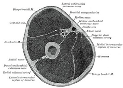
Here is a cross section of the upper arm from Gray's Anatomy. I'll bet you thought it was a Thanksgiving ham,didn't you? Its dissection time again! Here's our first subject now, relax, this won't hurt a bit.

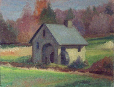
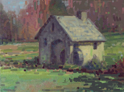
Heres a little mill, the original is above and my photoshopped version below.

Here is what I did to it and why.

  • I cropped it so that the mill no longer was right in the middle of the canvas, but had a little more open space on the left than the right.
  • I altered and strengthened the shadows at the lower right to carry the eye into the mill. That also gave me one dark corner and one light one. That is more interesting. I did the same thing up at the top too, closing off one side and showing the sky on the other.
  • I made the effect of the light more pronounced. I lightened the roof a little, and I darkened the shadow side, then I threw some reflected light from the grass and some variation into the color of the shadow,
  • I darkened all of the grass to get the illuminated wall of the mill to light up by comparison.
  • I tied all of the darks across the foreground and in the shadow side of the mill into one big shape.
  • I scattered some little accents about to give the look of a little more detail and get some vibration here and there.
Thanks for the image, mystery artist, I hope you find something of use in what I said, and remember this is only my opinion. I don't have THE only answer, I can only tell you how I would handle the problems presented in this painting.

Tuesday, November 24, 2009

Late November disssection time.


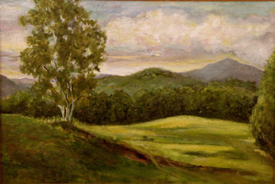
Its dissection time again! Hand me that Ginzu knife and lets get to work, there are several squirming volunteers duct taped to the gurney now, lets open em up! Here is the first, I of course do not reveal whose art I am critiquing and I don't always choose the best image I am sent. I am always looking for problems to point out. This artist sent some other images that were to my mind, more successful. I also like to mention that painting is HARD and I am thankful to the mystery artist who sent me an image to critique.


I will begin by talking about color. The painting is too much the same green all over, the distant hills are the same color as the foreground hill. The values AND the hues of the greens are too similar. All of the greens in this painting are in the same family. A good way to avoid this problem is to only allow yourself cadmium yellow in the foreground. Try painting the distance using ocher, or at least a lot less cadmium. If you put two notes on the canvas that are the same, the eye will assume they are equidistant. It is good to drop the yellow out of a painting as it recedes into the distance.

I did couple of posts not to long ago on greens they are here. and here and here. Those posts show a number of different sorts of ways to make greens. I heard a story once that the Eskimos had dozens of different words for snow, each describing a different sort. If you think of colors as words you will need a bunch of different ones to tell the story of this valley and hills.

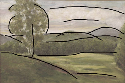
Here are the lines in the painting. They all march from one side of the painting to the other, well all except for the first hill on the left. Also as soon as we get out to the middle distance they are all nearly parallel and equidistant. Like the color the shapes or lines of this painting need greater variety. Perspecting lines that lead into the painting are generally the antidote for this. Sometimes I refer to this problem as stripeyness.

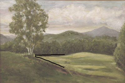
If you look at the overlay above you will notice that the strongest lines and the greatest contrast lead you to an intersection of the foreground hill, the base of the tree and the distant row of trees.It all seems a little coincidental I think it would be more natural if the line of the distant trees met the foreground hill lower.That will help to bring the foreground hill up and in front of the distant one.
Above is the original, below is a version that I have beat on in photoshop a little.

I have of course no idea of what the place actually looked like and I have imposed my own ideas on the artwork which are probably a long way away from its original intent. Here though is what I did and why.

  • I divided the tree into a light area and a shadow area to get form and a more interesting storyline there. I also implied a more "springy" S curve into it that makes it a little more lively.
  • I deemphasized the meeting of the field and the treeline in the middle distance.I thought that passage called too hard for our attention and when we arrived, there wasn't a lot to see.
  • I raised the value of the darks in the distant trees, to get them to drop back.They seemed too inky and assertive to be so far away. I added air between us and them.
  • I eliminated that tree that was hugging the edge of the painting on the right, and threw a few accents out into the field to give it a little detail out there.
  • I redesigned the clouds to make them have more form and to get a little more visual movement up there, I also darkened the sky and threw some lights into the clouds to raise the contrast up there. That gives it a little more light.
  • I made the distant mountain larger than the hill in front of it so it would be the more dominant of the two.
  • I increased the contrast and put in more darks and lights as I felt the whole piece was stuck in a middle tone. The decisions I made were based purely on design considerations. It may very well have been all middle tones out there. I threw some bright accents on top of the foreground hill and some dark accents into the distant hill. I did that in both places to lead the viewer to believe there was some detail going on there.
  • I threw some different greens into the piece. Doing that in photoshop seemed real clumsy to me. In Photoshop I always feel like I am working in Gummi worms.
Thank you mystery artist for letting me rip into your painting. I hope something I said was useful to you. In the old days before Photoshop it was only possible to do this sort of thing actually on the victims painting. Ain't technology great?

Wednesday, August 5, 2009

A few images gently critiqued


I have been painting in Maine and will return home today. Then I can take my new, new computer back to the store and see if they can fix it, again. If they do, I will be able to load photoshop and do all sorts of wonderful things that I have had to live without lately. I am going to crit a few images I received, as I have been meaning to do this for a while. I won't be able to draw on them or do a remake version this time, but I can discuss them verbally.


I like this one a lot. Probably in spite of myself. But it has a a lot of nice things going on. I like the design of the tree leaning to the right and how that gives a dynamic arrangement. If that tree had been vertical the picture would have been static and less interesting. The color in the fore ground is "modern" I guess and it is nice and clean and forms a nice color chord. Pretty smart. I could fault it a little as I think it looks a little more like a color scheme for a fabric than a landscape. I also think that long yellow sausage shape in the middle of the painting is overly geometric. The rest of the shapes in the painting are naturalistic, but that one shape sticks out as sort of artificial, and its bright yellow color draws attention to its being out of sync with the rest of the painting. Still its a very pleasing little piece and I am sure it will be happily welcomed into some collectors home.
The vertical piece above could use a few design tweaks. I think that the upright trunks if the trees could be varied more. Some could be lower in value and perhaps one or two might catch some light. The also all begin along a line at the bottom. I think they would look better if some were nearer and began closer to the lower margin of the painting and others further from that margin.
The limbs at the top of the trees are a bit repetitive too, most of them are the same weight and sit alone rather than touching another or better yet being arranged into groupings. When you can, paint GROUPS of things rather than individual things. When you look at a passage, particularly one that has a number of similar objects or shapes, ask yourself "how can I group these?" Grouping things is a design ploy that simplifies passages and eliminates repetitive shapes.

I also think the color in the tree trunks is a little too "brown" This might be a better picture with the introduction of some optical violets and maybe some ocher into those trunks to get variation and a feeling of light and shade. The brown feels too "local color".

This painting is in need of a walrus. That is, there needs to be more of a subject, something that will reward us for looking in there and seeing it. The water also feels a little like it runs up hill over on the right side. There are also two mustard colored ball shapes, one to each side, at the water line, that compete for our attention. I also think things could be delineated a little more to make this picture more interesting. This painting is nearly a design I call a three striper. I have made a zillion of them. They happen when you set up on a lake or other body of water and you have three horizontal bands stacked one above another, the lake, the distant shore and the sky, forming, three stripes. Whenever I am on a lake or similar environment I work real hard to stay away from that.

This next painting has an observed from nature look. That's always a good thing. I can make a few suggestions though. First of all the flowers in the foreground seem to sit on the bottom rabbet of the frame. Watch out for figures or trees or whatever, standing on the frame.

The hole through the trees seems too assertive and looks a little unnatural. I think a few spots of foliage within that cutout window would mitigate that a bit. Also the top border of that aperture is a the same height as the back edge of the field to its right. That sets up an unwanted geometric relationship in a place that should be random and varied. It is whats called a tangent I guess. I should do a post on tangents.

The little pool to the right of that doesn't read as well as it might. It doesn't lay out in space but seems to stand up vertically. There is an unintentional overly symmetrical shape left behind by the darks there, see it?

It also lookas if the horizon line is running downhill. but that could be the photography.

I know this boat. I have painted it too. I think it could use a little more space around it. Also the structure of the wheelhouse is a little vague. I think the plane that contains the front windows is in the shadow, that would be consistent with that square shaped extension of the cabin to its left. However the artist seems to have overstated the reflected light until the shadow area is as bright as the plane in the light. There is a general tendency through this whole painting to confuse the values of the lights and the shadows. Remember, no value occurs in both!

I also think the color of the hull is a problem. Both the shadow and the light are the same color.They are different in value, but not in color. The shadow is not a darker version of the color in the light! It is its own separate color. I did a post about that some time ago, here that is. And here is another relevant post.

Here are some things I do to separate my lights from my shadows.
  • I paint the lights in a high value and the shadows in a low value, so you can tell them apart.
  • sometimes I paint the lights with one pigment and the shadows with a different pigment, so you can tell them apart.
  • sometimes I paint the lights grave and the shadows highly colored, so you can tell them apart,
  • or I will paint the lights highly colored and the shadows grave, so you can tell them apart
  • sometimes I will paint the lights warm and the shadows cool, so you can tell them apart
  • sometimes I will paint the lights cool and the shadows warm, so you can tell them apart.
  • sometimes I will paint my lights opaque and my shadows transparent, so you can tell them apart.
  • sometimes I paint the lights with hard edges and the shadows with soft edges, so you can tell them apart
  • sometimes I use cool reflected light in the lights and hot reflected light in the shadow, so you can tell them apart.
See you all tomorrow