Showing posts with label paint. Show all posts

Sunday, July 8, 2012

tubing paint again


My shipment of paint arrived from my colormaker today and I think I will show you how I get it into the tubes. When you read this and look at the pictures it looks like a lot of trouble but with a little practice it goes very quickly and I enjoy tubing it up. I get about 6 or 7 big tubes out of a quart of paint. I try to keep enough paint on hand to last for months. I start to feel insecure when I don't have a big store of paint in my taboret. It is probably a hold over from the old days when I often didn't have enough money for both food and paint and hard choices had to be made.Most of you are not going to tube your own paint. Unless you use LOTS of it . There's plenty of good paint available from the many suppliers online and for most of you, of course, that's the answer.
I buy the empty tubes from Jerrys Artarama or Pearl Paint.
I order my paint from RGH Artists Oils. They sell 65 ml. and 250 ml.,jars, pint, quart, half gallon and gallon quantities of a very wide selection of different colors. Check them out at; http://www.rghartistoilpaints.com/
I think they make excellent quality paints and I particularly like their cadmiums. They are extremely affordable as you can see on their web site. Tell them I sent you, please.
I buy boxes of nitrile gloves from a nearby auto parts store because this is a messy business. I use nitrile gloves a lot. They don't seem to be as clammy as the plastic sort. They are cheap and disposable. I shovel the paint into the open end of the tube with a flat palette knife. I try to put the knife well into the tube and scrape the paint off on its lip. I inevitably get paint on the outside of the tube, but that's OK, I can clean it off later with mineral spirits.

I repeatedly rap the cap end of the tube sharply on my palette to get the paint to the front of the tube and eliminate any voids. Only fill the tube about four fifths of the way so as to leave room to close it up. I am using 175 ml. tubes in these pictures but you can buy small tubes as well. I use so much paint that I almost never buy small tubes. I do put up a few small tubes for use with my pochade box (pronounced "pochade"). I don't use pochade boxes very often though, as I like my big Gloucester easel and I am willing to put up with carrying the weight of a heavy paintbox because I often work on larger canvasses outside than most painters.
Next I close up the end of the tube squeezing out any extra paint that is there.
I then lay the tube on my palette and press the side of my palette knife down firmly on the tube about
3/8 of an inch from the end.

I lift the tube to vertical putting a nice clean fold in the end. It works like a box brake bending sheet metal, as shown below left. Then the next step is to crimp the folded over end with a canvas pliers. My canvas pliers are from the late 19th cent. or perhaps the early 20th century, a friend of mine found them in a junk shop more than 30 years ago and made a present of them to me.They are a far better design than the new ones They have a ordinary coiled spring unlike the new ones which have a sort of leaf spring, consequently they open when the pressure on their handles is released.
They are however not chromed, they have that old timey drop forged look. I really squeeze those pliers hard to crimp that end, and sometimes I will turn it over in one more fold and crimp it again. Below you can see the finished result.


After cleaning any excess paint off the outside of the tube with a paper towel dipped in mineral spirits I label the tube using a permanent marker. I recently began to paint a stripe of the color mixed with varnish or liquin to make it dry more quickly, around the top of your tube. Then it will look like a tube of Old Holland paint or like its from one of those fancy boutique manufacturers all the thoracic surgeons' wives use. I like the way my paint box looks, open on location. When other artists look in there, all they see are my non commercial tubes . Looks tough as hell.
It also is useful to know if you want to premix certain colors that you may be routinely cooking up on your palette.

Friday, May 18, 2012

A little dab'l doo ya!

Emile Gruppe

 A reader asked me this question;

  I have never used lead white. But titanium white to me is the color killer. I cannot get over how much it dulls and cools colors. Even the tiniest amounts sap the life from the color mixture you are working on. Since we are talking about palettes, do you have any instruction on color lightening while avoiding the neutralizing power of titanium white?

There's an interesting question. I have written about this before and somewhere back in the over 1000 posts behind this one lies pretty much what I am about to say now.

EVERY DROP OF WHITE YOU USE IS A DROP OF COLOR YOU DON'T USE.


 White will kill your color, make it chalky or vapid. Titanium white is very opaque and it will eat your color if used in excess. What I mean by that is it will overpower your colored pigments because it is so opaque. But still I think it is the best solution for 99% of the painters out there. But here are the alternatives.

  • Zinc white, the Emile Gruppe above was painted with zinc white, Gruppe and zinc's other adherents liked it because it didn't eat up their color so much., It is much more transparent than the titanium, weaker. BUT be warned, there is a major question about the permanence of Zinc white. It makes a brittle paint film and recent thought seems to have turned decisively against its use. If you are going to use zinc white you may have permanency problems.
  • Flake or lead white is less opaque than titanium also. It handles beautifully, looks good on the canvas and dries quickly. It has everything going for it except one thing. It is poisonous. I don't recommend that anyone other than  hardcore professionals use it. It is not appropriate for amateurs. Unless you paint pretty well you won't see a big benefit from its use, and will needlessly expose yourself to lead. It is a good idea to wear gloves when working with lead white, never eat or smoke when working with it and never spray it or sand it. Aerosolized lead is a dangerous thing. Don't breathe lead.
I think as I said before, that titanium is the right white for most painters. This One is the whitest thing imaginable, nothing else is like it. 

If you paint darker, that is, you key your paintings down little you will have deeper richer color. Just as transposing a melody down an octave on the piano gives a richer sound, keying down a painting gives richer color. You can make your paintings with color almost straight from the tube if you keep the key of your paining a little bit low. The answer is to use less  white.

An old, and very skillful  artist told me about twenty five years ago "make nature look like your palette" I thought that was really strange for a while. I had worked so hard to learn to "hit" the color of nature in the value s that it presented itself in front of me. What he meant was to voice nature in values  that were more like those of the pigments sitting on your palette unalloyed.

I have known a painter or two who have substituted Naples yellow for their white and used that in its place. I never thought that worked so well, to fold a soft yellow into the entire painting. it gave a "look," that while OK in a single panting would be oppressive in a roomful of them. Tricks are like that, they frequently take away more than they give. Naples, real Naples is a lead paint too, like flake. So it is poisonous. However, most Naples today is a mixture of titanium white, yellow ocher and some cadmium ( or cheaper substitute like arylide) yellow. These Naples are not labeled hues for some reason. Remember, a hue is a mixture of colors that imitates the real thing. The Naples hues have none of the lovely softness of the real Naples. They are strident and a bit acidic.You can tell a real Naples because the tube is very heavy, like lead.

Lastly, passages that are transparent, contain no white. That's what transparent means in painting practice, non white in there! The white of the grounds shows through the paint to keep it light in appearance.. The paint itself is only a thin film. You can bet the white problem and paint some very high key notes anyway by working transparently on a white ground.

I think the best strategy is to paint with less white but still use titanium. It s the best nontoxic permanent white. Titanium is inexpensive and made in lots of different styles by different makers. If you go easy on it you will have fine color.

Sunday, May 13, 2012

more palette talk

I was asked about the arrangement of my palette. In particular, a reader wanted to know whether I had the warm colors across the top and the cools on the side. I don't.

Mt palette is arranged a little like a QWERTY keyboard. That is, I have the colors I use a lot arranged near the white at the upper left hand corner of the palette. I also have my blues spaced across the palette from one another because I tend to mix them up when I am working quickly. Colors that I use the least are on the ends. Ivory black is on one side and cobalt violet is on the left, the violet is expensive and this makes me husband it.

I have the ultramarine and the viridian together and the cadmiums are just across the palette. That way, I can bring them both out to meet in front of my white. An awful lot of the colors I need in a landscape come out of that pile.

Changing one pigment on your palette often means that other colors need to be adjusted. There are so  many palettes you might think it is arbitrary, but there are "types" of palettes as I mentioned the other night. If, for instance, you add a pthalo blue to your palette you are probably going to want to add lots of cadmiums to step on it, or tone it down. You will need them, pthalo is strong stuff,

A reader mentioned using transparent red oxide instead of the burnt sienna. Richard Schmid seems to be the top exponent of  transparent red oxide, which is more transparent than the sienna (and more expensive.) I am not sure why an iron oxide should be expensive but it is. I believe it has to be milled carefully to get the small particle size that makes it transparent. When I have transparent oxide instead of sienna, I find I still want the burnt sienna. The two are too much alike to stock both, so I added a redder yellow...Indian red in my case. It is still in the family but redder. I think Schmid probably chose to add terra rosa because of this. Like Indian red, it is in the earth red family but redder than burnt sienna.

I guess I have to have viridian. I am never quite happy mixing all my greens from my blues. I do that a lot, but I still like to have the viridian. It makes a lot of greens, but it also means I don't need a cerulean. I used to carry a cerulean blue. It was very expensive and I have found that I can fake it with the viridian.

I am sorry for the rushed quality of these posts, I am traveling and using the wireless in a MacDonalds. I will be posting from home next so soon they will stretch out a bit.

---------------------------------------------------------------------------------------------------------
If you would like to know about the upcoming July workshop in New Hampshire please
click Here. I have included the cost of the workshop and information on the location in the White Mountains.

Tuesday, November 22, 2011

Surface and impasto

Images courtesy of artrenewal.org They have become a login site. For 14 dollars you get access to a lot of hi-res images. I have downsized these and cut details from them, those on the site are much larger. I believe the library of images they offer is worth the small investment and would encourage you to join. I receive no kickback, funding etc from them or anyone else who I recommend over there in the side bar, well, except for RGH paint who gave me a quart of white once.

I want to talk about surface in this post. There are two main sorts of surface, enameled (as it is sometimes called) ie. very smoothly painted without ridges or areas of deliberately roughened paint, and an impastoed, or 3D surface where the artist has intentionally allowed the paint to project from the surface to carry his illusion. Great painters have fallen into both camps.

The head at the top of the page is a detail of a Raeburn. He has used the thickness of his brush strokes which follow the forms of the sitters face to express the structure there. Until the early twentieth century painters worked with lead white. Lead white comes in a variety of handling qualities from ropey or stringy, to liquid and flowing, to crumbly and dry. The most common was an unguent and easily manipulated version such as you see in the painting above. One of the few drawbacks of flake lead (other than its toxicity) is that it becomes more transparent as it ages. Knowing this, artists would often load their whites ( paint them thickly) to make sure they retained opacity over time. However this gave an added benefit, these thick lights contrasted with the thinly painted shadows and a heightened dimensionality appeared. The artist gained another means to express the illusion of volume and dimensionality on his flat surface that an enameled surface didn't give him.

Painters who work over canvases with carefully transferred drawings on them tend to work very smoothly. Often they are coloring in or glazing these drawings in transparent veils to make their paintings. This is an academic approach. Painters who use impasto tend to paint directly from nature. They drag paint here, load it there, or use a palette knife to create the illusion of texture and form by various kinds of manipulative paint handling.

Below is an example of Rembrandt painting a sleeve. He was perhaps the greatest manipulator of impasto. The globs and striations in the paint surface appear at a distance to be the brocaded details of the material. In the upper left of the detail is a good place to see that. Incidentally, this is some of that crumbly look I spoke about earlier as opposed to the more liquid handling in the Raeburn above.

Art is what the artist brings with him to a painting. It is not found in nature itself. Art is man made and the result of an artists decision making process. It is not resultant from observation or accident, but is deliberately installed through intention.

The use of impasto requires the artist to make decisions about the nature of his paint application and its the varied effects he wishes to obtain. It cannot be more than inspired by nature in front of him, it must be invented. The same sort of passage can be painted absolutely smoothly to great effect as well.

Above is a sleeve and hand painted by Ingres. It has great complexity like the Rembrandt yet it is smoothly painted. In the hands of a master either approach can result in triumphant verisimilitude. I don't mean to say that one approach is better than another, however the use of impasto does require an additional set of decisions for the painter to make about how his surface will look.

Here is a detail of Rembrandt's' Hendrickje bathing. The impasto emphasises the simplified and broad planes with which Rembrandt has described the forms of his subject. The use of impasto and the expression of form are entwined and work together to further the artists purpose. More on this in my next post.

------------------------------------------------------------------------------------

I also received this e-mail:
"I, of course, noticed that you've ceased your superhuman habit of daily posting. I've grown so fond of spending evenings scouring your archives. Your blog is the art instruction I didn't receive back in the sixties/seventies, and your views and wonderful humor have become a comforting light in my search to improve my paintings. I've looked for a post that might explain your absence, but haven't found anything. I hope you are well, and that you'll be back soon. Thank you, for all your generosity and the effort you've put into what you have produced for us".

I have backed off to posting about once a week for now. I may return to greater frequency but I need to do this for a number of reasons which are:
  • Unspecified and serious difficulties in my private life.
  • A need to concentrate on my painting, I have to get my inventory up, which is off partly due to the unspecified difficulties opaquely alluded to above, but also because I have been making such difficult studio paintings, seascapes and such that take forever. I am much faster out on location than in the studio.
  • The blog was intended to be a one year project and instead extended to a thousand posts, which are archived and available should anyone want to read them. It is an encyclopedic "book" of what I have learned over the years I have painted. It should be useful to many who are looking for that information ( or perhaps slant is the better word ) which is hard to find in the mainstream art world.
  • I have written most of what I set out to write. The technical and design posts most importantly. I don't want to become repetitive. The low hanging fruit has been picked. There are lots more posts I can write and will, but they are more time consuming and difficult. The Encyclopedia of Dumb Design Ideas are a great example of that. I will do more of those but each one takes about 20 hours. They are worth the time and a lot of fun to do, providing I have the time to use doing them.
  • The blog will continue, but as I said above, I will have to keep to a reduced schedule for now. I do want to be useful. Thank you all who have continued to follow along.

Tuesday, October 4, 2011

A tip on paint handling in seascape painting

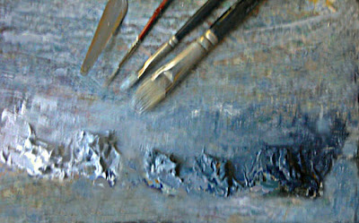
Above is a corner of my palette with five premixed values of a blue-gray tone. When I showed it last someone asked how it was mixed. I simply made a big pile of the darkest version using ultramarine, a little ivory black and a smidgen of titanium white. Each of the other piles was produced by diluting that "mother" color with gradually increasing amounts of white. I could of course do this with any "mother" color I wanted and sometimes I have several of these "strings" of color on my palette when I paint seascape, but seldom when painting anything else.

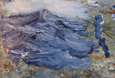
Below is an example painted on my palette of the use of a double loaded brush. I dipped one side (corner) of my flat brush into a dark pile and the other side into a light pile. Now I have two different values (or if I want, two different colors) on my brush. Over on the right I pulled a stroke to show you the kind of mark such a double loaded brush will make. I then painted the little wave study using a double loaded brush. I reloaded the brush after every few stokes.

I have worked at getting this effect to work for a long time and really only figured out how to do it reliably quite recently. It takes some practice and experimentation to control it. I found a reference to Frederick Waugh using this effect. The observer noted that Waugh twisted ( twirled) his brush between his fingers as he worked. That puts the dark on top sometimes and then the light note at others. It will also cause a striation of values within a plane of the water. If you look at the sketch above you can clearly see that. It is important to have the right white when doing this, Waugh used Permalba, but I painted this sketch using RGH (link in my sidebar) titanium white, the Lefranc is good too, and Winsor Newton is slippery, but stay out of the student gradee paints or anything too stiff or crumbly..The important thing for this is that the white is slippery and and somewhat soft, be sure you get the right ONE. Sometimes I add a little stand or linseed oil to get it to move better.

When I am doing this I am thinking about how the various planes of the water are facing. I also pull the shadow strokes downward and the lights up from below. There are all sorts of little niceties of handling, brush pressure and edge control that can be explored with a double loaded brush.

Thursday, August 11, 2011

A tool for smuggling red

One of the continual problems for the outdoor painter in the summertime is the color green. Green is everywhere. I do a lot to replace it or shade it towards red to tone it down. I often push my greens towards olive or ocher or heat them up or purple their shadows. I don't want to make paintings that are green all over, so I smuggle red. There are three colors, blue, red and yellow. Green contains blue and yellow so I want to use as much of a different color from those two as I can . That leaves red. So I smuggle reds. That is, I try to sneak it into my greens to "step" on them and get greater variety in my color rather than green, green, green.

I am particularly wary of a certain green that occurs everywhere in the lights during the summer. It is a high key chartreuse color most easily made from a combination of lots of white, plus viridian and some cadmium yellow light. Note I am not talking how to "hit" a given color outside. I am talking about modifying or even replacing the actual note of nature with something I think will make a more attractive painting. You have heard me speak of design a lot, here I am designing my color. Sometimes I want my paintings to be the color of 500 dollar suits. High key lemon greens are not something I would want in my suit.

I make up a custom color for myself that I think of as the anti-green. I call it Pornstar Pink. It is a hot pink with indelicate overtones of chewing gum and feather boa with a hot undertone that is nearly biological. This cheap lingerie color is the opposite of the green outside, and is the antidote. I can throw it into any of the mixtures I use to make greens and it will reduce or "step on" that green. I feed it into the painting here and there to "smuggle reds".

Painters I knew years ago sometimes carried tubes of "flesh color" into the field. They would never have used "flesh ( now I believe it is labeled "Caucasian flesh") in a portrait but it was really handy out doors. My homemade mixture, Pornstar Pink is a lot more vibrant than the old flesh color but the idea is the same, a red modifier pigment. In the winter this is a good color to have for painting snow, too

When I make this color I tube it not only for myself but for a friend or two who liked mine when they tried it. So I make about a quart at a time. I have experimented with it for a number of years and have arrived at a formula that works for me. But you probably don't want to tube paint, so there is this, Williamsburg Persian Rose

I started out using Persian Rose and then formulated my own version over the years from a mixture of precursor pigments I buy from RGH, my paint supplier. Their link is over in my sidebar.
------------------------------------------------------------------------------------------
Snowcamp I my winter painting workshop in the White mountains is filled. I have a few a spaces left in Snowcamp II. If you want to come click here. If that fills, maybe I can do another session, I don't know.

Sunday, July 31, 2011

Homeopathic whites

Here I am. I have dropped back the schedule on writing the blog to every other day or even every third day for a while. I have so much unfinished work in my studio. Those of you with various "feed" will get the blogs when I publish them and you who find me through Facebook will get the link on your home page when I publish. This is not a symptom of the blog ending. I have a lot more to write about. I keep a sort of flow chart so that when an idea for a post occurs to me I write it down, with little arrows like a genealogical tree showing how a series of posts might follow.

I am going to write about Homeopathy a little bit, not because of the practice itself, although I will tell you a little of that as an aside, but because I am going to describe a procedure in painting by comparison .

Homeopathy is an alternative medical philosophy invented by Samuel Hahnemann in 1796. Hahnemann was writing in an era when medicine was primitive, ineffectual and often painful and dangerous. He expounded a theory of "similars". That is, he believed that a very small dose of a substance that would give you a symptom, was useful for treating someone who had that same symptom. So if you had a problem with skin rashes he might have given you something that would cause skin rashes, like Poison Ivy. Because the remedies often contained noxious. or poisonous ingredients Hahnemann diluted them. In fact he believed that the more diluted they were, they more efficacious they would be. He would put a sprinkling of an ingredient, like salt or arsenic into a beaker of water. Then he would take a tiny eyedropper from that and dilute it with another entire beaker of water. From that beaker he would take another eyedropperful and add it to third beaker, and so on. Often the mixtures made contained no molecules of the original active ingredient actually present in the final remedy.

Homeopathy is discredited today although there are homeopathic remedies on the market. ZiCam for colds is a well known one, and there are people who compound and sell homeopathic remedies. Many of the products available today that say they are homeopathic, are not actually created by this dilution system. They just use the word to mean all natural, and harmless, selling their products to people who are unfamiliar with the actual definition of what a homeopathic remedy is.

The reason I brought all of this up is to talk about mixing paint on the palette though. My long suffering pink camera seems to have died, so I shot the following pictures with my cell phone. They aren't very good, but you should be able to see what I am up to.

I sometimes paint passages in extremely high values, notes that are very close to white but carry a smidgen of a color.This is useful in skies or the sides of boats in sunlight etc. I can mix up a pile of color to paint these passages this way, like a homeopath. I make a very high key (light) note using a lot of white and a pigment. In the picture below I used cadmium yellow.

Then I take a smidgen (like an eyedropperful) of that mixture and throw it into a new pile of white. That is shown below.


Often I will do this to three or so different pigments, with white, creating three piles that are very close to white but contain a little red or blue or yellow. With those three piles I can work in an extremely high value in broken color. I can use each of those different tints to express the turning of a form in bright sunlight.

-------------------------------------------------------------------------
SNOWCAMP

Snowcamp I is full. I have a few spaces left in Snowcamp II if you want one now would probably be the time to sign up. If there is sufficient interest I may be able to add a third session I am not sure. The link is over there on the right in my sidebar.

Wednesday, June 8, 2011

Covert pthalo

Blue poison dart frog

One of the things I noticed in the last workshop was how many people had Pthalo blue on their palettes and didn't know it. Pthalo is a powerful slightly greenish blue. I don't happen to like pthalo much, but you might. I feel it is out of step with the rest of my palette, being so much higher in pigmenting strength and that it can give an electric look that I don't particularly want in my somewhat reserved color. So I don't use it. But a lot of fine painters have and it is a permanant color. I am not opposed to modern pigments, I like quinacridone a lot, and there are a lot of great new red pigments.

BUT it is important to KNOW what is on your palette. If you are using pthalo, you need to know that. Many manufacturers either don't disclose on the tube that their paint is made with pthalo, or make it hard to figure out. Some companies force you to guess, divulging nothing about the contents of the tube. I want to use pure and named pigments. So I don't buy colors with names like astral blue or Hortensia. Pthalo is an inexpensive blue manufactured in enormous quantities. It is everywhere in the products and printed matter about us. It is also very cheap as pigments go.

Many of the colors that are counterfeited with pthalo are very expensive, like cerulean, cobalt or viridian. I give out a list of recomended colors before a workshop and suggest that they be the real thing and not a pthalo imitation. Probably half of the students show up with a thalo of one kind or another, and have no idea that is what they are using. So I asked each student if I could see their tube of viridian. Almost none of them were printed with the word hue (indicating a counterfeit) and on most of them the pigment code gave the content away. Pthalo is usually PB-7 or PB-15-3 or PB-36

Paint companies love the stuff and make a bewildering array of mixtures based on pthalo that you might not be aware are. There aren't that many blue pigments out there in the art trade and if the tube is filled with genuine viridian or cobalt, the manufacturer will be certain to boast of that on the label. Most of the proprietary blues and greens are pthalo, such as Winsor blue. If the paint is a blue or green and named something like astral blue, Sevres blue, or monastral blue, you can expect it to be a thalo based mixture. If you have any doubt or the tube doesn't say what it is, you can probably assume it is pthalo.

Sap green used to be made from buckthorn berries and I used it long ago. It was impermanent. Today, sap green is made of pthalo doctored with a little yellow. Permanent green is a pthalo color. Pthalo makes a lousy substitute for viridian, but viridian has become quite dear and as I said pthalo is cheap.

So check the small print on that tube of whelk blue and find out what you are really using.

I will be painting tomorrow at the Bethesda fountain in Central Park. If you are in the area, stop by and say hello. I expect to arrive at about 11;00 in the morning. You will recognize me because I am 6'4 and have shoulder length gray hair and I will be working on a Gloucester easel.

Monday, March 21, 2011

A question about three color palettes

baby animal


Here is a a letter from a reader;

Hey Stape -

After years of using a palette full of colors, I am going the limited route. I have experimented with a variety of triads and wondered if there are triads that you find to be most "harmonious," for lack of a better word. I have used the Ultramarine Blue, Cadmium Red Light, Cadmium Yellow triad and am now playing around with Alizarin, Pthalo Blue, and Cadmium Yellow Light. I enjoy mixing greens and would love your advice on that issue as well. As for my darks (particularly dark space) I use a mixture of Sap and Alizarin - in addition to the triad.
Thank you for your gracious and generous help!...........................Rodney Achromatopsia

Rod;

There are a lot of three color palettes, If I had to choose just one it would be Cadmium yellow light, alizarin permanent (quinacridone) and cobalt blue. Painting in a three color palette is a great way to develop your color technical skills. It also means you are dragging less stuff around with you. Matching a new note to one already on the canvas is easy too, because there are only a few color choices you can make. You will get great color harmony, but you lose some things as well.

I have also painted with earth color three color palettes. You don't hear much about those, but I have had some good days working in those. An example of that would be yellow ocher, ivory black and an earth red.

Mixing greens would seem pretty obvious as there are so few choices you can make. Yellow plus your blue, usually doctored up with your red.You may not be able to get anywhere near the actual greens in front of you, but that matters less than you might think, the harmony of your colors will make the greens seem correct,USUALLY.


I would suggest caution with adding that sap green and alizarin mixture to get your darks, after all, the beauty of the three color palette is the color harmony it automatically installs in your painting adding that sap green will probably compromise that. Sap green used to be made with buckthorn berries, today it is a hue, and can be almost any shade of yellow green, and is generally mad with pthalo. Unless you already have pthalo in your palette, I think that is a recipe for disharmony.

Working in a three color palette is excellent for learning to mix up your colors chromatically and as I mentioned before gives great color harmony. But it also brings some problems.They are;
  • Unless you are very careful you will end up with a lot of pictures that are the same color. You want to watch that if you are doing a show.
  • When I am working on a larger palette I have the ability to use different pigments to paint my lights than I use to paint my shadows, that's handy. If you are on a three color palette you are going to paint the light and the shadow with the same colors. For instance, if I am painting a red barn with a full palette I can paint the lights with cad red and the shadows with alizarin, if I am using a three color palette I am going to paint my lights with cad red and my shadows with cad red plus my blue or my yellow, but the same red note must appear in both.
  • I have far better control of my color temperature if I have a warm and a cool version of each hue.
  • A famous palette called the Zorn palette, after an artist who probably didn't use it, substitutes Ivory black for the blue.
  • I think a cool red is best if you only have one, rather than a hot red like the cadmium red light, unless you are Zornizing, in which case I suggest what ever red is closest to vermilion in color that you can find. I am painting figures one night a week and doing that with gold ocher, vermilion ( a hue, made by RGH), and ivory black. Real vermilion is too poisonous and the hue I am using works pretty well.

Sunday, January 23, 2011

Some questions asked, answered, and avoided

Dufaux 5


Hi Stape.

Do you have any words of wisdom on traveling with oil painting supplies? I'm flying to CA from MA next week for a workshop and plan to check all gear in a separate suitcase. I'm leaving all flammables behind, but am still a little worried that a young TSA agent will pull a nutty at the gate and confiscate my paints.--------------- Gustave Whitehead

Gustave:
I think I have written about this before, I don't remember, but here is what you need to know. You can fly with your paints, but not with volatile solvents. That would include painting medium also. You CANNOT however carry them on, you must check them in your luggage. This is not a maybe, if you try to carry them on, they will be disallowed.

I think their are now so many plein air painters traveling about that the security personnel see paint all the time. But to be extra safe you might want to include MSDS information sheets that are made available by Gambin, you can put that in with your paints. You can find them here Click on the color you want, and at the bottom of the description is a link for each color.

There is another way too, that I have used. I go online to Jerrys or one of the other suppliers and buy everything I think I will need upon arrival at my destination, but instead of giving my home address I give them one at my destination, a friend, dealer or the hotel where I am staying. If you do this well before your trip, when you arrive everything you need will be there in its little box, waiting for you. At the end of your trip you throw it all back in its box and mail it to yourself at your home address. That works real well. You will, still have to pack your easel and brushes for the flight but that is all...............................Stape:

Dear Stape

Gruppe used Rose Madder (deep) I think. What is that color most like today?

Pierre-Jean Robiquet

Dear PJ;

It is most like Winsor Newton Rose madder genuine. The Winsor Newton from Jerrys costs 35.69 for a 38 ml. tube, that is very expensive paint. I used it for several years and it has a lovely roseate color. I know of nothing with the same sweet glowing look. Some companies make a rose madder hue. I have never found one I liked. Perhaps a permanent rose is as close as you can get, that would be Quinacridone of course. You would never mistake it for the real thing though. Alizarin crimson is close also but lacks the subtlety and warm glow of the real thing. Rose Madder is NOT a permanent color.

madder plant, above

Rose madder is extracted from the root of the madder plant, it contains both the colors alizarin and purpurin. Purpurin is the more orange of the two and gives genuine rose madder its pleasing warm undertone. In the late 19th century alizarin was produced synthetically. It was in use until fairly recently. it was traditionally thought to be permanent but recent scholarship has disproved that. Today it has been largely replaced by quinacridone, developed in the late 1950's by Dupont, which is a cleaner, more permanent pigment. Quinacridone is a lightfast extremely durable red to violet color and comes in many shades across that range. When you buy permanent Alizarin, (and you should) quinacridone is what you get...Stape

Dear Stape:
Whats the deal with Alex Katz?

I have no idea.

Tuesday, January 11, 2011

Acrylics and alkyds

Constable, Chain Pier from artrenewal.org
I have to begin tonight with a correction. I mistakenly said that linseed oil used as a food was called rapeseed oil. Rapeseed oil is canola oil. I was wrong and several readers set me straight in my e-mail. My apologies.

I was asked in the comments about the permanence of alkyds and acrylics.
  • Alkyds are made by treating drying oils, such as linseed or soybean with an acid. There are two ways of introducing alkyd into your painting. The first and most common is the use of an alkyd medium. Liquin and Galkyd are the best known alkyd mediums. I use Liquin . Graham also makes a walnut oil based alkyd. The Graham is the most glossy followed by the Galkyd with the Liquin having a more satin finish. They give a faster drying time and help prevent drying in. That is when the darks in a painting lose their gloss and look matte compared to other parts of the picture.The second means of introducing alkyd into a painting is the use alkyd paints. There are now several on the market. The only one I have used is Griffin alkyd made by Winsor Newton. I have used their alkyd white for periods of time and added a few colors of theirs to my ordinary palette. Regular oil paint and alkyds are compatible and can be used together. Alkyd makes a tougher paint film that ordinary oil and it has a flexible :"rubberyness" that is very durable. It lacks some of the "jewel like" look of oil paint. Some people find the vapors from the evaporating alkyd mediums irritating to their sinuses.
  • Acrylics, formerly called polymer colors, are a plastic based paint that has become very common with "modern" artists and are less commonly used by traditional painters. The drawback of these paints is their rapid drying time. While that might seem an advantage, the longer open time of oils allows greater manipulation of the paint, such as blending, before it dries. I don't like working with them. They have been around since the late sixties and while they seem to be permanent, I suspect they are probably less so than oils.They are still well within the boundaries of archival and if you like using them I wouldn't worry about that. They look a a little different than oil on canvas and I feel they have a slightly plasticy look to them. They often seem to lack the glow of an oil painting. There are many brands of acrylic that are more student grade than professional. They are often marketed to students and amateurs. Almost none of the paintings in the galleries I show in are acrylic. I think the buyers prefer to hear oil rather than acrylic. In the "modern" art world this seems to be reversed and there are more acrylic paintings. Acrylics do not require noxious solvents though, and that is the major reason for their popularity I think.

Monday, January 10, 2011

A little about how tough paintings are

Generally oil paint is made with linseed oil. There are a few other oils used like safflower and walnut oil but generally linseed oil is the standard painters oil. Linseed oil is made from he seeds of the flax plant (pictured above) Flax has been cultivated for a long time, the ancient Egyptians grew it. Archaeologists have found died flax fibers over 30,000 years old. Most of the worlds flax is grown in Canada, but it also is grown in many other places including the northernmost parts of the Midwest.

Flaxseed oil or linseed oil is actually edible, however it is strong tasting and is usually used only as a health food supplement, as it contains high amounts of omega 3's.

The quality that makes linseed oil so good for making paint is that it is a drying oil. It polymerizes forming long chains of molecules. If you have ever had eggs dry on a counter top you have seen how tough polymer chains can be. Because they are rubbery and remain flexible they are close to indestructible.

Inh 1863 Fredrick Walton applied for a patent for a method of coating cloth backing with a thick layer of linseed oil and sawdust or cork. He called this product linoleum. That gives you an idea of how tough the stuff is when dry. An oil painting is basically a sheet of linoleum. Recent floor coverings are still called linoleum but are made of polyvinyl chloride (PVC). But there is plenty of the old stuff still out there and doing its job.

Oil painting are tough. There are virtually no 19th century men's ordinary clothes in existence. There are ceremonial outfits such as admirals uniforms and lots of women's garments. But almost no workman's clothes at all. They all got worn out. A pair of 19th century blue jeans found hanging on a hook deep in an abandoned mine in Colorado were sold at auction for 25,000 dollars. Oddly enough they were a pair of 34 by 33's, my size. The cloth from which those jeans were made came from the Amoskeag mills in Manchester, New Hampshire, still existing, though not as mills, I go there to draw figures once a week.

Unlike hundred year old pants, hundred year old oil paintings are very common, almost every antique shop has a few. Unless they are by a name artist or of a particularly attractive subject they may often be had cheaply. If people don't like a painting or it has gone out of style, they don't throw it away, they put it in the attic where it will wait patiently for generations to be rediscovered. Even if a painting is soiled or damaged, restorers refurbish paintings in dreadful shape, when they finish with them, they are as good as new, happens every day. For all artist's worry about permanence it is good to note that oil paintings are by nature pretty enduring.

Below is an example I found on e-bay today. It is 14 by 22 and has a minimum bid of 49.99. You can go bid on it by clicking here.

I could fill a truck with 19th century paintings in a week without leaving New England. They would still be worth less than the truck. Years ago I was invited into the home of a collector who haunted the auctions, buying 25.00 paintings. He wouldn't spend more. They were stacked against all the walls of his home, on the treads of his stairs, piled under his furniture and in the kitchen cabinets. After about half an hour I got bored with searching for a good one. I initially thought, with that many paintings there must be a treasure in there somewhere. I saw so much bad painting, I just couldn't go on. There was a lot of mass produced art and lots of grim amateur efforts. Just because a painting is old doesn't mean it is valuable.

Saturday, November 13, 2010

Sargent's palette

images from artrenewal.org

Here is another example of a painting that I believe could have been done with the limited red, yellow ocher and black palette I was describing last night. Passages that look blue in the painting below may well be ivory black. If a painting is couched in a warm enough key, black will appear blue. This was a common trick among Dutch painters before an affordable blue was available. The skies in as Jan Van Goyen are actually black based rather than made with a blue pigment. Sargent was also fond of Velazquez who used a lot of black.


Timothy Parks posted this list of Sargents pigments from a period source in last nights comments. Thank you. I have seen similar lists before but this seems both believable and typical. It is very similar to the palette I was taught when I was a student in Boston. I have added some explanations to the list.

Blanc d'Argent, (flake lead)

Chromes (Pale and Orange) (Chrome yellows were lead based . They were totally replaced by the more brilliant and permanent cadmium colors.)

Rose Madder (fragile and extremely expensive relative of alizarin, made from the root of the madder plant. Softer and more roseate in color than alizarin.

Cobalt Blue

French Ultramarine (synthetic ultramarine as opposed to lapis, the highly expensive original ultramarine had replaced long before Sargent's time).

Viridian

Transparent Golden Ochre ( I expect this is a synthetic version of iron oxide, sometimes called mars yellow. This is the yellow in the paintings I have been describing)

Chinese Vermilion ( made first from cinnabar, a rare ore and then in the lab, it is mercuric sulphide. Violently poisonous, it is difficult to find, expensive to purchase and dangerous to use. A lovely soft crimson red it has been replaced somewhat effectively with cadmium red. I was taught to paint with this color.)

Burnt Sienna

Raw Umber

Ivory Black

Peach Black ( I believe this would be a lamp black)

Cobalt Violet (an expensive but lovely color. I like this one and use it a lot)

Venetian Red ( an iron oxide red, probably a synthetic version)


Here is a portrait the majority of which could have been painted with the three color palette. I think that he sometimes worked in this palette and when the painting was nearly realized he accented it with a few accents of other colors from his palette.

Announcing a three day workshop to be held in Charleston, South Carolina. I am going to be down there painting for the Ella Walton Richardson gallery again and for the first time I will offer a workshop in conjunction with my visit. It will be fun to meet those of you who read this blog from the low country. Charleston is surrounded by marshes and sand beaches and has nice jungle like woods with palmettos and Spanish moss. As usual the workshop is open to all levels of experience and will run from Saturday, December 11 until Monday the 13th. I will teach outside and will demonstrate in the morning and then run from easel to easel teaching for the afternoon. I can save you years of screwing around learning to paint outside. We will have a great time painting in the unique environment along the coast.
Here is the link to sign up. Class size is limited to 10 and given the short notice on this one might be very small indeed.

Thursday, November 11, 2010

A little more about turpentine

Turpentine was until recently the standard solvent for oil painters That has changed in the last decade or so and most painters I know you mineral spirits, a petroleum product, as their solvent.
Artists use a solvent to thin their paint and in the manufacture of mediums. It is still the preferred solvent for any medium containing damar varnish.

Turpentine is made from the exudate of various pine trees and derives its name from the terebinth tree which grows around the Mediterranean from which turpentine was originally distilled. Terebinth a relative of the pistachio is mentioned in the Old Testament, and Virgil's Aeneid. Various different pines give different qualities and varieties of turpentine. Venice turpentine, for instance is from the Western larch tree.

There were formerly many commercial uses for turpentine. It was made into a bewildering assortment of patent medicines such as the one pictured in the advertisement from the 19th century above. It was sold as a cure for pneumonia, diphtheria, toothache, headache, rabies and even cancer in both people and animals. It was to be applied to the skin and taken internally as well. Many cleaning products still contain turpentine today because of its solvent qualities and clean smelling pine odor. There are still patent medicines based on turpentine too. Vick's Vapo-Rub is one. Most of the industrial uses for turpentine have now been superseded with petroleum products.

Until about five years ago it was possible to buy a good quality turpentine at the paint store. Sadly, that is no longer the case. There are several ways of making turpentine. The old and best way was like making maple syrup. The pine trees were "tapped" (actually scored) so their sap could be collected. Generations of slaves toiled in the heat of the Carolinas and Georgia to produce turpentine. It was as nasty a job as any man ever had and often enough being sent to the turpentine farms was a death sentence. This sap was carted to the cities and boiled in a huge retort over a fire. The resulting distillate was bottled and used for paint thinner, lamp oil, and in the making of furniture polishes when mixed with wax. The navy used vast quantities of turpentine.

There is a cheaper way to make turpentine that is far less labor intensive than that. Stumps, bark, and branches are all ground up and the product of that is distilled and sold as turpentine. Technically that product is called wood turpentine. I believe that is what is now commonly marketed as gum turpentine. Gum turpentine smells sweet and piney, wood turpentine smells like benzine laced cadavers. If you open a can of turpentine at the hardware store today and smell it, it won't smell like Pine-Sol, it will smell like death. Don't buy that, and don't use it.

I recommend you use Gamsol. I use various species of odorless mineral spirits (OMS) but since lots of people are reading this I need to err on the side of caution and recommend the Gamsol. It contains far less of the harmful volatile hydrocarbons which evaporate and poison the air in your studio. Turpentine may cause skin and lung irritation, nervous system damage and kidney disease. I have never had an allergy problem with turpentine, but many people have. My own teacher, Ives Gammell developed this problem late in life and switched to mineral spirits because of that. The health risks being what they are, Gamsol is the best solution, I think. I do miss the pine smell of good turpentine though. I actually wore it as cologne in art school, it was highly effective there. God knows what I would attract if I tried that with the turpentine of today.

Wednesday, November 10, 2010

Ask Stape, about solvents, safety and longevity


Dearest Stape:

You may have answered this question ad-nauseam by now, but I've been doing some research and need to know - because I love to paint wet, juicy oil paintings, about 3 different mediums solvents.

Natural turpentine seems to be the best - but there are differing "opinions" about how toxic it really is for studio use. Then - Gamblin Gamsol - a petroleum product doesn't seem that archival - is it?? Gets good reviews in the safety category. Then - last, most importantly, and my most favorite is Orange Turpine - Eco House - 915. I Love the stuff, but again - what's the truth about the toxicity and particularly the archival qualities of it???
signed;
Astrozenica Rhodococcus


Dearest Astro:

I referred your question to my friend and chemistry wiz Robert Carter, a painter and reader of this blog. The following is his answer. Robert has the ability to make the complex understandable to laymen like me.

Safety:

To answer this definitively, I pulled up the Manufacturer’s Data Sheets (MSDS) for turpentine (Utrecht), Gamsol (an odorless mineral spirit, OMS) and Eco-House Natural Orange Turpene #915. I have no experience with the Orange Turpene product, but it’s interesting to see that it is being promoted as a safer solvent that will dissolve damar. The principal ingredient is food grade orange turpene oil, which has an FDA GRAS rating (generally regarded as safe). GRAS is applied to most foodstuffs on the basis of long experience (e.g., spices are on the GRAS list), but there is no presumption of rigorous testing.

The health concerns of any solvent are acute toxicity on the one hand, and long-term health risks on the other. On both counts, turpentine is definitely the worst, Gamsol (and other OMS products) are better, and Orange Turpene is the (presumably) most benign. As the Merk Index notes, turpentine is absorbed through the skin, lungs, and intestine. It causes acute skin and mucous membrane irritations, skin eruptions, gastrointestinal irritation, delirium, ataxia (loss of muscle coordination), kidney damage, and coma. Inhalation causes palpitation, dizziness, nervous disturbances, chest pain, bronchitis, and nephritis (kidney irritation). Chronic contact can cause benign skin tumors. All in all, we’re better off not using it, except when necessary (e.g., damar-based mediums). OMS has similar risks, but they are generally regarded as less acute. In part, this is because it is less volatile (has a lower vapor pressure) than turpentine, so the build-up of vapor in the studio over time is lower. Certainly the narcotic effect is less. But among OMS products, there is a great deal of variation in the composition of the hydrocarbons present. Gamsol’s claim to superiority is that it is very low in aromatic hydrocarbons (less than 0.02%), which potentially reduces the long-term safety concerns. Chemists these days are very concerned about the use of volatile organic compounds (VOCs) in synthesis and manufacturing, but most especially about aromatic hydrocarbons. Aromatic hydrocarbons are composed of planar, six-member rings of carbon atoms, with benzene (C6H6) being the parent compound. Years ago, we thought nothing of doing reactions in benzene, but today you have to jump through hoops just to buy a bottle. The problem is that benzene is carcinogenic. So anything that minimizes benzene and other aromatic compound content is preferred. The Orange Turpene product, having ingredients on the GRAS list, is presumed to be safe. But we should throw in a word of caution here – GRAS just means we don’t know of any problems. Just because something is natural does not mean it is necessarily benign. In the absence of data, one should still take reasonable handling precautions. Beyond this, the only other thing I spot in the MSDSs is a difference in the flash point temperatures: 91o F for turpentine, 113o F for Orange Turpene, and 145o F for Gamsol. This is the same order as the boiling points. It means that the potential of starting a fire in the solvent is least with Gamsol. But this is really a minor concern.

Longevity:

The principle to apply in evaluating for longevity is that simple is better than complex. The process of forming a paint film (“drying”) is actually an oxidative polymerization process. Polymerization is the joining together of smaller molecular units (monomers) to make an infinitely large structure. The strongest polymer, and hence the strongest film, would be formed from a single vehicle (e.g., linseed oil), because only the same kinds of monomers would be joined. With a variety of alternative monomers present, the network building frequently ends in dead ends or less strong linkages. Now that’s the theory, but in practice it may not make a big difference. For example, white paints frequently have a mixture of linseed oil and safflower oil to reduce the yellowing tendency, but I do not know of any data that says these make weaker films than a white mixed with, say, pure linseed oil. So, how does this apply to solvents? Well, we need to think about the residue they leave. Looking again at the MSDS data, Gamsol is 100% volatile, turpentine is 99.5% volatile, and Orange Turpene is 99% volatile. The latter two, then, leave a nonvolatile residue in the paint. We have hundreds of years experience with turpentine, so we know that the oily residue it leaves does not interfere with the polymerization of linseed oil, and may actually be incorporated into the film. At least in theory, Gamsol should be even better, because it leaves no residue to interrupt polymer formation. In other words, your questioner is misinformed to think OMS compromises longevity. The Orange Turpene leaves 1% residue, so the question is what effect if any does it have on the strength of the film? The manufacturer claims that this material is archival, but it is a new product that does not have the lengthy record of turpentine, or even OMS. They may be right, but they could be wrong. As far as I know, orange oil (which is 90% d-limonene) is not a drying oil, which means it does not readily polymerize on exposure to oxygen. If that is the residue, it could be a problem. But to be fair to the product, I am speculating here.

Speaking personally, I tend to be very conservative about materials with respect to longevity. (By contrast, painters like Fairfield Porter loved to mess around with odd materials, and now their paintings are employing legions of restorers trying to hold them together.) I avoid turpentine, except when necessary, only because of the health issues, but certainly not because of longevity concerns. I prefer OMS because of health concerns, and I am confident it poses no compromise to longevity. (As an aside, if someone with the technical expertise of Robert Gamblin doesn’t have a problem with it, then I don’t.) Personally, I would be reluctant to take a chance on this new orange product. I know, for example, that Turpenoid Natural should not be used as a painting medium solvent, so I guess that prejudices me on this stuff. Maybe I’m just reacting to the knowledge that if I really wanted to mess up my paint film, I’d add orange oil. That’s like adding Goo Gone. I guess if you like the product and you’re willing to take the manufacturer’s word on its archival nature, then go for it.

Hope this helps.

Robert L. Carter, Chair

Department of Chemistry

University of Massachusetts Boston


Thank you Robert, That was great!.....................Stape

Sunday, September 26, 2010

Odds and ends

I have been teaching all day and will only write a little tonight. I think I will answer a few questions that have been thrown at me lately.

I said in the critique last night that "light eats color". One of you asked what I meant by that. In extremely brightly lit areas of a scene the color is refused. Instead of being highly colored glare takes over in these passages. More color is found out by the turning edge of the shadow than in the really bright areas. You remember the images of spheres lit to show the parts of the light. One part, called the highlight is often represented as white, even on a colored sphere. That is an extreme example of light "eating" the color.

I was asked if the permanent reds I have been using are from RGH. They are not. I have been using two, Rembrandt, and Sennelier. I happened to have a couple of big tubes of those and they last me a long time. If I were shopping for a permanent red at RGH I would check out their pyrolene ruby red. I haven't actually tried it, but I have used other makers pyrolene red and liked them. So buy a little and see if you like it first before buying the half gallon.

I was asked about giving and receiving critiques in a group. I wanted to suggest a discipline you might want to try. Whoever's work is being critiqued doesn't speak until the crit is finished. That eliminates all of the excuse making and reduces the chance of disagreements arising (sometimes)
I have a general rule for myself of never defending my art. Say what you want, I will listen and decide whether it is useful, but I don't ever explain or make excuses.I won't try to tell you that you are wrong, even if I think you are. I just smile and listen, nodding occasionally so you know I am listening. Then I go back to work, either using or ignoring your criticism.

I have found that the Sherwin Williams prime which I have recommended her on the blog for panels has been reformulated and turpentine lifts it some. I switched to Zinsser OIL based primer (not shellac based!) and it seems to be working fine. Here is the original post on making panels

Gotta have sleep, goodnight.