Showing posts with label drawing. Show all posts

Thursday, March 24, 2011

sporadic firing along the halftone front

Goodbye, Liz Taylor

I received more comments including the following;

Rubysboy
said...
This post sows confusion. if the halftones are everything that's neither a shadow nor a highlight, what, then, are the lights? the lights is a term normally used to refer to all the lights as distinct from all the shadows and the lights are normally thought to include highlights, average light, and half tones, where half tones are the darkest lights. Is there a good reason confuse readers by ignoring common usage?

Dear Rubysboy;
There would seem no reason indeed, to confuse readers by ignoring common usage. And the usage I usaged was common in the milieu in which I was trained, where all the modeling was referred to as halftones, probably as a convenience. But, tonight I will present a non spheroid form and cut the demarcation into finer pieces. I don't understand how there can be average light on a sphere, as it constantly turns away from the light. Could you please link to your art on your profile? When I clicked on it I found nothing, no name, no website, nothing. If you want to post a strong disagreement with me, that is fine, but I would prefer you not do so anonymously. Keeps everything a little more civil too. I Googled Rubysboy and all I found was a Pomeranian puppy by that name for sale. Probably bites.

Brady said: A highlight is the brightest spot in the painting or drawing.
A halftone is any value between the highlight, and the bedbug line.
So, there could be any number of halftone values from 1 up to the limits of human vision. (Which I think is about 100 steps.)
So lets say that your bed bug line is value 99 on a 100 value scale and that the highlight is value 1.
(Given a scale where black is 100 and white is 1.)
This means that you could have up to 98 values in the halftones. Since all of those values are between the highlight and the bedbug line, they are all halftones.
To put what I said into context with Stape's post you can put all values into two categories.

Highlights + halftones = Lights

Bedbug line + Reflected light = Shadows.

Brady;
Yes that is what I meant. However I was speaking in the simplest form and there is another tighter definition I will now explain.

Tonight we are going to look at a more complex form and take this out a little further. Please meet me again below this crude drawing below
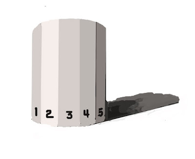
Last night we talked about a spherical shape. Here is a cabochon or a tetrahedral or whatever the proper name for such an object might be. It is faceted, or planar. As you read above, I have referred to all the modeling as halftones, but there are systems for dividing it more finely. In the tightest definition a halftone is exactly that,

the tone exactly halfway in value between the lights and the shadow.

On a sphere that would be a band about a micron wide running close to the shadow edge. but on a faceted surface it is defineable. On the form above #2 would be the highlight and #4 would (approximately) represent the halftone. The problem with this strict definition is, in use it precludes any discussion of this halftone being varied from that halftone. There is only one value that is a halftone. There are no halftones, only the halftone. That is clumsy from a teaching standpoint.

There are painting systems that premix a standard color for the highlight, average light, halftone and the shadow and reflected light. In the form above the #1 and #3 would represent the average light.

Portrait painters are very fond of these systems. I sometimes use a system like this for laying in a figure painting. But I generally discard it and go with close observation of the values after my lay in. These systems are useless training before a cast, for instance, when the point is to observe the nuances of modeling rather than large and approximate groupings of the values into two or three standard deviations. It is a good way to roughly build a structure of form, but disallows both the observation from nature of values and the nuanced infinitesimal gradations of value found in something like that Bouguereau I discussed the other night.

Now I suppose I have really sown confusion.

Tuesday, March 22, 2011

About the subtlety of halftones

William Bouguereau courtesy artrenewal.org

My Dearest Stape;
Can you please address the magic behind the half tones? As I grow as an artist, I find little written about the importance of them, and how to use them correctly. I truly need advice here!
Love!............................ Ms. Darlene Lubriderm

Darlene;
That's a big topic. I will throw out a few pointers. The painting above is a great example of beautifully managed halftones. Here are some bullet points on halftones;
  • The halftones ARE A PART OF THE LIGHTS!
  • Look at the painting above and notice that the halftones (those parts of the light that approach the shadow and explain it's structure) are always way lighter than the shadow. They are lighter than the reflected lights.
  • The most common drawing error is to represent them darker than they are, to overstate them. This instantly destroys the illusion of form and gives the drawing a dirty look. If you walk through any art school you will find endless pads of crudely drawn figures from life drawing class bearing exactly this fault. The models look like they are wearing rubber wetsuits.
  • This overmodeling happens because the tendency is to compare them to the value of the rest of the lights, that is, they look darker than the lights and in order to make them look darker, the tyro overstates them. If they are compared to the entirety of nature they will appear in the proper value. The "big" look of nature is more valuable in comparison that a piecemeal approach. Nowhere is this more vital in obtaining the proper values for halftones.
  • Look at the subtle value changes about the cheek and around the mouth of the painting above, see how subtle those transitions are? They are enough to turn the form, but they don't chop up the large presentation of the lights. They are a small variation in the value of the lights and only that, they are not part of a different light.
  • If you squint at the Bouguereau above the halftones almost disappear. Delicacy is the key. Understate your halftones and you will usually find they are about right. Never paint them any value that is found in your shadows. Often the addition of just enough color to make them different from the highest lights will drop their value sufficiently to work.

Saturday, March 12, 2011

Ingres drawing, overlapping lines

Another device that Ingres and other line draftsmen use is overlapping lines. Above is the "Study for the golden age", a very beutiful and important Ingres drawing. Below I have cropped out a detail and drawn some cryptic lines and numbers on it.

If you look at the bounding line of the figure, what Ives Gammell sometimes called the arabesque you will notice it is not entirely uninterrupted. Ingres has cut some of his lines diving into the interior to express the overlapping forms of the musculature. I don't have my anatomy books with me tonight so I will spare you most of the nomenclature. I am going by memory so you artistic anatomists are welcome to correct me in the comments.

1) Here is a real good example of what I am describing, Ingres has shown the biceps diving down under the pectoralis major, and on the viewers left the triceps diving in under the teres major and minor. He has clearly expressed the way these forms meet. His overlapping forms are installed from his knowledge of anatomy as much as they are observed.
External oblique

At 3) the pectoral shows itself in front of the neck, this overlap establishes dimension. That neck is obviously behind the top line of the pectoral

At 4) the underside of the chin cuts in front of the sterno-clito mastoid, which goes behind it on its way to the base of the unseen ear.

At 5) the line is darkened, I believe that is the Latisimus dorsi there, and when the line begins to represent the ribcage it goes soft. By varying his line weight here he is able to separate out the different masses.

At 6) The external oblique is depicted by a line that cuts inside the outline of the figure. Whew, I hope I got those right!

So here is the point. Rather than a dumb outline like a coathanger or a traced silhouette, Ingres uses lines that overlap and dive inwards across another line to show the overlapping of forms.

Like the other nights post showing the varying of line weight to express form without leaving the discipline of pure line, Ingres uses overlapping lines to express the form without having to resort to much shading which would clutter up the open lights of his spare drawing.

Friday, March 11, 2011

Ingre's drawing, examined some more

Here is our lady again. Tonight I want to point out a very simple thing. Look at the way Ingres conceived of the head as an ovoid or egg shape. This is constructive rather than strictly visual draftsmanship. He initially laid an oval on his paper to represent the shape of the head.

When I was a kid, I had a series of books by Arthur Zaidenburg that explained how to draw cats or horses using various ovals that were joined together by lines.While that seems pretty basic it is one of several approaches to building a drawing. There is another way, purely observational, that uses no preset armature but instead the copying of the shapes in the flat by observation. My training under Ives Gammell was more like the latter. I have over the years moved towards a more constructed type of drawing.


Then he wrapped the features around the head and not onto it. I have drawn some construction lines on the head below to show you what I mean.

The hair is laid unto the surface of that egg too, like ribbons. It sits on and defines the form of the upper part of the egg shape. The use of the hair and the way the eyes are wrapped around the head on lines that describe it's form, explains the volume of the head. Because the volume of the head is described by these lines, Ingres can dispense with most of his modeling, his line has done the work already.

Last night I talked about how we expressed the values of forms by varying the lines about them, tonight I am showing how he describes the forms by lines that plot their circumferences. Both of these are ways to make the drawing work nearly by line alone.

I have heard devotees of impressionist and mass drawing say "there are no lines in nature" and strictly speaking they may be right. But Ingres made his art from line and used some subtleties of that line to make that happen. These are abstract and elegant solutions. You cannot observe art into a drawing. Art is the result of decisions made by an artist, to make the image look a certain way. These nuances of line and the solutions he imposes on the drawing to get form and imply value are artful. When we look at the drawings we are pleased in a way that a matter of fact strictly observed (or shudder) copied from a photo image cannot approach. By forcing his drawing into the realm of line he has made something beautiful. That is not to say that there are not beautiful mass drawings, but the clarity and reduction of the Ingres is special.
Below I have shown the same method operating on the head of the boy in the same drawing.


Thursday, March 10, 2011

Ingres, Line weight and value suppression

Above is an Ingres pencil portrait of Madame Victor Baltard. I will make a few observations on it tonight. Bullets please:
  1. This is a line and not a mass drawing. The values of the clothing, for instance are completely left out. This is not transposed from nature in the same way that a visual draftsman might work. It is abstracted deliberately into a reduced description of its boundary's in space and the most salient lines of its construction.
  2. If you were making a study for an academic painting, a colored drawing built up in glazes, this is the information you would want on your canvas before the brush began it's work.
  3. The darks are concentrated about the heads with the remainder scattered as accents about the drawing.
  4. The modeling, even in the heads is suppressed. There are no cast shadows and the darks are selectively used to express the forms like the eyes and the lips rather than the larger shadow structure of the light on the forms. Ingres is drawing the forms and not what he saw before him in light and shadow. He has extracted the forms from the appearance of light on the model. This is the opposite of impressionist drawing. It is a classical way of perceiving the drawing.
  • Notice at 1 how soft the modeling (representation of the form through shadow or halftone) is. The plane formed by the side of the face is a different value, but it is suppressed so that it is just enough to tell the story of the plane change there. It is very subtle and understated. This is true of all the modelling of the face. Ingres has deliberately done this to keep the big shape of the face rather than chopping that up with darks. Also this soft focus gives a delicate look to the drawing and that is elegant and refined. Particularly he has avoided covering the face of this lovely woman with big dark areas indicating the structure of the head. He still has the structure in their but he has expressed it by outline and hinting at the different values out in the open spaces of the illuminated forms.
  • At 2 and 3 notice how he has expressed the major axises of the head which I have shown by a construction line through the eyes and the mouth. If he didn't put the lines I have added in as he began the drawing, later to erase them, he certainly had them on the paper mentally.
Here are some remarks on line weight, that is the strength of the line Ingres has used to express and accent the forms. Some of this is done to explain what we are seeing and some of it is done to obtain an elegant and varied variety of line. Most of this variety is had simply by his pressure on the pencil as he drew.
  • At 1 is a very soft line, the equivalent of a lost edge we might find in a painting. Notice at the top of this line where the fabric would be shadowed by her fancy collar the line is darkened. That shows that the form is in shadow, but still keeps this in the vernacular of line rather than having a shaded area here.
  • At 2, where the cape turns in direction Ingres has used a darker line, as it is the bottom of something, he has made it darker, the bottom of that form is in the shadow as it faces the ground away from the light source.
  • At 3, he has trotted out an even darker line. Almost all of the lines representing the sleeves are darker representing that that portion of her garb is made of a different darker material that takes the light differently. Rather than put a dark value out in the open space of it's form he has implied its entire value merely through variations in the outlines that describe it.That is very economical use of darks. Pencil is best as a line medium so he has made the lines do the description that a in mass drawing would have done within the boundarys of the form by dark modeling.
  • 4, points out soft lines probably made with the side of the pencil point representing modeling on the folded surface of the cape, again very carefully understated. This is intended to be as much a line drawing as it can be, and lots of modeling destroys that intention by making it more of a mass drawing. Expression of the shadows and modeling is always subordinated to expression through the use of an incise line.
  • 5, points to a dark accent that represents a place where the cloth goes into a fold and into the shadow created by that. Also this accent makes the illuminated portions look brighter. It is impossible to make something really look bright with out the contrast of a few strong darks. Again this also adds to his line variety.
  • 6, there is no six.
I will return and do more analysis of the drawing chops of Ingres tomorrow.

Friday, January 14, 2011

Supression of values and Stapletonian confusion

Sargent portrait from artrenewal.com

Below is another e-mail question:

Dear Stape:
Howard Pyle is quoted (paraphrased):
Only 2 values - makes strong & powerful picture
Only 3 values - picture is still good
4 or more -- throw it away.
But we are told to use value change - don't substitite color change for value - novices use too few values - etc. I have made the error of using too few values and I see too few values in many weak paintings.
How do I reconcile these two bits of advice???????? It has been bothering me since reading the Pyle quote.
Thanks,
Australopithecus Portapotty

Dear Austra:

I read that quote too, over on Mathew Innis's great blog (find that here) The supression of values is an idea that I was unaaware of until a decade or so ago. Richard Schmid hipped me to that. I can't say that I have fully assimilated it either. usually I confidently write about things I know well, but tonight I will have to say I am a little fuzzy on this too. Here are my muddled thoughts, none the less.Would bullets make me seem smarter? Maybe.
  • I work with ten values with the darkest being a little less that black and the lightest being little less than white. I had this driven onto me by Ives Gammell before the cast. I may not use all ten in a painting, but that IS my frame of reference.
  • I was also taught to suppress halftones lest my drawing be "overmodeled". Still I don't see how I can adequately work in two or three values.I think I need at least;
  1. the value of the lights
  2. the shadow note
  3. A highlight
  4. a reflected light in the shadow
  5. a variation in the halftone as it approaches the shadow (modeling)
That comes to at least five values .I believe I see those separate values in the works of the great painters I study. So I am a little befuddled here too.
  • I do suppress values to simplify my value construction but perhaps I don't really get the implications of this.I try to avoid chopping forms up with lots of fussy transitions and keep the "big".
  • Pyle was working for reproduction by what would now seem primitive means. Some of the illustration in that era was reproduced in black, white, and red. Perhaps getting his art to "read": in that environment made it important to collapse his values, I am not sure. I do understand how this works in the largest overall picture design sense, but not as much within the objects represented themselves.
  • Richard Schmid certainly does it, and that is enough to impress me. I have studied his painting and he is suppressing his value changes, so there has to be something to it. His word is enough for me. His book is a little cryptic on this. I noticed his mentions of it and wished for more explanation.He mentions it, but doesn't explain it, at least not enough for me to figure it out.
  • I understand how portrait pointers turn form with color rather than with value change, and I use that in my landscapes when it seems feasible.
  • When I teach, most of my students have too few values. They have a light, and a couple of darks, and their paintings work better when I throw a better observed panoply of values into them.
  • Henry Hensche used to stress turning form with color rather than value and I was exposed to that through his students long ago. but still......
  • I'm with you, I don't really get it either. I have been worrying over this myself, perhaps I am overthinking it, I don't know.
There I have done a post on something I don't know. Thats a new frontier for me and opens up lots of possibilities for the future as there are lots of other things I don't know. I will no longer be constrained to writing only when I know what I am talking about.

Sunday, October 24, 2010

Pen Drawing book for free

I would like to call your attention to a great little old book on pen drawing, mostly architectural subjects, that is a quick read and has some good ideas for the landscape painter. It is Pen Drawing by Charles Miginnis It can be read in HTML or downloaded for free at the Archive.org site. There are lots of fabulous books in there. Here follows an excerpt from the book that discusses the changes he has made to a drawing from a photograph. The thought process sounds like some of the things that I have written about on design.
--------------------------------------------------------------------------------------------------------
From the book Pen Drawing;

I have thought it advisable in this chapter to select, and to work out in some detail, a few actual problems in illustration, so as to familiarize the student with the practical application of some of the principles previously laid down.

Fig. 35
FIG. 35FROM A PHOTOGRAPH
Fig. 36
FIG. 36D. A. GREGG

First Problem In the first example the photograph, Fig. 35, shows the porch of an old English country church. Let us see how this subject has been interpreted in pen and ink by Mr. D. A. Gregg, Fig. 36. In respect to the lines, the original composition presents nothing essentially unpleasant. Where the strong accent of a picture occurs in the centre, however, it is generally desirable to avoid much emphasis at the edges. For this reason the pen drawing has been "vignetted,"—that is to say, permitted to fade away irregularly at the edges. Regarding the values, it will be seen that there is no absolute white in the photograph. A literal rendering of such low color would, as we saw in the preceding chapter, be out of the question; and so the essential values which directly contribute to the expression of the subject and which are independent of local color or accidental effect have to be sought out. We observe, then, that the principal note of the photograph is made by the dark part of the roof under the porch relieved against the light wall beyond. This is the direct result of light and shade, and is therefore logically adopted as the principal note of Mr. Gregg's sketch also. The wall at this point is made perfectly white to heighten the contrast. To still further increase the light area, the upper part of the porch has been left almost white, the markings suggesting the construction of the weather-beaten timber serving to give it a faint gray tone sufficient to relieve it from the white wall. The low color of the grass, were it rendered literally, would make the drawing too heavy and uninteresting, and this is therefore only suggested in the sketch. The roof of the main building, being equally objectionable on account of its mass of low tone, is similarly treated. Mr. Gregg's excellent handling of the old woodwork of the porch is well worthy of study.

Second Problem Let us take another example. The photograph in Fig. 37 shows a moat-house in Normandy; and, except that the low tones of the foliage are exaggerated by the camera, the conditions are practically those which we would have to consider were we making a sketch on the spot. First of all, then, does the subject, from the point of view at which the photograph is taken, compose well?* It cannot be said that it does. The vertical lines made by the two towers are unpleasantly emphasized by the trees behind them. The tree on the left were much better reduced in height and placed somewhat to the right, so that the top should fill out the awkward angles of the roof formed by the junction of the tower and the main building. The trees on the right might be lowered also, but otherwise permitted to retain their present relation. The growth of ivy on the tower takes an ugly outline, and might be made more interestingly irregular in form.

[Footnote *: The student is advised to consult "Composition," by Arthur W. Dow. [New York, 1898]]

Fig. 37
FIG. 37FROM A PHOTOGRAPH

The next consideration is the disposition of the values. In the photograph the whites are confined to the roadway of the bridge and the bottom of the tower. This is evidently due, however, to local color rather than to the direction of the light, which strikes the nearer tower from the right, the rest of the walls being in shadow. While the black areas of the picture are large enough to carry a mass of gray without sacrificing the sunny look, such a scheme would be likely to produce a labored effect. Two alternative schemes readily suggest themselves: First, to make the archway the principal dark, the walls light, with a light half-tone for the roof, and a darker effect for the trees on the right. Or, second, to make these trees themselves the principal dark, as suggested by the photograph, allowing them to count against the gray of the roof and the ivy of the tower. This latter scheme is that which has been adopted in the sketch, Fig. 38.

Fig. 38
FIG. 38C. D. M.

It will be noticed that the trees are not nearly so dark as in the photograph. If they were, they would be overpowering in so large an area of white. It was thought better, also, to change the direction of the light, so that the dark ivy, instead of acting contradictorily to the effect, might lend character to the shaded side. The lower portion of the nearer tower was toned in, partly to qualify the vertical line of the tower, which would have been unpleasant if the shading were uniform, and partly to carry the gray around to the entrance. It was thought advisable, also, to cut from the foreground, raising the upper limit of the picture correspondingly. (It is far from my intention, however, to convey the impression that any liberties may be taken with a subject in order to persuade it into a particular scheme of composition; and in this very instance an artistic photographer could probably have discovered a position for his camera which would have obviated the necessity for any change whatever;—a nearer view of the building, for one thing, would have considerably lowered the trees.)

Tuesday, June 16, 2009

Mass drawing, and the scarcity of linear drawing in our current era


Here is a drawing by Jean Clouet 1485-1541. It is of course an example of a linear style of drawing. Clouet was a portrait artist in the French court and was a creator of many fashionable drawings. Noble patrons bought and exchanged these drawings as we might exchange photographs today.Here is another

This is the work of Hans Holbein the younger 1497-1593. They may have met, although Holbein worked in the English court he traveled through France and they were contemporaries. I think it is amazing how similar their work is.

and here is another by Holbein

When I was a student I copied a number of drawings by each of these artists. Their eloquent and understated style seemed to me to be the ultimate way of drawing. I liked the repression, and the ethereally delicate modulation of the values that made these drawings so subtle. Another artist whose drawings have the same sensibility, although he lived a little later is Jean Auguste Dominique Ingres 1780-1867. I have shown his drawings before on this blog. He gets my vote for greatest draftsman.

Here is another Ingres head with much the same sort of an aesthetic.

One of my readers is working on a portrait and that got me to thinking of the different approaches to drawing . I am next going to show you some mass drawings, that are from the opposite end of the spectrum and are made with strongly stated values. The seem to me to have power rather than delicate elegance.

This head of Isabella Brandt, his wife, is by Peter Paul Rubens 1577-1640 This is a tonal or mass approach. Here is another example below.

This figure was drawn by Michelangelo 1475-1564 and is another example of mass drawing.

Linear and mass drawing, these are really the two great poles of artistic drawing. As an artist it is best to be able to do a little of both of them. Painters today tend to think in mass, and sometimes it is called the painters way of drawing. The implications of impressionism are largely tonal, the French impressionists obliterated line and worked entirely in mass, and we are almost all the result of that system of thinking. We hear so much about the "war" between the impressionist and the academic painters of the 19th century. I think too much is made of that, by the way. Looked back on from the distance in time at which we now stand, they seem more like each other than the avant garde art that followed them , which seems to be totally unlike either.

Here are two drawings by the Fenchman Pierre-Paul Prud'hon 1758-1823

and;


Within a short generation the academies and then the art schools began to teach a method of painting that was heavily influenced by impressionism. By 1900 virtually all of the training in the art schools was based on impressionism. My own teacher R.H.Ives Gammell was essentially an impressionist trained painter, and he spent his whole career trying to do academic paining using that impressionist training. I think in a way he was hobbled by that, as the things he made were influenced more by the pre impressionist generation. Either way for better or worse we are nearly all of us painting today from a mostly impressionist sensibility. As a landscape painter, that's pretty logical for me and not really a problem. If I wanted to make allegorical paintings it might be.

Where I am going with all of this is, it seems to me that the linear style of drawing is becoming less and less common today. Most, not all, but most of thecontemporary drawings I see reproduced in the art magazines today are mass drawings. I think that the computer generated art that I see out there is heavily weighted towards mass drawing. The manga and graphic novel artists are more linear but and work leans toward a "cartoon sensibility" rather than realism. The linear draings above are not like cartoons, but are a reductionist kind of realism. I would have thought that the stripped down, simplification of linear drawing would be most popular in our "modernist" infleunced era.

I wonder if line drawing now seems archaic to contemporary viewers or whether it is harder for them to read because of all the photographs we see daily. Photographs are of course a mass treatment, rather than a linear one.

Other than in cartoons we seem to see linear drawing only in explanatory art, blueprints and instruction manuals .When I was younger there was a lot of fashion illustration in the magazines which was done in a linear style, and their were often little pen drawings illustrating magazines. Those have both gone away too. Perhaps it is only fashion or perhaps it is more. Either way I hope that as traditional painting is revived, which sure seems to be happening today, we again see a renewed popularity of line as a drawing medium.

Illustrations courtesy artrenewal.org.

Saturday, April 25, 2009

Edges, deweighting for eye control

© The Estate of Edward Seago, courtesy of Portland Gallery www.portlandgallery.com

Here's our Seago again. Did you get the book?

I am going to break out some passages and speak about what is going on in them. Particularly as concerns expression of edges. For that is what the control of edges is, expression, not transcription.
I have had a side conversation with a painter who was concerned about the turning of form with color and was having a hard time getting both his values and his color . There has been some instruction on this blog where I have mentioned turning form using color (but not much) I clarified something for him, and I thought I might repeat it here.

Values are part of drawing.


Color is a decoration you hang on your drawing. Therefore go after the values first. You can inject the color later, if you have the values "right". Drawing is always the first consideration, not color. Anything well enough drawn will be well enough colored. I remember Ives Gammell saying that and I am sure it is a quote. But I am afraid I don't know whose.

Turning form with color is a means of simplifying the halftones, out in the lights. It will not build the "bedbug" line. That calls for a value shift.Rermember thepost on the parts of the light? You may want to review that if you aren't sure about the bedbug line, and its significance as arbiter between Gods pure light and the stygian darkness of shadow. Now I am going to get all the Hensche students after my hide. Henry Hensche put a great deal of emphasis on turning form with color. None of his students are young anymore, I will" puff up" and intimidate em.

I am going to throw a new idea at you , ready?

Here is a detail of the left hand side of the painting. Compare it with the full image above and notice something. The sky is light on the right side of the tree and dark on the left. Seago is doing something I call "deweighting". Don't go looking for that phrase in art instruction books because I made it up. But not recently. What I mean by deweighting is the downplaying of an edge in order to lessen visual interest.

Seago has darkened the edge of the sky as it meets the branches of the tree in order to direct the viewer elsewhere. He has arranged his values in such a way that the eye doesn't stop there but continues on to where he really wants you looking. He has put a bright sky contrasting strongly against the branches on the other side of the tree in order to direct your attention to that area.

You may remember in an earlier post my saying to imagine visual interest as having weight, and a painting needs to create an artistic balance of those different weights. Seago lessens the visual interest that would have been drawn to this area had he allowed the contrast of a bright sky with the gnarled and complex branches . He has removed visual weight from the area . Hence deweighting.

Here is the opposite. Seago has weighted this passage. He has done it with edges and values. Look at the razor sharp edges on the top of those houses out there, they haul our eye to the area with their contrast with the darks behind them. He has also loaded his lights. He has used a great deal of paint to get a textural attention grabber there. That house stands out better than if he had painted it the same value, but thinly. Seago of course wants us to look here.

I have shown you Seago drawing attention to this passage and called it weighting, after all I am using the word deweighting, surely there must be weighting? Well the important idea is really deweighting, I think we all know about drawing attention to an important area within a painting. Subordinating other passages to it by reducing visual interest at our edges, is a more subtle matter.

ALL OF THIS IS ABOUT EYE CONTROL


I am going to be talking a lot more about eye control.

Seago image from: Edward Seago, the vintage years by Ron Ranson, available through Amazon

Thursday, April 23, 2009

Different ways of making an edge

There are several ways of softening an edge. When I present them in this post,you will probably say to yourself. "Whats the difference whether I use one or the other, it looks like the end result is the same?"
Here in the lab there isn't a lot of difference, but I will be going somewhere with this later. I am laying ground work for some further conclusions.

Okay, here is our first example. The edge between the two notes has been made by pulling a flat bristle brush along the edge. That melds the two together. If I was doing real slick work, I might want to use a sable for this. But In my brushy paintings a bristle is just fine.

Also, as an aside here, notice my handling in the blue portion . That sort of fat look to the paint is something I have learned to do. Often painters try to push the paint around with lots of medium and not enough paint. I make em out of paint . I am a brushwork guy and often I want that luscious look of the full bodied paint. You may want that, or not want it, but you should be able to do it. It is another arrow to have in your quiver when the need arises.

To do this, you load the brush (bristle ) and put the paint down straight no medium, and then most importantly you leave it alone. Try working with your paint as it comes out of the tube with no added turpentine or medium at all. I 'll bet you get the best handling you have ever had in your life. If you need to speed your drying add a little alkyd to your white before you begin, but don't put it on your palette. This is not always how I do things but it is something I use to get a certain look out of the paint. Incidentally if you are putting pea sized blobs of paint on your palette, you will never have good handling.You may get an enameled surface, but you won't have expressive brushwork.

You are working on what Emile Gruppe called a starved palette. He said to paint like a millionaire. Squirt more than you would put on your toothbrush, onto your palette. Get cheap somewhere else, buy the generic soda. Teach your pets to forage for themselves. But lay out enough paint to allow you to use it freely. I am always amazed by how stingy students palettes are at workshops. When I lay out their palette with enough paint they act like I am crazy. Then they drive home in a Mercerdes.

Here is the other way of dealing with an edge. I am referring to this as softening it, but actually this is something different. Rather than blurring the two together I am darkening the light note as it approaches the dark note, and I am lightening the dark note as it nears the light note.
I am really downplaying the value shift between the two. The viewers eye will pass on without "over registering:" on the edge.

This means of dealing with an edge allows all sorts of trickery and diversions in the designing of paintings. More about that in a following post.

The second way of making edges often gives a firmer look to your work. Too many softened edges that are pulled together can give an overly slick look to a painting. Making your edges by adjusting your values is often the better choice in practice.

I suggest you practice until you have both in you repertoire. You need to be able to blur or pull delicate colors together without dirtying the notes , only melding them. To do the values control method you will have to think about altering the temperature of the two notes as they come together. Sometimes that is not necessary, but sometimes it is. You should be able to do both neatly and cleanly. I have seen many still lives and many horizons in landscapes ruined by crudely handled edges.

Wednesday, April 22, 2009

Yet more about edges


Here's a recent painting of mine. I did this next to the historic' Fort Moultrie near Charleston South Carolina. Fort Moultrie was bombarded in both the revolutionary and the civil wars. I will use this painting to show you some softened edges. Below is a detail of the sky.


There are several different types of edges in this passage. The first and most obvious is the clouds at the top of the detail. I pulled them together as I painted them, with the same large bristle brush . I put them into the wet sky so the whole thing went down in one go. If it had not all been done at once I would have been unable to soften the clouds into the sky. Sometimes people call this wet into wet. I don't, because when I hear that I think of "method" painters . The ones with their books at the local craft supply barn.


The second set of soft edges are created by dragging the tops of the stunted trees up over the sky. Rather than blending the two together with a brush, I let the color break over the sky note below it, to represent the fine haze of branches there. I also threw some sky color into the mixture I used to do this. Thay way the two notes were not so different. They shared a common element and were close together in value.

I have blurred the ocean and the sky together at the horizon to get that to recede.

There are other edge games going on in here also. In the grass I am throwing different colors of the same value over one another giving in effect soft edges. I am also throwing in real hard edges there. I have for instance put a dark shadow under that bush and then pulled the grass up over it and left it as a crisp accent stroke.

Lastly if you look at the upper right hand corner of that bush you will see I have "loaded" the paint there with my palette knife. That gives me a super hard edge to serve as a contrast to my soft edges. I want a bone or two in there. If I used only soft edges I would get a weak kind of painting. Although soft paintings can look very real they can also look vapid, insipid, noncommittal, fluffy poodle like and indecisive. You don't want that. Dynamic paintings contain a variety of edges.

With every note I lay on the canvas I ask myself a list of questions. I will give you that in a later post. But one of the questions on it is." What about the edge?" If the edge is not right the brushstroke is not right. I consider my edges with every stroke I lay on a painting, just like I do color and value. If you handle your edges on the" fly" it becomes automatic and you get the edge right while the passage is still wet. An overly hard edge in a passage can command so much attention that you see it, instead of another fault lurking nearby. When you soften that edge you become aware of the concealed problem, and can fix that.

I guess I will say it one more time just to make sure you have the concept because it is crucial.

YOU CANNOT OBSERVE EXPRESSIVE EDGES INTO A PAINTING. THEY MUST BE INSTALLED.

IN ORDER TO DO THAT YOU MUST OBSERVE, THINK AND THEN DECIDE.

See you all tomorrow.,


Tuesday, April 21, 2009

More about edges 2

Chardin, Return from the Market
image:artrenewal.org

Learning to use soft edges was very important when I was studying with Ives Gammell back in the 70's. Why do I say soft edges and not hard edges? Well, because hard edges are the norm. You will get hard edges without trying or thinking about it. Almost all amateur painters have them. Softened edges are a nicety of drawing that seem never to occur to the uninitiated. I remember when I was instructed about edges, thinking "how come nobody told me that in art school?"

The painters of the Boston school of which Ives Gammell was a fossil, were often recognizable for their control of edges. They nearly made a fetish of it. I think to some extent it came from idolizing John Sargent. But many of those artists were trained in Paris in the late 19th century by men who also stressed the importance of edges.
In the evening as my dinner cooked on the DC current hotplate with the cloth covered cord from
about WWI, I would sit with my painting in my lap, and using a small sable flat, soften the edges. I did this not looking at the subject I was painting . I just softened every edge. This did a number of things for my painting.

Most importantly it assured that I had softened my edges. It was really hard for me to get the idea and this enforced it. I remember thinking I had done it, and having Ives come in and berate me for my hard edges. He would soften a few of them and I would see he was right. I thought I had but....

I could the next day, harden up a few select edges as needed. It is a safe assumption that you are painting with edges that are too hard. If you just soften them all, you will be surprised by how often a painting will come together. There is a phenomenon that goes on here. When you soften a few of your edges you realize that all of your edges look too hard in comparison. Because you had them all as hard as razors they didn't individually look too hard. Soften a few and that fault jumps out at you.

There is another thing to be gained from keeping those edges soft at least until you are well into a painting. If you put something down with a hard edge, the temptation is to believe it is more accurate than it actually is. It sure as hell looks authoritative. A line stated more softly "admits" to being a little approximate, and you won't treat it as sacred. As other parts of your painting become more "right" you will be willing to go back and correct this fuzzy line.

Another thing softening my edges did for a painting was to give it more unity. The eye "slid" more easily about the image without the hard edges seizing our attention to each separate area rather than allowing us to apprehend the entire image.. Remember me telling you in an earlier post that the most important quality a painting can have is unity of effect. That is, the painting is one single image on the canvas, rather than a dozen separate images each clamoring for our attention.

This softening edges discussion leads me to another quick point I want to make. The beginner complains that oil paints dry so slowly. The pro knows that the advantage of oil paints is that they dry slowly. The long "open"time gives you the ability to manipulate your paint while it is on the canvas. but before it has dried. This is one of the reasons I don't like acrylic paint. The rapid drying time means that you can't return later to a passage and soften it up, so that it takes its proper place in the larger tableau. So if you are at a point where, although you have been working in acrylic, but you have been considering switching to oils this is a good reason to do it. And quit wearing polyester while you're at it.

Tomorrow I will discuss some different ways of getting softened edges, or actually, a variety of edges in your paintings.

Sunday, April 19, 2009

More about edges.

image:artrenewal.org

This is a Vermeer called The Girl in the Red Hat. This is of course a really great little head.
Vermeer was a master of edges and we can learn a lot from him. I chose Vermeer because he
often uses a great number of very soft edges.

I am sorry this post published late today. Other people were bad. Actually sometimes blogger screws up the html and the type comes out in sizes I don't want after I use large type to highlight a thought. I am not good enough at working in html to fix it, although I do waste valuable daylight to trying. So today if the type sizees are screwed up I apologize. When my wife gets the time, I will turn her loose on the html and she will buff it up . Pretend its the large print edition.

I can think of four different purposes served by controlling your edges. They are;

  • Expression of the turning edge away from the viewer.This also includes declaring variations in the drawing that occur on that turning edge, such as we saw with that malar bone in yesterdays post.
  • Pushing forms back or pulling them forward to establish their position relative to the other forms surrounding them.
  • Directing the viewers attention through our painting. That is, subordinating a less important passage by using a soft series of edges, to an area you wish to be dominant, where you will use a harder edge.
  • Obtaining rhythm and variety throughout a painting by making your edges part of your design machinery.
These all are decisions you make, by filtering the appearance of nature through your intentions.

You can not "observe" fine handling of edges into your painting. You must, observe, think and then decide, how you will handle each edge.


This whole head is a dance of hard and soft and lost and found edges. Let me point a few of those out to you. I know I did this yesterday but I would like to run another example by you. I think after this you will look for handling of edges in paintings when you see them . Here we go:

At point A we have the collar, a hard edge. It draws the eye there. It is the point from which the head launches and is our starting point for reading it. The hard edge here also gives a counterbalance to the face over on the right. Above it at B, the hair disappears into the background. The hair and the back of the head is secondary to the face so it is soft pedaled, it also needs to give the idea of its going around, out of our vision.

Point C above that, has, I think, the same purpose as the edge at A that is, it is a sort of accent. That of course is only part of its purpose. The edges if all soft would give a flaccid look to the painting so you have to get some hard ones in somewhere. A painting should be an artistic arrangement of hard and soft edges. An arrangement deliberately made by controlling and not merely observing the edges in nature.

Below D where it is soft, Vermeer hardens the edge up as it nears the ear and throws a hard edge where the jaw sits proud in front of the neck. The hard edge pulls it forward and separates it from the neck behind. As the line slides down to E he softens the jawline where it and the neck merge together softly.

Lastly at F, notice this whole passage is soft except for the hard edge on the right side of the pupil. That's where he wants you to look. It is the lead player on the stage which is the eye. Not everybody on the stage can be the star, some must be relegated to a supporting role. If everything in a passage, or an entire picture is handled with equal attention you get a busy and hard to perceive painting, lacking unity, as each diverse part calls for our attention over its neighbor.
More tomorrow on edges.


About edges

Okay; Thats it with the Bouguereau, now we are moving on to the study of edges.

image: artrenewal.org
Painters worry a lot about edges. An edge is, of course, where one area of color or form meets another. The Sargent above is a great example of masterful handling of edges. Lets take a closer look.


The jawline of this head goes from hard to soft, and back again repeatedly. Look at point A. that hard edge shows where the the malar bone sits close to the surface and creates the bony cage protecting the eye. I know, you thought because I was a landscape painter, I knew nothing of the figure didn't you? I can paint a better landscape because I spent a great deal of time in front of the figure. If you want to paint anything well, you should too.

The line of the cheek runs downward and softens till at B it disappears and is lost against the background.The line again hardens up, bringing the chin out in front of the line of the cheek, and in front of the neck below it. After the edge passes C it softens into the shadow and is lost at D. The head comes forward from the soft distance and hardens up as it comes closer to you. That is an over simplification, but that is the rough idea.

Each of these changes in softness of edge describe something that is going on in the form. Often where the form turns gradually an artist will use a soft edge. Often in portraits or a figure, a hard edge is used where a bone sits close to the surface. Point E is a hard line and the two points F and G are soft. F to keep the hairline subordinated to the face and unobtrusive and G to drop the back of the head back and into the "distance".

Notice how Sargent has taken that hoop earring in and out of view. Those are called lost and found edges. Sargent is particularly known for this sort of handling. He has also used a selectively hard edge to show the forms about the eye emerging into the light from the shadow filled socket. Look at how squared off and planar the upper lids are. That is a demonstration of structure and how to get it. He has expressed the planes as simply as they can be shown.

Here we return to a variation of an ongoing theme in this blog. Which is this:

These edges were designed and installed into this painting.


They are based somewhat on what the artist saw in front of him. However they also are used to describe the anatomy and the way some forms sit in front of other forms, or disappear into the shadow and drop away from the viewer. There are visible hard and soft edges in nature. But you can copy that model in front of you as carefully as you want and you will never get edge quality like this. The edges are expressive because they have been expressed, not discovered.

Whenever you have an artist using bravura (flashy ) brushwork, look for an interplay of hard and soft edges. Artists who are into brushwork pay very close attention to their edges.

What happens when you paint all of your edges hard? This is what you get. Nasty, and brutal.

We will continue with the study of edges tomorrow.

Friday, March 20, 2009

More lines in the sky


There is something else going on in that sky. Another set of lines run in such a way as to establish perspective or recession. They also point towards my house and tree grouping which helps take the viewer to that area which is my subject. The first line I showed you was done for designs sake, these lines are part of my drawing, ( design is that part of a painting which is neither drawing or color) These lines are a little hard to see in the image here and not much easier to see in the real painting.The image above is the same without my explanatory lines so that you may compare the two. Oh doo da day!

As I said , I have kept the sky pretty soft. These lines are meant to be subtle. If I nailed them they would attract too much attention to themselves. An awful lot of good painting is about subtlety, the ability to subordinate things to the larger whole.

Above is a close up of a section of the sky, and below is the same close up with some explanatory lines drawn on it.You will have to look closely at these two images to see what I mean, but if you compare them you will see a smaller set of implied lines, these are sort of notches cut by negative space ( the sky color ) that do the same thing as the first set I described above.

Big bugs have little bugs ,
upon their backs to bite 'em
little bugs have littler bugs.
and so on, ad infinitum.
- Johnathan Swift

There are smaller lines implied by the negative spaces here too. They are one size smaller and "ride" on the backs of the larger perspecting lines shown above. So I have implied perspective lines on two different scales hidden in this sky. There are actually more of these than I have outlined.

Paintings often contain a lot of hidden geometry, in my case it is poolroom geometry rather than actual mathematical plotting. But there are artists who have worked with carefully plotted systems of geometric structures operating within their images. Arthur Wesley Dow was one and he wrote a book on what he called the Scotch Plaid system. He promulgated a formal way of plotting points on which elements of a composition were to be placed.

I hope I haven't confused you, this is rather ethereal stuff, I will return to it again and perhaps make it more clear. Some of these ideas are larger than a single post and I will have to spell them out in future posts. If I have you scratching your head, hang in there I will return to these ideas again. But not tomorrow. Tomorrow I shall discuss variety of shape.

Saturday, March 7, 2009

More about drawing and expression

image;artreenewal.org

The painting above is by Jan Van Goyen,1596-1656

This post is a continuation of the last, if you have not read that, go back, please and do, as it will be essential to the understanding of what I am about to write. In about 1975 or maybe 76, it is now a long time ago and things are a little fuzzy, I had one of those life changing revelations. The previous post describes Harold Speed having the same awakening. I had read Harold Speed several years before, but I guess it was a case of only being able to understand what you are ready for. I had read it, but had to find it out on my own in order to understand this idea.
Here is how this awakening happened. I had been studying with R.H.Ives Gammell and then with Robert Douglass Hunter and as I was not a terribly promising student, I was given lots of the basics. That was fitting, and a good decision on their part which has served me well. Still my training was very similar to that which Speed described.

I had moved from the old Fenway studios in Boston with its minimal heat and bathroom down the hall, to a small apartment a few blocks away on Commonwealth ave. It was cheap then, it is a rather tony address now.My roommate was another painting student named David. I lost track of him long ago and I believe he may have died in unfortunate circumstances many years ago. He was a fine young man and had far more talent than I.
W e were both making painted copies at the Boston museum. Every day we would walk there with our French easels and drop cloths and work in the European galleries making copies of the old masters. I was copying the "Head of Isabela Brandt" by Rubens and he was copying the Jan Van Goyen of a river fort. Both of us were confronted with a nagging problem.

The visual draftsmanship we were being taught did not give us results anything like the things we were copying. If exact reproduction of what was in front of us was the goal, then we knew half a dozen of our fellow students were some of the greatest artists to have ever lived. I knew that was not so,which meant there was a gaping hole in our philosophy andwe needed to figure out what the GREAT masters were really up to.This was the turning point in my painting as I set about on a long quest for those other things. I will tell you more in the next post, until then, God bless.

Friday, March 6, 2009

Accuracy and expression


image; artrenewal.org

The following is a selection from the preface to "The Practice and Science of Drawing" by Harold Speed:

It was not until some time after having passed through the course of training in two of our chief schools of art that the author got any idea of what drawing really meant. What was taught was the faithful copying of a series of objects, beginning with the simplest forms, such as cubes, cones, cylinders, &c. (an excellent system to begin with at present in danger of some neglect), after
which more complicated objects in plaster of Paris were attempted, and finally copies of the human head and figure posed in suspended animation and supported by blocks, &c.

In so far as this was accurately done, all this mechanical training of eye and hand was excellent; but it was not enough. And when with an eye trained to the closest mechanical accuracy the author visited the galleries of the Continent and studied the drawings of the old masters, it soon became apparent that either his or their ideas of drawing were all wrong. Very few drawings could be found sufficiently "like the model" to obtain the prize at either of the great schools he had attended. Luckily there was just enough modesty left for him to realise that possibly they were in some mysterious way right and his own training in some way lacking. And so he set to work to try and climb the long uphill road that separates mechanically accurate drawing from artistically accurate drawing. (end quote)


I am running out to do a gallery opening tonight and I must produce this post in haste.Tomorrow I will tell you about my own discovery in 1975 of the same thing at the hands of Jan Van Goyen whose painting is reproduced above.